
Brand Identity — Logo, Type, Colour & GuidelinesEaxi Agu
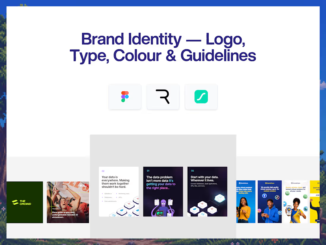
A logo isn't a brand.
A strong brand identity gives your business a recognizable visual language that can work across your website, product, social media, presentations, and everything else you build.
This engagement creates that foundation.
I develop the core visual identity around your positioning, audience, and personality — from the logo and typography to the color system and practical guidelines for using everything consistently.
The result is a brand identity that's designed to be used, not just presented.
Why this engagement model exists
A lot of brand identities stop at a logo.
You get a mark, a few colors, and a font — but no clear system for how everything works together.
That creates inconsistency as soon as the brand starts appearing in different places.
I approach identity as a system.
The logo, typography, colors, layout principles, and visual direction are developed together so your brand has a consistent foundation that can extend into your website, product, marketing, and other high-impact surfaces.
Who this is for
Startups building a new brand from the ground up. Founders preparing to launch a product or company. Businesses that have outgrown their current identity. SaaS and technology companies preparing to reposition. Agencies and teams that need a clear visual foundation before starting a website or product design.
It's for businesses that want a brand identity that can grow with them.
Not for: companies looking for a full naming, messaging, or comprehensive brand strategy engagement. Those can be scoped separately if required.
What you walk away with
A brand discovery session covering your business, audience, positioning, personality, competitors, and visual direction.
A primary logo with supporting variations designed for different applications.
A logo usage system covering appropriate sizing, spacing, backgrounds, and common usage scenarios.
A complete typography system including primary typeface, supporting typeface where required, hierarchy, weights, and usage guidance.
A considered color system including primary, secondary, accent, neutral, and supporting colors with HEX values.
Visual direction covering imagery, graphic elements, shapes, composition, and other elements that help define the brand's look and feel.
A reusable brand system designed to work across digital and physical applications.
Brand guidelines documenting how to use the logo, typography, colors, and core visual elements consistently.
Exported brand assets in the formats required for digital and everyday use.
A final organized Figma file containing the complete identity system.
How it ships
Days 1–3: Discovery & direction — Brand questionnaire, audience, positioning, personality, competitor review, references, and initial creative direction.
Days 4–7: Identity exploration — Logo concepts, typography exploration, color direction, and visual language development.
Days 8–10: Identity refinement — Selected logo direction refined, typography and color system finalized, and supporting visual elements developed.
Days 11–12: Guidelines & applications — Brand guidelines, logo usage, typography rules, color specifications, and practical application examples.
Days 13–14: Finalization & handoff — Final QA, asset preparation, organized Figma file, exports, and brand handoff.
Typical turnaround: 2 - 3 weeks.
FAQs
Eaxi's other services
Starting at$1,999
Duration2 weeks
Tags
Adobe Illustrator

Brand Identity
Figma

Brand Designer
Brand Strategist
Logo Designer
Service provided by
Eaxi Agu proNigeria
- $25k+
- Earned
- 9
- Paid projects
- 5.00
- Rating
- 32
- Followers
Brand Identity — Logo, Type, Colour & GuidelinesEaxi Agu
Starting at$1,999
Duration2 weeks
Tags
Adobe Illustrator
Brand Identity
Figma
Brand Designer
Brand Strategist
Logo Designer
A logo isn't a brand.
A strong brand identity gives your business a recognizable visual language that can work across your website, product, social media, presentations, and everything else you build.
This engagement creates that foundation.
I develop the core visual identity around your positioning, audience, and personality — from the logo and typography to the color system and practical guidelines for using everything consistently.
The result is a brand identity that's designed to be used, not just presented.
Why this engagement model exists
A lot of brand identities stop at a logo.
You get a mark, a few colors, and a font — but no clear system for how everything works together.
That creates inconsistency as soon as the brand starts appearing in different places.
I approach identity as a system.
The logo, typography, colors, layout principles, and visual direction are developed together so your brand has a consistent foundation that can extend into your website, product, marketing, and other high-impact surfaces.
Who this is for
Startups building a new brand from the ground up. Founders preparing to launch a product or company. Businesses that have outgrown their current identity. SaaS and technology companies preparing to reposition. Agencies and teams that need a clear visual foundation before starting a website or product design.
It's for businesses that want a brand identity that can grow with them.
Not for: companies looking for a full naming, messaging, or comprehensive brand strategy engagement. Those can be scoped separately if required.
What you walk away with
A brand discovery session covering your business, audience, positioning, personality, competitors, and visual direction.
A primary logo with supporting variations designed for different applications.
A logo usage system covering appropriate sizing, spacing, backgrounds, and common usage scenarios.
A complete typography system including primary typeface, supporting typeface where required, hierarchy, weights, and usage guidance.
A considered color system including primary, secondary, accent, neutral, and supporting colors with HEX values.
Visual direction covering imagery, graphic elements, shapes, composition, and other elements that help define the brand's look and feel.
A reusable brand system designed to work across digital and physical applications.
Brand guidelines documenting how to use the logo, typography, colors, and core visual elements consistently.
Exported brand assets in the formats required for digital and everyday use.
A final organized Figma file containing the complete identity system.
How it ships
Days 1–3: Discovery & direction — Brand questionnaire, audience, positioning, personality, competitor review, references, and initial creative direction.
Days 4–7: Identity exploration — Logo concepts, typography exploration, color direction, and visual language development.
Days 8–10: Identity refinement — Selected logo direction refined, typography and color system finalized, and supporting visual elements developed.
Days 11–12: Guidelines & applications — Brand guidelines, logo usage, typography rules, color specifications, and practical application examples.
Days 13–14: Finalization & handoff — Final QA, asset preparation, organized Figma file, exports, and brand handoff.
Typical turnaround: 2 - 3 weeks.
FAQs
Eaxi's other services
$1,999