
Figma - Atomic Design System & ComponentsNikul Patel
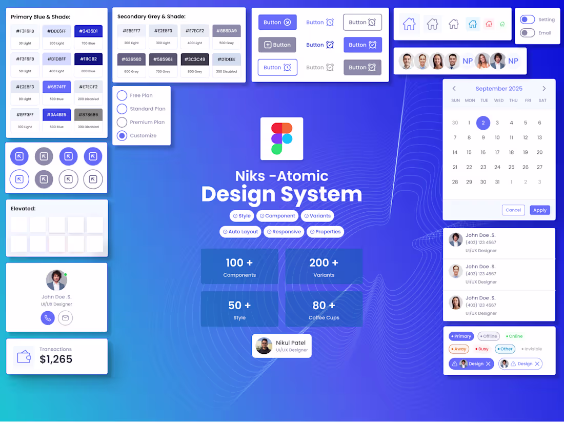
Niks – Atomic Design System (My Own Design System) is a scalable UI/UX framework built to streamline design consistency across SaaS dashboards, e-commerce platforms, and modern web applications. A modular design system built using the Atomic Design methodology. It brings consistency, accessibility, and speed to product teams through reusable tokens, components, variants and patterns and every component is managed using properties and nested instances dynamically.
Almost 100+ components with 200+ variants and 60+ styles with primary, secondary, contextual and light/dark themes.
Nik's Atomic Design System includes:
• Fully responsive components
• Atomic structure from Foundations → Components → Patterns → Templates
• Flexible variants & dynamic properties
• Multi-theme support
• Accessibility-ready elements
• E-commerce, dashboard, and mobile-first components
• Developer-friendly documentation & guidelines
This system helps create consistent, scalable, and efficient product experiences across platforms and teams.
You can explore the full design system documentation at the URL below:
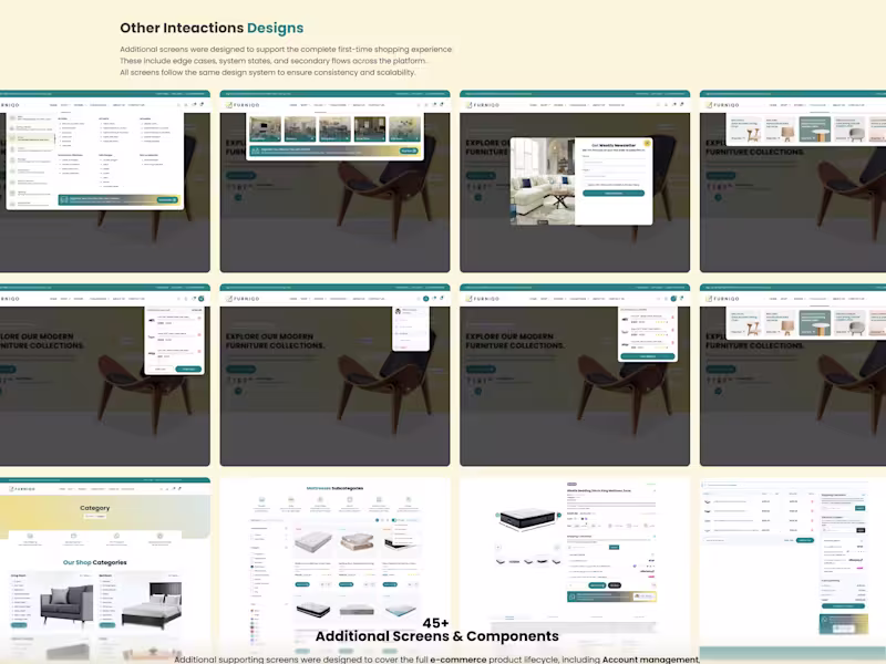
What's included
Goal & Research for Design System
- Identify the user requirements.
- List of components
- Find the pain-points and gaps between legacy system
- Prepare the roadmap for the component.
Foundation
- Color palette (primary, secondary, semantic, neutral)
- Typography (font families, sizes, weights, line-heights)
- Spacing system (margins, paddings, grids, breakpoints)
- Iconography (icon set and usage guidelines)
- Elevation & shadow styles
Components
- Buttons (primary, secondary, disabled, hover, active states)
- Forms & Inputs (text fields, checkboxes, radio buttons, toggles)
- Navigation components (menu, tabs, breadcrumbs, sidebar)
- Cards / Lists / Tables
- Modals, Pop-ups, Tooltips
- Alerts / Notifications / Banners
- Many more advanced components
I have created Nik's Atomic Design System using Style / Variables-based standards. You can explore the design system on the Figma community.
https://www.figma.com/community/file/1577779626859531461
Patterns & Guidelines
- Interaction patterns (hover, click, focus, loading states)
- Responsive behaviour rules (desktop, tablet, mobile)
- Component usage guidelines
- Do’s and Don’ts for consistency
Documentation & Handoff
- Figma / design tool files (organized & labeled components)
- Component library / Tokens (colors, typography, spacing variables)
- Usage documentation (how to apply components in new screens)
- Developer-ready specs & redlines
- Light / Dark mode variants
- Micro-interaction guidelines (animations, transitions)
- Versioning & update instructions
Contact for pricing
Tags
Adobe XD
Figma
Miro
Sketch
Zeplin
Design Systems Specialist
Product Designer
UI Designer
Service provided by
Nikul Patel Calgary, Canada
- 2
- Followers
Figma - Atomic Design System & ComponentsNikul Patel
Contact for pricing
Tags
Adobe XD
Figma
Miro
Sketch
Zeplin
Design Systems Specialist
Product Designer
UI Designer
Niks – Atomic Design System (My Own Design System) is a scalable UI/UX framework built to streamline design consistency across SaaS dashboards, e-commerce platforms, and modern web applications. A modular design system built using the Atomic Design methodology. It brings consistency, accessibility, and speed to product teams through reusable tokens, components, variants and patterns and every component is managed using properties and nested instances dynamically.
Almost 100+ components with 200+ variants and 60+ styles with primary, secondary, contextual and light/dark themes.
Nik's Atomic Design System includes:
• Fully responsive components
• Atomic structure from Foundations → Components → Patterns → Templates
• Flexible variants & dynamic properties
• Multi-theme support
• Accessibility-ready elements
• E-commerce, dashboard, and mobile-first components
• Developer-friendly documentation & guidelines
This system helps create consistent, scalable, and efficient product experiences across platforms and teams.
You can explore the full design system documentation at the URL below:
What's included
Goal & Research for Design System
- Identify the user requirements.
- List of components
- Find the pain-points and gaps between legacy system
- Prepare the roadmap for the component.
Foundation
- Color palette (primary, secondary, semantic, neutral)
- Typography (font families, sizes, weights, line-heights)
- Spacing system (margins, paddings, grids, breakpoints)
- Iconography (icon set and usage guidelines)
- Elevation & shadow styles
Components
- Buttons (primary, secondary, disabled, hover, active states)
- Forms & Inputs (text fields, checkboxes, radio buttons, toggles)
- Navigation components (menu, tabs, breadcrumbs, sidebar)
- Cards / Lists / Tables
- Modals, Pop-ups, Tooltips
- Alerts / Notifications / Banners
- Many more advanced components
I have created Nik's Atomic Design System using Style / Variables-based standards. You can explore the design system on the Figma community.
https://www.figma.com/community/file/1577779626859531461
Patterns & Guidelines
- Interaction patterns (hover, click, focus, loading states)
- Responsive behaviour rules (desktop, tablet, mobile)
- Component usage guidelines
- Do’s and Don’ts for consistency
Documentation & Handoff
- Figma / design tool files (organized & labeled components)
- Component library / Tokens (colors, typography, spacing variables)
- Usage documentation (how to apply components in new screens)
- Developer-ready specs & redlines
- Light / Dark mode variants
- Micro-interaction guidelines (animations, transitions)
- Versioning & update instructions
Contact for pricing