
Mobile App Design Kit (iOS · Android · React-Native)Orezi Mena
I’ll turn your product vision into a universal iOS + Android design kit—complete with core screens, light/dark components, and a dev-friendly hand-off. Think “App Store-ready UI” in less than a month, without the endless back-and-forth or surprise scope creep.
What's included
Universal Component Library
40+ reusable buttons, inputs, nav bars, cards, modals, and toast states—tokenised for light & dark mode.
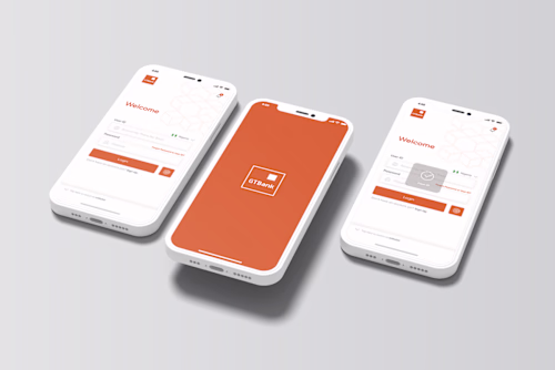
5 Core Screen Designs (Pixel-Perfect)
Onboarding, Home, Detail, Search, Settings—aligned to iOS HIG & Material 3 so devs ship fast on both stores.
Interaction-Ready Prototype
Clickable Figma flow with gestures, haptic cues, and micro-animations for stakeholder sign-off and user testing.
Mini Design System Guide
Typography scale, colour palette, spacing tokens, and usage rules documented inside the Figma file.
Developer Handoff Package
Layer-named Figma, Zeplin redlines, exported SVG/PNG assets, plus a Loom walkthrough of component logic.
2 Revision Rounds
Two feedback cycles for copy tweaks, colour swaps, or layout adjustments—no surprise fees.
FAQs
Example work

Contact for pricing
Tags
Figma
Supabase
Zeplin
Product Designer
UX Designer
UX Engineer
Service provided by
Orezi Mena proUnited Kingdom
- $10k+
- Earned
- 1
- Paid projects
- 5.00
- Rating
- 26
- Followers
Mobile App Design Kit (iOS · Android · React-Native)Orezi Mena
I’ll turn your product vision into a universal iOS + Android design kit—complete with core screens, light/dark components, and a dev-friendly hand-off. Think “App Store-ready UI” in less than a month, without the endless back-and-forth or surprise scope creep.
What's included
Universal Component Library
40+ reusable buttons, inputs, nav bars, cards, modals, and toast states—tokenised for light & dark mode.
5 Core Screen Designs (Pixel-Perfect)
Onboarding, Home, Detail, Search, Settings—aligned to iOS HIG & Material 3 so devs ship fast on both stores.
Interaction-Ready Prototype
Clickable Figma flow with gestures, haptic cues, and micro-animations for stakeholder sign-off and user testing.
Mini Design System Guide
Typography scale, colour palette, spacing tokens, and usage rules documented inside the Figma file.
Developer Handoff Package
Layer-named Figma, Zeplin redlines, exported SVG/PNG assets, plus a Loom walkthrough of component logic.
2 Revision Rounds
Two feedback cycles for copy tweaks, colour swaps, or layout adjustments—no surprise fees.
FAQs
Example work
Contact for pricing