
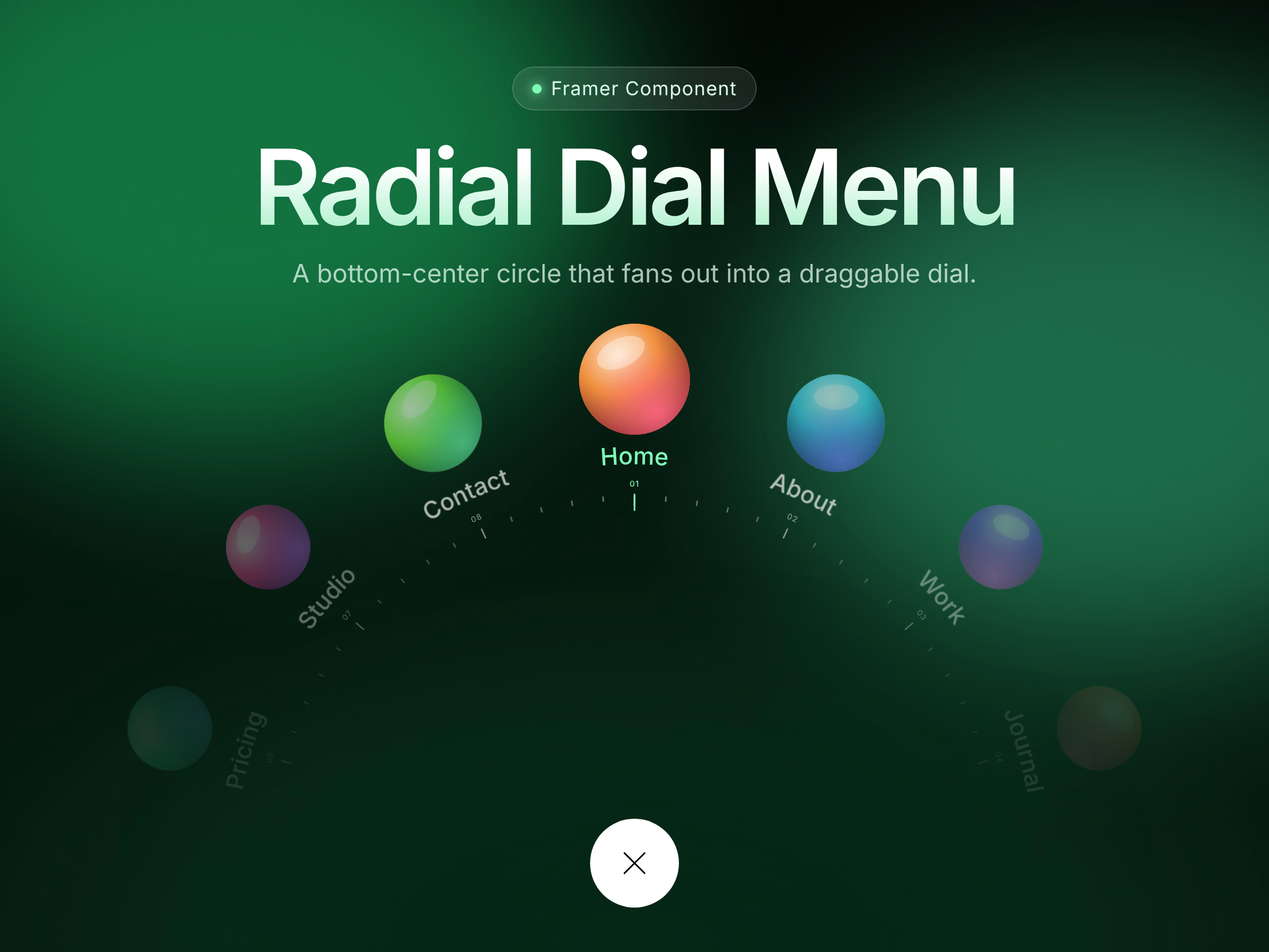
Radial Dial Menu turns a simple round button into a premium, tactile navigation experience. Tap the circle at the bottom of the screen and a dial fans out upward with a smooth staggered reveal. Drag, scroll or use the arrow keys to spin it; the item at the top snaps into place, glows in your accent color, and loops infinitely. Fully responsive, fully customizable from the properties panel, no code needed. Perfect for portfolios, mobile-first sites, studios and creative landing pages.
Features: infinite loop, drag/scroll/keyboard support, tick marks with numbering, image or fallback avatars per item, links per item, light dim backdrop with optional blur, adjustable motion, reduced-motion support, canvas-safe static preview.
User Manual:
Component Setup: Drag and drop the component onto your page. For the best experience, keep the frame set to full-width and full-height (this ensures clicks outside the menu are not blocked when it is closed).
Items: For each item in the "Items" list, configure its Label, Image, Fallback Color, and Link. If no image is provided, a circle displaying the first letter of the label will be shown instead.
Trigger: Customize the size, bottom gap, background color, and icon color directly in the Trigger section.
Layout: Fine-tune the dial's shape using the Radius (0 = auto), Item Size, Spacing, and Visible settings.
Ticks: Toggle or adjust the Ticks, Numbers, and Ticks/item settings to modify the dial's appearance.
Style: Customize the Font, Text, Active state, Ticks color, and Backdrop. To create a subtle dimming effect, simply lower the Backdrop's alpha value (default is 0.45).
Motion: Control the animation behaviors using the Open Time, Close Time, Open Spin, and Snap Stiffness/Damping controls.
Behavior: Configure behavioral rules such as Infinite Loop, Tap = Go, Close on Pick, Link Target (same vs. new tab), and Start Open. Toggle "Open on Canvas" to keep the menu expanded while editing on your canvas, or turn it off to keep it closed.
How to Use: Click the central circle to open the menu. Spin the dial by dragging, scrolling, or using the Left/Right (←/→) arrow keys. Tap an item or press Enter to select it. Press Esc or click the central circle again to close the menu.


Get it for$6.00
Tags
Framer
UI kits
Radial Dial Menu turns a simple round button into a premium, tactile navigation experience. Tap the circle at the bottom of the screen and a dial fans out upward with a smooth staggered reveal. Drag, scroll or use the arrow keys to spin it; the item at the top snaps into place, glows in your accent color, and loops infinitely. Fully responsive, fully customizable from the properties panel, no code needed. Perfect for portfolios, mobile-first sites, studios and creative landing pages.
Features: infinite loop, drag/scroll/keyboard support, tick marks with numbering, image or fallback avatars per item, links per item, light dim backdrop with optional blur, adjustable motion, reduced-motion support, canvas-safe static preview.
User Manual:
Component Setup: Drag and drop the component onto your page. For the best experience, keep the frame set to full-width and full-height (this ensures clicks outside the menu are not blocked when it is closed).
Items: For each item in the "Items" list, configure its Label, Image, Fallback Color, and Link. If no image is provided, a circle displaying the first letter of the label will be shown instead.
Trigger: Customize the size, bottom gap, background color, and icon color directly in the Trigger section.
Layout: Fine-tune the dial's shape using the Radius (0 = auto), Item Size, Spacing, and Visible settings.
Ticks: Toggle or adjust the Ticks, Numbers, and Ticks/item settings to modify the dial's appearance.
Style: Customize the Font, Text, Active state, Ticks color, and Backdrop. To create a subtle dimming effect, simply lower the Backdrop's alpha value (default is 0.45).
Motion: Control the animation behaviors using the Open Time, Close Time, Open Spin, and Snap Stiffness/Damping controls.
Behavior: Configure behavioral rules such as Infinite Loop, Tap = Go, Close on Pick, Link Target (same vs. new tab), and Start Open. Toggle "Open on Canvas" to keep the menu expanded while editing on your canvas, or turn it off to keep it closed.
How to Use: Click the central circle to open the menu. Spin the dial by dragging, scrolling, or using the Left/Right (←/→) arrow keys. Tap an item or press Enter to select it. Press Esc or click the central circle again to close the menu.
$6.00