Projects using Icon
Projects using Icon
Sign Up
Post a job
Sign Up
Log In
Filters
1
Projects
People
Message
1
Vlado Nacev
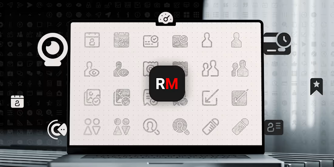
Custom Icons Set (900+ icons and symbols)
1
20
Message
0
Hardikkumar Vinzava Top 1% Framer Creator
pro
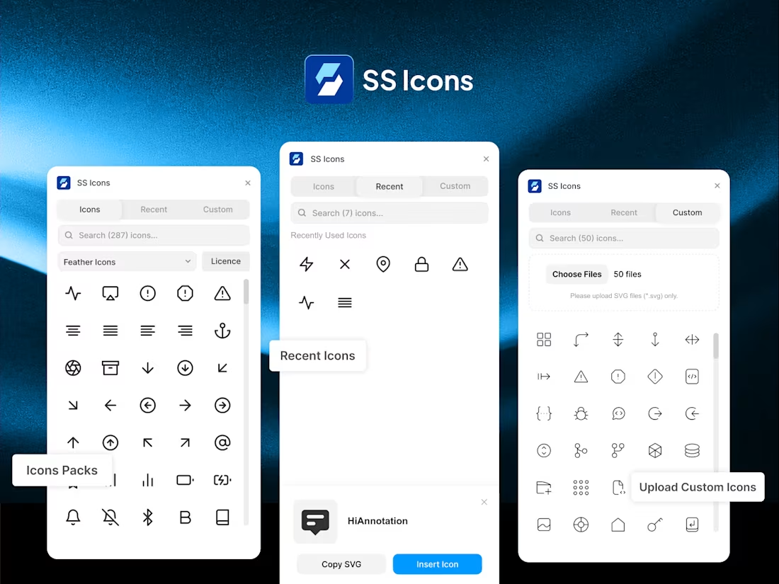
SS Icons : Icon Management Framer Plugin
0
18
Message
1
Freelancer Deven
pro
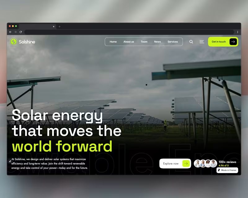
Hi, I’ve created a Framer template called Solshine for solar and renewable energy websites: https://solshine.framer.website/ The template has been approved and featured in the Framer Marketplace. It’s designed specifically for solar and renewable energy brands, with a strong focus on conversions, clarity, and performance.
1
530
Message
0
Florence .
pro
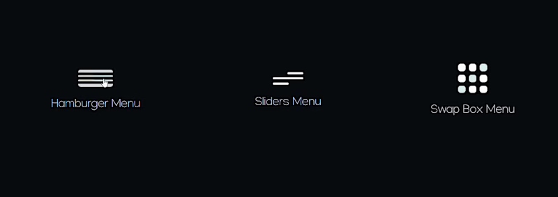
Menu icon animations all done on Framer
0
150
Message
0
Alprav Design
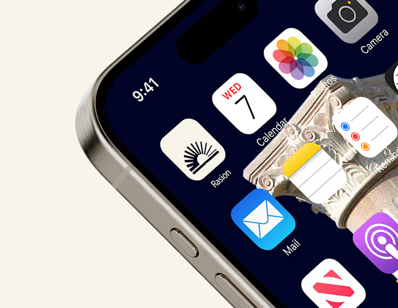
A clean and minimal app icon designed for Raison, an AI-powered education platform. The rising form symbolises knowledge, clarity, and intellectual growth, reflecting the platform’s mission to guide students with trusted AI assistance. The design ensures strong visibility and recognisability across digital interfaces and mobile environments.😊
0
196
Message
0
Amr Mohamed
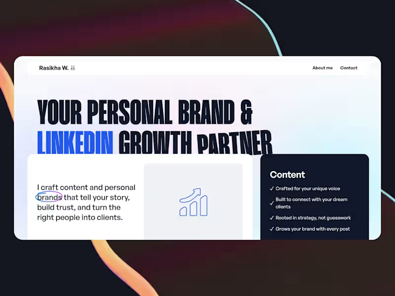
Surprise Website Gift for Rasikha
0
15
Message
0
Rehan Sajid
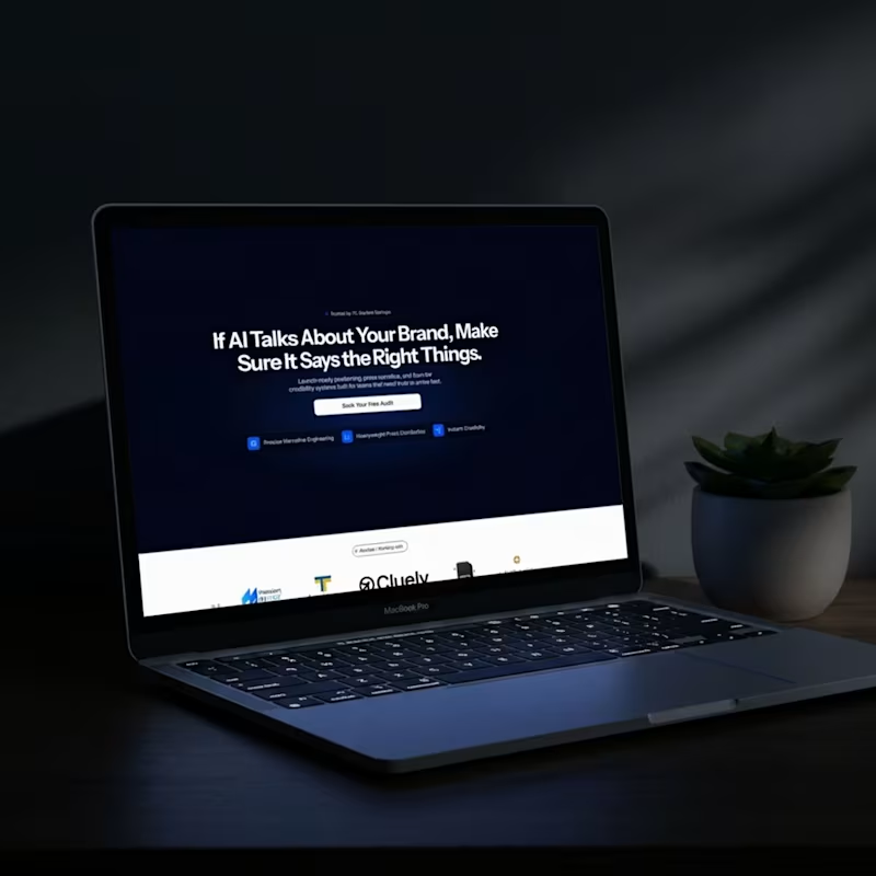
A client recently came to me with a common startup problem. "Our website looks great, but nobody is clicking 'Book a Demo.'" They were getting visitors to their website, but those visitors weren't turning into leads. People landed on the site, looked around for a few seconds, and left. The website wasn't ugly. In fact, it looked modern and professional. The real issue was that it wasn't built to guide people toward taking action. The Problem Many businesses treat their website like a digital brochure. They spend weeks making it look beautiful but forget that a website has one job—to help visitors become customers. When I reviewed their website, a few things stood out: The messaging was too generic and filled with business jargon. The hero section didn't clearly explain what the company does or who it's for. Visitors had to scroll too far before finding the "Book a Demo" button. There was no clear journey that guided users from interest to action. When people don't quickly understand your value, they leave. It's that simple. The Solution Instead of giving the website a new look, we focused on making it easier for people to understand and take action. First, we rewrote the hero section to speak directly to the customer's biggest problem and clearly explain how the business solves it. Then, we reorganized the page so every section answered the next question a visitor would naturally have. Instead of making people search for information, we guided them through it. Finally, we placed clear and consistent call-to-action buttons throughout the page, making it easy to book a demo whenever someone was ready. The Result The final website wasn't just cleaner or more modern. It became a tool that helped the business generate more leads by making the message clear and the next step obvious. A website shouldn't only look good. It should make people understand your value, build trust, and encourage them to take action. Because at the end of the day, a website that converts will always create more value than one that simply looks beautiful.
0
99
Message
1
Olalekan Daramola
pro
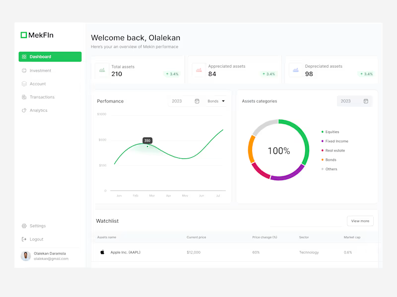
Investment Dashboard Design for MekFIN - Casestudy
1
4
Message
0
Igor R.
pro
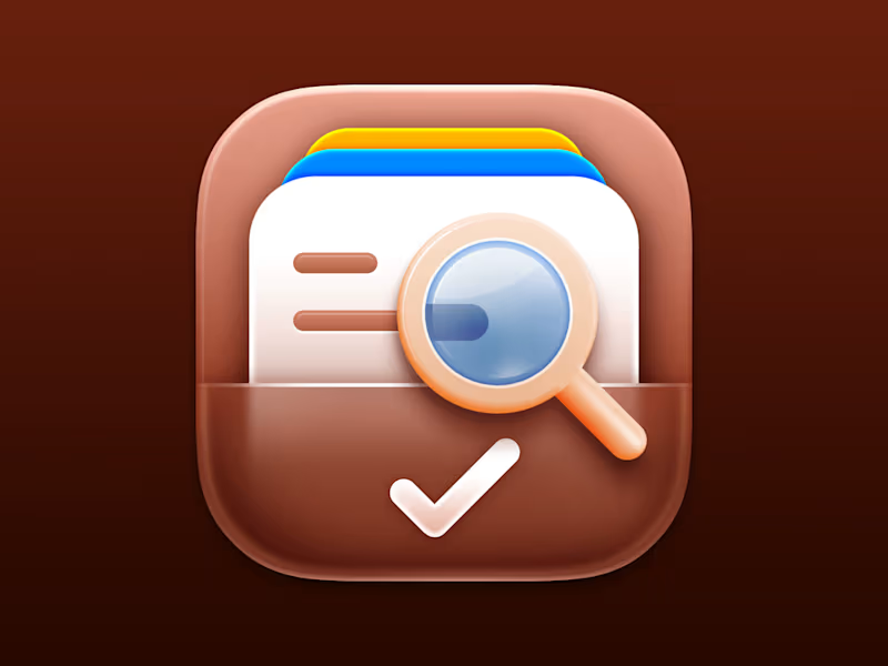
Service Directory iOS App Icon. #iosicon (https://bsky.app/hashtag/iosicon) #iphoneicon (https://bsky.app/hashtag/iphoneicon) #appicon (https://bsky.app/hashtag/appicon) #iosappicon (https://bsky.app/hashtag/iosappicon) #ios27 (https://bsky.app/hashtag/ios27)
0
167
Message
0
Lucca Moreira
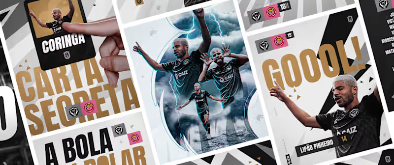
FURIA FC Visual Identity
0
0
Message
1
MD SAJIBUZZAMAN
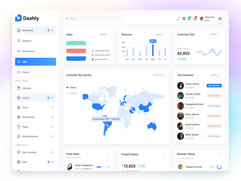
✦ Dashly — CRM Dashboard Dashly CRM is a modern and intuitive dashboard designed to help teams manage leads, track interactions, and build stronger customer relationships in one simple interface. The layout focuses on clarity, accessibility, and flow, giving users a complete overview of their customer pipeline — from first contact to closed deals. Each element, from data cards to activity sections, was designed with purposeful hierarchy and breathing space, ensuring users can focus on what truly matters. Soft tones, consistent grids, and clear typography make the experience feel balanced, reliable, and human-centered. Because great CRM design isn’t just about managing data — it’s about understanding people.
1
86
Message
0
Elfirayani Sirait
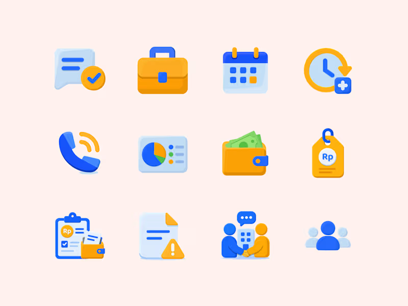
Flat icon set focusing on business, finance, and workspace management.
0
13
Message
0
Ecommerce Visual
MESSEGUE LISTING
0
38
Message
0
Ecommerce Visual
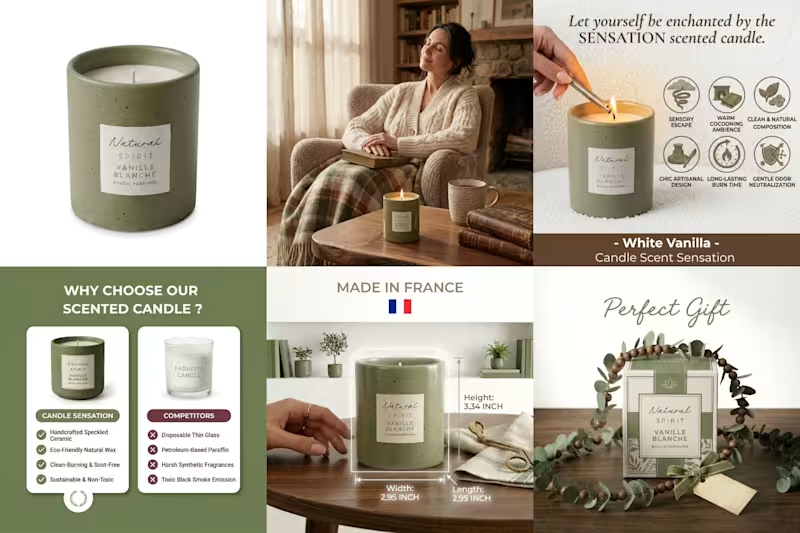
candle parfum
0
54
Message
0
Ecommerce Visual
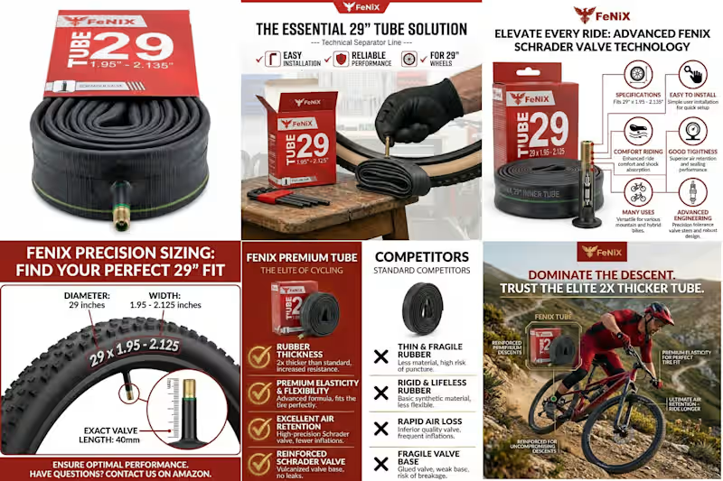
Fenix Inner Tube
0
57
Message
0
Ecommerce Visual
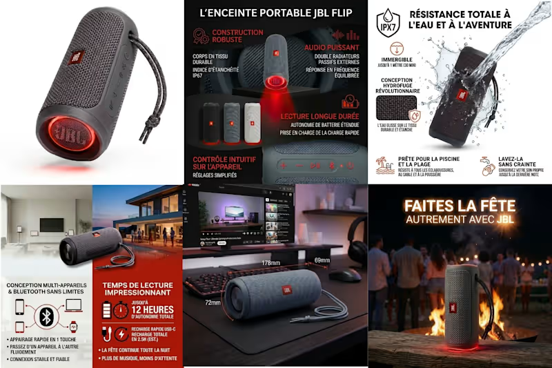
JBL FLIP listing
0
61
Explore projects