
Web design & build for startups and growing businesses


WordPress Developer | Elementor & Bricks Builder

Founder · Framer, Webflow, WordPress, Shopify, AI Automation
- 21
- Followers
Founder · Framer, Webflow, WordPress, Shopify, AI Automation

UX-Focused Product, WordPress, Webflow & Framer Designer
- $1k+
- Earned
- 2x
- Hired
- 5.0
- Rating
- 36
- Followers
UX-Focused Product, WordPress, Webflow & Framer Designer

WordPress & Framer Designer for Business Websites
- 5.0
- Rating
- 11
- Followers
WordPress & Framer Designer for Business Websites
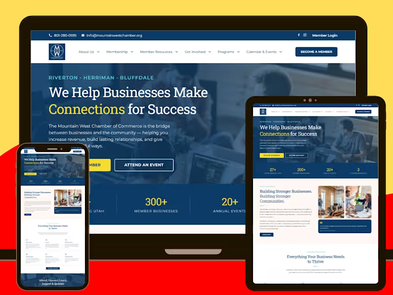
Mountain West Chamber of Commerce is a community-focused business website built to serve entrepreneurs, local companies, professionals, sponsors, and residents across Riverton, Herriman, and Bluffdale, Utah. The website needed to function as more than an informational platform — it had to become a central digital hub for memberships, events, resources, sponsorship opportunities, community programs, business networking, and local engagement.
I worked on the WordPress website design and development with a strong focus on creating a clear, modern, and professional experience that could handle a large amount of information without feeling cluttered or difficult to navigate. Because a Chamber of Commerce serves several different audiences at once, the structure had to make it easy for visitors to quickly identify the most relevant path, whether they wanted to become a member, attend an event, explore business resources, view community programs, find local companies, or learn more about sponsorship opportunities.
From a WordPress Developer perspective, I focused heavily on content organization, responsive performance, page hierarchy, navigation, usability, and scalability. The website includes dedicated areas for membership benefits, member resources, programs, events, sponsorships, job listings, community information, member directories, and organizational details, all structured in a way that keeps the user journey straightforward despite the depth of content available.
A major part of the project was creating a strong WordPress website structure that could support both immediate usability and long-term growth. Chamber websites naturally evolve as new programs, events, announcements, partners, and community initiatives are added, so the build needed to remain flexible and easy to manage. I approached the development with that scalability in mind, making sure the site could grow without sacrificing consistency or user experience.
From a WordPress Designer perspective, I focused on building a visual experience that feels established, trustworthy, energetic, and community-oriented. The layout balances professional branding with accessible content, using strong typography, clear section breaks, concise calls to action, statistics, program highlights, membership benefits, testimonials, and community-focused messaging to keep visitors engaged.
The homepage was designed around a clear conversion journey. Visitors are introduced to the Chamber’s mission and value proposition before being guided toward key actions such as becoming a member, attending an event, exploring benefits, sponsoring programs, or contacting the organization. The site prominently communicates the Chamber’s experience, membership reach, events, and coverage across three Utah cities, helping reinforce credibility from the moment a visitor arrives.
I also applied strong UI/UX design principles throughout the project. With a content-heavy organization like this, user experience is especially important. Rather than simply presenting information, the website was structured around intent. A business owner interested in networking should be able to find events quickly. A prospective member should be able to understand the benefits of joining. A sponsor should have a clear path toward partnership opportunities. Existing members should be able to access resources without searching through unnecessary pages.
Responsive web design was another key priority. The website was built to maintain clear navigation, readable content, balanced spacing, and strong visual hierarchy across desktop, tablet, and mobile devices. This was particularly important for event information, membership resources, contact options, and community updates, where users are likely to access the website from different devices while on the move.
The project also incorporates conversion-focused website design through strategically placed calls to action, simplified navigation paths, contact forms, membership prompts, event links, sponsorship opportunities, and repeated engagement points throughout the site. Rather than treating the website as a static brochure, I approached it as a business development and community engagement platform.
From an SEO-friendly WordPress development standpoint, I paid attention to structured content, logical page organization, readable layouts, service and program categorization, internal navigation, and a scalable foundation for future content marketing. With sections covering business resources, events, local programs, jobs, membership information, and community initiatives, the site has a strong framework for continued search visibility and organic growth.
The website also features lead-generation and engagement elements such as contact forms, member calls to action, event pathways, program promotion, partnership opportunities, and business resources. These features help transform general website traffic into meaningful actions, whether that means a new membership enquiry, event attendance, sponsorship interest, or deeper community participation.
Overall, this project demonstrates my ability to handle WordPress website design, WordPress website development, responsive web design, UI/UX design, SEO-friendly website development, business website design, lead generation, conversion optimization, content architecture, and scalable WordPress development within one complex website.
The final result is a professional and highly structured digital platform that gives the Mountain West Chamber of Commerce a stronger online presence while making it easier for businesses and community members to connect, participate, discover resources, attend events, build relationships, and become active members of the Chamber.
0
84
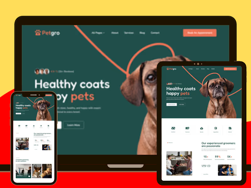
Petgro: Framer Pet Grooming & Pet Care Website
Petgro is a modern Framer website design and development project created for a professional pet grooming and care business. The goal was to create a friendly, trustworthy, and visually engaging website that makes it easy for pet owners to understand available services, compare grooming packages, build confidence in the team, and book an appointment.
The design uses a warm, approachable visual direction that fits the pet-care industry while maintaining a polished professional feel. The homepage immediately communicates the core value proposition around keeping pets clean, healthy, and happy, supported by clear calls to action that guide visitors toward exploring services or booking a visit.
A key part of the project was developing a clear service and pricing experience. Visitors can explore grooming options including bath and brush, full-body grooming, haircut and styling, nail care, and other pet-care services. Dedicated pricing sections make it easier to compare grooming packages and understand what is included before booking.
The website also focuses heavily on trust-building UI/UX. Testimonials, customer satisfaction indicators, professional grooming credentials, team profiles, pet-safe product messaging, and information about the grooming environment help reassure pet owners that their animals will receive safe and professional care.
I structured the booking journey to minimize friction. The appointment section collects essential information such as the owner's name, contact details, pet breed, selected service, and additional message, creating a straightforward path from browsing to appointment request. A four-step grooming process — booking, pet assessment, professional grooming, and happy homecoming — also helps visitors understand what to expect.
The experience is supported by a dedicated FAQ section addressing common grooming and pet-care questions, alongside an educational blog for ongoing content and pet-care resources. This gives the website more depth while creating additional opportunities for visitors to learn about grooming and engage with the brand.
Built in Framer, the project combines responsive layouts, reusable components, modern typography, visual storytelling, structured service content, pricing sections, testimonials, appointment-focused CTAs, and content-driven sections to create a complete digital experience for a modern pet grooming business.
Key Focus Areas
Framer website design and development
Pet grooming website design
Pet care business website
Appointment-focused UX
Service and pricing presentation
Grooming package comparison
Responsive Framer development
Pet-care focused visual storytelling
Testimonials and trust-building sections
Team and professional profile presentation
Booking and lead-generation flow
FAQ and educational content structure
Blog and content sections
Reusable Framer components
Conversion-focused calls to action
Mobile-friendly responsive experience
0
14
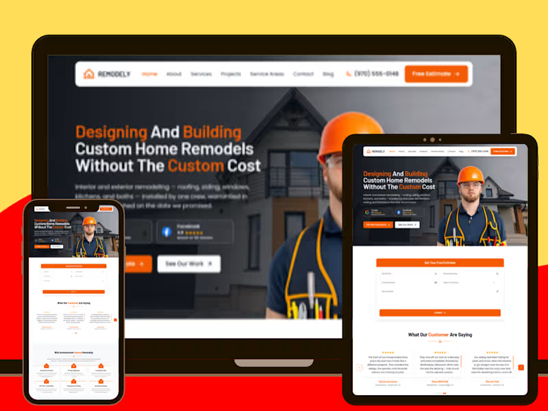
Remodely: Framer Home Remodeling & Roofing Website
Remodely is a modern Framer website design and development project created for a home remodeling and exterior renovation company serving Northern Colorado. The objective was to create a polished, trustworthy digital experience that presents multiple remodeling services clearly while turning homeowners into qualified estimate requests.
The website was structured around a strong conversion journey, starting with a clear value proposition and immediate calls to action for a free estimate. Instead of overwhelming visitors with technical information, the experience guides homeowners through the company's services, recent projects, customer testimonials, guarantees, process, FAQs, and service areas in a logical sequence.
A major focus was building trust through the UI/UX. The design incorporates review ratings, customer testimonials, licensing and insurance information, a written workmanship warranty, in-house crews, transparent pricing, on-time completion, and detailed project expectations. These elements help address the concerns homeowners typically have before committing to a major renovation project.
The service architecture was also designed to make a broad remodeling offering easy to navigate. Dedicated sections cover roof replacement, siding installation, window replacement, gutter systems, exterior remodeling, and interior remodeling, with supporting details that communicate the scope of each service.
The project showcase adds another layer of credibility by presenting completed work such as storm-damaged roof rebuilds, fiber-cement siding installations, and whole-home window replacements. A structured three-step process — free estimate, scope and schedule, then project completion — further simplifies the path from initial interest to taking action.
Built entirely in Framer, the website combines responsive layouts, reusable components, strong typography, image-led sections, structured content, service-area navigation, FAQ content, blog sections, and strategically placed CTAs. The result is a professional remodeling website designed to feel established and trustworthy while keeping the user journey focused on one key action: requesting an estimate.
Key Focus Areas
Framer website design and development
Home remodeling website design
Roofing and exterior renovation website
Construction and contractor website UI/UX
Lead-generation focused website structure
Free estimate and quote conversion flow
Service-based information architecture
Project showcase and visual storytelling
Testimonials and trust-building sections
Responsive Framer website development
Service area and local business content
FAQ and educational content structure
Reusable Framer components
Conversion-focused calls to action
Professional construction industry branding
Mobile-friendly responsive experience
0
28
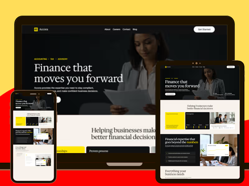
Accora is a polished Framer website design and development project created for a modern accounting, tax, and financial advisory brand. The goal was to build a professional digital experience that could make complex financial services feel clear, trustworthy, and approachable while guiding potential clients toward booking a consultation.
The website opens with a strong value proposition around helping businesses make better financial decisions, immediately supported by credibility indicators such as years of experience and businesses served. From there, the experience is structured around a clear journey through accounting, tax, and financial advisory services, making it easy for visitors to understand what the business offers and how it can support their financial goals.
The service sections were designed to provide more than surface-level descriptions. Accounting and bookkeeping content covers financial statements, general ledger management, reconciliations, and reporting, while the tax section focuses on planning, compliance, filing assistance, and regulatory guidance. Financial advisory services highlight forecasting, budgeting, performance reviews, and strategic financial advice.
I also focused heavily on trust-driven UI/UX design. Industry sections introduce the types of businesses the firm supports, while certification information, experience statistics, client testimonials, financial performance metrics, and results-oriented content reinforce credibility throughout the experience.
The site also uses carefully placed calls to action such as “Book Consultation” and “Get Started” to turn informational browsing into a clear next step. Supporting pages for About, Careers, Contact, Blog, FAQs, and other essential content create a more complete website structure rather than relying on a single landing page.
Built in Framer, the project combines responsive layouts, reusable components, modern typography, structured content sections, visual storytelling, and conversion-focused interactions to create a scalable financial-services website that feels credible without becoming overly corporate or difficult to navigate.
Key Focus Areas
Framer website design and development
Accounting & financial services website
Tax and advisory service presentation
Professional financial-services UI/UX
Responsive website design
Conversion-focused consultation flow
Service and industry-based information architecture
Trust-building testimonials and credibility sections
Financial metrics and visual data presentation
Reusable Framer components
Modern typography and editorial layouts
FAQ and content structure
Business-focused calls to action
Mobile-friendly responsive experience
Professional brand storytelling
0
34

Shopify, WordPress & Webflow Developer · 250+ Projects
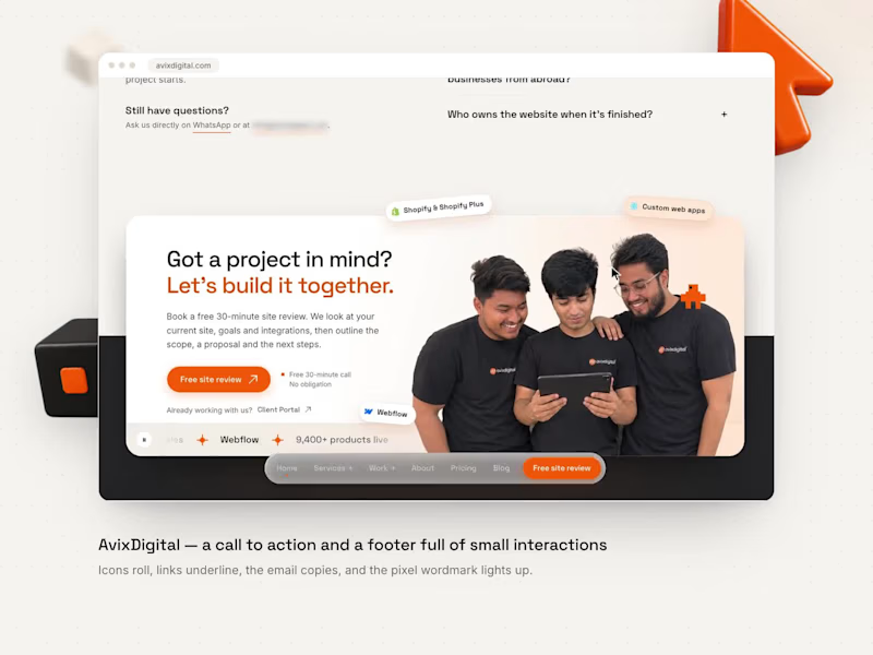
Nobody remembers a footer. Unless it surprises them.
On our own site, avixdigital.com, the last screen still has a job. The call to action offers a free 30-minute site review, and every detail answers the cursor.
→ Social icons roll and fill as you hover
→ The email copies in one click, and a pixel mascot confirms it
→ The wordmark is built from pixels that light up under your cursor
Built in WordPress with 34 custom Elementor widgets.
What's the smallest interaction on a website that ever made you smile?
3
2
146
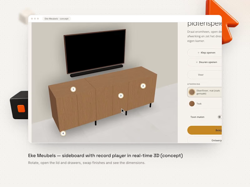
A sideboard you can walk around, open and re-finish, right in the browser.
A concept demo for Eke Meubels, the Dutch furniture maker: their sideboard with a built-in record player, shown in real-time 3D.
→ Drag to walk around it, scroll to zoom
→ Open the record-player lid, the drawers and the doors
→ Four finishes: oak veneer, okoumé plywood, teak and matt black
→ Dimension lines, a slider against a photo of the finished piece, and AR to place it in your room
It's built on the SketchUp designs Eke already makes: one export per project, no extra modelling.
Would seeing a piece in 3D change how you buy furniture online?
1
2
128
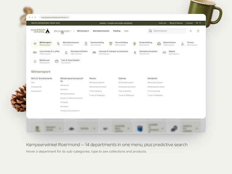

Your website should work as hard as you do.
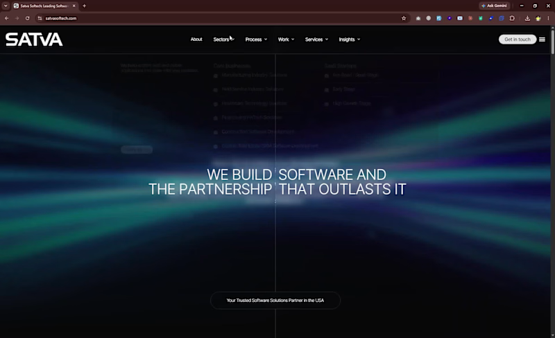
Software Development Agency Website
I worked on a software development agency website based in Raleigh, USA, designed to showcase the company’s services, technical expertise, and case studies. The project focused on creating a polished, modern online presence that clearly communicated the agency’s capabilities while maintaining strong performance and a smooth user experience.
Overview: A software development agency website based in Raleigh, USA, highlighting services, expertise, and case studies.
Key Contribution: Used the Bricks theme extensively to achieve a custom, high-quality design while maintaining strong performance standards.
Key responsibilities included:
- Building and customizing website sections to present the agency’s services, expertise, and case studies
- Using the Bricks theme to create flexible, visually refined layouts with a custom feel
- Designing responsive pages that delivered a consistent experience across desktop, tablet, and mobile devices
- Organizing content to clearly communicate the agency’s offerings, process, and project experience
- Developing intuitive navigation to help visitors quickly explore services, case studies, and company information
- Writing custom PHP, JavaScript, HTML, and CSS to support tailored functionality and design requirements
- Optimizing performance to ensure the website remained fast, efficient, and user-friendly
- Fixing bugs and maintaining smooth functionality across the site
- Supporting ongoing improvements to enhance usability, presentation, and overall engagement
Best part: Playing with Bricks theme elements to get the best results and create a custom design that looked great while still performing well.
1
270
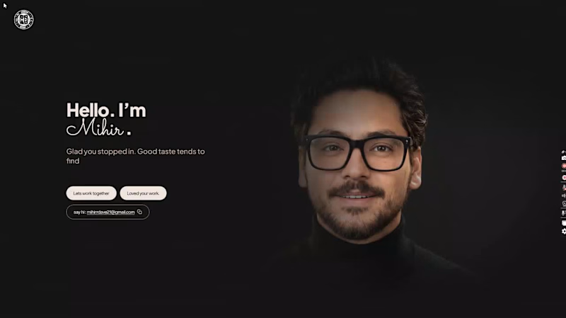
I just finished my new personal hero page.
The part I'm most excited about is the 3D character. As you scroll, it plays out frame by frame, so you're basically controlling the animation with your scroll wheel. It also reacts to your mouse, which makes the page feel alive the moment you land on it.
What I focused on: - A 3D character that moves as you scroll - A clean black and white look with nothing extra on the page - Plus Jakarta Sans for the main text, with a cursive font for a personal touch - Small pill buttons like Pitch us an idea and Loved your work. - One click to copy my email Built with React, TypeScript, Vite, Tailwind CSS and Lucide icons.
The character animation runs as a frame sequence drawn on canvas. I dont think a personal website should be a static resume. It should show your taste and your craft before anyone reads a word about you. I build WordPress and WooCommerce sites for clients too, with a team of developers and designers behind me. If you have a project in mind, lets talk. Have a look and tell me what you think. And if you're building something interesting right now, Id love to hear about it.
1
93
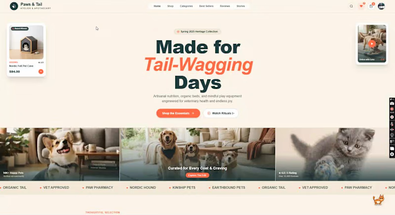
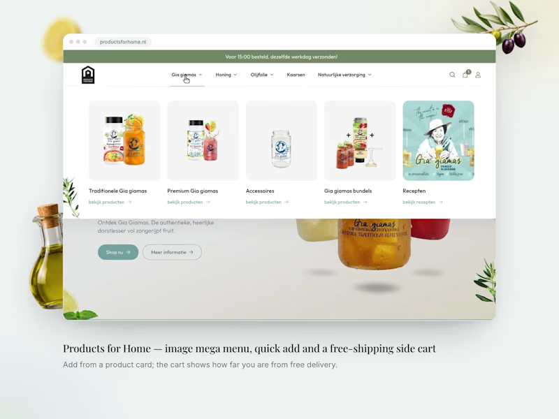
Just wrapped up a fun one for a pet care brand 🐾
The goal was simple: make their online store feel less like a standard product grid and more like a place people actually enjoy browsing.
A few things I really liked working on:
🐱 A cursor-following kitten mascot with little reactions when you click it.
🎨 An editorial-style design with warm terracotta, deep spruce tones, and clean typography.
🎥 Vertical video reels built directly into product cards, bringing real customer content into the shopping experience.
✨ Small interactions throughout the site, from floating hero cards and brand marquees to seasonal carousels and quick-add feedback.
The technical side matters, of course. Performance, responsiveness and clean code are expected.
But I think the little details are what make a website memorable.
Sometimes it's that extra 5% that has nothing to do with the conversion funnel and simply makes someone smile.
How much room do you leave for those little moments when building client websites?
#WebDevelopment #UIUX #Ecommerce #WordPress #WooCommerce #FrontendDevelopment #ClientWork #Website #ResponsiveWebDesign
2
4
423

What if something is always watching?
I’ve always been fascinated by the cosmos, the unknown, and the things we can’t explain. So I turned that fascination into Existence, a cosmic web experience built around the idea of the All-Seeing Eye.
It follows you. Watches you. So… be careful out there. You’re never really alone. 🌌
Tech Stack:
Three.js, WebGL, Vanilla JavaScript, HTML5, CSS3, Tailwind CSS
Built with a custom Event Horizon Design System to bring the dark, immersive aesthetic to life.
2
230

A creative artist having 9 years of expirence in branding
New to Contra
A creative artist having 9 years of expirence in branding
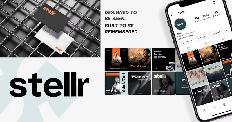
Stellr — From "another branding agency" to the only name CEOs remember
Stellr walked in with a problem most personal branding agencies never admit to: their own site couldn't tell you who it was for. Heavy visuals, scattered messaging, three different service blocks all competing for attention, and zero clear answer to "why should I care?"
The fix wasn't more design. It was restraint.
We rebuilt the homepage around one audience-first headline: "We build the world's most visible leaders," and let everything else earn its place around it. The abstract hero background got replaced with a real photo. Four competing CTAs became one repeated "Work With Us," appearing exactly where a decision actually gets made. Whitespace stopped being empty space and started doing the work of pacing the story: who this is for, what we do, how it works, proof, one clear next step.
Nothing on the page is decoration. Every pixel is either building trust or moving someone toward a decision, and for a brand whose entire business is making other people look unmistakably credible, the site finally does too.
0
29
Hi, all New to Contra.
but not new to design and development.
I’ve spent more than 10 years working across branding, web design, and WordPress development, helping businesses turn ideas into clear, professional, and high-performing digital experiences.
My hands-on experience includes:
• Brand identity and visual design
• Website strategy and UI design
• WordPress development
• Etch, Bricks Builder, and GeneratePress
• Responsive, conversion-focused websites
• Design-to-development implementation
I’m joining Contra to connect with founders, agencies, designers, and developers who value reliable collaboration and thoughtful work.
For a limited time, I’m making myself available to the community for portfolio reviews, one-to-one conversations, project discussions, and opportunities where a team needs an experienced extra pair of hands.
Whether you need help completing a website, improving an existing design, building a brand identity, or supporting your internal team during a busy period, I’d be happy to discuss how I can contribute.
I’ve completed branding and web design projects for a wide range of clients, and I’m confident I can bring practical experience, strong attention to detail, and dependable execution to the right project.
Feel free to view my work or reach out for a one-to-one conversation.
#WebDesign #WordPress #Branding #BricksBuilder #GeneratePress #Etch #WebDevelopment #Contra #FreelanceDesigner #FreelanceDeveloper
0
54
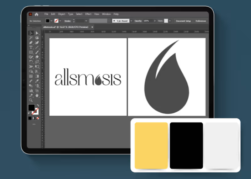
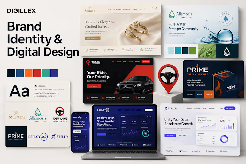
We refreshed Allsmosis, a Canadian water-purification brand serving remote and underserved communities. We developed a clean, modern logo system, refined the typography and introduced a vibrant colour palette representing purity, innovation and sustainability. Multiple logo variations and consistent brand assets were created to ensure the identity worked effectively across digital and printed materials
0
62
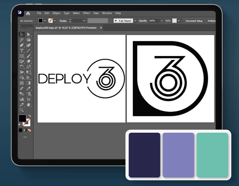
We developed a modern visual identity for Deploy 360, an outsourcing company offering customer experience, e-commerce and marketing solutions. The project included a contemporary wordmark logo, a versatile monogram, professional typography and a cohesive colour system designed to communicate innovation and trust. The identity was adapted for websites, social media, stationery and other business touchpoints, creating a consistent and recognisable brand presence.
0
62