Freelancers using Adobe Launch
Freelancers using Adobe Launch
Sign Up
Post a job
Sign Up
Log In
Filters
1
Projects
People
Message
0
Jacey V
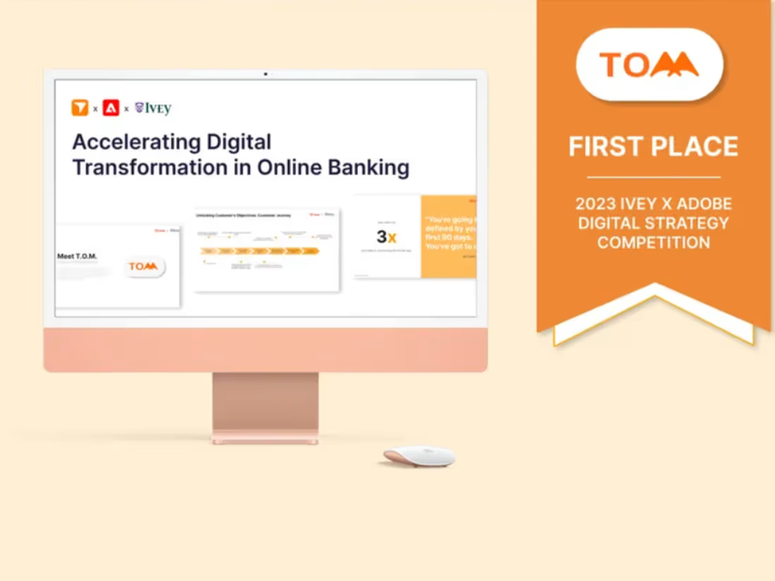
First Place @ Adobe’s Digital Strategy Competition
0
4
Message
1
Grace Titilayo Moses
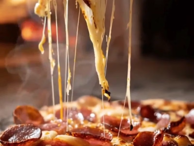
I create eye-catching fast-food pizza ads in CapCut, using attractive visuals, engaging text, smooth transitions, and effects to make the pizza look irresistible and drive customer interest.
1
179
Message
0
Funmilayo Adewale
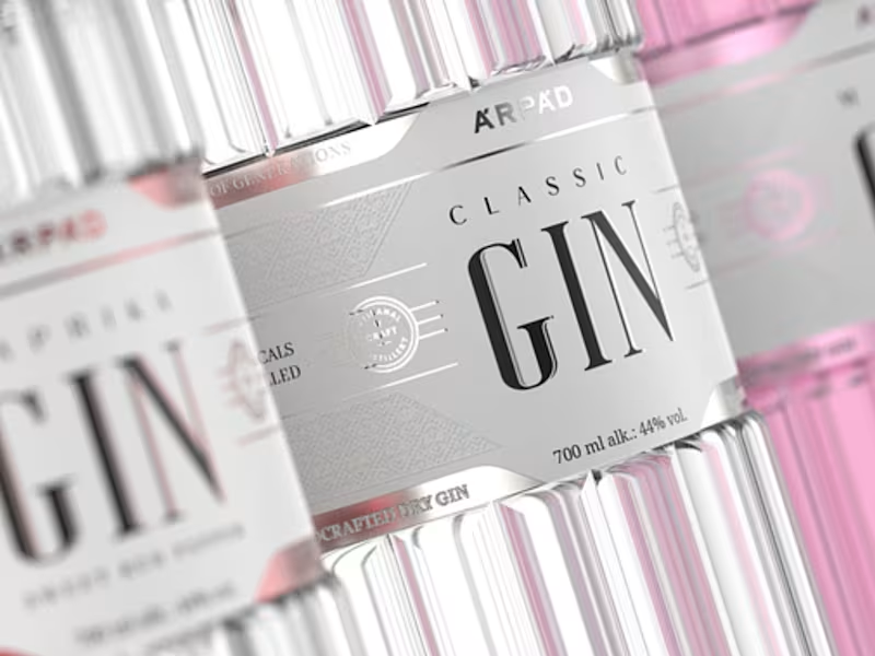
Premium Gin Label Design for Vellora Spirits
0
2
Message
0
Popoola Daramola
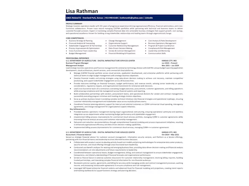
I revamped the Business Program Manager’s resume by highlighting clearer financial results, adding precise budget metrics, and showcasing improvements that boosted reporting efficiency.
0
126
Message
10
Diego Sánchez
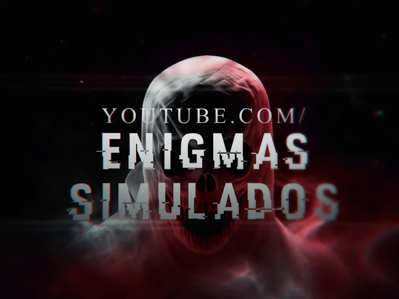
Horror YouTube Channel
10
19
Message
0
Gbenga Oluwasoji
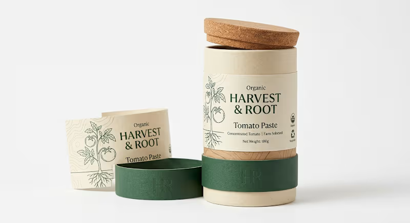
Organic Food Packaging Design | Sustainable Paper Tube & Label Sustainable organic food packaging design created for HARVEST & ROOT Tomato Paste. The concept combines a premium paper tube package, food label design and eco-friendly packaging system with botanical illustrations, natural materials and minimalist branding. Designed for organic food brands, farm-to-table products and environmentally conscious retail markets. HARVEST & ROOT is a sustainable organic food packaging design concept developed for a premium tomato paste brand with a strong focus on natural ingredients, responsible materials and modern eco-conscious retail presentation. The objective was to move away from conventional tomato paste packaging and create an eco-friendly packaging design that feels natural, trustworthy and distinctive. Instead of relying on traditional metal cans, glass jars or highly printed cartons, the concept explores a cylindrical paper tube packaging system with a tactile natural finish, cork-inspired lid and minimal printed components. The visual identity was built around the idea of food coming directly from the source. A hand-drawn tomato plant, including the roots, becomes the main illustration and reinforces the HARVEST & ROOT brand story. This botanical approach communicates organic agriculture and farm-selected ingredients without making the food packaging design feel overly rustic. A restrained palette of warm cream, natural kraft tones and deep forest green creates an immediate connection with organic and sustainable products. The typography combines an elegant serif style with generous negative space, giving the product packaging a premium character while preserving the honest, natural personality of the brand. The main label clearly communicates HARVEST & ROOT, Organic, Tomato Paste, Concentrated Tomato, Farm Selected and Net Weight information through a clean hierarchy. Small sustainability and organic symbols provide supporting information without overcrowding the front panel. One of the strongest aspects of this project is the structural packaging direction. The cylindrical paper tube packaging uses multiple components to create a distinctive opening experience while maintaining a cohesive brand identity. The removable outer section, natural lid and printed inner container demonstrate how sustainable packaging design can become part of the customer experience rather than simply functioning as a product container. The accompanying printed card extends the botanical visual system and creates an additional branded touchpoint that could support product information, sourcing details, preparation instructions or brand storytelling. This project demonstrates my capabilities in sustainable packaging design, eco-friendly packaging, organic food packaging, food packaging design, paper tube packaging, cylindrical packaging, product label design, food label design, sustainable branding, botanical packaging, package graphics and structural packaging design. For organic and environmentally conscious brands, packaging needs to communicate more than the product itself. Material selection, visual language, typography, illustration and structure all contribute to how customers perceive sustainability and product quality. This concept was developed with those considerations at the center of the design. As a packaging designer, I can develop complete solutions including custom packaging design, sustainable labels, paper packaging, tube packaging, box design, packaging artwork, dielines, print-ready files, product branding and realistic 3D packaging mockups. The final HARVEST & ROOT system positions the product for organic grocery stores, natural food retailers, zero-waste shops, specialty food markets and environmentally conscious consumer brands while maintaining a clean and commercially appealing presentation. Best Upwork Tags Packaging Design · Sustainable Design · Food Packaging · Label Design · Package Graphics The main SEO territory for this portfolio should be sustainable packaging design, eco-friendly packaging, organic food packaging, paper tube packaging, cylindrical packaging, sustainable food packaging, food label design, natural product packaging, botanical packaging, paper packaging, packaging designer, dieline design and 3D packaging mockup. So now our three tomato-paste projects have distinct jobs: CASA ROSSA = premium/gourmet food packaging, TOMA DAILY = FMCG/canned food/multipack packaging, and HARVEST & ROOT = sustainable/organic/paper packaging. That separation is important because it broadens your search coverage rather than making three portfolio entries compete for exactly the same buyer.
0
72
Message
7
Fadare Gabriel
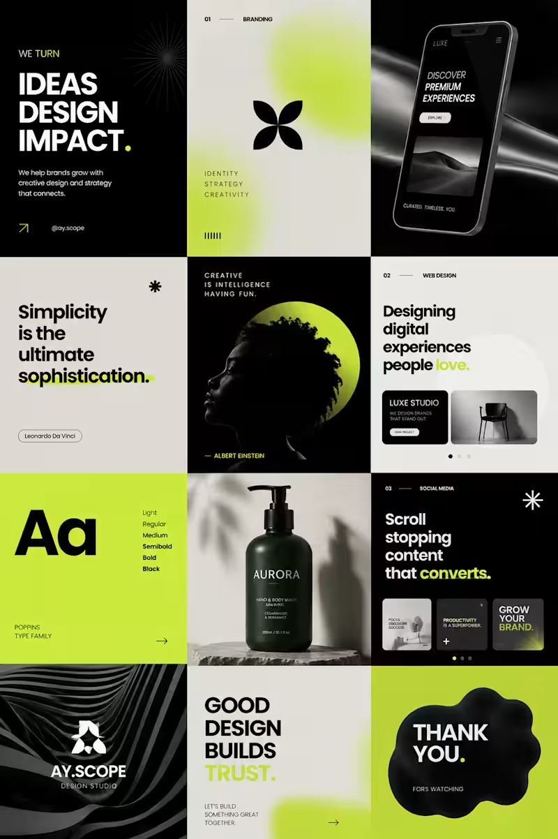
Design that makes brands feel different. A self-initiated visual design exploration focused on bold typography, modern branding, digital experiences, and social content. Built from scratch with a clean, premium visual system designed to feel confident, intentional, and memorable. Branding • Web Design • Social Design • Visual Identity #GraphicDesign #BrandDesign #UIUX
7
235
Message
1
Emmanuel Fikayo
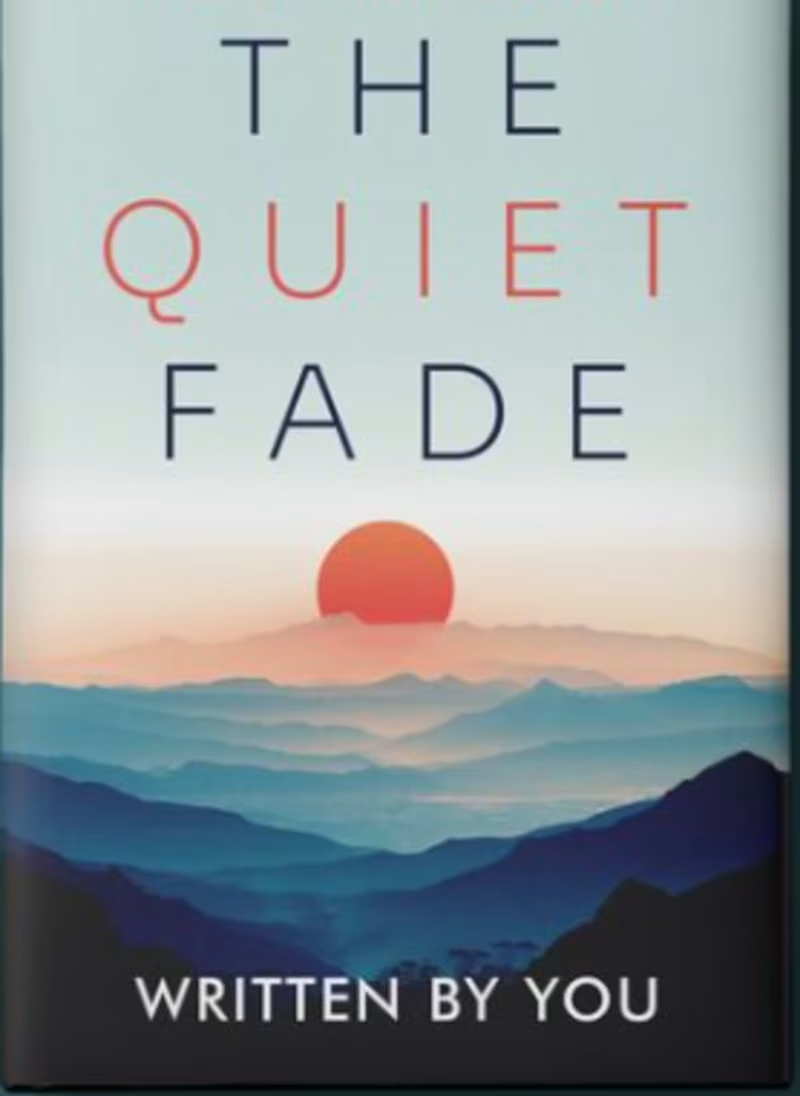
The Quiet Fade A minimalist book cover designed to evoke silence, transition, reflection, and emotional distance. The layered mountain landscape creates a sense of depth and journey, while the setting sun introduces a subtle feeling of change, endings, and new beginnings. The restrained typography keeps the composition clean and contemporary, allowing the imagery and title to carry the emotional weight. The soft, muted palette and spacious composition give the cover a quiet, cinematic quality that suits reflective fiction, poetry, memoir, or contemporary literary writing. Design Focus: Minimalism • Emotion • Nature • Reflection • Transition
1
144
Message
0
Mudassir Jaleel
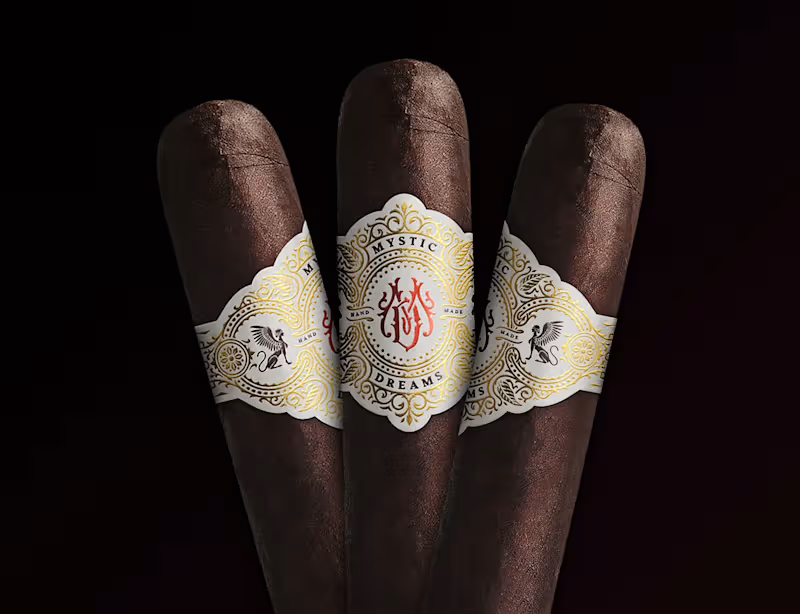
🎩 Mystic Dreams — Cigar Band Brand Identity & Packaging Design Design isn't decoration. It's expectation. A cigar band has only a few square inches to communicate quality, heritage, and value. Every line, ornament, texture, and finish shapes that perception — there's no room for anything that doesn't earn its place. ✨ The Concept For Mystic Dreams, we developed an identity inspired by classical engraving, ancient symbolism, and luxury packaging — creating a brand that feels timeless rather than trendy. 🕰️ The goal was simple but demanding: design something collectors would want to keep — not just remove and discard. The Details ✒️ Classical engraving — intricate linework that signals craftsmanship 🔮 Ancient symbolism — meaning and mystique woven into the mark 💎 Luxury packaging sensibility — premium finishes that feel collectible 🏛️ Timeless over trendy — built to age with grace, not fade with fashion Mystic Dreams — White Label Edition. Naming, brand identity, creative direction, illustration, and presentation by DH Solutions. 🖋️
0
70
Message
0
lekan lawal
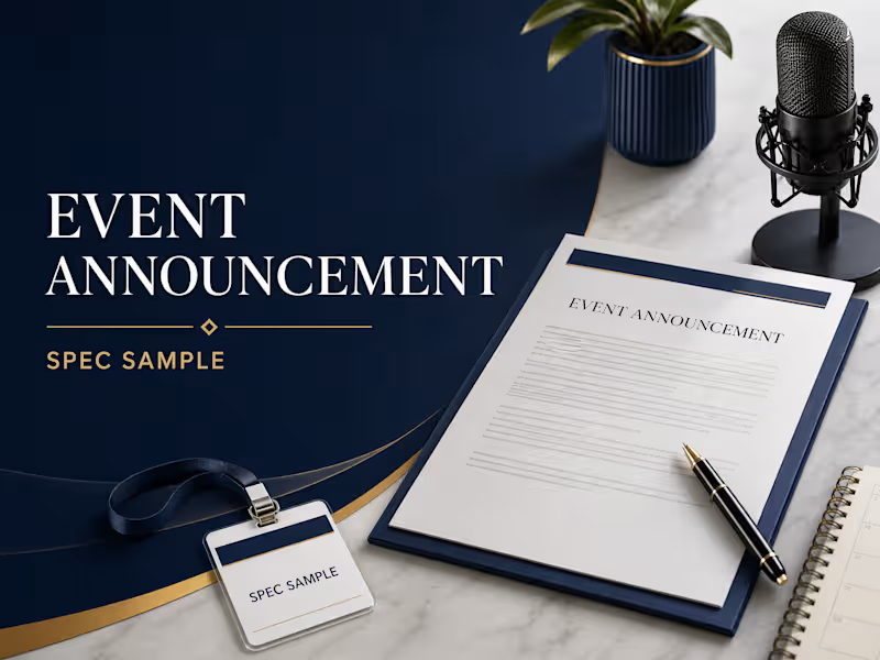
Spec sample created to demonstrate my press-release writing ability. This sample shows how I promote a business event using a news-focused headline, event details, audience information, speaker quote, registration call to action, organizer information, and media contact section.
0
28
Message
0
NEXORA CREATIVE
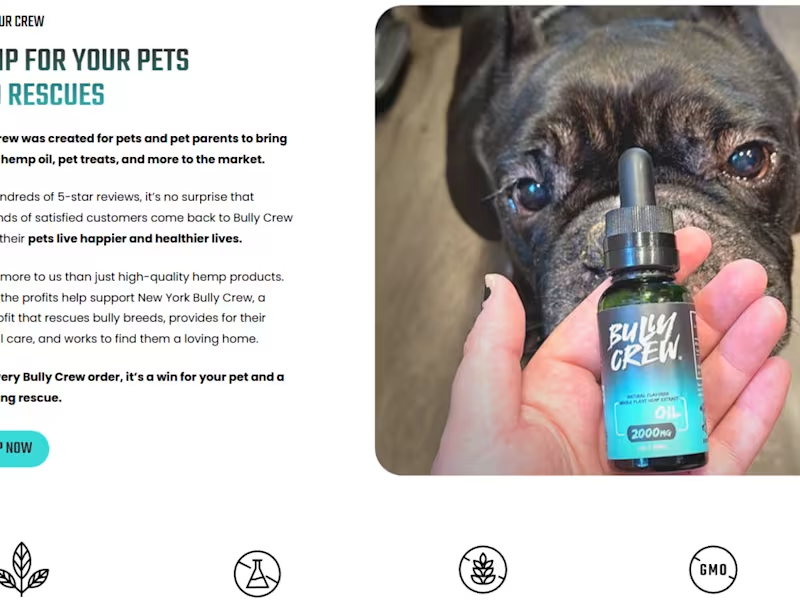
E-commerce Landing Page Design For a pet care
0
2
Message
1
Bianca Ursaru
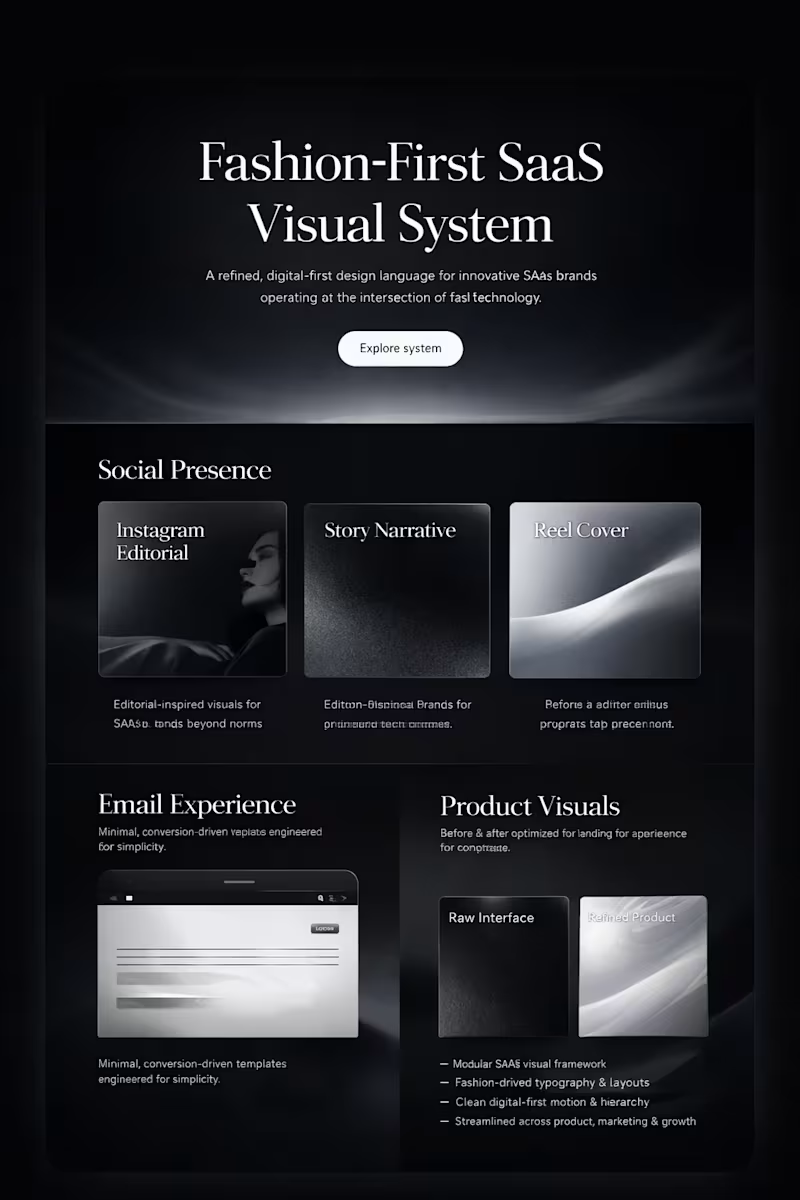
This project explores a fashion-forward visual system designed for modern SaaS brands that want to stand out beyond traditional tech aesthetics. The concept blends editorial design principles with product-focused clarity, creating a refined digital presence that feels premium, confident, and scalable.The system is built around bold typography, high-contrast layouts, and subtle motion to guide attention and enhance user experience. Visual components are designed to work seamlessly across social media, email campaigns, and product pages, ensuring consistency and brand recognition at every touchpoint. https://wabo4sw39m.youware.app
1
163
Message
0
ALI HASSAN
pro
illustration logo design
0
41
Message
3
Jean-Christophe Freakitt Prod
Music and video clip for real artist - Full project
1
3
168
Message
0
Richard Spohn
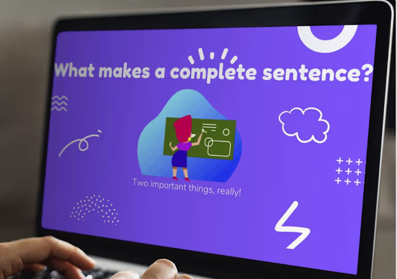
A quick Canva course on what makes a complete sentence.
0
32
Message
0
Leticia Forker
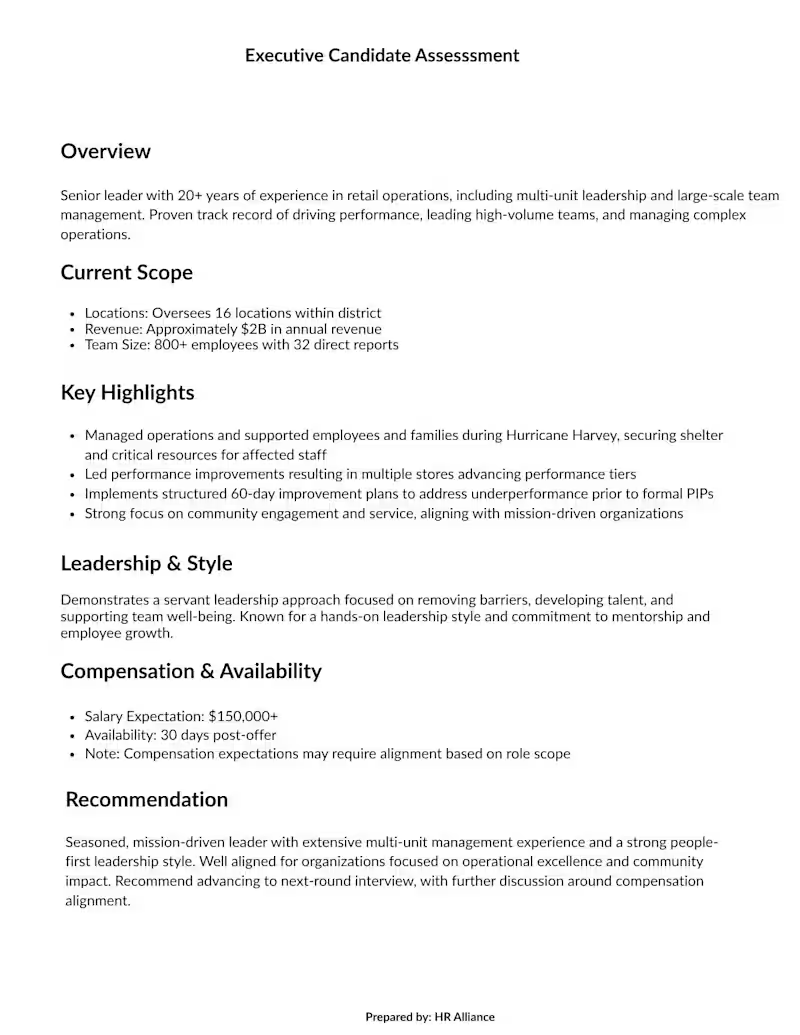
Executive Candidate Assessment
0
26
Explore projects