Projects using Adobe InDesign in ZwolleProjects using Adobe InDesign in ZwolleBeam Coffee Bar – Brand Identity & Storefront Design
Services: Brand Identity, Packaging Design, Custom Iconography, Storefront Design, Merchandise
About the Project
Beam Coffee Bar is a modern, neighborhood coffee spot that doesn't take itself too seriously, but takes its coffee very seriously. The goal was to create an approachable, highly recognizable, and uplifting brand identity that brings a pop of color and personality to the daily coffee routine.
The Challenge
The third-wave coffee scene is often dominated by ultra-minimalist, moody, or hyper-industrial aesthetics. The challenge for Beam was to break the mold by designing a visual identity that feels incredibly fresh, playful, and inviting, while still communicating the high quality of their espresso and baked goods.
The Solution & Design Choices
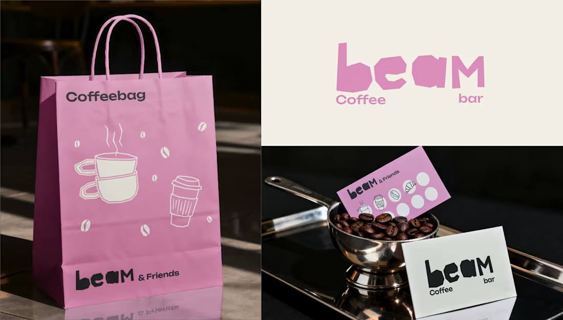
Logo & Typography: The custom "beam" wordmark features chunky, irregular, "cut-out" style lettering. This organic, slightly imperfect typography gives the brand a human touch and a playful, laid-back energy.
Color Palette: I moved away from traditional coffee tones and introduced a signature, vibrant pastel pink paired with off-white and a deep, dark roast brown. This high-contrast palette makes the brand instantly recognizable and highly "Instagrammable."
Custom Iconography: To add charm across all touchpoints, I developed a set of quirky, hand-drawn line art icons featuring a croissant, a muffin, stacked coffee cups, a moka pot, and a stylized character enjoying a brew.
Packaging & Merchandise: The playful aesthetic was rolled out across various physical items, including pink "Snackbags" for pastries, custom coffee cups with personalized name spaces ("This is your Cappuccino, Laura"), branded receipts, and "beam & Friends" punch cards for community loyalty.
Storefront Design: The brand comes to life on the street level with a striking pink-and-white striped awning, crisp window decals featuring the custom iconography, and a clean, brightly lit shop sign that makes the café an unmissable local landmark.
Deliverables
Primary Logo & Typography System
Custom Illustration & Iconography Library
Packaging Design (Cups, Snack bags, Receipts)
Merchandise & Loyalty Cards ("beam & Friends")
Physical Storefront Branding (Awning, Signage, Window Decals)
Looking for a brand identity that stands out in a crowded market? Let's collaborate and bring your vision to life. Pats. Smashed Burgers – Brand Identity & Street Food Design
Services: Brand Identity, Packaging Design, Illustration, Menu Design, Vehicle Wrap Design
About the Project
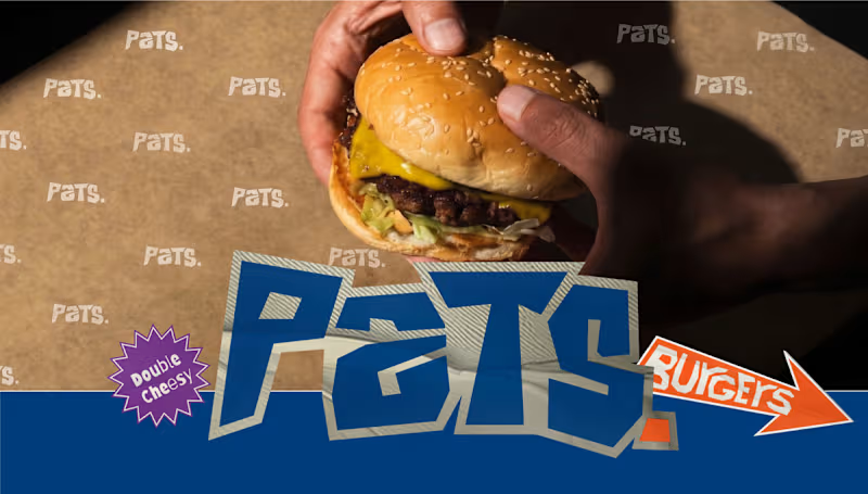
Pats. Smashed Burgers needed a brand identity that hits as hard as their burgers. The goal was to create a bold, unapologetic, and highly recognizable street food brand. Drawing inspiration from retro fast-food culture and modern street aesthetics, I developed a comprehensive visual system that works everywhere—from greasy burger wrappers to a fully wrapped food truck.
The Challenge
The smash burger market is highly competitive. The challenge was to design an identity that cuts through the noise, communicates "no-nonsense authenticity," and feels instantly familiar yet totally unique to the Pats. brand.
The Solution & Design Choices
Logo & Typography: The custom wordmark features chunky, dynamic, and slightly jagged typography, giving it a raw, street-ready energy. Starburst stickers highlighting features like "Double Cheesy" add a playful, retro fast-food touch.
Color Palette: I utilized a striking, high-contrast combination of bold navy blue, vibrant orange, and off-white. This creates a highly visible, appetizing aesthetic that stands out in urban environments.
Character Illustration: To give the brand a friendly face, I designed "The Master Smasher"—a stylized, retro-inspired chef mascot with a prominent mustache, holding a spatula and a signature burger. This character adds personality and approachability.
Packaging Design: The visual identity translates seamlessly into physical touchpoints, including custom-printed burger wrappers, checkered paper takeaway bags, and branded "SLURP." beverage cups.
Menu System: I designed clear, appetizing digital menu boards that highlight their core offerings like "De O.G. Pats", "De Vegan Pats", and "De Spicy Smash" using the brand's signature typography and colors.
Food Truck Wrap: To take the brand on the road, I designed a full exterior wrap for their food truck, utilizing the brand colors, checkerboard elements, and the mascot to serve as a rolling billboard.
Deliverables
Primary Logo & Typography Variations
Custom Mascot Illustration ("The Master Smasher")
Packaging Design (Wrappers, Bags, Cups)
Menu Design & Digital Signage
Food Truck Exterior Design
Graphic Banners & Marketing Assets Neuralis – Brand Identity & UI/UX Design for an Urban Run Club
Services: Brand Identity, UI/UX Design, Art Direction, App Design, OOH (Out of Home) Design
About the Project
For Neuralis, I had the opportunity to design the complete brand identity and app interface. Neuralis isn't just another running app; it's a premium, community-driven platform that connects and motivates athletes in cities like London, Amsterdam, and Berlin. The brand's mission is clear: elevate performance through the power of the pack.
The Challenge
The challenge was to create a visual language that feels high-end and minimalist, yet exudes the raw, athletic energy of urban street running. The brand needed to breathe a performance-oriented mindset while remaining deeply connected to a tight-knit community.
The Solution & Design Choices
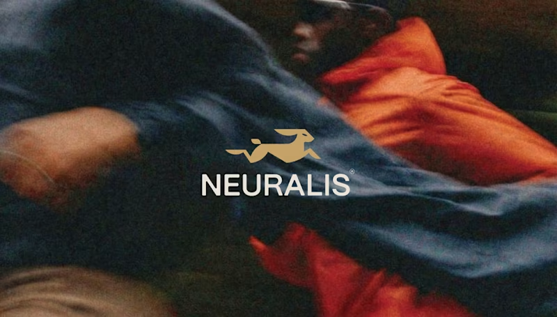
The Logo & Mark: The core of the identity is the stylized, geometric golden hare. This symbolizes speed, agility, and relentless forward momentum. The logo is designed on a strict grid, ensuring perfect balance and scalability across all formats.
Color & Typography: I opted for a bold, high-contrast palette. The base consists of deep dark gray and black, creating a 'stealthy' and premium feel. The gold adds a touch of exclusivity, while the bright action red is used for interface elements and key typography to instantly grab attention. The sleek, sans-serif typography gives the overall design a modern, urban aesthetic.
UI/UX App Design: The iOS app interface is designed with a strict focus on clarity during workouts. By using striking, floating widgets (like the red 'Outdoor group run' card), users can check their route, fellow runners, distance, time, and calories burned at a single glance.
Copywriting & Campaign: To reinforce the community's mindset, powerful slogans were integrated into the brand identity: "Forward is the only way", "PACE DICTATES THE PACK", and "WE RUN TOGETHER". These elements come to life across striking billboards, urban posters, and merchandise like tote bags.
Deliverables
Concept & Art Direction
Logo & Brand Guidelines
Mobile App Design (iOS Interface)
Merchandise (Tote Bags)
OOH Campaign Assets (Billboards & Posters)