

Allow me to reintroduce myself.
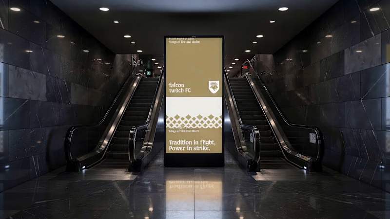
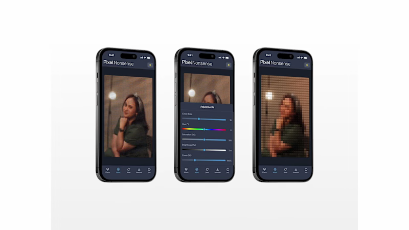
My name is Rudy, a visual designer working across product design, brand identity, editorial design, icon design, and illustration.
I've finally put together a collection of my work from 2025–2026. A mix of freelance projects, personal explorations, and visual experiments.
Here's a look at what I've been making over the past two years.
More of my work at https://rudypagnel.me
4
2
124
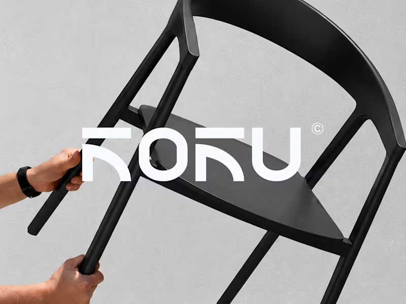
Koku. Premium Custom Furniture Logo Identity and Visual Direction
Koku is a premium custom furniture brand specializing in chairs, created for those who appreciate the relationship between thoughtful design, craftsmanship, and everyday living. In a market where furniture often competes through function or appearance alone, Koku explores a more considered approach, where the design of an object becomes part of the character of a space.
The brand was developed around the idea that a chair can be more than a functional object. Its form, material, proportions, and presence can influence how a space feels. This perspective became the foundation for shaping Koku into a brand that communicates quality through restraint, presenting furniture as an expression of refined taste rather than excess.
The Challenge.
The challenge was to establish a distinctive premium identity without relying on excessive visual decoration or obvious luxury cues. Koku needed to communicate craftsmanship, exclusivity, and quality through a clean and minimal visual language, while remaining recognizable as a brand built around custom furniture.
The Process.
Research and Exploration.
The process began by exploring the visual characteristics commonly associated with premium furniture and contemporary interior design. This involved considering how minimalism, materiality, proportion, and presentation contribute to perceptions of quality. The goal was to identify a visual territory that could communicate sophistication without making the brand feel cold, generic, or overly decorative.
Brand Concept Development.
From this exploration, Koku's direction centered on understated luxury. Rather than using visual complexity to communicate value, the concept emphasized clarity, restraint, and attention to detail. The brand was positioned for an audience that values considered design, lasting appeal, and furniture that complements a space without overwhelming it.
Visual Direction.
The visual direction translated this positioning into a clean and refined aesthetic. Minimal compositions and a restrained visual approach helped establish a sense of balance and sophistication. The intention was to let the furniture remain the focal point, supported by a brand identity that communicates quality without competing with the products themselves.
Identity Development.
The identity development focused on creating a cohesive visual presence that could represent Koku across its brand touchpoints. The design approach emphasized simplicity and consistency, ensuring that the brand's presentation aligned with its premium positioning. Each visual element contributed to a broader impression of refinement, craftsmanship, and thoughtful design.
The Result.
Koku's brand identity brings together minimalism, understated luxury, and contemporary furniture design. The resulting direction establishes a visual foundation for a premium custom furniture brand that values substance over excess and quality over visual noise.
More than simply presenting chairs as products, Koku positions furniture as part of a considered lifestyle, where function and aesthetics work together to create a lasting impression.
0
64



Fast doesn’t mean good.
Most teams move fast.
Ship fast.
Break things faster.
But speed isn’t what makes a product last.
What matters is:
– how accurately it solves the problem
– how honest the scope is
– how maintainable it stays months after launch
That’s the idea behind this identity.
A visual tension between speed and precision.
Between moving fast — and moving right.
Because “fast” is easy to promise.
But “right” is something you have to stand by.
0
103

Exploring New Directions ✦
I’ve rebranded!
My new identity represents how I work — exploring, experimenting, and creating designs that grow from real ideas.
Every detail in this identity tells a story of curiosity and evolution.
✹ Where Ideas Find Their Form
Available for freelance work:
→ Brand Identity
→ UI/UX & Product Design
Let’s build something great together 🚀
#BrandDesigner #ProductDesign #FreelanceDesign #CreativeExploration
2
1
237
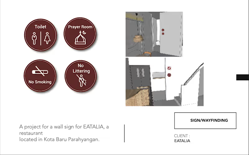

This project involved developing e-books for educational and public awareness purposes, including social issues, community empowerment, and institutional programs.
I supported the process from content coordination, structuring, and visual alignment to final delivery, ensuring the e-book was clear, accessible, and aligned with the intended audience and objectives. The e-books were used as learning materials, digital publications, and campaign resources.
1
135