
Fullstack Engineer | AI Engineer | 6+ years of experience
- $5k+
- Earned
- 2x
- Hired
- 5.0
- Rating
- 59
- Followers
Fullstack Engineer | AI Engineer | 6+ years of experience


Premium UI/UX & Web Design for Fintech, SaaS & Web3 | Framer


Premium UI/UX & Web Design for Fintech, SaaS & Web3 | Framer


Kumo — Interactive Matcha Tea Landing Page UI-UX
Choosing a drink online is often a flat and boring experience — static product cards don’t convey taste, freshness, or emotion. For a premium product like matcha, this makes it harder to stand out and convert.
This animated landing page for Kumo turns product selection into an interactive and sensory experience. Instead of reading long descriptions, users visually explore flavors through motion, ingredients, and composition.
28
112
2.2K
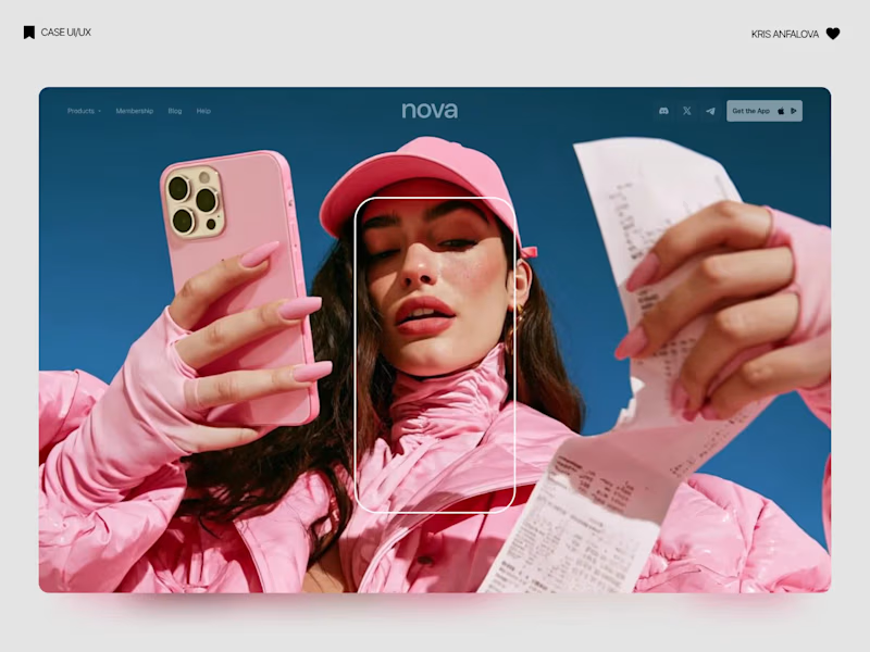
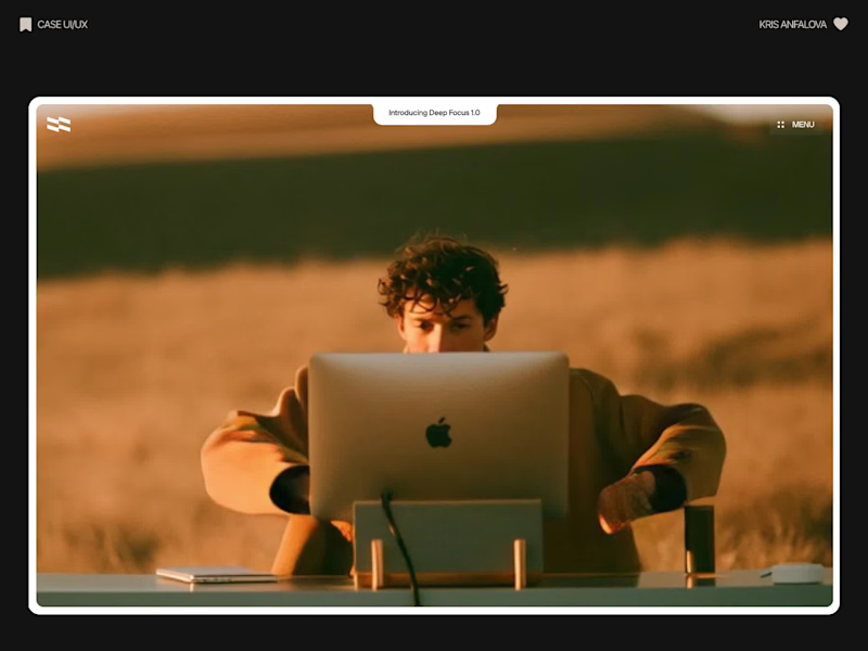
Deep Focus is a fictional macOS app that silences notifications so people can do deep work. The catch is the audience: people who need a productivity app are already tired of apps. Every competitor promises more features, so this page had to promise relief and turn it into a download within seconds.
What I did
I started from the pain, not the product. The second screen lists what a normal day looks like: push notifications, endless pings, 142 unread emails, context switching. I styled those chips like the four benefit chips in the hero, only white instead of frosted, so the visitor reads before and after without a line of explanation.
The hero section design shows no interface on purpose. This product is about absence, and a screenshot would add noise, so a person alone in a field does the proving. The headline “Deep focus. Anywhere.” is a high-contrast serif because every tool in this category speaks in a grotesque, and a serif sounds calm and human.
I kept one action, Download for macOS, with no pricing and no form. The first job of this landing page design is a download, and everything else can wait until after it.
Would you keep the serif for the headline, or switch to a grotesque so it feels more like software?
32
103
3.3K

UI/UX Designer with 15+ years’ experience & Webflow expert

UI/UX Designer with 15+ years’ experience & Webflow expert


AI Web App Developer | MVPs, automation & SaaS tools
AI Web App Developer | MVPs, automation & SaaS tools
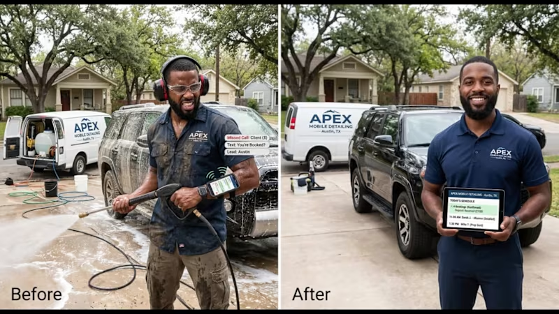
I decided to help saving money to the Mobile Detailing owner.
Marcus is a solo owner of the Apex Mobile Detailing in Austin, TX. He spends 7 hours a day behind a 3,000 PSI pressure washer wearing ear protection. He can't pick up calls, client inquiries go cold, and when he does book over text, 30% ghost him or live outside his driving radius.
The new site eliminates the necessity of answering the calls because there will be no calls - the customers will register their visit directly on the website specifying the service they need. Marcus will visit only those clients who lives within his driving radius. No missed calls, no missed revenue, only wins.
🛡️ Front Door Fix: Instant Zip Code radius verification + dynamic vehicle & condition estimator + deposit lock.
🔄 Follow-Through Fix: Automated pre-arrival checklists, self-service rescheduling, and an owner dispatch view with 1-tap client updates.
From "Can I book with you?" to "You're booked and prepped" without the owner opening a single text.
https://apex-detailing-planner.lovable.app/
1
129

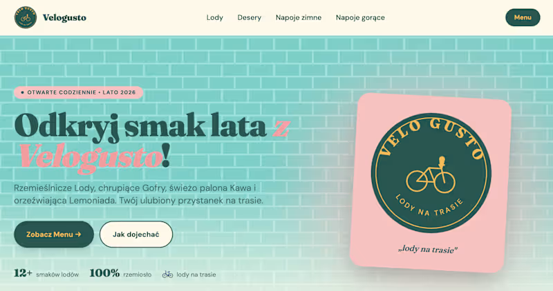


Full-Stack Web, Mobile & AI Automation Developer


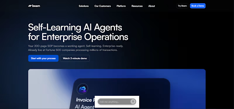


From vision to product, without the chaos: https://aegte.dev
From vision to product, without the chaos: https://aegte.dev


Web Design & Development
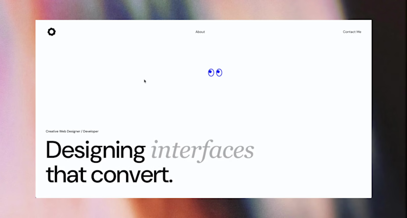
Just shipped my own portfolio site — designed and built end to end.
No templates, no page builder. Figma for the design, then coded in HTML/CSS/JS + Next.js — working alongside AI tools to move faster without cutting corners. Custom animations, full mobile optimization, built in from day one.
Same process I bring to client work: design with intent, build it myself, ship something that actually performs.
2
128

Just shipped my own portfolio site — designed and built end to end.
No templates, no page builder. Figma for the design, then coded in HTML/CSS/JS + Next.js — working alongside AI tools to move faster without cutting corners. Custom animations, full mobile optimization, built in from day one.
Same process I bring to client work: design with intent, build it myself, ship something that actually performs.
18
20
1.4K
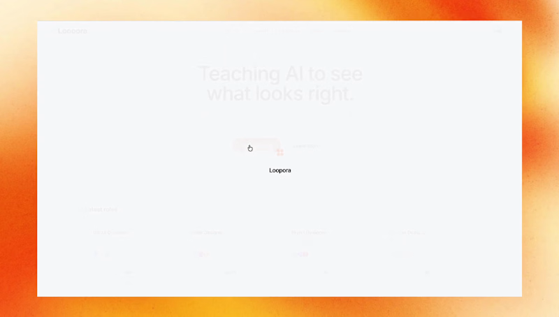
From zero to shipped — I designed and built the full Loopora platform UI: the job feed, candidate dashboard, application flow, and matching interface. Every screen was prototyped in Figma and implemented in code, end to end. 🚀
#UIDesign #WebDesign #WebDevelopment #AI #Startup #Figma #ProductDesign
2
110


Brand Designer & Official Framer Expert.

For ARTIFICIAL IMAGES STUDIO, an AI art agency, I designed an elegant portfolio website. Showcasing a curated selection of their visionary artwork, I crafted a seamless user journey leading to a clear, compelling contact CTA.
0
230

For the leading Polish fashion brand JEMIOL, I launched a modern digital press office. I built a dedicated media site, crafted cohesive publication templates, and edited the first press releases, establishing a new standard for their communication.
0
211

