
Our first Webflow website at LOOP® — and it’s a beautiful one. Paris by Emily is a digital experience that brings the charm of Paris and the world of Netflix’s Emily in Paris to life.
From elegant motion and custom-designed Midjourney icons to a fresh, editorial-inspired layout, every detail was crafted to feel effortlessly Parisian. The project blends storytelling and design, combining visual finesse with smooth performance — all developed entirely in Webflow.
A bold, design-driven website that pushes the boundaries of what’s possible within the platform.
Design & Development: LOOP® - Barry Baris Dogan
Client: DHARMA
Tools: Webflow, Figma, Midjourney
Live Site: https://www.parisbyemily.com
5
26
430
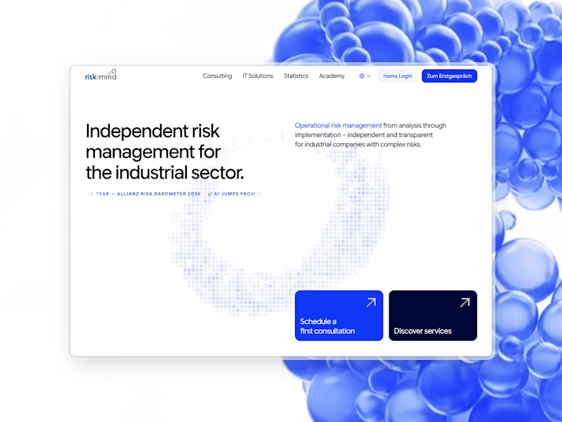
riskonmind.eu (http://riskonmind.eu) — a website for an independent risk management consultancy serving the industrial sector.
The brief: make a deeply technical service feel approachable without losing authority. Risk management lives or dies on trust, and the web is usually where it's lost first… dense paragraphs, stock photography + generic blue.
We went the other way. Confident type, generous space, a single hero animation that visualizes "complex risk made legible." Bilingual (DE/EN), built in Framer.
0
208

Title
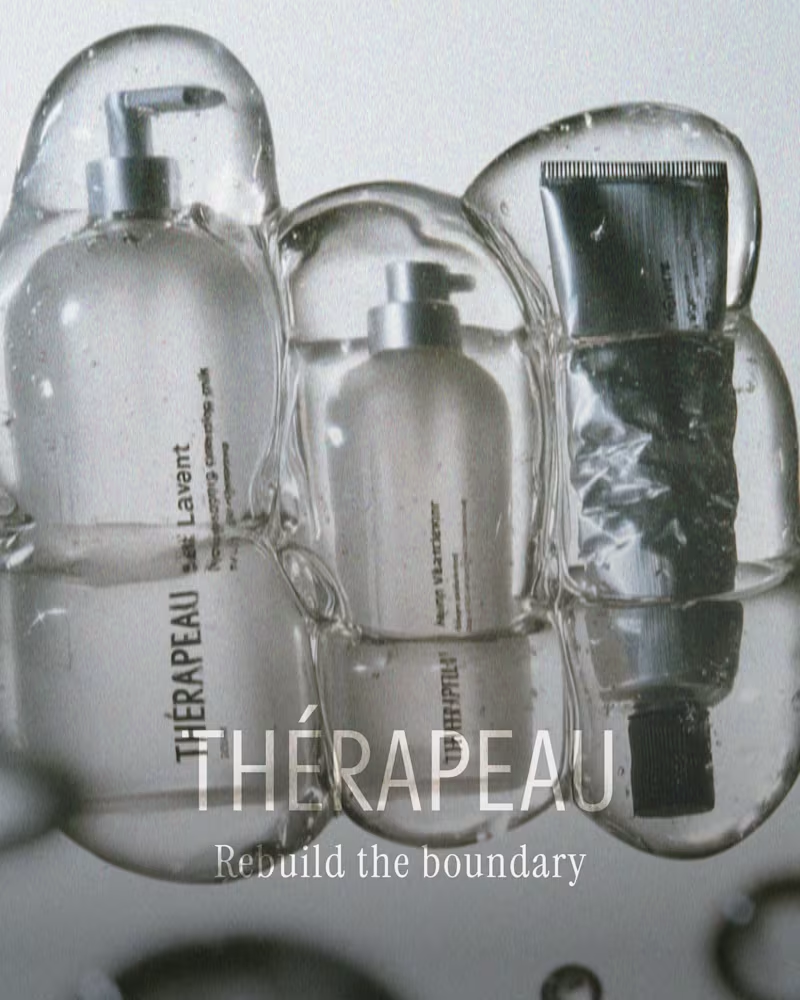
Thérapeau — Brand Identity & Packaging for Clinical Skincare
Description
A concept identity and packaging system for Thérapeau, a clinical skincare brand built on barrier-repair science. Created for Designer Briefs challenge #182.
The concept starts with how skin actually works. Dermatology describes the skin barrier as bricks and mortar: cells held together by lipids. Instead of the aggressive “transformation” language most clinical brands use, Thérapeau tells a quieter story: repair is the transformation.
That one idea shapes everything. A running-bond grid explains the science and structures every layout. A seal stroke taken from the accent in the name works as the brand mark. The packaging follows the same logic, with glass for what goes onto the skin and aluminium for what seals it, all printed directly onto the material with no paper labels. The campaign uses real skin and real ages, in calm, backlit photography.
What I did
Brand strategy and concept · Naming system and verbal identity · Visual identity · Packaging design for a five-product range · Carton design · Art direction and campaign imagery · Product copy
Tools
Adobe Illustrator, Photoshop, Midjourney (AI-augmented art direction)
Looking for
Skincare, beauty and wellness brands that need an identity with a clear idea behind it. Get in touch if you’re launching a range or rethinking your packaging.
📸 See it whole project on Instagram: https://www.instagram.com/p/DeXWNOpkejQ/?img_index=1
1
129
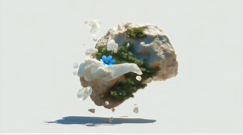
The hero asset for rubble.design (http://rubble.design). A spinning fragment of stone with life pushing through it.
The name "Rubble" came first: the idea that good work starts in the broken pieces, and that something quiet always grows back. I wanted the studio's hero to literally show that, not describe it.
5
13
602
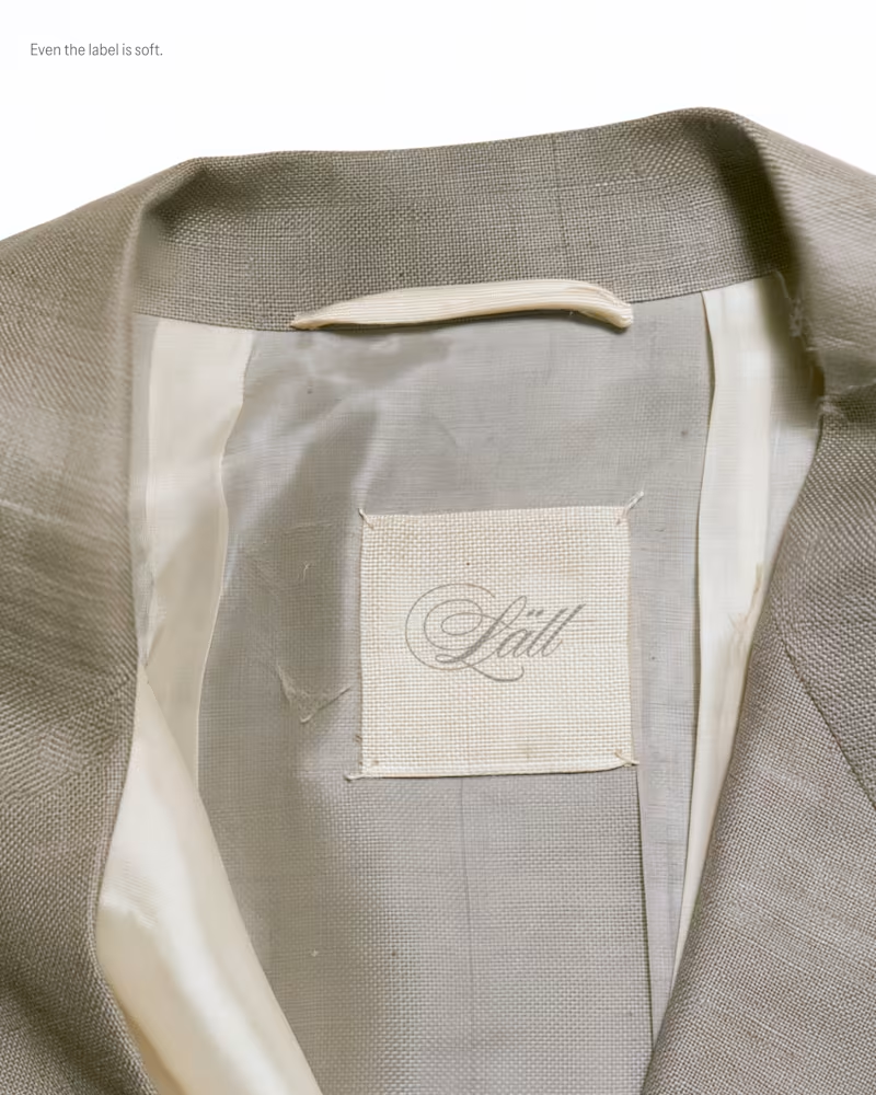
My entry for the Designer Briefs: a brand identity and label system for Lätt, a Stockholm label bringing a light, romantic touch to modern tailoring. Silk, sheer knits and suiting made to be worn lightly.
The idea is "Tailoring, softened," and it runs through every touchpoint. A script wordmark is embossed blind into the hang tag and the shopping bag. A woven neck label is sewn loosely into the lining, and a satin care tag carries bilingual Swedish/English care instructions in a typewriter-style mono. Packaging is tissue, lace and frayed silk ribbon: "Wrapped lightly. Opened slowly." The visual world is built from fabric scans and phone snapshots, so it feels tactile and real.
I loved this project so much, what do you think? I would love to hear the feedback of the community!
4
17
706

IQONIC. Website for an Austrian consultancy helping midsized companies turn challenging situations into measurable outcomes.
Consulting firms are usually crowded with corporate-photography-and-handshakes.
We went the other way: a cinematic brand spectrum, confident but clear typography, and a calm voice that earns trust instead of demanding it.
Launching soon on iqonic.at (http://iqonic.at)
1
3
176