Pitch Deck Designer Projects in Ukraine
Pitch Deck Designer Projects in Ukraine
Sign Up
Post a job
Sign Up
Log In
Filters
2
Projects
People
Message
0
Karina K
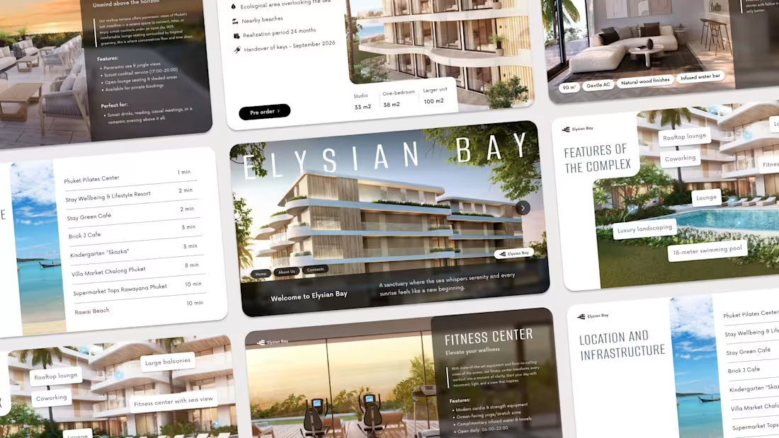
Elysiym Bay | Hotel Presentation
0
58
Message
0
Alexandr Korshykov
Pitch Deck Design - Tangos
0
10
Message
3
Ditych
max
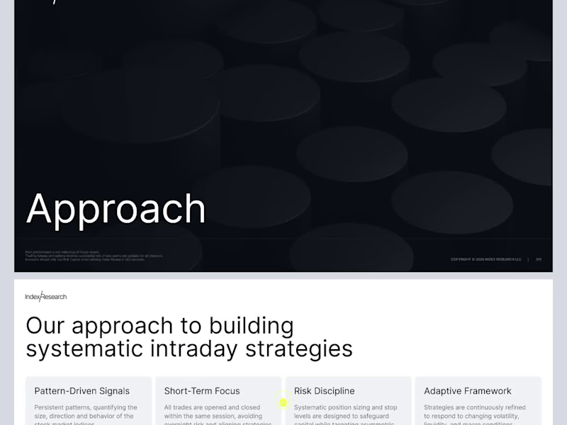
Investor Pitch Deck Presentation
3
8
Message
32
Heed Collective
pro
Sharing a deck design for ChatAndBuild. AI solutions were in the spotlight this year — and at Heed Collective, we’ve been working with teams building in this space. Good data visualization always starts with understanding the data first — only then can the visuals truly support the story.
7
32
2.1K
Message
1
Oleksii K.
pro
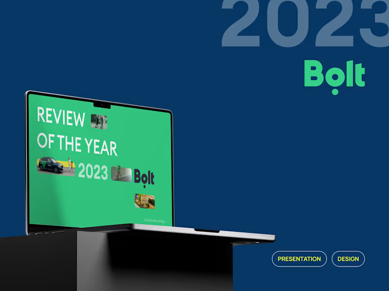
Bolt's Presentation: Review of the year 2023
1
192
Message
2
Oleksandr Neborachko
Pitch Deck Design & Branding-Focused Presentation
2
253
Message
1
OBI x OACAE
Nior preview
1
258
Message
1
Vladyslav Stadnyk
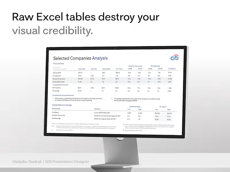
I recently watched a founder defend a $15M valuation using a raw Excel screenshot as his main slide. He assumed the dense grid proved his analytical rigor. It actually proved he did not know what his core metrics were. When you paste an unformatted spreadsheet into your pitch deck, you force the investor to do the analysis for you. Excel is a tool for calculation. PowerPoint is a tool for communication. They require completely different approaches. I handled a similar problem when designing a selected companies analysis for Citi. The initial draft was a wall of default borders and tiny numbers. The data was accurate, but the narrative was completely buried. We threw out the screenshot and used The Frictionless Data Method. First, we killed the gridlines. Heavy borders add unnecessary visual noise. We let whitespace separate the columns naturally 📐 Then we fixed the alignment. Left-align the text categories. Right-align the financial numbers. This creates a sharp visual edge the human eye processes instantly ⚡ Finally, we anchored the insight. We applied a subtle background fill to the one specific column that justified the valuation. We made the conclusion impossible to miss 🎯 Start here: open your deck and find your densest financial table. Delete the lazy image import. Rebuild it natively, strip away the borders, and highlight the single number that drives your deal.
1
140
Message
3
Dmytro Messer
Financial Presentation Design
4
3
203
Message
0
Yurii Lototskyi
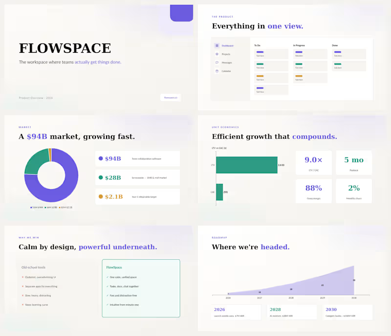
Investor pitch deck for FLOWSPACE — a SaaS workspace platform competing with Notion and Linear. 14 slides covering the problem, product overview, market size ($94B TAM), traction, unit economics (9× LTV/CAC), roadmap to $100M ARR, team, and $8M Series A ask. Clean light design with custom charts, donut graphs, and data visualizations. Delivered in PowerPoint — fully editable.
0
71
Message
0
Emiliya Smuzhanytsia
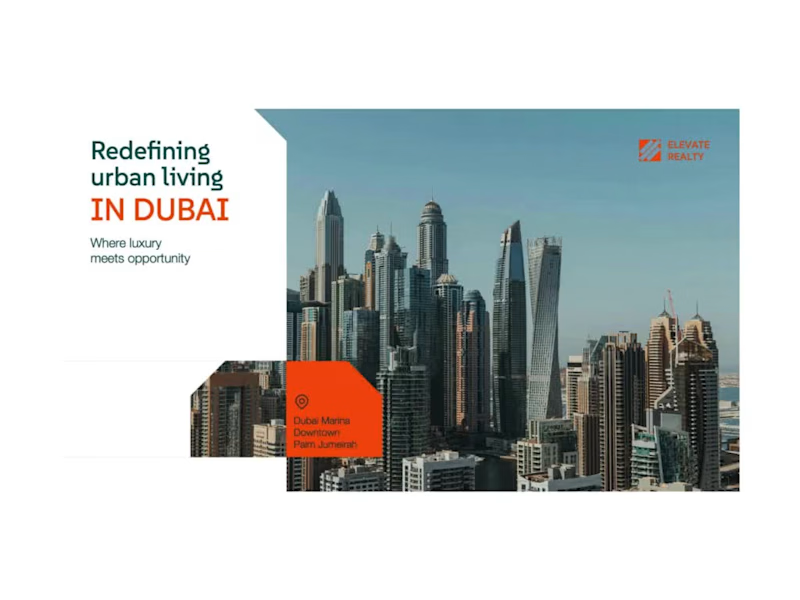
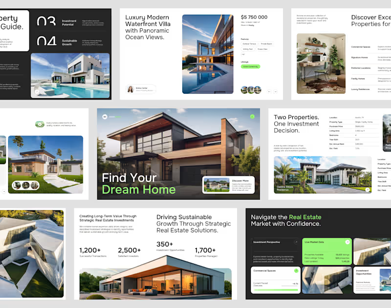
Real Estate Pitch Deck - PowerPoint Presentation Design
0
11
Message
0
Serge Tiutyk
Purefi
0
2
Message
5
Karina K
Root Reality | Branding + Website design
5
73
Message
3
Oleksandr Neborachko
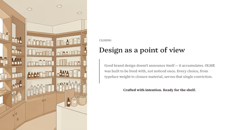
Branding & Packaging Showcase Deck
3
257
Message
1
Vladyslav Stadnyk
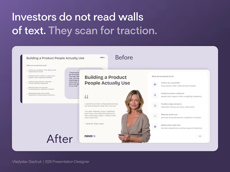
Founders cram every customer quote onto one slide to prove they did the research. But a wall of text does not prove traction. It proves you lack focus. Investors do not read paragraphs during a pitch. They scan layouts. Look at the "Before" slide in the image. It has a massive grey box of text sitting next to five dense bullet points. If an investor has to squint to read your user feedback, they will simply tune out. A founder brought me a deck full of slides exactly like this. We completely rebuilt the hierarchy. The Visual Anchor Framework: 📍 The Human Element - Replace generic text boxes with a real face. A photo anchors the quote and builds instant empathy. 📍 Iconographic Scannability - Turn dense bullet points into spaced items with clean icons. The eye processes shapes faster than sentences. 📍 Ruthless Whitespace - Give the content room to breathe. Cramped slides signal a cluttered business model. Start here: open your current deck and find the slide with the most text. Force yourself to cut the word count in half. Build the new layout around one single focal point. When I design these layouts in Figma, I lock the grid structure. Then I export the file to PowerPoint so the founder can update the quotes later without breaking the aesthetic.
1
140
Message
0
Dmytro Messer
Real Estate Investment Presentation
0
90
Explore projects