
YouTube Promotion, GMB & Local SEO Specialist
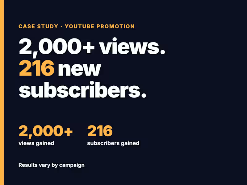
Case study: 2,000+ views and 216 new subscribers in 3 days
This is my 1st order at Contra.
A creator came to me with 88 aubscribes and 11 views on a video that had been live for weeks but was reaching only 11 viewers
What I did:
Reviewed the title, description and tags against what viewers search for
Researched who is most likely to watch this topic, and where they are
Planned and ran a targeted promotion campaign aimed at that audience
Reviewed the results with the creator at the end
Results after 3 days, from the creator's YouTube Studio:
2,000+ views gained
216 subscribers gained
Want the same for your video? Send me your video link, your target country and your goal. I'll reply with a short plan and a fixed quote before any work starts.
Results vary by campaign. Views, subscribers and rankings aren't guaranteed.
#YouTubePromotion #YouTubeSEO #CreatorTips
0
20
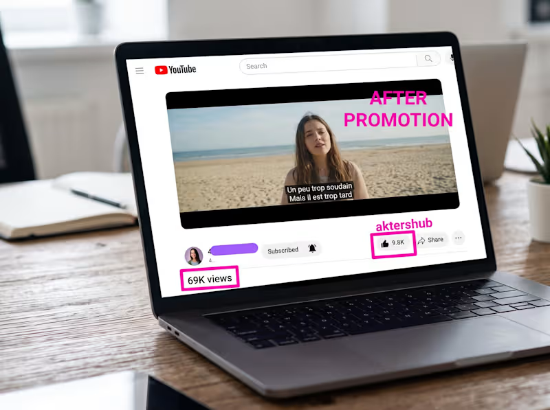
Scaling a Canadian Producer's Music Video to 69K Views in 7 Days
The Challenge
A Canadian music producer approached me with a newly released cinematic music video. Despite the high-quality production and engaging French lyrics like "Un peu trop soudain, Mais il est trop tard", the video was struggling to get picked up by the YouTube recommendation algorithm. The goal was clear but ambitious: generate immediate, high-velocity organic engagement to build social proof within a strict 7-day window.
What We Did:
To get fast, natural momentum without using artificial tactics, I ran a targeted 7-day promotional sprint.
Audience Targeting: I focused on specific geographic and interest-based clusters, pushing the content to viewers who actively watch and engage with similar music styles.
Metadata Tweaks: I ensured the back-end SEO and tags were fully optimized around the project's core hashtags, including #rackell, #troptard, and #toolate, to capture natural search intent.
High-Velocity Placements: I distributed the video across targeted music discovery networks to drive real, active viewers to the video during the crucial first few days of the campaign.
The Results
Within just one week, the campaign drove incredible engagement for the producer:
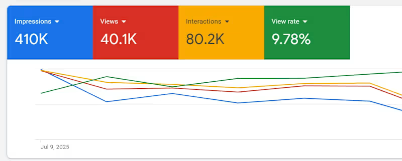
69,000+ organic views.
9,800+ likes.
This resulted in a massive view-to-like ratio, which signaled high audience satisfaction to YouTube's algorithm. The producer walked away with a highly active video, giving them the exact social proof needed to build their channel's authority.
0
72

Professional UI/UX Design – From Start to Finish
Professional UI/UX Design – From Start to Finish
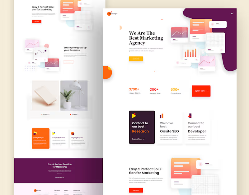
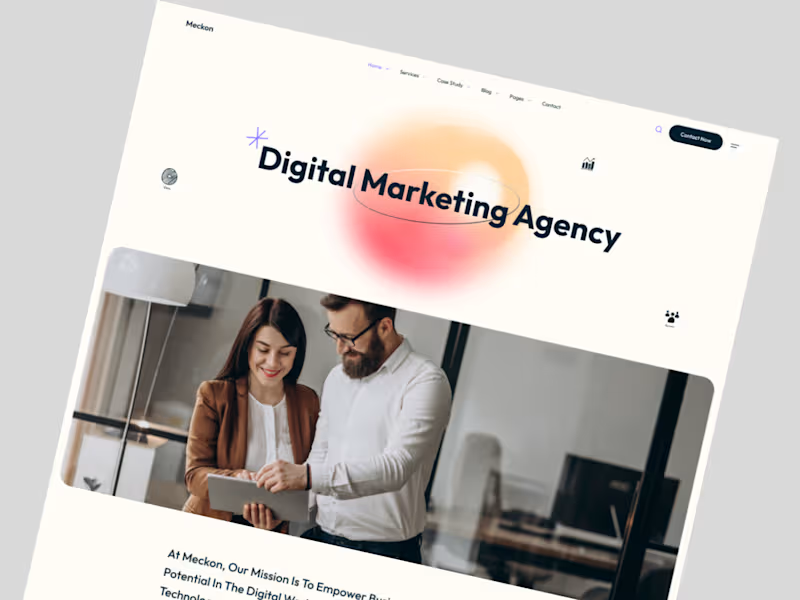
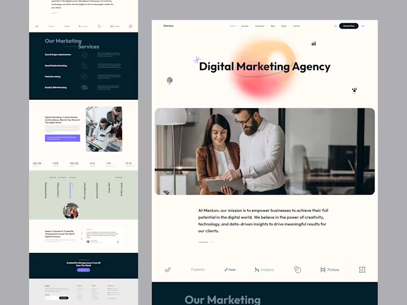
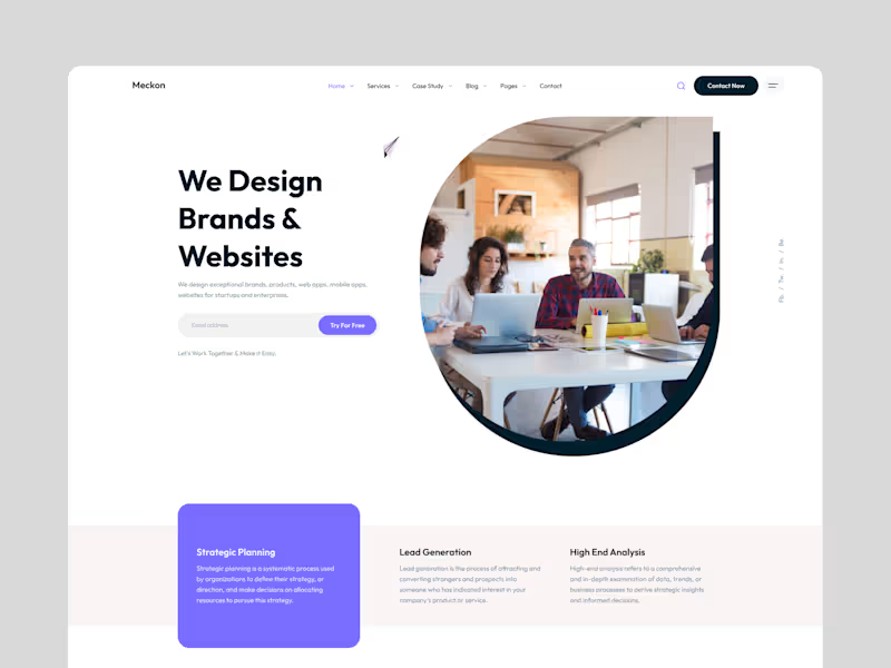

Rapid Figma UI/UX Design Expert 🚀

🏠 HomeCare — Live-In Care Website UI/UX
Designed a trust-focused landing experience for a senior live-in care platform.
→ Emotion-led hero with clear value proposition
→ Service transparency & care solutions
→ Founder/doctor credibility section
→ Stats to build trust & authority
→ Care plans, FAQs & testimonials
→ Conversion-focused CTAs
Focused on empathy, clarity, and accessibility.
Designed in Figma.
#UIUX #ProductDesign #HealthTech #WebDesign
5
4
134

🚀 Planso — Project Management SaaS UI/UX (All Screens)
Designed a scalable UI/UX system for a modern project management platform covering the full team workflow.
→ Dashboard & productivity overview
→ Inbox & team communication
→ Task board (Kanban) & task list
→ Project planning & task details
Focused on reducing cognitive load, improving clarity, and keeping communication + execution in one workspace.
Built in Figma.
#UIUX #ProductDesign #SaaSUI #WebAppDesign
3
145

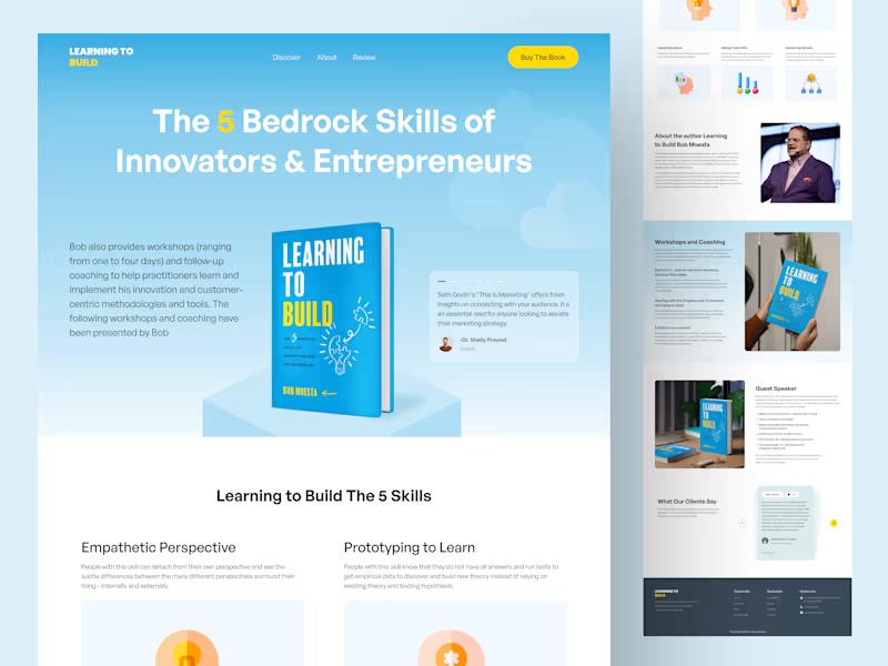
Camp — Travel & Hotel Booking Website UI/UX
Designed a full landing page experience for a modern travel booking platform.
→ Smart search for fast discovery
→ Destination-led inspiration
→ Featured hotels with price & ratings
→ Clear value props & social proof
→ Conversion-focused CTAs
Built in Figma with usability, trust, and scalability in mind.
10
11
247

🤝Helping businesses to get Logo & Brand designs
New to Contra
🤝Helping businesses to get Logo & Brand designs


modernlogos,branding,craftingbold,memorablevisuals,identity.
modernlogos,branding,craftingbold,memorablevisuals,identity.
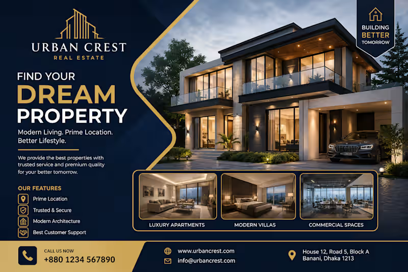
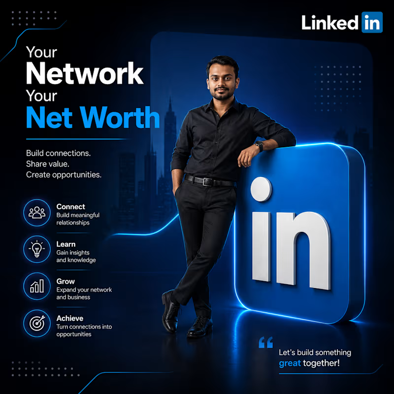
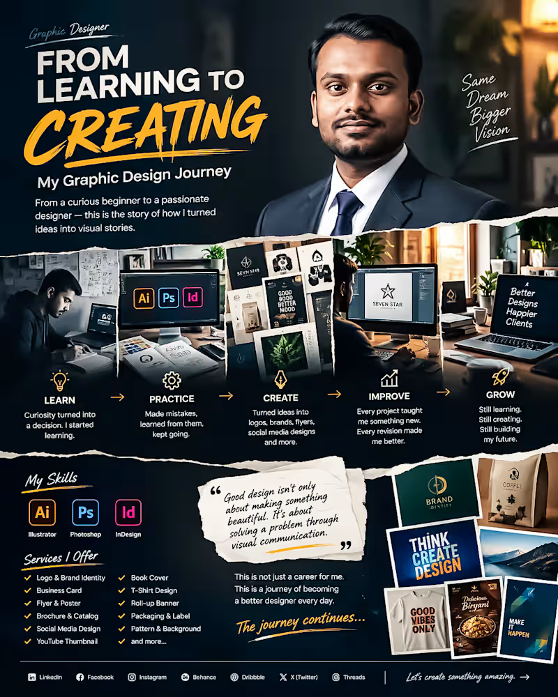
From Learning to Creating. My Graphic Design Journey 🎨
Every designer has a beginning.
Mine started with curiosity, uncertainty and a simple decision: I wanted to learn how to turn ideas into communication.
At the beginning I didn't know everything. I made mistakes struggled with typography, colors, layouts, software and countless small details that experienced designers make look easy.
I kept learning.
Step by step I improved my skills in Adobe Illustrator, Photoshop and InDesign. I started creating logos, branding materials, flyers, social media designs, packaging, thumbnails, posters and many other visual projects.
The biggest lesson I have learned is this:
Good design's n't only about making something beautiful. Good design is about solving a problem through communication.
Every project has taught me something. Every revision has made me better. Every difficult brief has pushed me to think creatively.
Today I’m still learning, still experimenting and still improving.
My journey isn't finished—. Thats what makes it exciting.
I’m building my career one design, one project and one client relationship at a time.
This is not a career, for me. This is a journey of becoming a designer every day.
If you're also building something from zero remember:
Start where you are. Learn what you don't know. Keep creating. Don't stop.
🚀 The journey continues.
#GraphicDesigner #GraphicDesign #DesignJourney #CreativeJourney #DesignerLife #AdobeIllustrator #AdobePhotoshop #AdobeInDesign #BrandIdentity #LogoDesign #FreelanceDesigner #CreativeDesigner #DesignPortfolio #VisualCommunication #Freelancing
0
53
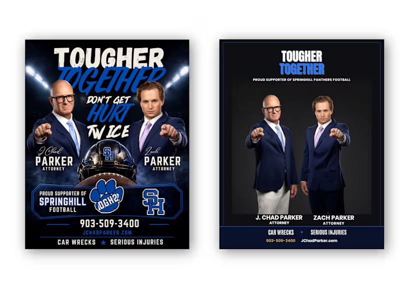
From Cluttered to Clear — Attorney Football Supporter Flyer Redesign
Client: “We have all the information we need, but the flyer doesn't communicate it clearly enough.”
My response:
“I’ll restructure the visual hierarchy, simplify the layout, strengthen the typography, and make the attorneys and contact information easier to recognize—while keeping the football-supporter identity.”
Result:
A cleaner Before → After transformation with stronger hierarchy, improved readability, better visual balance, and a more professional attorney-focused presentation.
Client Problem
The original flyer had strong content, but the overall design felt visually crowded and overly promotional. Too many elements competed for attention, making it difficult to immediately understand the attorneys, their names, services, contact information, and football sponsorship message.
BEFORE — Client's Problem:
The original concept contained all the necessary information, but the visual hierarchy was weak. Multiple headlines, images, football graphics, logos, and contact details competed for attention.
AFTER — My Solution:
I transformed the layout into a more structured and professional composition with a clear hierarchy, stronger typography, improved spacing, focused imagery, and easier-to-find contact information.
Final Result
The goal wasn't simply to make the flyer look different. The goal was to make the information easier to understand, strengthen the professional presentation, and preserve the client's football-supporter identity.
I redesigned this attorney promotional flyer by solving a common communication problem: too much information competing for attention.
The original design had strong imagery and messaging, but the hierarchy was crowded. I reorganized the content, strengthened typography, improved spacing, created a clearer information structure, and balanced the football-supporter theme with a professional legal identity.
The result: a cleaner, more focused flyer that communicates the message faster while keeping the original brand personality.
Tools: Adobe Photoshop, Adobe Illustrator
Service: Flyer Design • Graphic Design • Print Design • Layout Design • Advertising Design
Focus: Visual Hierarchy • Typography • Information Architecture • Branding • Readability
Hashtags
#GraphicDesign #FlyerDesign #FlyerRedesign #BeforeAndAfter #DesignCaseStudy #AdobeIllustrator #AdobePhotoshop #PrintDesign #AdvertisingDesign #Typography #VisualHierarchy #Branding #CreativeDesigner #AttorneyMarketing #ProfessionalDesign
0
38