Projects using WebGL in Sydney
Projects using WebGL in Sydney
Sign Up
Post a job
Sign Up
Log In
Filters
2
Projects
People
Message
2
Bearplus Fullstack Agency
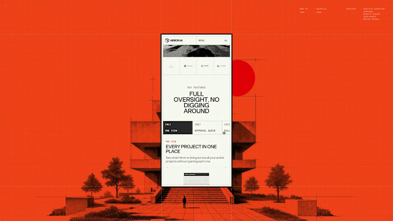
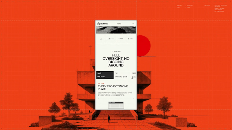
The Heron Dashboard page had to make an agent's work legible after the fact, which is a different job to explaining what the agent does. The hierarchy leads on time saved rather than activity volume. Heron's positioning rests on hours lost to repetitive modelling, so the product reports back in the same unit, supported by model health, active and pending item counts, and a feed of agent actions. The second half of the page covers contextual code questions, answered against a specific layout and occupancy rather than quoted in isolation. Mobile treated density as the core problem. The four headline figures are kept grouped so the summary survives a portrait screen, and tabular content is restructured into stacked cards rather than compressed into scrollable tables.
2
49
Message
1
Bearplus Fullstack Agency
Very little of the Heron site is layout, which makes responsive a design problem rather than a build task. The hero depends on a cursor drag, the preloader on a datum line moving up a full elevation, the explanation on a four-beat scroll sequence, and the whole visual system on architectural linework that fails when scaled down. Each of those was re-solved for mobile. The hero interaction was rebuilt for touch and reframed to portrait. The scroll sequence was re-timed for shorter distances. Drawings were recropped so the relevant part of the plan is shown at a readable size instead of the whole drawing at an unreadable one. Motion weight was reduced to hold performance on mid-range devices without dropping any of the beats that carry the story. Since most traffic arrives on mobile, this version had to stand on its own rather than gesture at the desktop experience.
1
54
Message
1
Bearplus Fullstack Agency
Page transitions on Heron are treated as view changes rather than document loads. Motion exits one page and continues into the next, with no hard reset and no white flash between states. The reasoning is product-led. Heron runs inside Revit, Rhino, ArchiCAD and SketchUp, where switching context means panels updating around a drawing that stays put. A site built to sell that experience shouldn't behave like a set of separate files. The transition also gives us somewhere to hide load time, which keeps the heavier interactive sections feeling immediate on slower connections.
1
1
96
Message
3
Bearplus Fullstack Agency
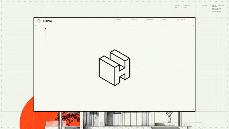
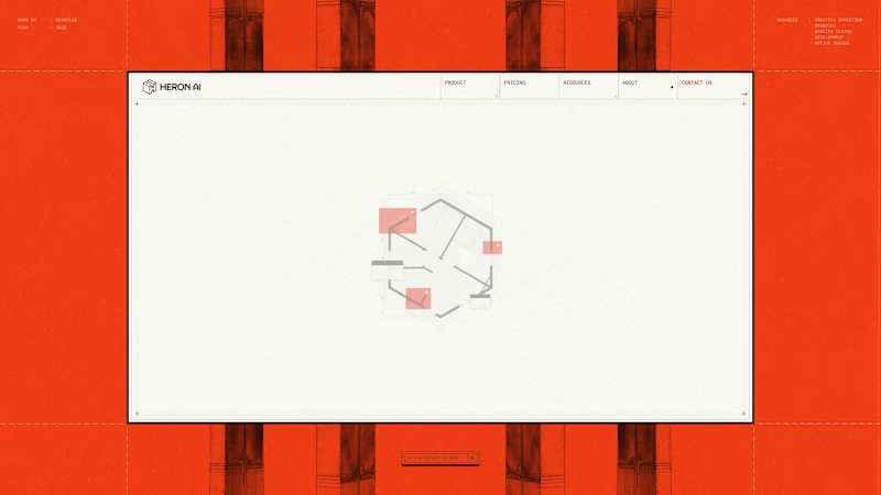
The About hero is a three-state sequence that does the identity work and the product explanation at the same time. It opens on a hexagonal floor plan drawn in full detail, with walls, fixtures and dimension strings. Red blocks then resolve over sections of the layout, marking the kind of issues Heron is built to catch. Finally the plan lifts into an isometric view and folds into the Heron wordmark's symbol, with the dashed hexagon beneath the mark matching the original building footprint exactly. The mark was constructed from the plan rather than drawn separately and rationalised later, which is why the transition holds. It also means the About page opens by demonstrating the product loop before any copy about the founders appears.
2
3
201
Message
4
Bearplus Fullstack Agency
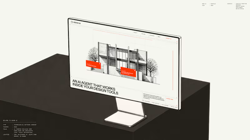
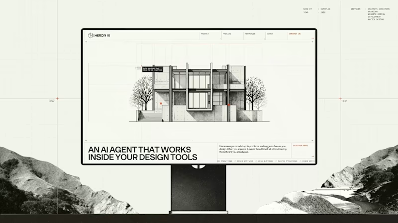
Heron AI is an agent that reviews architectural models and flags building code problems. The hardest part of the brief was making that legible in the first few seconds. We built the hero as a small interaction instead of a statement. The visitor drags across a black and white building sketch and violations surface where they drag, annotated with real IBC clauses. It puts the person in the agent's position for a moment. Everything after that section can then talk in normal product language, because the core idea has already landed without needing to be described.
4
4
490
Message
13
Bearplus Fullstack Agency
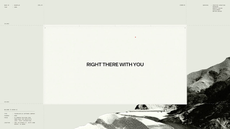
Heron runs inside Revit, Rhino, ArchiCAD and SketchUp, so the site had to read as an instrument rather than a brochure from the first frame. The preloader replaces the progress bar with a drawing in progress. A red datum line moves up an architectural elevation carrying the percentage value, and the building is drawn in line by line as loading completes. Supporting information sits in the margins in the same register: live cursor coordinates, a project spec card covering type, founding year, focus and location, and a numbered system boot sequence. Functionally it covers asset loading for the interactive hero, so the drag-to-reveal behaviour responds immediately once the page lands. Editorially it sets the frame before a single line of marketing copy appears.
8
13
660
Message
11
Bearplus Fullstack Agency
Agent products resist normal product marketing. There's no single interface to screenshot and the category vocabulary has gone generic, so a feature list communicates almost nothing. We built Heron's explanation as a four-beat scroll that runs the agent's actual loop. The model appears and is watched. Violations surface with plain language and a real IBC clause. An edit is applied after approval. The system learns the firm's standards. Pacing was the main design problem. Each beat needed enough scroll distance to register as a separate action, without the section becoming so long that people bail before the payoff. The sequence carries the technical detail that would otherwise sit in a spec table.
4
11
674
Message
18
Bearplus Fullstack Agency
The category default for AI products is dark backgrounds and gradient glow. Heron's audience is architects, so we built the visual system out of their working material instead. Everything on the site is drawn as architectural line work. Plans, elevations, dimension strings, and annotation boxes styled like redline mark-ups, each one holding a genuine code reference rather than lorem text. The system does two jobs. It reads as native to someone who spends their day inside Revit, and it supports the product story, because Heron works inside the drawing rather than beside it.
7
18
729
Message
20
Bearplus Fullstack Agency
The Heron homepage carries an unfamiliar product to an audience with very little patience for marketing language. The page is structured in two halves. The first half earns attention: a boot-sequence preloader, an interactive hero where dragging surfaces real code violations, four problem statements, and the agent loop delivered as a paced scroll. The second half spends it. Use cases are laid out plainly by role, from architects and BIM managers to small firms, and the demo booking section is the quietest thing on the page. Deciding where the ambition stops is the part that determines whether a B2B site converts or just impresses.
16
20
559
Message
2
Bearplus Fullstack Agency
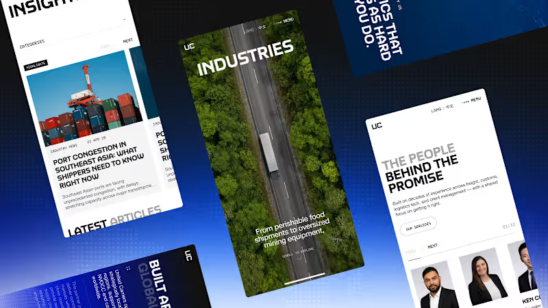
Mobile was treated as its own design problem rather than a responsive afterthought. The scroll journey had to survive a vertical frame and much shorter scroll distances, so the sequence was re-timed and each scene reframed for portrait. Motion budgets were reduced to protect performance on mid-range devices without dropping the parts of the sequence that carry the story. Given that the majority of traffic arrives on mobile, this version had to stand on its own rather than gesture at what the desktop experience does.
2
2
184
Message
3
Bearplus Fullstack Agency
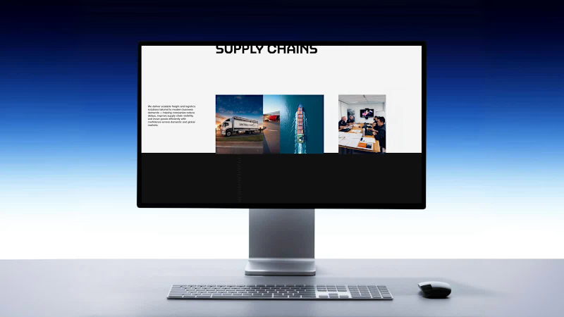
United Carriers serve sectors with genuinely different requirements, from pharmaceuticals to automotive to retail. The industries hero establishes that range before the page goes into specifics. The hero uses a wide, cinematic frame to signal breadth, then hands off into a structured layout where each sector gets its own handling detail. The intent is to make a broad capability feel specific rather than generic, which is the usual failure mode of an industries page.
3
151
Message
2
Bearplus Fullstack Agency
The services section is deliberately the most restrained part of the site. Everything before it is built to hold attention. This section is built to answer a question fast. Road freight, sea freight, air freight and warehousing are laid out with a clear hierarchy, consistent card structure and no motion competing with the content. For a considered B2B purchase, this is where the enquiry actually starts. Applying the same visual ambition here would have made it harder to use, so we pulled back on purpose.
2
155
Message
2
Bearplus Fullstack Agency
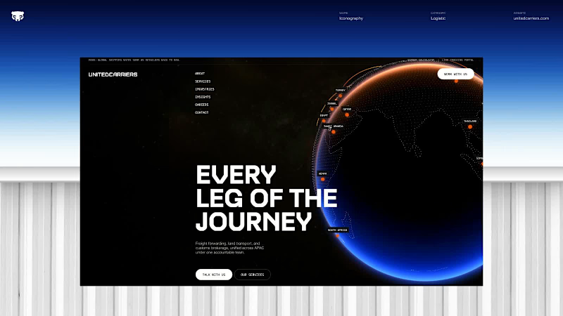
Page transitions are handled as continuations rather than cuts. Motion leaving one page becomes motion arriving on the next, with no white flash and no hard reset in between. The effect is that the site behaves like a single continuous space you're travelling through, which matters a lot on a project built around the idea of a journey. It also gave us room to hide loading time inside the transition itself, so the experience stays smooth even on slower connections.
2
144
Message
1
Bearplus Fullstack Agency
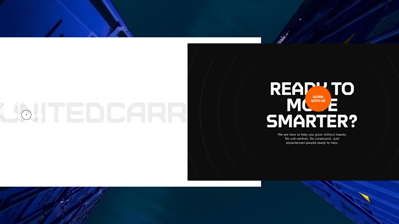
Micro-interactions are where a site stops feeling like a document and starts feeling like a place. United Carriers 2.0 is full of them. A custom cursor trail shaped after the logo. A footer that responds as you move through it. Considered hover states on every button and content block. Small state changes throughout that acknowledge the user's input. Individually none of these are impressive, and that's the point. They aren't meant to be noticed. Together they create a constant sense that the site is responsive and alive, and that no element was left sitting on its default behaviour. It's the layer that separates a site that looks finished from one that actually feels finished.
1
121
Message
30
Bearplus Fullstack Agency
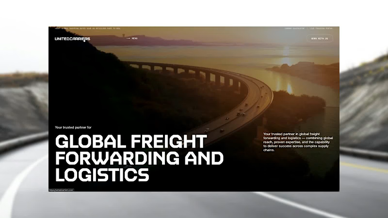
The hero is the site's handshake, so it had to carry the whole idea in a few seconds. Rather than a static image with a headline over it, the hero responds to cursor and scroll input with subtle parallax and depth. The freight reads as something in motion rather than a photograph of something that moved. Restraint mattered here: enough life to signal that this site behaves differently, not so much that it turns into a demo reel and gets in the way of the message.
14
30
1.1K
Message
3
Bearplus Fullstack Agency
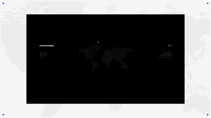
Loading screens are usually an apology. We treated this one as the first frame of the story. The United Carriers preloader introduces motion before any content arrives, so the user's first impression is of things moving rather than of waiting. It also does real work: assets for the opening scroll sequence are fetched behind it, which means the journey starts smoothly instead of stuttering on first scroll.
1
3
132
Explore projects