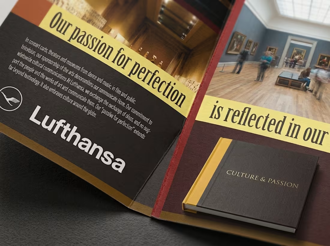
Projects using QuarkXPress in SpringfieldProjects using QuarkXPress in SpringfieldThis project began as a print campaign exploring the connection between travel, culture, and the arts. I developed the visual direction around bold photography, strong editorial typography, and a warm, museum-inspired color palette.
To show how the concept could extend into a larger publication system, I expanded the original design language into brochures, editorial spreads, and multi-page layouts. The focus was on creating clear hierarchy, maintaining consistency across different page types, and balancing image-heavy moments with more content-dense sections.
My role included art direction, layout design, typography, print design, and developing the broader editorial system.
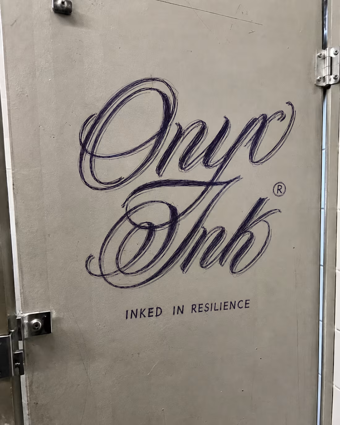
Original campaign design by me. Additional publication mockups were created to demonstrate how the visual system could scale across longer-form print and editorial applications. I developed Onyx Ink as a Black tattoo magazine concept centered on artistry, identity, culture, and the stories carried through ink. I designed the publication’s logo and visual identity around the phrase “Inked in Resilience,” using an expressive script wordmark paired with a bold black-and-gold color system to give the brand a look that feels artistic, elevated, and rooted in tattoo culture.
I extended the identity into a full editorial direction, creating magazine covers, feature spreads, media-kit layouts, press materials, and promotional applications using photography of real tattooed models. The layouts balance strong imagery with refined typography and generous editorial space, allowing the tattoos and the people wearing them to remain the focus while maintaining a recognizable Onyx Ink visual language throughout.
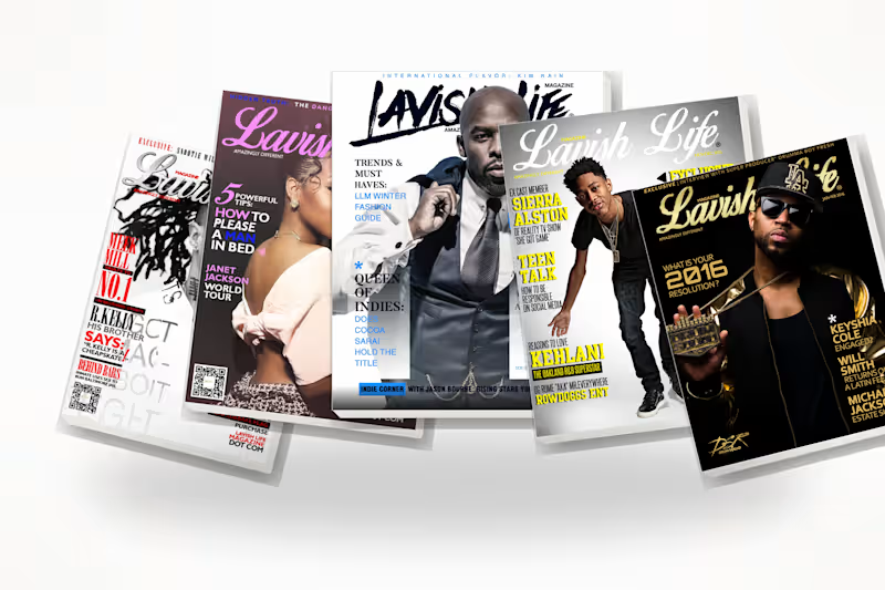
The project demonstrates how I take a brand from an initial logo concept into a cohesive publication system that can work across print, digital, editorial, and promotional touch points. A collection of magazine covers created for a lifestyle and culture publication, with a focus on bold typography, strong visual hierarchy, and cover compositions that feel polished, editorial, and attention-grabbing.
For each issue, I worked with provided photography and developed the complete cover design, including masthead placement, headline hierarchy, typography, color balance, image treatment, and overall layout. The goal was to create covers that felt distinct from issue to issue while still maintaining a consistent visual identity across the publication.