

Web + Brand designer for ambitious brands.
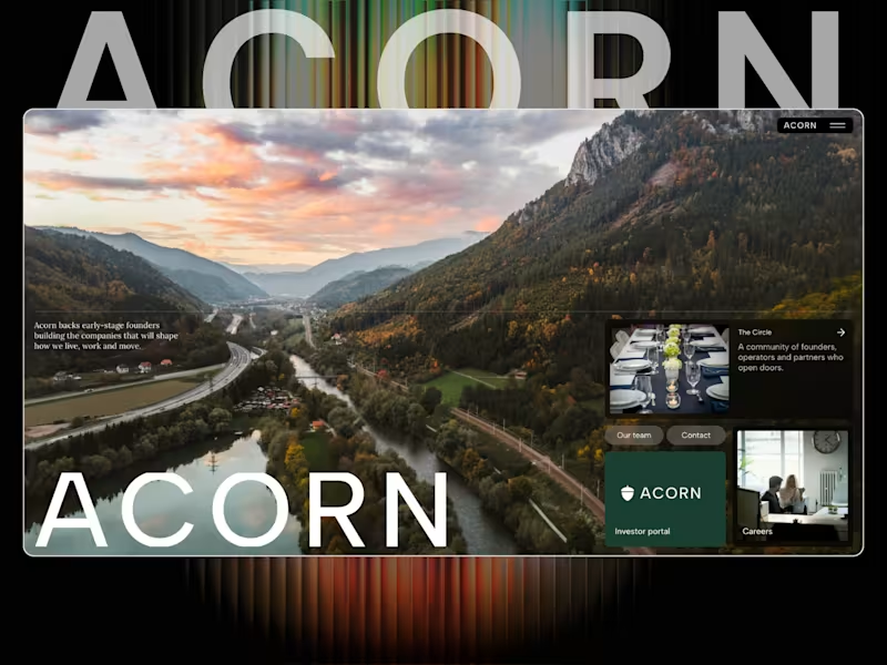
Acorn — a new VC website concept 🌱
Been working on Acorn, a Framer site for a modern venture capital firm.
I wanted this one to feel less like a traditional finance website and more like a serious technology brand — editorial, confident and very focused on the people and companies behind the numbers.
The site is built around three core areas:
Invest. Build. Scale.
With sections covering the investment thesis, criteria, portfolio, locations, team, fund metrics and dedicated journeys for founders and investors.
A big part of the challenge was making a lot of information feel simple without making it feel empty.
Built in Framer.
Acorn — backing founders early, and staying for the long run. 🌱
#Framer #FramerDesigner #WebDesign #VentureCapital #VC #StartupDesign #Investment #WebDesignInspiration
0
105

Really proud of this one.
I’ve put a lot of time into Helm, obsessing over the small details, interactions, spacing and overall feel until it felt right.
View here: https://helm.framer.media
It’s a complete SaaS website built in Framer, with product pages, pricing, customers, docs, changelog, status and everything in between.
Probably one of my favourite templates I’ve built so far.
Would genuinely love your feedback on this one, what works, what doesn’t, and what you’d change.
Built in Framer. 🤍
2
242
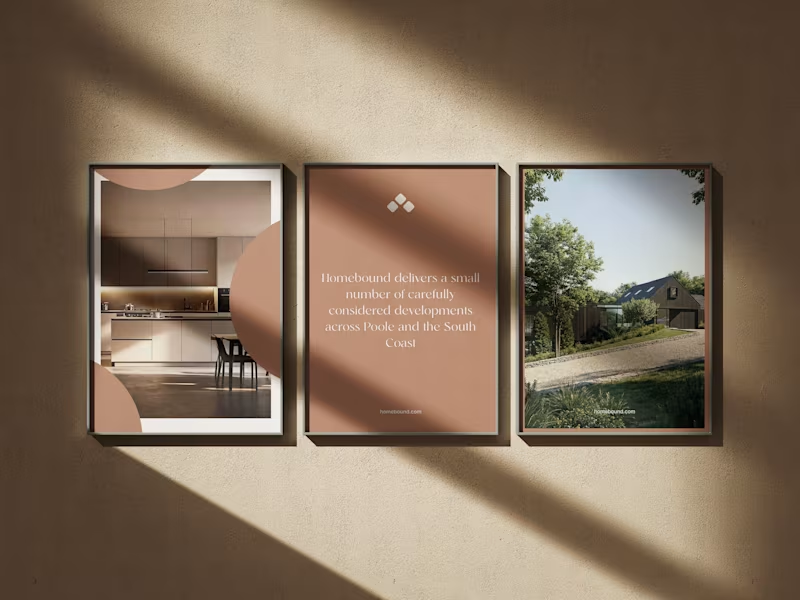
Really enjoyed working on Homebound, a property brand built around making the experience of discovering a home feel a little more considered.
The brief was to create something that felt premium, calm and editorial, while still making the important stuff easy to find.
Photography does a lot of the heavy lifting here, so the design is intentionally restrained — giving the homes room to breathe rather than throwing information at you.
From the property experience through to mobile, everything was designed to feel simple, intuitive and genuinely enjoyable to use.
A really nice one to work on.
#WebDesign #Branding #Property #WebDesignInspiration #Framer #FramerDesigner
4
14
442
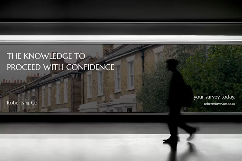
Roberts & Co. A new identity built around certainty.
A complete brand identity for Roberts & Co, an independent firm of Chartered Surveyors and Registered Valuers.
The brief was to move the brand away from the conventional, corporate language of surveying and create something that felt established, considered and quietly premium.
We developed a refined visual identity built around restrained typography, a deep neutral palette and a more editorial approach to communication, giving Roberts & Co a distinctive presence across both digital and physical touch points.
From business cards and stationery to advertising and the new website, every element was designed to feel consistent, confident and unmistakably Roberts & Co.
Brand identity. Art direction. Digital.💯
Designed by Fabricatr.
#BrandIdentity #Branding #Rebrand #CreativeStudio #ArtDirection #WebDesign #Contra #PropertyBranding #Surveyors #RobertsAndCo
2
4
227


Always, think different.


AI Product Design Specialist with UX Focus

Just wrapped a website for a multi-disciplinary design studio based in Bangalore
After months of async workshops, rethinking the why and goals for the redesign as well as 1000s of conversations about fonts and colours, we’ve finally launched.
Their WhatsApp message made my day.
“Hi Nim!
Good news first! We had an architects recruitment portal post a vacancy at TOO yesterday… And, thanks to our website, we have a flood of applications. Almost 40 over 2 days… thanks a tonne, we have never received so many applications. The job was well done, and the purpose was served.
So thanks a lot for that.”
Their primary goal was to attract talent for the work they have lined up in 2026. And seems like they’re on the right track.
theopenoffice.in
(http://theopenoffice.in)Built with Framer (https://www.linkedin.com/company/framer/)
11
163

Anyone else revisiting old side-projects over the holidays?
I just opened up my TimeSync app on Claude Code for some maintenance and couldn't resist adding and improving some things in there
Try it out > time-sync-five.vercel.app (http://time-sync-five.vercel.app)
0
89


UX/UI Designer & Developer (No-Code & Full Stack)
UX/UI Designer & Developer (No-Code & Full Stack)


UX & Web Design: User-first, Results-driven
UX & Web Design: User-first, Results-driven


