Projects using Adobe Photoshop in Singra
Projects using Adobe Photoshop in Singra
Sign Up
Post a job
Sign Up
Log In
Filters
2
Projects
People
Message
0
Md Toufic Ahmed Khan Badhon
pro
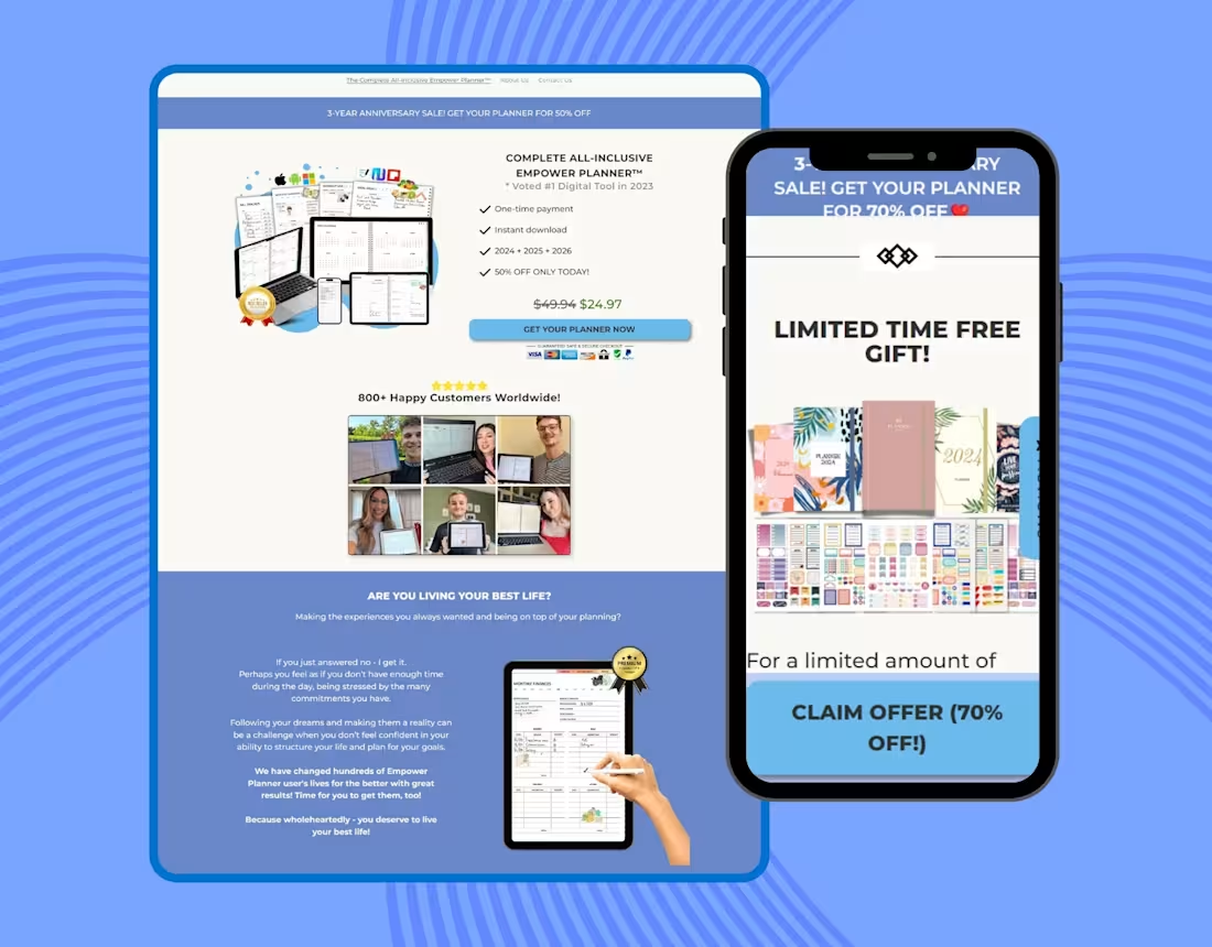
Planner Website Clone Using Pagefly on Shopify
0
12
Message
1
Humaun Atelier
pro
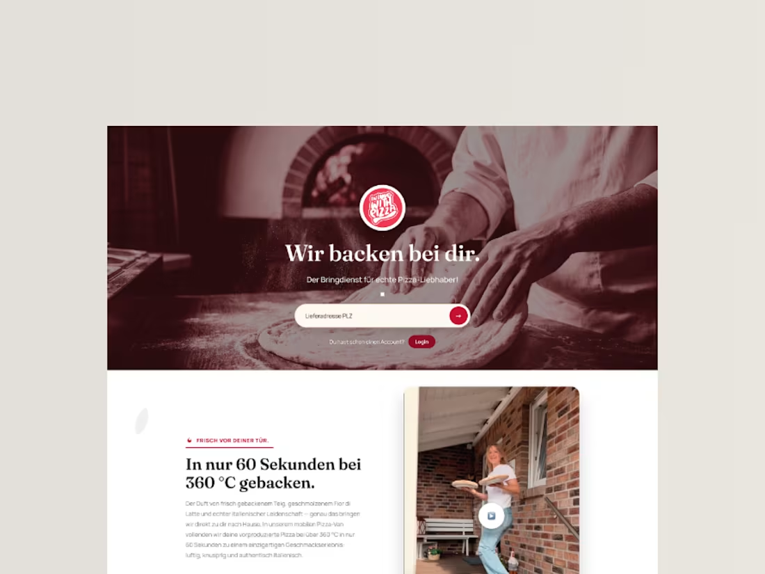
InLoveWithPizza Premium Landing Page Redesign
1
4
Message
1
Md Zahid Hasan Khan
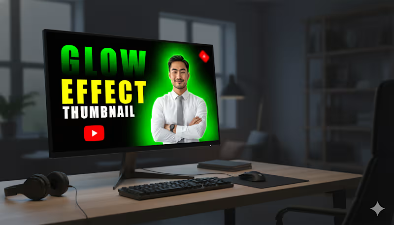
This YouTube thumbnail is designed to be highly eye-catching and is focused on demonstrating a "Glow Effect. Subject: A smiling, professionally dressed man (in a white shirt and grey tie) is positioned prominently on the right side. Glow Effect: A vibrant, bright green glow radiates from behind the man, creating a strong contrast against the black background. This immediately draws attention and illustrates the "Glow Effect" mentioned in the text. Background: The background is a solid black, which maximizes the impact and visibility of the glow and the text. Text Hierarchy: The text is large and uses high-contrast colors to stand out: "GLOW" is in a neon green/yellow-green gradient, directly matching the glow effect. "EFFECT" is in a bold, solid yellow. "THUMBNAIL" is in white text, slightly smaller, defining the subject matter.
1
72
Message
0
Suvas Bin Monir
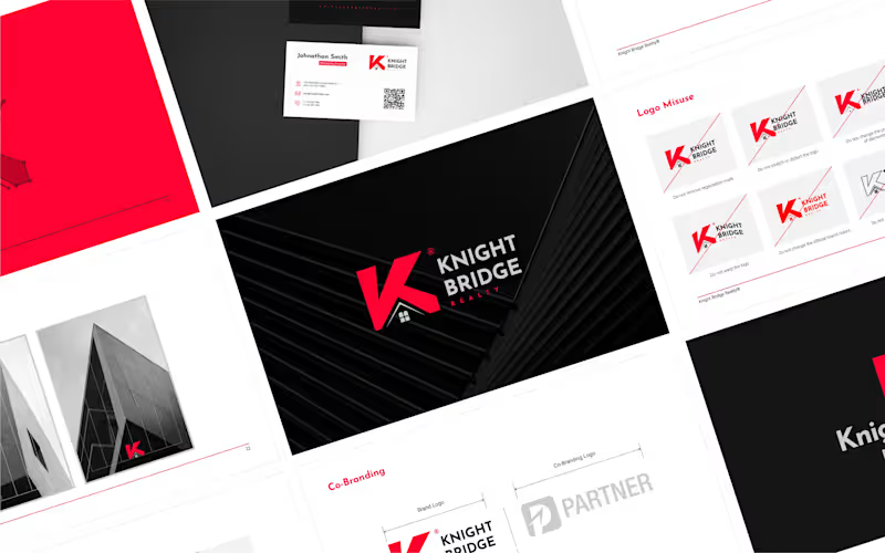
Logo & Brand Style Guide
0
85
Message
0
MD FARHAD ALI
New Impact Media Logo Design
0
15
Message
0
Shakhawat Hossen
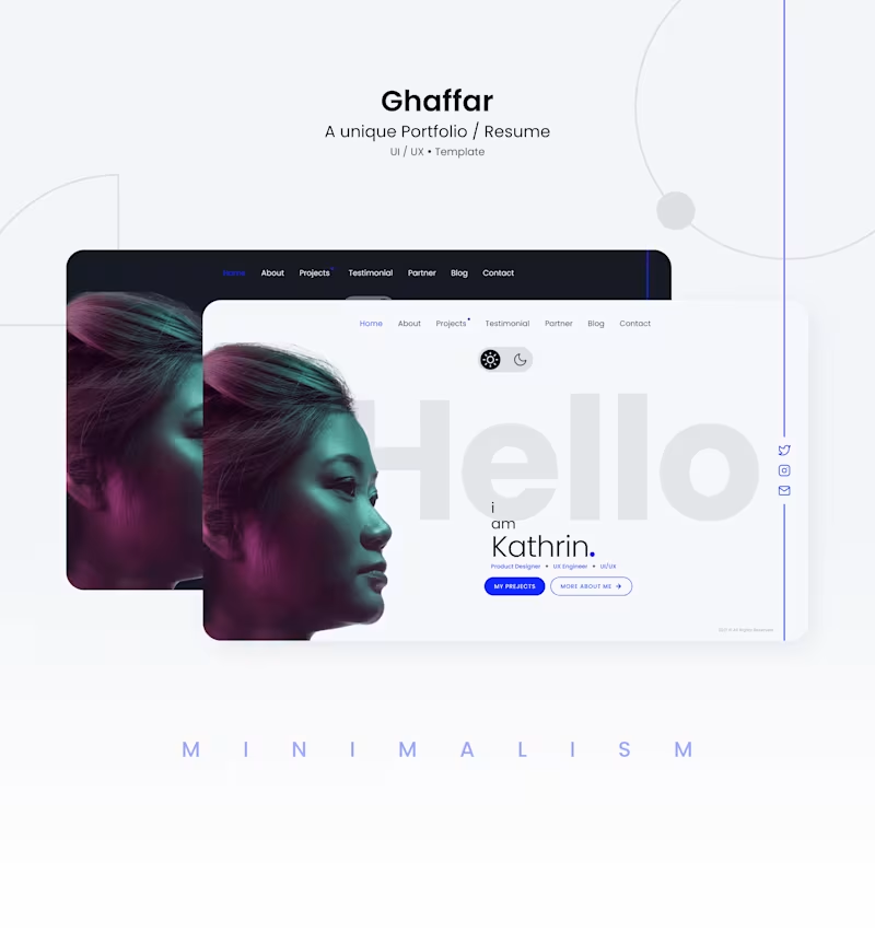
Portfolio website design
0
28
Message
0
Humaun Atelier
pro
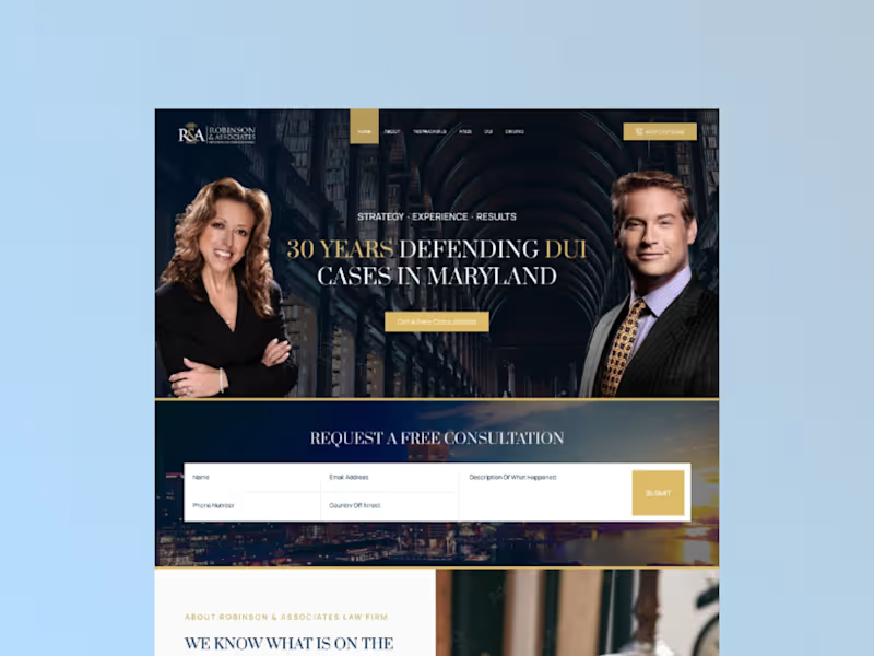
I designed a high-converting landing page for Robinson & Associates, a law firm specializing in DUI and criminal defense. The goal was to create a trustworthy, authoritative, and client-focused digital presence that converts visitors into leads. Using a clean, professional layout with strategic visual hierarchy, I emphasized credibility through trust signals (case results, client testimonials, and credentials) while keeping the call-to-action prominent. The design balances a serious, empathetic tone with modern aesthetics—using navy blue and gold accents to convey professionalism and reliability. I incorporated carefully selected stock imagery to humanize the firm without compromising the serious nature of the practice. The result is a landing page that builds confidence and encourages immediate action from potential clients facing DUI charges
0
252
Message
1
Md Zahid Hasan Khan
I can create every type of logo design and marketing materials for your company.
1
81
Message
0
MD FARHAD ALI
Pixellab App Icon Design
0
18
Message
0
Humaun Atelier
pro
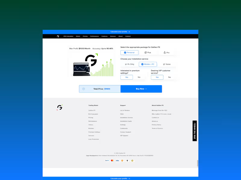
Galileo FX, a sophisticated automated trading software for forex and crypto, suffered from a cluttered and lengthy pricing page that confused visitors and hurt conversions. The challenge was to redesign the page to mirror the clean, luxurious, and highly intuitive checkout experience of industry leaders like Apple and Tesla. I stripped away traditional tables and dense text, replacing them with iconic, visual-rich cards that clearly differentiate each package at a glance. I implemented a clean, responsive grid system using the client's existing brand palette, prioritizing generous white space to elevate the premium feel and avoid unnecessary decorations. Crucially, I removed the traditional shopping cart and integrated direct, prominent 'Buy Now' links to streamline the purchase journey, reducing friction and speeding up the decision-making process. The result is a highly scannable, minimalistic pricing hub that guides users effortlessly to the right choice while emphasizing trust, speed, and a distinctly high-end aesthetic.
0
238
Message
0
Humaun Atelier
pro
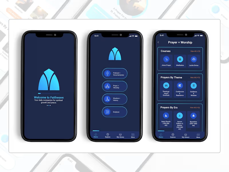
A full UI concept for FaithWave, a faith-based app designed to help users explore and deepen their Christian faith through meaningful learning, prayer, and customizable worship experiences. I designed three key screens—Home, Prayer & Worship, and a Customizable Item Page—that together demonstrate the app's core user journey. The Home screen features four main content sections (Podcasts, Prayer & Worship, Wisdom & History, Scripture) with a clean, intuitive bottom navigation. The Prayer & Worship page organizes a rich library of prayers by theme, era, courses, and meditations, making spiritual content easily discoverable. The Customizable Item page allows users to personalize their prayer experience by selecting narrator voices, background sounds, and volume controls—creating a deeply personal and immersive devotional experience. The design uses a calming blue gradient inspired by the brand's logo (cyan to deep blue), with thoughtful typography and ample whitespace to create a serene, focused atmosphere for prayer and reflection.
0
141
Message
2
Humaun Atelier
pro
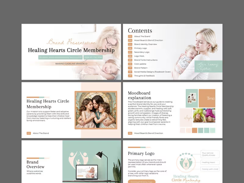
This is a comprehensive brand identity and guidelines project for Healing Hearts Circle Membership, a coaching service dedicated to supporting foster and adoptive parents. The mission is deeply emotional: to equip parents with the skills to help their children heal from trauma and build resilient, nurturing family environments. The design challenge was to translate this profound sensitivity into a visual language that feels warm, safe, and professional—never cold or clinical. I began with a strategic moodboard to align on visual direction, anchoring the brand in soft green hues to symbolize growth and renewal, balanced with gentle pinks and rust/orange tones to evoke compassion and emotional warmth. I developed a versatile logo suite—primary, secondary, and a distinct logo mark—to ensure the brand works cohesively across all touchpoints, from a website header to printed materials. Organic textures and friendly, approachable typography were selected to create a welcoming, community-driven feel. The full brand guideline document (Version 1.0) encapsulates the complete system: color palette, typography instructions, brand pattern, social media designs (Facebook cover), and actionable feedback sections. The visual narrative focuses on diverse, loving family imagery to reflect inclusivity. The final result is a nurturing, trustworthy, and cohesive brand identity that makes foster and adoptive parents feel seen, supported, and empowered—turning the complex journey of healing into a beautifully structured visual story.
2
286
Message
1
Humaun Atelier
pro
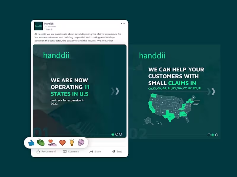
A LinkedIn carousel post designed for handdii, a company expanding across 11 U.S. states. The goal was to visually communicate their growth and service areas while maintaining their brand identity—using their signature green (#00FF99), supporting colors, and a clean, modern layout. I incorporated the 2-letter state abbreviations (CA, TX, OH, GA, etc.) into the design, creating a map-like visual that immediately conveys the company's reach. The carousel structure allowed me to present the key message—operating in 11 states with more expansion coming—across multiple slides, keeping each one clean, scannable, and on-brand. The design uses bold typography, consistent spacing, and a professional tone suitable for LinkedIn's audience, without relying on the logo since the post was published from the company page.
1
153
Message
1
Humaun Atelier
pro
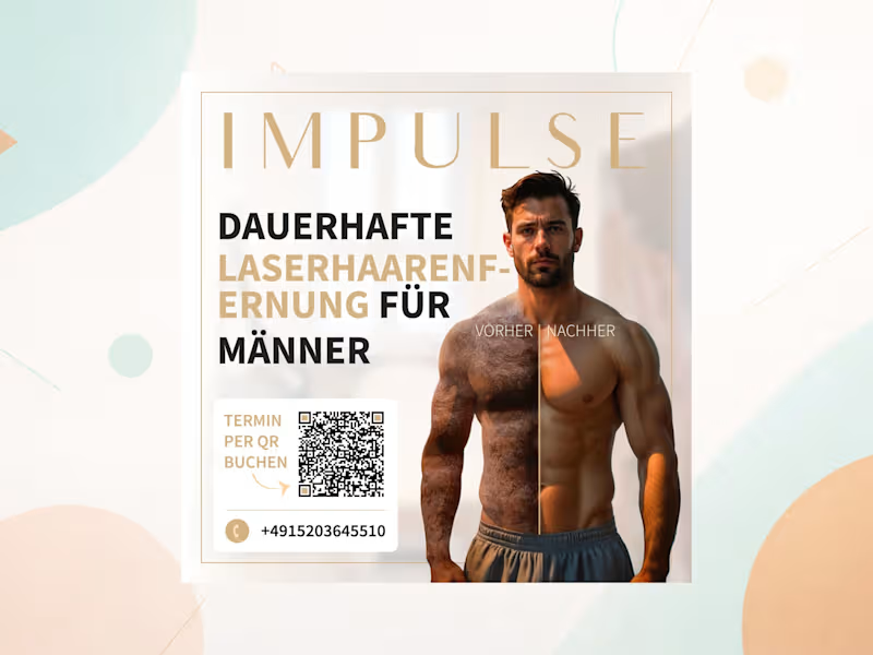
This project was a targeted advertising campaign for a laser hair removal clinic, specifically designed to attract a male audience—a demographic often overlooked in the beauty and aesthetics industry. The primary challenge was to shift the perception of laser hair removal from a strictly 'female' treatment to a modern, practical, and aesthetically appealing choice for men. The core visual strategy was built on a bold, immediately clear contrast: a split composition showing a male body with hair on one side and smooth, hair-free skin on the other. This instantly communicates the service's value without relying on long, tedious copy. I kept the color palette dark, clean, and highly masculine—using deep blacks, cool greys, and sharp whites to convey a premium, technical, and hygienic aesthetic that resonates with men. The typography was bold and direct, adhering strictly to the client's requirement of 'kurz und knapp' (short and concise). Crucially, I integrated the booking QR code (linking to the impulse-nbg.de/termin (http://impulse-nbg.de/termin) page and phone number) seamlessly into the composition without disrupting the visual flow, making the conversion path frictionless. The layout was designed to be highly adaptable, working flawlessly across the required formats—a square social media post, a flyer for print/digital distribution, and a full-screen vertical Instagram Story. The result is a cohesive, high-impact campaign that makes laser hair removal feel like a lifestyle upgrade for the modern man.
1
246
Message
0
Humaun Atelier
pro
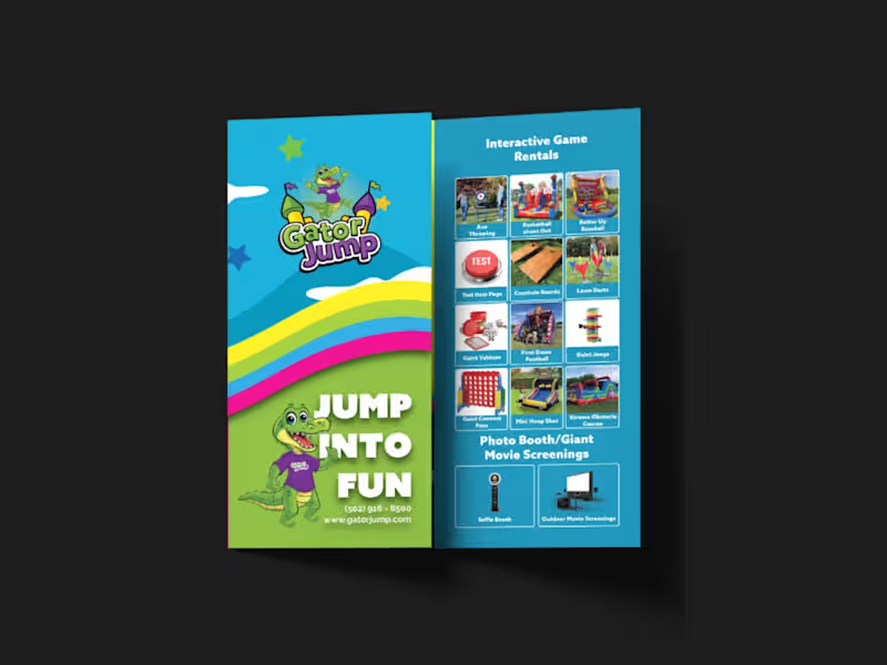
I designed a strategic, high-impact tri-fold brochure for Gator Jump, an event rental company transitioning its focus toward large-scale corporate clients, churches, and schools. The primary challenge was balancing a wide product catalog—Inflatables (Bounce Houses, Slides, Obstacle Courses), Games, Photo Booths, and Giant Movie Screens—while distinctly guiding the viewer’s attention toward the premium, high-ticket items ideal for corporate events. To solve this, I applied a strict visual hierarchy on the A4 tri-fold canvas. Obstacle Courses, Slides, and Games were given prominent placement with large, dynamic visuals on the most visible panels (front cover and center-fold), while secondary services like Bounce Houses and Photo Booths were positioned strategically on the back and side panels to ensure visibility without competing for the spotlight. Visually, the client adored a specific rainbow gradient color palette, so I used it as the structural backbone of the design—allowing the colors to flow seamlessly across the front and back panels. This creates a cohesive, energetic brand experience and transforms the brochure from a simple price list into a professional statement. I paired this with bold, modern typography inspired by the Azo Sans family (avoiding their old website fonts as requested) to ensure high readability against the colorful backdrop. All required functional elements were integrated seamlessly: the logo and contact details on the front, categorized product grids inside, and a QR code, email, phone number, and the specific brand messaging on the back. The result is a print-ready, visually striking tri-fold brochure that captures the excitement of large events while maintaining the premium credibility needed to attract corporate clients.
0
179
Message
1
Humaun Atelier
pro
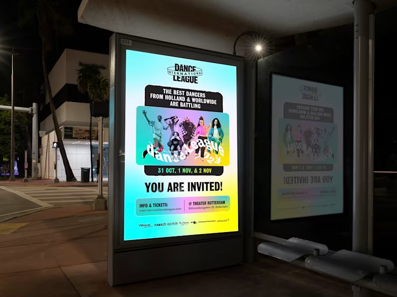
I designed the key visual / poster campaign for the International Dance League, Rotterdam's premier hip-hop and street dance festival. The core challenge was balancing two opposing forces: the raw, competitive intensity of a 5v5 'Premier League' battle (featuring 60 dancers and international rivalries against France & Germany) with the need to feel welcoming and inclusive to a broad audience—from urban families to dedicated party kids. To solve this, I moved away from the existing brand book's exact style while using its colors and shapes as a springboard for a fresher, more contemporary edge. I built a dynamic, layered composition centered on the team captains and dancers to showcase the spectacle of the event. To emphasize the 'battle,' I used bold, clashing typography and directional lines that create visual tension, representing the clash of dance styles (Hiphop, Afro, Breaking, House, Popping, Krump). Crucially, I avoided stock imagery and utilized authentic dancer assets to build trust and community. I designed the visual hierarchy to appeal to all four target personas simultaneously: the scale appeals to the 'City Family,' the competitive clash hooks the 'Netflix Couple,' the artistic expression inspires the 'Musical Adventurer,' and the urban aesthetic draws in the 'Party Kid.' The final poster embodies the event's dual message—'Join the Movement' and 'Which Team Are You For?'—making it a powerful tool for both outdoor campaigns and digital engagement.
1
200
Explore projects