Graphic Design Projects in Singra
Graphic Design Projects in Singra
Sign Up
Post a job
Sign Up
Log In
Filters
2
Projects
People
Message
0
Md Toufic Ahmed Khan Badhon
pro
Figma to shopify converting using Replo
0
9
Message
1
Md Zahid Hasan Khan
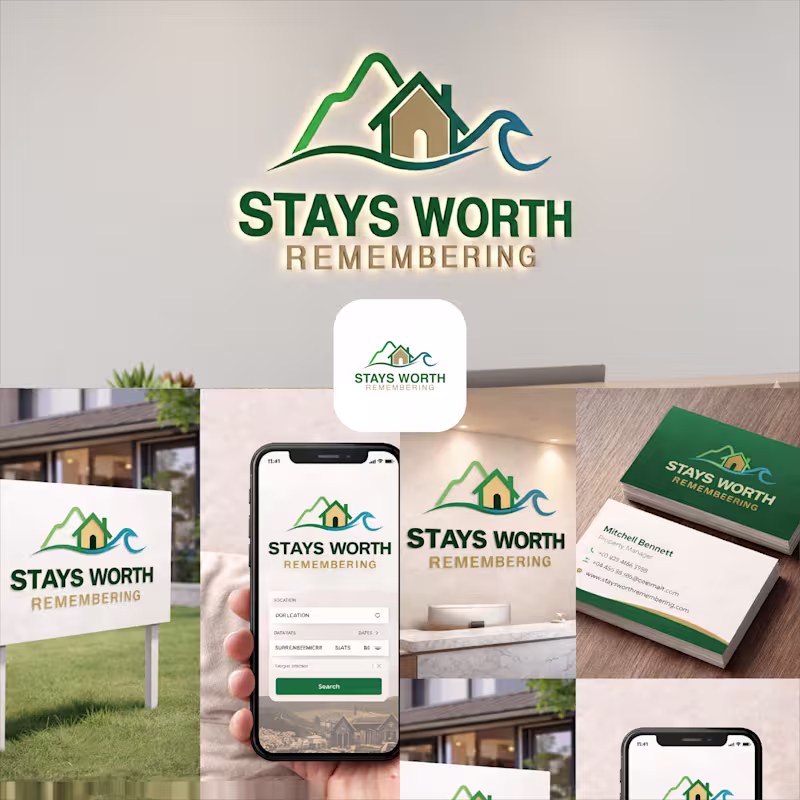
Stays Worth Remembering Travel Company Logo Design 2026. The idea behind this logo was to create a visual identity that instantly communicates comfort, memorable experiences, and destination-based stays in a clean and meaningful way. The mountain element represents travel, adventure, peaceful escapes, and beautiful destinations. It gives the brand a sense of exploration and unforgettable journeys. The house placed in the center symbolizes comfort, hospitality, safety, and the feeling of being “at home” no matter where someone travels. The wave element was added to represent relaxation, premium vacation experiences, and destinations connected to nature, lakes, beaches, or peaceful environments. Together, the mountain, home, and wave create a complete story of travel and memorable stays. For the typography, I used a bold and clean font to make the brand look professional, trustworthy, and easy to recognize across both digital and physical platforms. The word “REMEMBERING” uses a softer gold tone to create a warm emotional feeling and reinforce the idea that these stays are not just accommodations, but experiences people will remember for a long time. The green color palette represents nature, growth, relaxation, and trust, while the blue wave adds freshness, calmness, and a travel-inspired feeling. Overall, the logo was designed to feel welcoming, modern, memorable, and versatile for signage, branding materials, business cards, websites, and mobile applications.
1
44
Message
0
MD FARHAD ALI
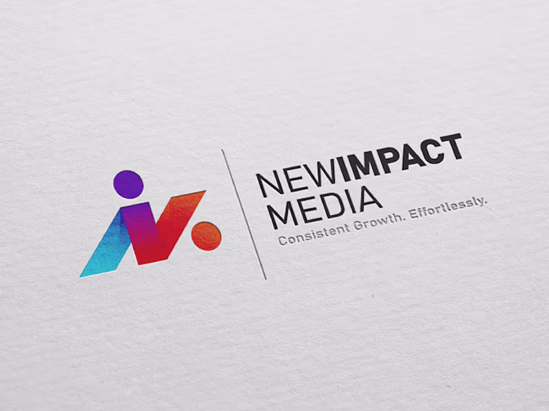
New Impact Media Logo Design
0
13
Message
0
Shakhawat Hossen
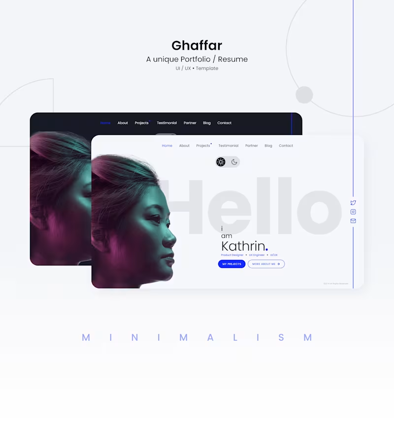
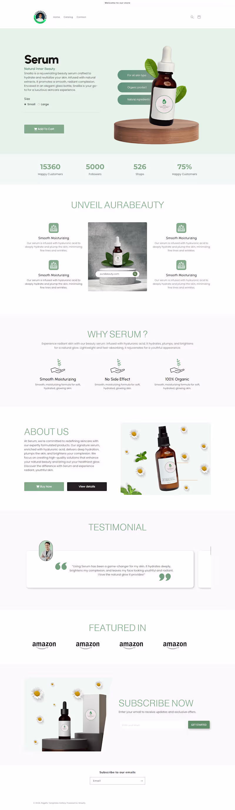
Portfolio website design
0
25
Message
0
Alex sabbir Bibard
Company logo design
0
0
Message
0
Md Toufic Ahmed Khan Badhon
pro
Shopify One-Product Store Homepage Design Using Replo
0
6
Message
2
Md Zahid Hasan Khan
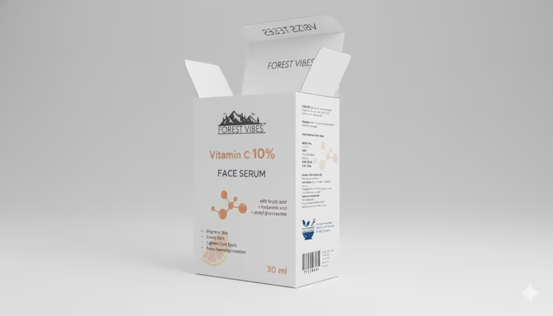
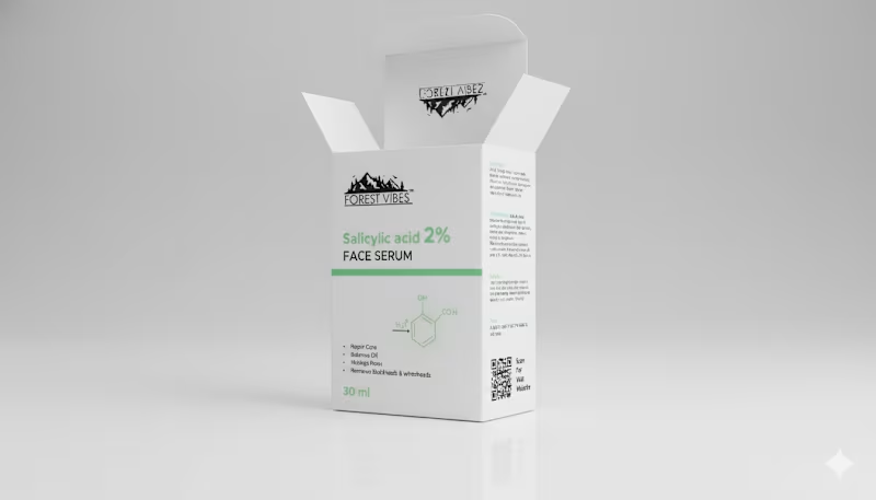
Indian Client Work Vitamin C 10% Face Serum Package Design. Here I have designed several packages of Vitamin C 10% Face Serum for my Indian client. From here, the client has finalized a design and is selling their product by printing that package. From here you can get your design ideas if you want and those who want to package such products can contact me. I am here for you. You (http://you.you/) can design labels for your products, and if you want, you can get your company's full branding done by me. If you want to get ideas about my designs, you can check out my entire portfolio, so if you need this service, be sure to contact me.
2
69
Message
0
MD FARHAD ALI
Pixellab App Icon Design
0
15
Message
0
Alex sabbir Bibard
1. "Brand Marks: Crafting Identity Through Logo Design
0
2
Message
0
Md Toufic Ahmed Khan Badhon
pro
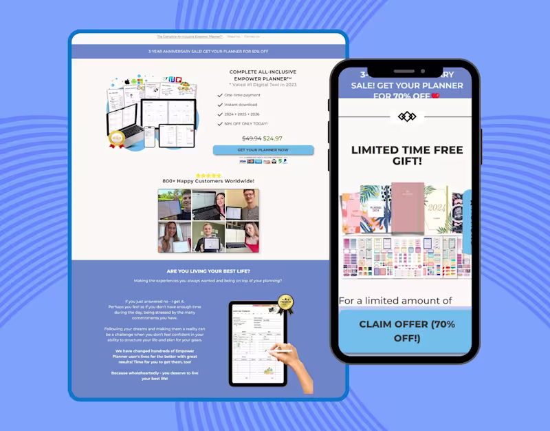
Planner Website Clone Using Pagefly on Shopify
0
9
Message
2
Md Zahid Hasan Khan
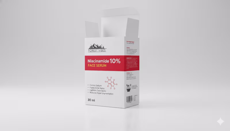
Indian Client Work Niacinamide 10% Face Serum Multiple Style Package Design. Here, I have designed several packages of Niacinamide 10% Face Serum for my Indian client. From here, the client has finalized a design and is selling their product by printing that package. From here, you can get your design ideas if you want, and those who want to package such products can contact me. I am here for you. You can design labels for your products, and if you want, you can get your company's full branding done by me. If you want to get ideas about my designs, you can check out my entire portfolio, so if you need this service, be sure to contact me.
2
2
87
Message
0
Md Toufic Ahmed Khan Badhon
pro
Shopify Beauty One Product Store Using Pagefly
0
7
Message
2
Md Zahid Hasan Khan
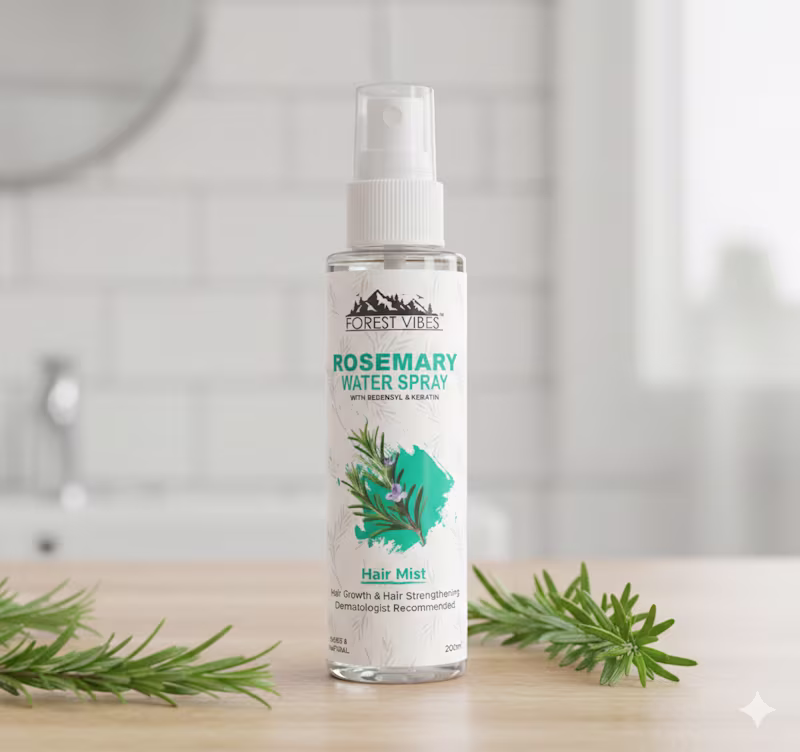
Indian Client Work Rosemary Water Spray Multiple Label Design. Here I have given samples of all the label designs I have prepared for my clients so that you can see and get ideas. My client liked one of the designs and printed that design and then sell products through the Label. If you want, you can also get such a label design from me. I also do full branding projects, so those who are going to start a new company can hire me for the full branding and product packaging design of the company.
2
90
Message
2
Md Zahid Hasan Khan
Here I have given samples of all the package designs I have prepared for my clients so that you can see and get ideas. My client liked one of the designs and printed that design and then sold it. If you want, you can also get such a label design from me. I also do full branding projects, so those who are going to start a new company can hire me for the full branding and product packaging design of the company.
2
74
Message
4
Md Zahid Hasan Khan
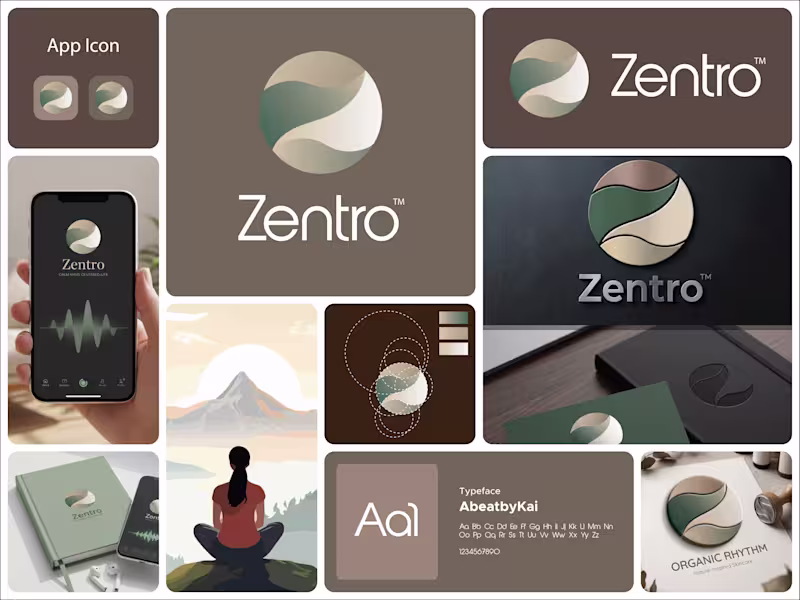
This logo for Zentro is built around calm, balance, and centered living. The symbol is a circular form, representing wholeness, unity, and completeness. It reflects the idea of being centered, both mentally and emotionally, which aligns perfectly with a meditation or mindfulness-focused brand. Inside the circle, the flowing shapes create a soft, continuous movement. These curves feel natural and organic, almost like a gentle path or breath flow. They subtly guide the eye through the mark, reinforcing a sense of calm and balance rather than tension or sharp direction. There’s also a quiet suggestion of a path or journey within the form. It hints at self-discovery and inner alignment without being literal, keeping the design minimal but meaningful. The color palette plays a big role here. The muted greens and earthy beige tones bring a grounded, natural feeling. Green connects to growth and harmony, while the warm neutrals add softness and stability. Together, they create a peaceful and reassuring visual tone. The typography is clean and modern, providing contrast to the organic symbol. It keeps the identity clear and professional while letting the icon carry the emotional and conceptual weight. Overall, the logo communicates a simple idea: Zentro is about finding balance, staying centered, and moving through life with calm and clarity.
4
112
Message
1
Md Zahid Hasan Khan
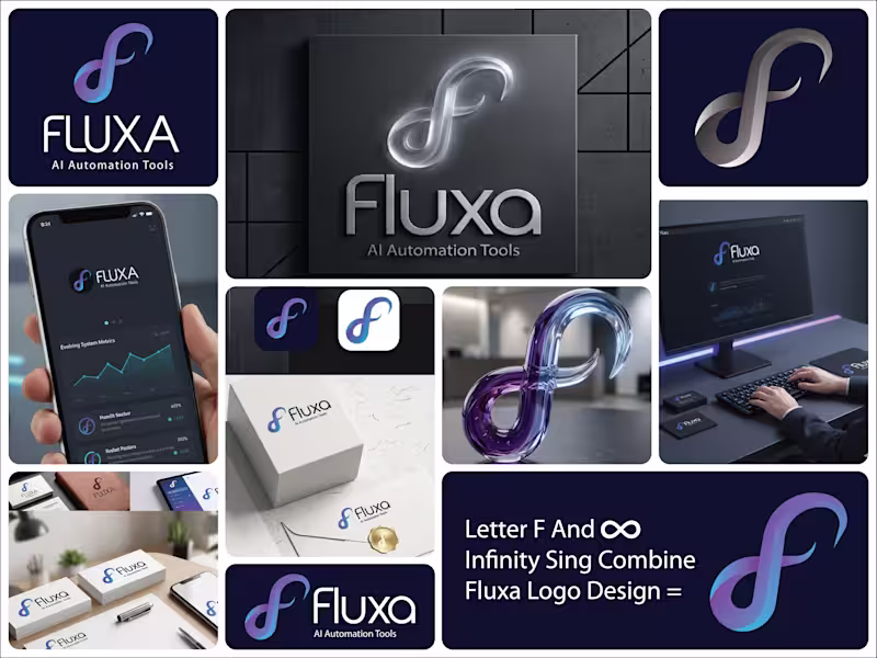
This logo for Fluxa – AI Automation Tools is built around the idea of continuous flow, adaptability, and intelligent systems. The symbol is the core of the identity. It takes on an infinity-like form, representing endless processes, automation loops, and systems that keep running without interruption. At the same time, the shape subtly hints at an “F,” tying it directly back to the brand name. The smooth, flowing curves communicate flexibility and evolution. Nothing feels rigid. This reflects how AI systems adapt, learn, and optimize over time rather than staying fixed. The gradient blend of blue and violet adds depth and a sense of movement. Blue brings trust and technology, while the shift into violet introduces innovation and forward-thinking. Together, they create a modern, intelligent feel. The typography is clean and minimal, allowing the symbol to carry the concept. It keeps the brand grounded and professional, making it suitable for tech platforms and scalable across different use cases. The spacing and simplicity also reinforce clarity, which is key for a brand focused on automation and efficiency. Overall, the logo communicates a clear message: Fluxa is about seamless, continuous systems that evolve, adapt, and work effortlessly in the background.
1
89
Explore projects