Brand Design Projects in Santo Domingo ProvinceBrand Design Projects in Santo Domingo ProvinceMARKS & FORMS 2026 — SPECIAL EDITION
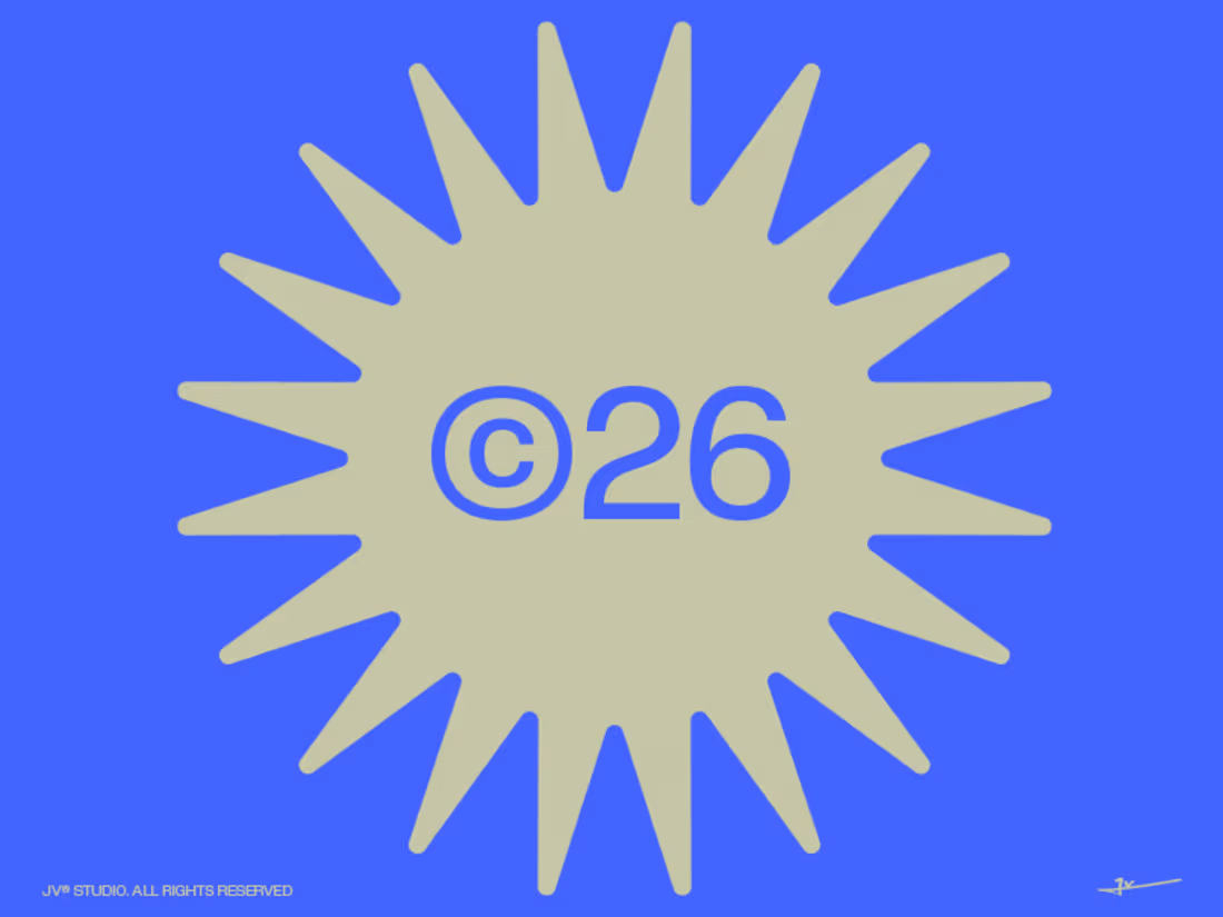
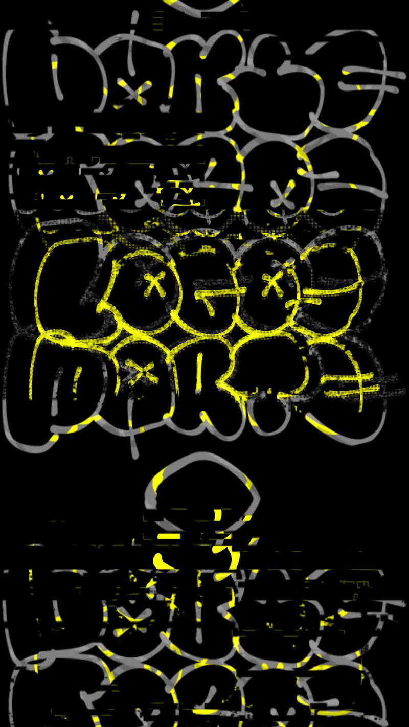
A curated exploration of modern logo design, brought together in a special edition — where concept, form, and contrast speak through a single visual language.
MARKS & FORMS is an ongoing exploration of identity, symbolism, and visual form through the discipline of logo design.
Each edition brings together a collection of original marks developed around different ideas, industries, and visual territories — from minimal geometric symbols to expressive, conceptual forms. Rather than following a single style, the project explores the endless possibilities within the language of identity design.
For its 2026 Special Edition, MARKS & FORMS continues to evolve as a visual archive of ideas, experimentation, and refinement. Every mark is approached as an independent visual statement while remaining part of a larger system defined by simplicity, intention, and strong form.
There are no predefined rules for what a mark should be.
Some begin with a letter.
Some with a symbol.
Some with an abstract idea.
Others emerge simply from the exploration of shape.
What connects them is the pursuit of a clear and memorable visual language.
MARKS & FORMS 2026 — SPECIAL EDITION is not a collection of trends. It is a study of possibilities — a continuous conversation between meaning and form.
Now live on Behance (https://www.behance.net/gallery/256176459/MARKS-FORMS-2026-SPECIAL-EDITION)
2026© - Jv® Studio. — Enmanuel Jimenez V. All rights reserved. MARKS & FORMS began in 2025 with a simple idea: to explore the endless possibilities of marks and forms.
What started as the first edition gradually became an ongoing collection of identities, symbols, experiments, and visual decisions — a space to explore, refine, and keep pushing my approach to identity design.
The first edition brought its first recognition. Then another. And another.
But every edition eventually reaches its final mark.
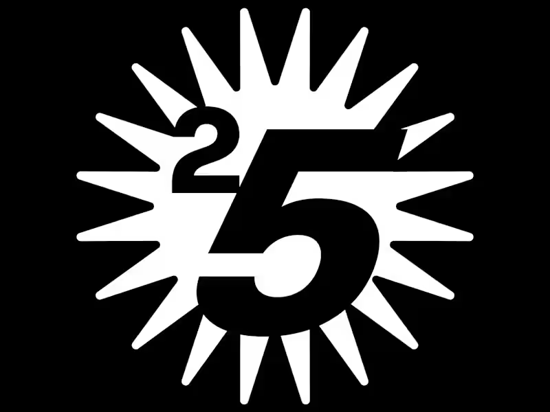
THE LAST DANCE (https://www.behance.net/gallery/255424595/MARKS-FORMS-2025-THE-LAST-DANCE) was created as the definitive closing piece of MARKS & FORMS 2025 — the final statement of a year of exploration.
And just one week after its release, on September 8, 2026, it received another Featured recognition on Behance.
A fitting way to close a chapter.
Now MARKS & FORMS continues into 2026, carrying everything that came before into a new edition, new marks, and new explorations.
One collection.
Two editions.
Countless forms.
Still evolving.
Explore the full MARKS & FORMS collection on Behance
And if you're looking for a designer to build an identity with intention, character, and a strong visual point of view — let's create something together.
→ Explore the collection
(https://www.behance.net/EnmaJv)→ Available for new projects (https://docs.google.com/forms/d/e/1FAIpQLSfNZ4OYJotGFT-CjWJcGKPu6BX2nIvbUqCII-1Lwwp0ZrKCQw/viewform) What if a space brand didn’t just look futuristic — but felt like it was already living in the future?
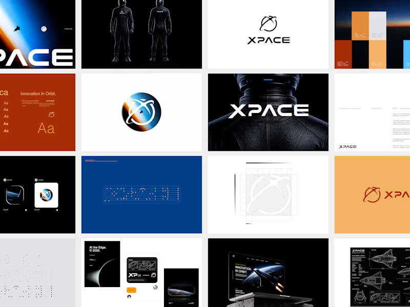
For XPACE, the goal was to build a visual identity that could turn the idea of space exploration into a complete and immersive brand experience.
The identity combines a bold typographic system, a high-contrast visual language, and electric blue accents against deep black to create a futuristic presence that feels precise, technological, and unmistakably XPACE.
But the identity didn’t stop at the logo.
The system was extended across digital interfaces, web design, favicon and UI icons, access cards, board passes, and branded applications — creating a consistent experience across every touchpoint.
Every detail was designed to make XPACE feel less like a brand inspired by the future, and more like a brand built for it.
XPACE — Visual Identity System.
Looking to build a visual identity that goes beyond a logo?
Let’s create something with a world of its own. What happens when you stop chasing the market and start watching it?
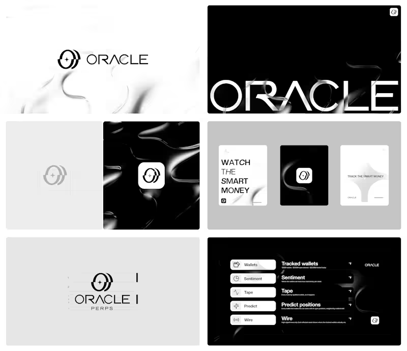
For Oracle Perps, the answer was a visual identity built around precision, transparency, and signal over noise.
Oracle Perps (https://oracleperps.com) is a market intelligence platform that tracks the positioning of leading perp wallets across Hyperliquid, Phoenix, and GMX — turning real-money activity into sentiment, live market intelligence, and graded predictions.
The challenge was to create a brand that could feel institutional and trustworthy without becoming cold or predictable. The identity needed to communicate observation, intelligence, and quiet confidence while standing apart from the visual clichés of crypto and trading.
The result is a dark-first visual system built around a precise geometric mark, a refined wordmark, and a restrained visual language designed to make complex market signals feel clear and intentional.
A quiet identity for a platform built to see what others miss.
Building a brand that deserves to be remembered? Let’s talk. MARKS & FORMS — a journey in marks, forms, and recognition.
What started in 2025 with the first edition of MARKS & FORMS has grown into an ongoing exploration of identity, symbolism, and visual systems.
From its first launch and first feature, through every new edition and recognition along the way, the collection has continued to evolve — becoming not only a personal archive of work, but a visual record of how my approach to identity design keeps moving forward.
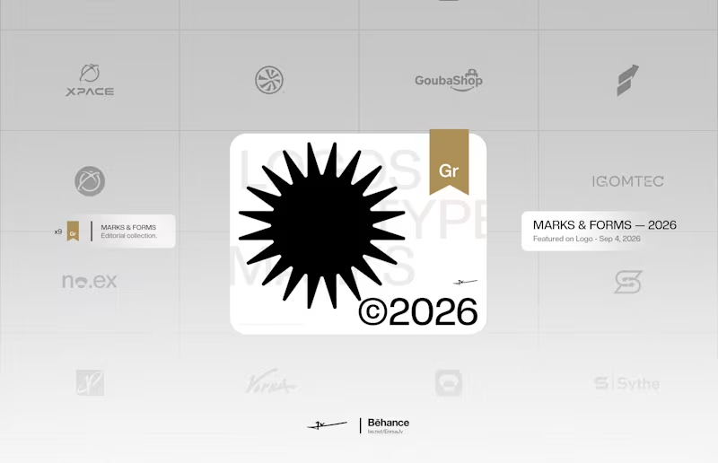
Now, in the 2026 edition, MARKS & FORMS has reached another milestone: its latest feature, bringing the collection to what I believe is its 9th badge of recognition.
Nine moments of being seen.
One collection that keeps growing.
MARKS & FORMS is an ongoing study of the marks we create, the forms we shape, and the ideas behind them.
Explore the full collection on Behance and discover the work behind every mark.
And if you're looking for a designer to build a distinctive identity for your next project, let's work together.
→ Explore MARKS & FORMS (https://www.behance.net/gallery/254382515/MARKS-FORMS-2026)
→ Interested in working together — Start your project here (https://docs.google.com/forms/d/e/1FAIpQLSfNZ4OYJotGFT-CjWJcGKPu6BX2nIvbUqCII-1Lwwp0ZrKCQw/viewform?usp=header) MOONIQ — Visual Identity System
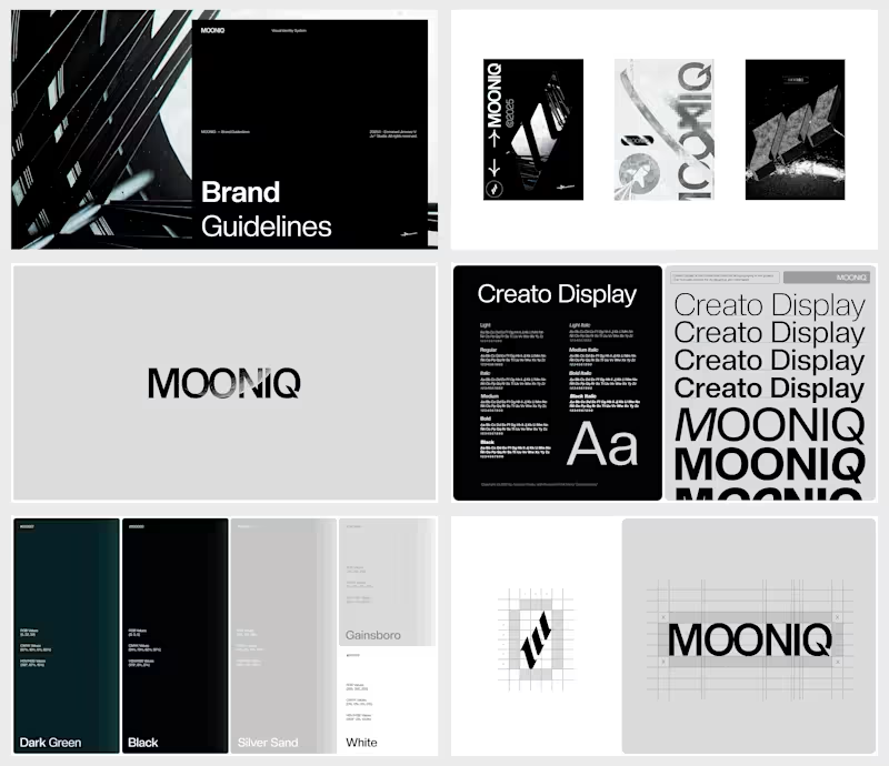
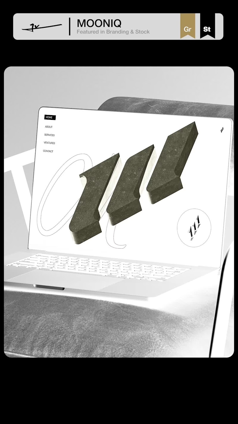
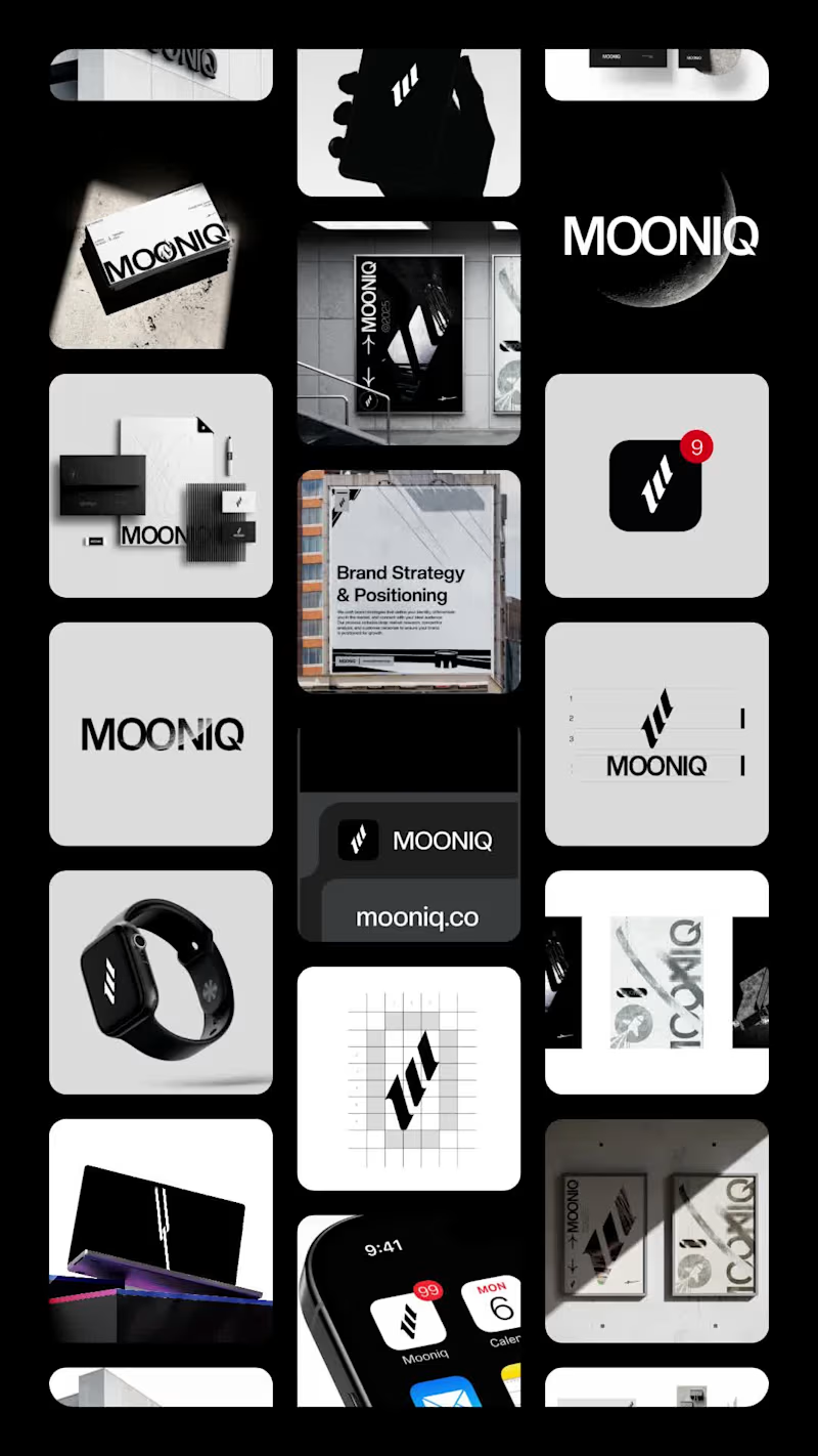
Mooniq is a leading digital marketing agency specialized in social media, blockchain, and Web2 consulting. Its new identity reflects a bold and futuristic vision, inspired by exploration and constant innovation. A system built to express ambition, trust, and elegance, positioning Mooniq as a guide for brands reaching new heights.
The brand required an identity that could embody its innovative spirit, strategic mindset, and futuristic vision.
This visual identity was designed to capture Mooniq’s essence: a forward-thinking agency inspired by the concepts of exploration, technology, and limitless growth. Every element of the system —from the logo to the typographic and chromatic choices— was created to establish a sophisticated and aspirational brand presence.
2025© - Jv® Studio. — Enmanuel Jimenez V. All rights reserved.
Featured project in Graphic Design / Branding & Stock by Behance
You can view the entire project here: Contra (https://contra.com/p/APbrvZOR-mooniq-visual-identity-system?r=enmanueljv) MARKS & FORMS — 2026
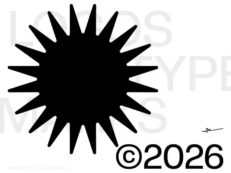
A curated collection of logos and marks exploring identity through form, concept, and visual precision.
MARKS & FORMS returns with its 2026 edition, continuing an ongoing exploration of logo design, visual identity, and the many ways a simple mark can communicate an idea.
This volume brings together a new selection of logos developed throughout the year, ranging from commissioned identities to independent explorations. Each mark represents a different approach to form, typography, symbolism, and reduction, while sharing a common pursuit: creating identities that are distinctive, intentional, and built to last.
Rather than following a single visual style, MARKS & FORMS celebrates the diversity of logo design. Monograms, custom lettering, abstract symbols, geometric constructions, and expressive marks coexist within the same collection, revealing how different visual languages can emerge from the same fundamental discipline.
Every logo begins with an idea. Through refinement, proportion, balance, and thoughtful reduction, that idea becomes a recognizable form. The process is not about adding more, but about discovering what is essential and giving it enough strength to stand on its own.
The 2026 edition reflects another chapter in that process — a growing archive of marks shaped by different challenges, industries, concepts, and creative directions. Together, they document an evolving approach to identity design and a continued commitment to creating work with clarity, character, and purpose.
MARKS & FORMS is an ongoing study of the relationship between form and meaning. Each edition captures a moment in that journey, preserving selected marks not simply as finished logos, but as records of experimentation, refinement, and creative growth.
Now live on Behance
(https://www.behance.net/gallery/254382515/MARKS-FORMS-2026)
2026© - Enmanuel Jimenez V. — Jv® Studio. All rights reserved. No.ex — Next Operational Experience
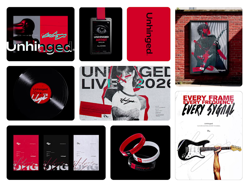
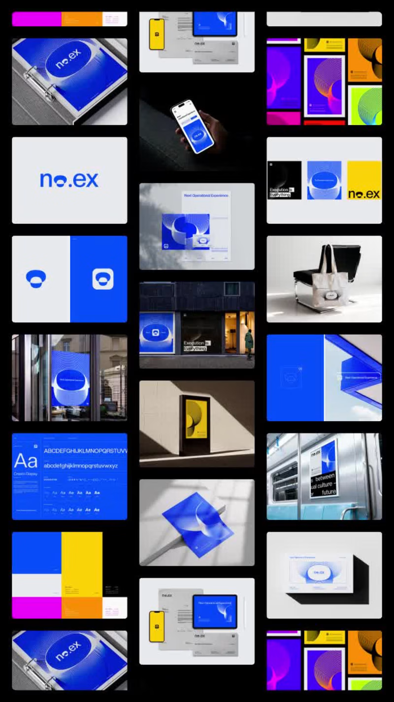
No.ex is a conceptual visual identity exploring how modern systems behave, evolve, and communicate through design.
Positioned between digital experimentation and physical presence, No.ex combines editorial structure, immersive visual direction, and future-oriented aesthetics to create a dynamic and adaptive identity language.
The project investigates movement, signal, structure, and interaction through posters, large-scale applications, environmental graphics, and visual systems designed for both digital and real-world spaces.
Rather than functioning as a traditional brand, No.ex exists as a visual framework — one that reflects contemporary culture, technological progression, and the constant evolution of modern communication.
2026© AMNE Studio.
Enmanuel Jimenez V.
Jv® Studio. —
All rights reserved. MOONIQ — Visual Identity System
Mooniq is a leading digital marketing agency specialized in social media, blockchain, and Web2 consulting. Its new identity reflects a bold and futuristic vision, inspired by exploration and constant innovation. A system built to express ambition, trust, and elegance, positioning Mooniq as a guide for brands reaching new heights.
The brand required an identity that could embody its innovative spirit, strategic mindset, and futuristic vision.
This visual identity was designed to capture Mooniq’s essence: a forward-thinking agency inspired by the concepts of exploration, technology, and limitless growth. Every element of the system —from the logo to the typographic and chromatic choices— was created to establish a sophisticated and aspirational brand presence.
2025© - Jv® Studio. — Enmanuel Jimenez V. All rights reserved.
Featured project in Graphic Design / Branding by @behance (https://www.instagram.com/behance/)