Freelance Brand Designers in Santo Domingo Province
Freelance Brand Designers in Santo Domingo Province
Sign Up
Post a job
Sign Up
Log In
Filters
2
Projects
People
Enmanuel Jimenez Veloz
Santo Domingo Province, Dominican Republic
Branding & Logo Designer | Visual Identity Specialist
48
Followers
Follow
Message
Branding & Logo Designer | Visual Identity Specialist
2
MARKS & FORMS 2026 — SPECIAL EDITION A curated exploration of modern logo design, brought together in a special edition — where concept, form, and contrast speak through a single visual language. MARKS & FORMS is an ongoing exploration of identity, symbolism, and visual form through the discipline of logo design. Each edition brings together a collection of original marks developed around different ideas, industries, and visual territories — from minimal geometric symbols to expressive, conceptual forms. Rather than following a single style, the project explores the endless possibilities within the language of identity design. For its 2026 Special Edition, MARKS & FORMS continues to evolve as a visual archive of ideas, experimentation, and refinement. Every mark is approached as an independent visual statement while remaining part of a larger system defined by simplicity, intention, and strong form. There are no predefined rules for what a mark should be. Some begin with a letter. Some with a symbol. Some with an abstract idea. Others emerge simply from the exploration of shape. What connects them is the pursuit of a clear and memorable visual language. MARKS & FORMS 2026 — SPECIAL EDITION is not a collection of trends. It is a study of possibilities — a continuous conversation between meaning and form. Now live on Behance (https://www.behance.net/gallery/256176459/MARKS-FORMS-2026-SPECIAL-EDITION) 2026© - Jv® Studio. — Enmanuel Jimenez V. All rights reserved.
2
69
4
MARKS & FORMS began in 2025 with a simple idea: to explore the endless possibilities of marks and forms. What started as the first edition gradually became an ongoing collection of identities, symbols, experiments, and visual decisions — a space to explore, refine, and keep pushing my approach to identity design. The first edition brought its first recognition. Then another. And another. But every edition eventually reaches its final mark. THE LAST DANCE (https://www.behance.net/gallery/255424595/MARKS-FORMS-2025-THE-LAST-DANCE) was created as the definitive closing piece of MARKS & FORMS 2025 — the final statement of a year of exploration. And just one week after its release, on September 8, 2026, it received another Featured recognition on Behance. A fitting way to close a chapter. Now MARKS & FORMS continues into 2026, carrying everything that came before into a new edition, new marks, and new explorations. One collection. Two editions. Countless forms. Still evolving. Explore the full MARKS & FORMS collection on Behance And if you're looking for a designer to build an identity with intention, character, and a strong visual point of view — let's create something together. → Explore the collection (https://www.behance.net/EnmaJv)→ Available for new projects (https://docs.google.com/forms/d/e/1FAIpQLSfNZ4OYJotGFT-CjWJcGKPu6BX2nIvbUqCII-1Lwwp0ZrKCQw/viewform)
4
268
28
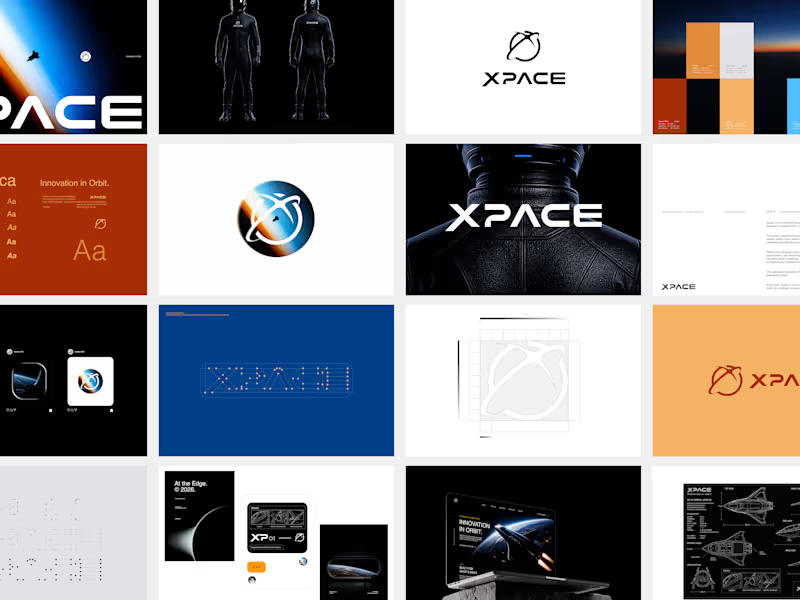
What if a space brand didn’t just look futuristic — but felt like it was already living in the future? For XPACE, the goal was to build a visual identity that could turn the idea of space exploration into a complete and immersive brand experience. The identity combines a bold typographic system, a high-contrast visual language, and electric blue accents against deep black to create a futuristic presence that feels precise, technological, and unmistakably XPACE. But the identity didn’t stop at the logo. The system was extended across digital interfaces, web design, favicon and UI icons, access cards, board passes, and branded applications — creating a consistent experience across every touchpoint. Every detail was designed to make XPACE feel less like a brand inspired by the future, and more like a brand built for it. XPACE — Visual Identity System. Looking to build a visual identity that goes beyond a logo? Let’s create something with a world of its own.
11
28
2.4K
37
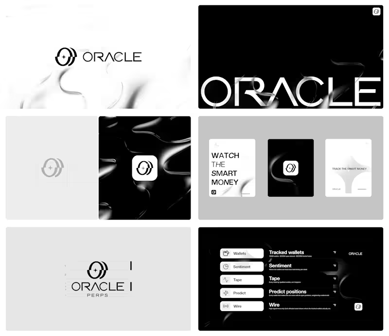
What happens when you stop chasing the market and start watching it? For Oracle Perps, the answer was a visual identity built around precision, transparency, and signal over noise. Oracle Perps (https://oracleperps.com) is a market intelligence platform that tracks the positioning of leading perp wallets across Hyperliquid, Phoenix, and GMX — turning real-money activity into sentiment, live market intelligence, and graded predictions. The challenge was to create a brand that could feel institutional and trustworthy without becoming cold or predictable. The identity needed to communicate observation, intelligence, and quiet confidence while standing apart from the visual clichés of crypto and trading. The result is a dark-first visual system built around a precise geometric mark, a refined wordmark, and a restrained visual language designed to make complex market signals feel clear and intentional. A quiet identity for a platform built to see what others miss. Building a brand that deserves to be remembered? Let’s talk.
24
37
2K
Brand Designer
(22)
Follow
Message
Rafael Llaverias
Santo Domingo Province, Dominican Republic
Wix Studio Expert | Web&App | SEO Especialist
Follow
Message
Wix Studio Expert | Web&App | SEO Especialist
0
Sitio Web para la industria de Viajes / Travels
0
2
0
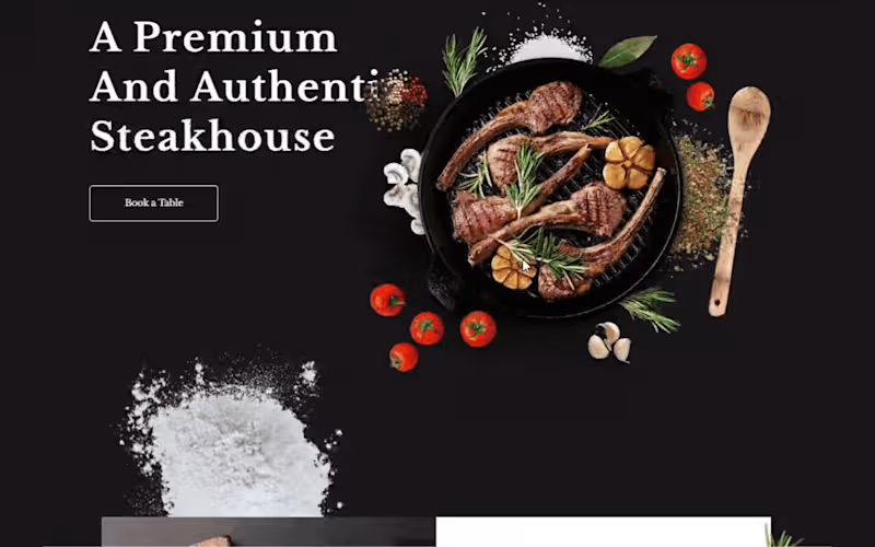
Diseño web para la industria de Restaurantes
0
3
2
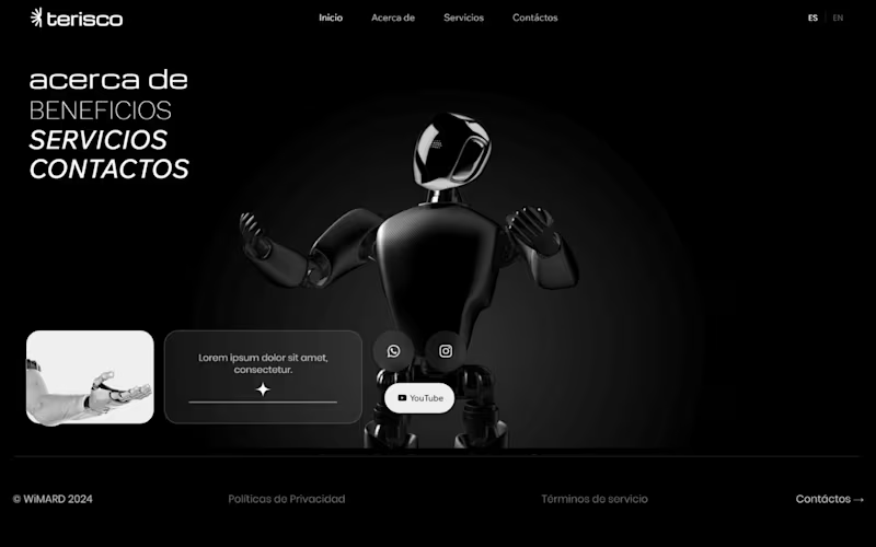
Sitio Web dinámico para industria tecnológica
2
4
0
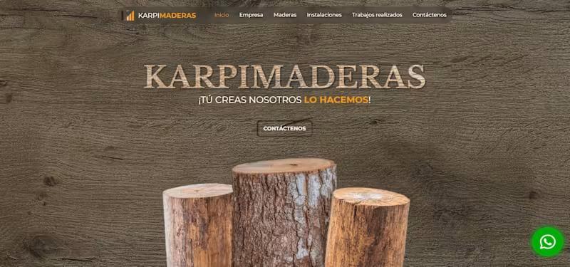
¡Diseño web para la industria de la madera!
0
4
Brand Designer
(3)
Follow
Message
Explore people