I designed and developed this landing page for Stereo Fest: Eclipse, the upcoming youth event for @caminodevida.
The visual concept comes from a simple truth: the moon has no light of its own, it only reflects the light of the sun.
In the same way, we weren’t made to generate our own light, but to reflect Jesus.
The cool part: as you scroll, you control the movement of the moon. Right at the core phrase, the eclipse happens, showing that in the darkness, the Glory of God is revealed.
Check it out here: stereofest.com (http://stereofest.com)
13
17
1.1K


Can a website feel like a safe place?
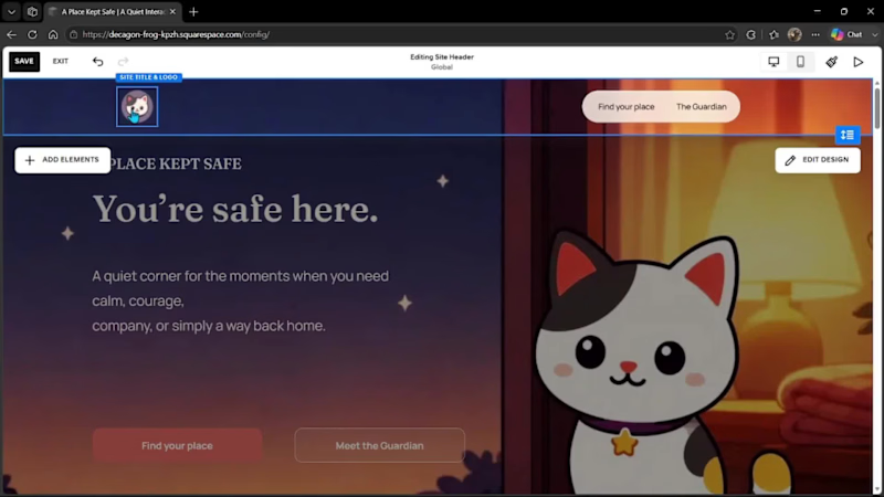
That question became A Place Kept Safe, a digital experience created for moments when someone needs calm, courage, company, or simply a reminder of what it feels like to be home.
The little cat is not merely a decorative mascot. I made her The Guardian because cats have a unique way of caring: they do not ask questions, try to fix everything, or demand attention. They simply stay close. Sometimes, that quiet presence is exactly what we need.
The entire experience was designed around that idea. Visitors can choose the emotional space they need and explore a series of illustrated scenes shaped by a warm color palette, editorial typography, and deliberately gentle motion. The Guardian remains the narrative thread connecting every part of the journey.
Finish Layer helped translate this visual direction into a responsive design system using Stacks, Block Hiding, Block Transforms, and Block Animations. I created device-specific compositions, structured content hierarchies, subtle visual offsets, and progressive entrances to preserve the rhythm of the experience without overwhelming the visitor.
For the final scene, I developed a custom interaction in JavaScript and CSS: a sequence of 24 transparent frames synchronized with scroll progress, in which The Guardian follows a light, moves forward, gradually slows down, and finally rests.
The implementation combines normalized scroll progress, smooth interpolation, requestAnimationFrame, IntersectionObserver, GPU-accelerated translate3d transforms, and independent motion paths for different screen sizes. It also includes a prefers-reduced-motion fallback, preserving the narrative for visitors who prefer a more static experience.
The result is not intended to give advice or solve what someone may be feeling. It simply keeps a light on, offers a quiet journey, and reminds us that some forms of care are understood through what they quietly do.
A Place Kept Safe is an emotional idea brought to life as an interactive, responsive, and technically crafted web experience.
Private website: https://decagon-frog-kpzh.squarespace.com/
Password: 123
1
166

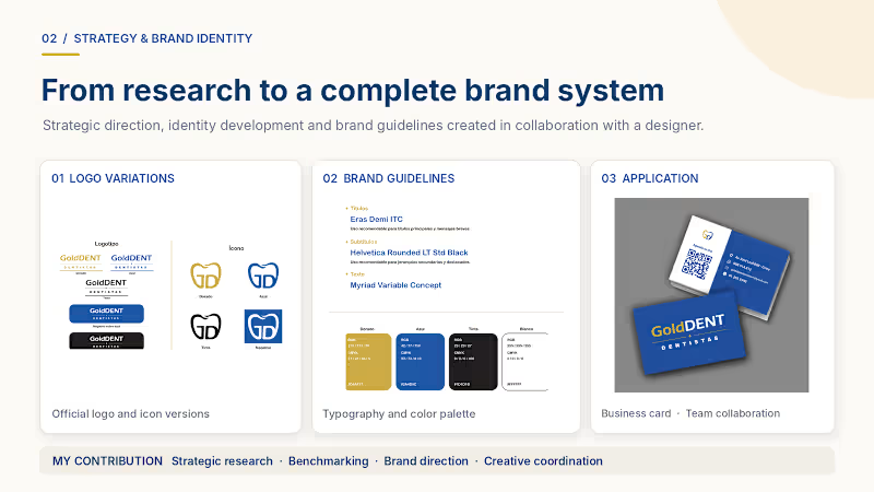
Gold Dent | Brand Strategy, Website & Digital Presence
Marketing & Branding Consultant | Project Lead
I led the branding and digital presence development for Gold Dent, a dental clinic in Lima. My role included strategic research, competitor benchmarking, website structure and content creation, Wix setup, Google Business Profile optimization, and project coordination. The result was a more cohesive brand identity and a published digital presence across key patient touchpoints.
0
38