Projects using Google Antigravity in RawalpindiProjects using Google Antigravity in RawalpindiTitle: Axon Modular — High-Performance Architecture for Technical Apparel
Overview
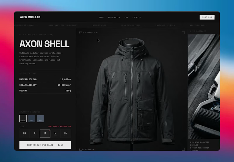
Axon Modular is a conceptual digital storefront engineered for a performance outerwear brand. The goal of this project was to bridge the gap between traditional e-commerce and a native software experience. By employing a high-performance minimalist aesthetic, the interface prioritizes absolute mathematical precision, frictionless user flow, and rapid conversion over standard, static template designs.
The Design Philosophy
The visual language draws heavily from tech-focused, dark-brutalist architecture. By utilizing an explicit grid system, high-contrast states, and a stark obsidian color palette, the interface mimics a high-end desktop application. This structural approach ensures the product’s technical specifications are delivered with ultimate clarity and zero visual clutter.
Key Technical & Interactive Features
App-Like Variant Matrix: Engineered an interactive product module where colorway and size selections trigger instant, mechanical state changes. The UI responds with physical "weight," utilizing snappy, 200ms transitions that feel tactile and highly responsive.
Conversion-Optimized Flow: Integrated dynamic micro-copy and live-state indicators, such as low-stock alerts, directly into the selection grid to drive urgency without disrupting the premium aesthetic.
Strict Design System & Tokens: Built on a robust, scalable foundation of reusable components. Every padding, margin, and typography scale adheres to strict grid rules, ensuring the entire visual identity can be seamlessly translated into a functioning Shopify architecture.
Data-Driven Typography: Utilized monospace fonts for specifications and data points to contrast with clean sans-serif headers, reinforcing the brand's technical, lab-tested identity.
The Result
A flawlessly structured, highly interactive landing page that guides the user from exploration to purchase with zero friction. It serves as a blueprint for how technical DTC brands can leverage advanced UI/UX to elevate their perceived value and streamline the path to checkout.
Capabilities Demonstrated
UI/UX Concept & E-Commerce Flow
High-Fidelity Prototyping & Micro-Interactions (Antigravity IDE)
Design System Architecture (Tokens, Variables, Components)
Conversion-Focused Layout Design Introducing OneCart — a modern, full-stack fashion e-commerce platform built for a seamless shopping experience across Men, Women, and Kids categories.
🛍️ Home Page — A bold hero banner with rotating slides, "Fashion Made for Everyone" messaging, and a clean navigation bar (Home, Collections, About, Contact) with live cart count.
🧥 All Collections Page — Smart sidebar filters by Category (Men/Women/Kids) and Subcategory (Topwear, Bottomwear, Winterwear), plus a "Sort By: Relevant" dropdown for easy browsing across a full product grid with pricing.
💬 About Us Section — A clean, editorial-style layout introducing the brand story and mission alongside lifestyle imagery.
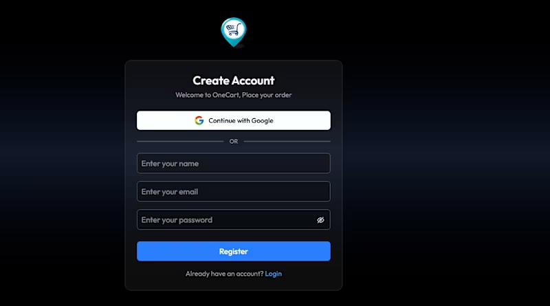
🔐 Authentication Flow — A sleek Create Account screen with Google OAuth sign-in and standard email/password registration, matching the site's dark, minimal aesthetic throughout.
Built with a focus on responsive design, intuitive navigation, and a consistent dark-mode UI with gold accent branding — OneCart delivers a premium, distraction-free shopping experience from landing page to checkout.
💻 Tech stack / features you can customize: [add your stack here — e.g., React, Node.js, MongoDB, Stripe] Title: Monolith — Cinematic E-Commerce Experience for Luxury DTC
Overview
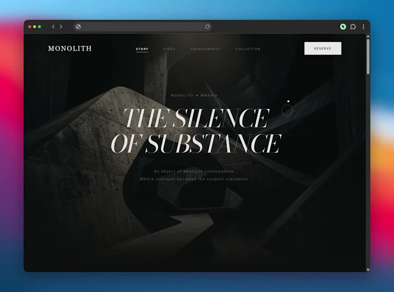
Monolith is a conceptual, high-performance landing page designed for an ultra-luxury consumer goods brand. The objective was to move away from static, traditional e-commerce layouts and instead build an immersive, "alive" digital environment. By treating the browser as a cinematic canvas, the design communicates absolute premium quality through intentional motion, deep contrasts, and frictionless storytelling.
The Design Philosophy
The core aesthetic relies on a high-performance minimalist framework. Every pixel serves a purpose. By utilizing a stark, monochromatic palette and a highly refined typography scale, the product itself becomes the undisputed focal point. The user experience is designed to feel heavy, viscous, and deliberate—matching the physical properties of luxury hardware.
Key Technical & Interactive Features
Cinematic Scroll Architecture: Implemented scroll-driven, perspective-shifting macro pans that guide the user's eye through the intricate details of the product without requiring clicks.
Intentional Micro-Interactions: Replaced standard snappy animations with slow, viscous transitions. Accordions and text reveals unfold smoothly with precise cubic-bezier timing, creating a sense of unfolding space.
Frictionless Information Architecture: Designed scannable, sticky specification sections that lock into the viewport, allowing users to absorb technical data alongside stunning visual assets seamlessly.
Robust Design System: Built on a strict token-based system including defined color variables, a fluid typography scale, and reusable component architectures (like the dynamic FAQ accordions and interactive collection grids) ready for direct integration into platforms like Shopify.
The Result
A flawlessly smooth, app-like web experience that elevates the brand identity and drives conversion through sheer visual authority and tactile digital interaction.
Tools & Workflows
UI/UX Design & Prototyping
Antigravity IDE & Google Stitch for rapid, high-fidelity interaction generation
Framer Motion / Advanced CSS Transitions
Responsive Grid Architecture Memento — A Notes App Where Memories Decay
Live app: https://memento-navy.vercel.app
Every notes app treats a thought from three years ago identically to one from this morning. Memento doesn't.
Notes decay visually from the moment they're created — across typography weight, contrast, border integrity, and color temperature — until they become near-invisible archaeological artifacts. A note from today is sharp and vivid. A note from six months ago is a ghost. The archive isn't a list. It's fog. Pinning a note revives it — it returns warm and glowing, carrying the memory of having faded.
Eight decay states. One continuous system. The interface is alive because time is acting on it constantly — even while you sleep.
—
HOW I USED STITCH
I've been using Stitch since it first launched, and this project pushed it harder than anything I've built with it.
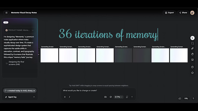
The entire visual system — all 8 decay states — was designed simultaneously on Stitch's infinite canvas using multi-screen generation. I wrote a single detailed prompt specifying exact hex values, typography weights, opacity levels, and border behavior for each state, then used targeted follow-up prompts to refine individual screens without disrupting the system. The workflow was: Stitch for the full design system → HTML/CSS export → Antigravity to build the functional React/Next.js app using Stitch exports as visual reference → deployed on Vercel.
The most interesting challenge was making decay feel considered rather than broken — Stitch's rapid iteration helped me find the line between "elegantly faded" and "unreadably dark" faster than any other tool would have.
—
FEEDBACK ON STITCH
I've used Stitch across several projects since launch and it's genuinely changed how I approach UI work — the speed from concept to exportable interface is unlike anything else available.
One honest observation: visual continuity across screens can drift, particularly on the Flash model. When generating a system of related screens, subtle inconsistencies in spacing, border radius, and color values creep in between generations. The Pro model handles this significantly better, but it's worth noting for anyone building multi-screen products.
That said — Stitch moves the bottleneck from "can I design this" to "can I think clearly about what I want." That's exactly where the bottleneck should be.
Title: Fluid Editorial: AI-Powered Transcript Summarizer
Platform: Web Application / AI SaaS
Live Demo: notes-summarizer-nu.vercel.app (http://notes-summarizer-nu.vercel.app)
Overview:
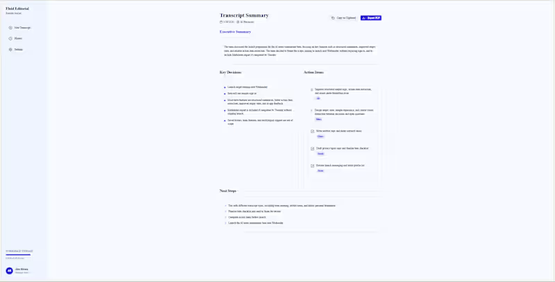
Fluid Editorial is an AI-driven productivity workspace designed to convert raw, messy meeting transcripts into polished, actionable documentation. Built with a crisp, modern, light-mode enterprise aesthetic, the application acts as a "Remote Atelier," instantly structuring unstructured data so teams can focus on execution rather than administration.
The tool bypasses the standard "wall of text" output typical of basic AI wrappers, instead utilizing a highly opinionated UI that separates insights into distinct, scannable architectural blocks: Executive Summaries, Key Decisions, Action Items, and Next Steps.
Key Features:
Frictionless Ingestion: Supports direct text pasting or drag-and-drop file uploads (.txt, .docx, .pdf up to 50MB) for rapid processing.
Granular AI Control: Users can customize the processing parameters before generation, selecting specific summary styles (e.g., Executive), tones of voice, and toggling automatic speaker detection.
Structured Action Extraction: The AI doesn't just summarize; it actively assigns tasks. The output dashboard isolates specific action items and visually assigns them to recognized team members via UI tags.
Workspace Management: Features a built-in History Dashboard with a searchable index of past transcripts, a workspace storage tracker, and native one-click PDF exports for easy team distribution.
My Role:
End-to-end development, including enterprise SaaS UI/UX design, frontend engineering, and AI prompt-structuring to guarantee consistent, highly formatted data outputs. Title: SubTracker: Minimalist Subscription Manager
Platform: Android
Live Link: avgdev.gumroad.com/l/subtracker (https://avgdev.gumroad.com/l/subtracker)
Overview:
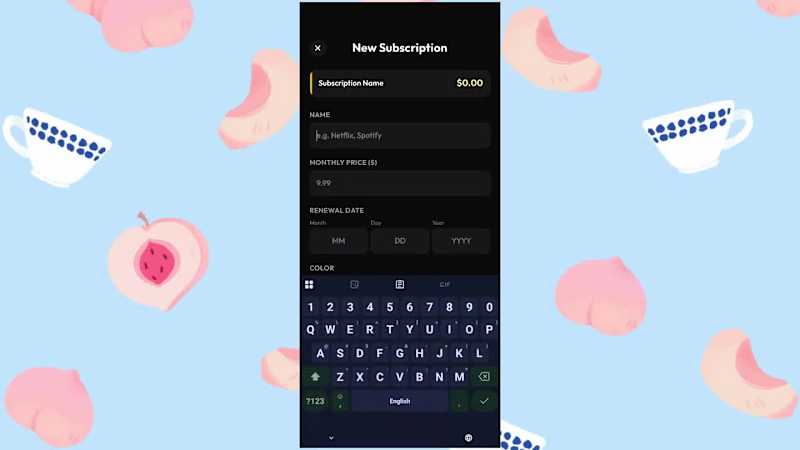
SubTracker is a streamlined Android application designed to put users back in control of their recurring digital expenses. With the rapid growth of subscription-based services, SubTracker eliminates financial blind spots by providing a friction-free, intuitive dashboard to monitor where money is going every month.
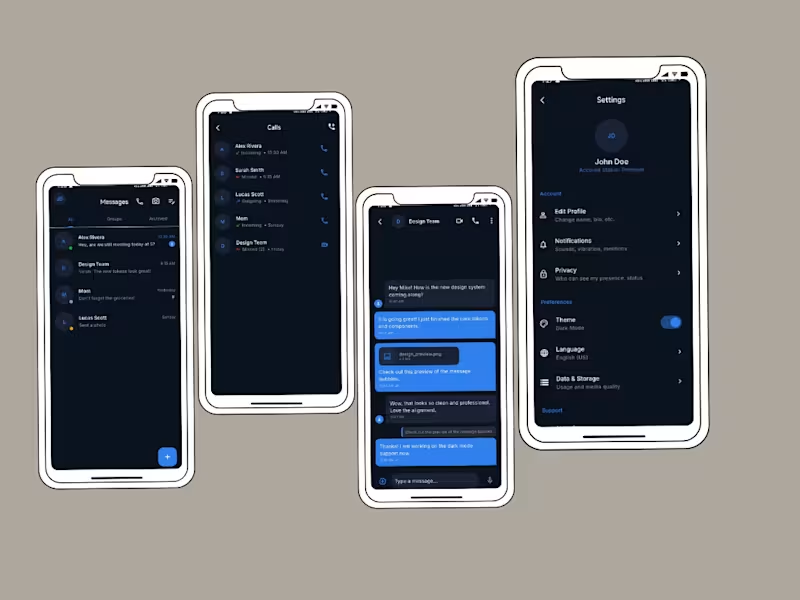
Built utilizing Antigravity and Lovable, the application prioritizes a clean, minimalist, Apple-esque design language within the Android ecosystem. The dark-mode interface utilizes high-contrast color coding and typography to make financial data instantly readable, stripping away unnecessary clutter to focus entirely on user experience.
Key Features:
Proactive Alerts: Automated notifications trigger exactly two days before any subscription renews, giving users ample time to cancel unwanted services before they are charged.
Financial Insights: The dashboard automatically calculates both monthly and yearly spending overhead, translating small monthly fees into their true annual cost.
'Most Expensive' Target: A dedicated UI card highlights the highest-cost subscription, actively showing users how much they could save annually by cutting their biggest expense.
Seamless Data Entry: A simplified, color-coded input flow allows users to add new subscriptions (like Netflix, Spotify, or Amazon Prime) in seconds.
My Role:
End-to-end product development, including UI/UX design, dark-mode color theory application, and frontend Android development. Frame.io (http://Frame.io) Was Supposed to Make Client Feedback Easier. Instead, It Made Billing a Full-Time Job.
If you've ever sent a video to a client and gotten back a voicemail saying "the thing at like... the two-minute-ish mark, change that" — you already know the problem. Client feedback on video is broken. And the tools that exist to fix it are either too expensive, too bloated, or require your client to create an account just to leave a single comment.
Reel was built to fix exactly that.
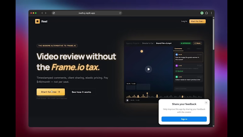
Reel is a browser-based video review and approval platform built for freelance editors, motion designers, small post-production studios, and anyone who needs clean, professional client feedback without the enterprise price tag. Upload your cut, share a link, get frame-accurate timestamped comments back — no client login required. That's it. That's the whole product.
What Is Reel?
Reel is a lightweight, focused alternative to Frame.io (http://Frame.io). It gives you the core review workflow that editors actually need: upload a video, share a private review link, and collect precise timestamped feedback from clients directly on the timeline — all inside a clean, distraction-free player.
There are no complicated workspaces to set up. No per-seat fees that scale against you as your client list grows. No bloated feature sets designed for 50-person studios when you're running a lean freelance operation. Just a fast, professional review tool that works the way you already think about your projects.
The Features That Actually Matter
Frame-Accurate Timestamped Comments
Clients click directly on the video timeline and leave a comment tied to that exact frame. No more "around the 2-minute mark" — every piece of feedback is pinned to a precise moment so you know exactly what to fix, the first time.
No-Login Share Links for Clients
Your client doesn't need to create an account, download an app, or navigate a dashboard. You share a link. They watch. They comment. Done. This alone eliminates the single biggest source of friction in the review process.
Project Dashboard with Approval Status
Every video project lives in your Reel dashboard with a clear status: In Review, Changes Requested, or Approved. At a glance, you know exactly where every project stands across all your clients.
Clean Distraction-Free Player
The review experience is built around the video, not around the interface. No cluttered sidebars, no feature overload — just the cut, the timeline, and the feedback panel. Your client stays focused on the work.
Cloudflare R2-Powered Storage
Reel runs on Cloudflare R2 infrastructure — fast, global, and built to handle real production files without breaking a sweat. Video loads fast, playback is smooth, and your files are secure.
Why Reel Instead of Frame.io (http://Frame.io)?
Let's be direct about it. Frame.io (http://Frame.io) was a great product. Then Adobe acquired it, and what was once a beloved indie tool became a line item inside Creative Cloud with per-seat pricing that makes zero sense for small teams and solo operators.
Reel is built for the people Frame.io (http://Frame.io) left behind:
Freelance video editors who work with 3-10 clients at a time
Motion designers who need to share animation drafts for approval
Small production studios that can't justify $50/seat/month for a review tool
YouTubers and content creators who need clean client sign-off on sponsored content
Indie filmmakers and animators collecting director feedback on cuts
With Reel, there are no per-seat charges, no collaborator limits on your shared review links, and no surprise overage fees when you have a busy month. It's a flat, simple pricing model designed for people who treat their tools as business expenses, not budget line items.
The Story Behind It
Reel was built by a solo developer in a weekend out of genuine frustration with the existing tools. The goal was simple: create the most focused, most frictionless video review workflow possible. No feature bloat. No enterprise nonsense. Just the core workflow that editors use every single day.
The first version went live on a Friday. By Sunday, editors were using it on real client projects. A Reddit post about it on r/premiere hit over 9,000 views before it was removed by a moderator — which, ironically, was the strongest possible signal that Reel was hitting a real nerve in the editing community.
Reel is currently in open beta. It's free to try, no credit card required.
Who Is Reel Built For?
Reel is for any creative professional who shares video with clients or collaborators and needs structured, frame-accurate feedback. Specifically:
Freelance Video Editors — You're managing multiple clients, multiple projects, and you need a professional review workflow that doesn't eat into your margins. Reel is built around your actual workday.
Motion Designers and Animators — Sharing a render for feedback shouldn't require a 10-minute client onboarding call. Reel makes the review link the entire onboarding.
Small Production Studios — You need the same professional review workflow as a large post-production house, just without the enterprise software contract.
YouTubers and Content Creators — Brand deals and sponsored content require client approval. Reel gives you a paper trail of exactly who approved what and when.
Indie Filmmakers — Getting feedback from directors, producers, and collaborators scattered across time zones is hard. Reel makes it asynchronous and frame-precise.
What's Coming Next
Reel is actively being developed. The roadmap includes:
Live billing via LemonSqueezy with Solo and Studio plans
Custom domain and branded workspace for a polished client experience
Review history and activity log per project
Video version stacking — upload V1, V2, V3 and track feedback across iterations
Quality-of-life improvements based on real editor feedback from beta users
Try Reel Free During Beta
Reel is free to use right now. No credit card. No waitlist. No hoops.
Sign up, upload your first cut, share the review link with a client you trust, and see how it changes the back-and-forth. If it saves you even one revision cycle or one confusing email thread, it's already worth it.
Reel. Built for editors who just want to get it approved and get it done.
PS : There's an update coming in a month or so, so servers might be down 🤞👀