Projects using Adobe Illustrator in Rajshahi DivisionProjects using Adobe Illustrator in Rajshahi DivisionLuxury Brand Identity System for a Premium Event Planning Business
PROJECT DESCRIPTION:
Mynt Events is a premium event planning business built around moments that matter — proposals, curated celebrations, and experiences where every detail is considered and nothing is left to chance. The founder came to me with a business that had already outgrown its brand. The work was operating at a premium level. The identity wasn't communicating that yet.
The brief was clear: build a complete brand identity system that positions Mynt Events as the obvious choice for clients who already know what they want and are deciding who to trust with it.
The Strategic Starting Point
Every decision in this project started with a single question: what does a client need to feel the moment they encounter this brand for the first time?
For Mynt Events, that feeling needed to be confidence. Trust. The quiet certainty that this is a business that handles things properly — that the moment they're planning will be in the right hands.
That emotional target shaped every mark, every color choice, and every surface application that followed.
The Logo
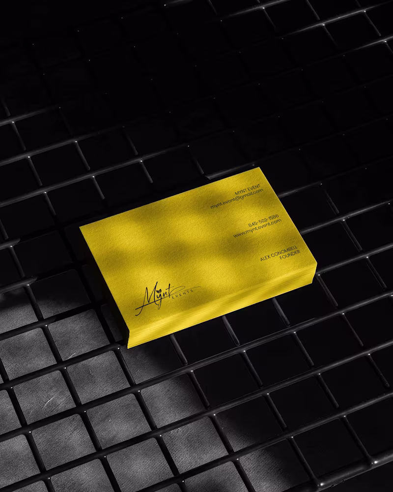
The primary mark is a signature script logo with a leaf detail structurally embedded within the letterforms. The script was chosen deliberately — in the events industry, clients are trusting you with moments that cannot be redone. A signature communicates personal commitment. It feels authored, not assembled.
The leaf element does secondary brand work quietly. It signals organic intention, care, and attention to detail without requiring explanation or a separate icon.
The underline sweep grounds the composition and gives it the horizontal confidence it needs to hold across wide-format surfaces — packaging lids, signage panels, and environmental applications where a floating mark would lose presence.
A monogram M was developed as a secondary mark for applications where the full signature loses legibility at small scale — product labels, cap patches, and interior packaging details.
The Palette
Gold and black. Not chosen for trend. Chosen for emotional function.
Gold carries warmth, occasion, and perceived value — the feeling of something worth celebrating. Black carries authority, precision, and restraint — the feeling of a business that delivers without drama. Together they position Mynt Events exactly where it needs to sit: celebratory but controlled, personal but professional.
The palette was tested across matte, gloss, foil, backlit, and fabric applications to confirm it held integrity across every surface in the system without compensation or adjustment.
The Full Identity System
Every deliverable was designed as part of a single coherent brand expression — not a collection of individual design tasks, but a system where every piece reinforces every other piece:
— Primary signature logo and monogram secondary mark
— Full brand palette and typography hierarchy
— Premium gold foil business card
— Luxury magnetic gift box with full interior branding
— Ring box and product packaging application
— Branded tote bag
— Apparel — t-shirt and structured cap with patch application
— Backlit environmental signage panel
— Digital UI and mobile wallpaper application
The Result
A brand identity system that closes the gap between what Mynt Events delivers and what a client sees before they ever make contact. The brand now works at a proposal ring box and a storefront signage panel simultaneously — with the same presence, the same authority, and the same unmistakable identity at every scale.
That's not styling. That's positioning. And positioning is what turns a great business into the obvious choice.
SERVICES INCLUDED IN THIS PROJECT:
Brand Strategy, Logo Design, Visual Identity System, Monogram Design, Business Card Design, Luxury Packaging Design, Gift Box Design, Apparel Design, Environmental Signage Design, Digital UI Application, Brand Collateral Design, Full Brand System
KEYWORDS:
Luxury Event Brand Identity, Signature Logo Design, Event Planner Branding, Gold Brand Identity, Script Logo Design, Visual Identity System, Custom Logo Design, Brand Identity Designer, Luxury Logo Design, Event Brand Design, Handcrafted Logo Design, Premium Brand Identity, Calligraphy Logo Design, Brand Mockup Design, Logo Design Concept, Black And Gold Branding, Event Planner Logo, Signature Brand Identity, Full Brand System, Brand Strategy Design Stays Worth Remembering Travel Company Logo Design 2026.
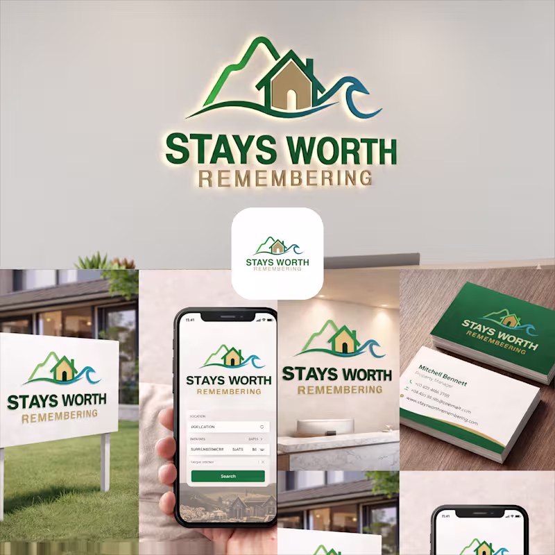
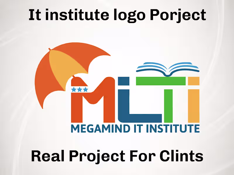
The idea behind this logo was to create a visual identity that instantly communicates comfort, memorable experiences, and destination-based stays in a clean and meaningful way.
The mountain element represents travel, adventure, peaceful escapes, and beautiful destinations. It gives the brand a sense of exploration and unforgettable journeys. The house placed in the center symbolizes comfort, hospitality, safety, and the feeling of being “at home” no matter where someone travels.
The wave element was added to represent relaxation, premium vacation experiences, and destinations connected to nature, lakes, beaches, or peaceful environments. Together, the mountain, home, and wave create a complete story of travel and memorable stays.
For the typography, I used a bold and clean font to make the brand look professional, trustworthy, and easy to recognize across both digital and physical platforms. The word “REMEMBERING” uses a softer gold tone to create a warm emotional feeling and reinforce the idea that these stays are not just accommodations, but experiences people will remember for a long time.
The green color palette represents nature, growth, relaxation, and trust, while the blue wave adds freshness, calmness, and a travel-inspired feeling. Overall, the logo was designed to feel welcoming, modern, memorable, and versatile for signage, branding materials, business cards, websites, and mobile applications.