Illustration Projects in Rajshahi DivisionIllustration Projects in Rajshahi DivisionAura Aesthetic & Longevity Clinic — Exploration Concepts ✨🌿
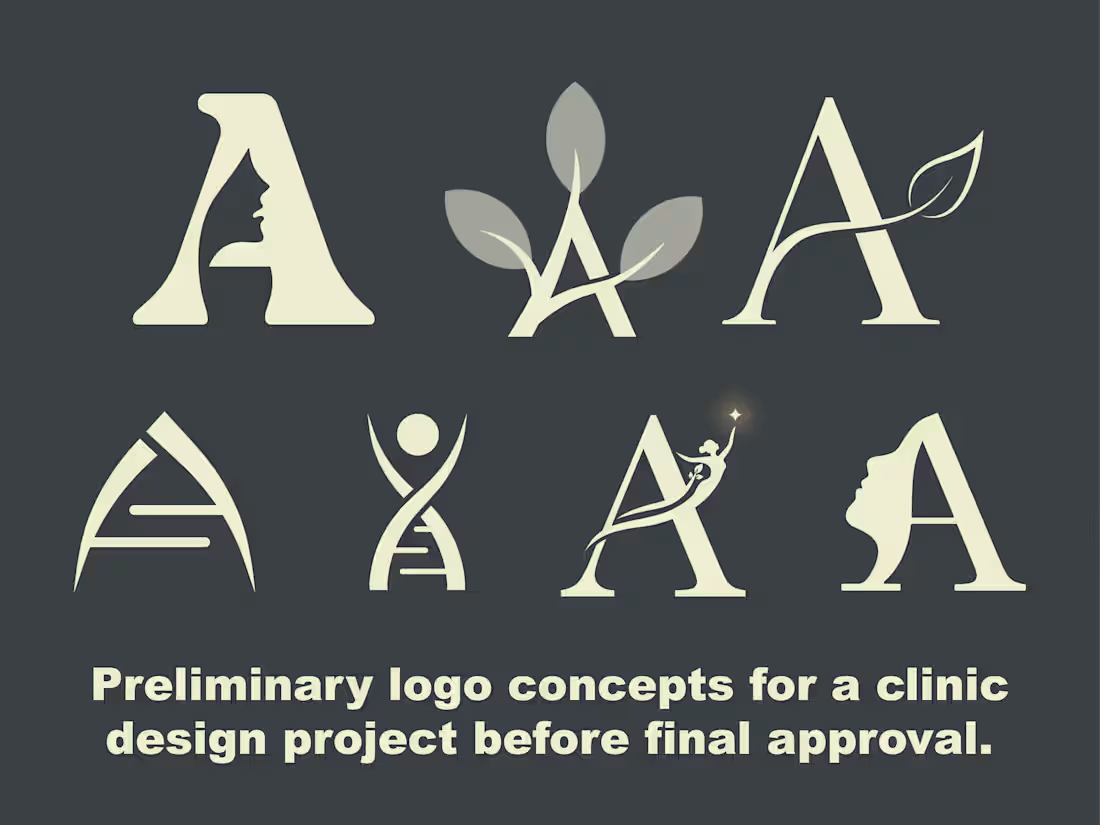
Here is a collection of preliminary logo concepts explored for Aura Aesthetic & Longevity Clinic before finalizing the core visual identity.
The primary challenge was to seamlessly combine the initial letter 'A' with elements representing facial aesthetics, natural rejuvenation, longevity, and clinical precision—all while maintaining a premium, high-end, and elegant appeal.
💡 Concept Breakdown & Design Rationale:
👤 Facial Profile & Negative Space: Monograms incorporating a sleek silhouette in negative space, signifying personalized cosmetic care and aesthetic transformation.
🍃 Botanical & Organic Elements: Stylized leaf accents flowing through the letterform to embody natural beauty, organic wellness, and longevity.
🧬 Scientific & DNA Helix Structure: A minimalist modern mark representing advanced medical technology, cellular regeneration, and clinical precision.
✨ Spark & Rejuvenation Figure: An ascending figure reaching for a glowing star, conveying confidence, radiance, and holistic wellness.
Design Approach:
Typography: Elegant serif typography mixed with sleek geometric structures to communicate luxury and trustworthiness.
Palette: Neutral, earthy tones designed for a calming and sophisticated aesthetic.
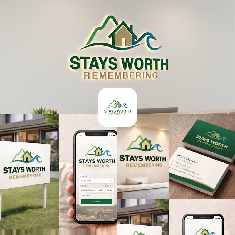
Which concept stands out to you the most? I’d love to hear your thoughts in the comments! 💬✨ Stays Worth Remembering Travel Company Logo Design 2026.
The idea behind this logo was to create a visual identity that instantly communicates comfort, memorable experiences, and destination-based stays in a clean and meaningful way.
The mountain element represents travel, adventure, peaceful escapes, and beautiful destinations. It gives the brand a sense of exploration and unforgettable journeys. The house placed in the center symbolizes comfort, hospitality, safety, and the feeling of being “at home” no matter where someone travels.
The wave element was added to represent relaxation, premium vacation experiences, and destinations connected to nature, lakes, beaches, or peaceful environments. Together, the mountain, home, and wave create a complete story of travel and memorable stays.
For the typography, I used a bold and clean font to make the brand look professional, trustworthy, and easy to recognize across both digital and physical platforms. The word “REMEMBERING” uses a softer gold tone to create a warm emotional feeling and reinforce the idea that these stays are not just accommodations, but experiences people will remember for a long time.
The green color palette represents nature, growth, relaxation, and trust, while the blue wave adds freshness, calmness, and a travel-inspired feeling. Overall, the logo was designed to feel welcoming, modern, memorable, and versatile for signage, branding materials, business cards, websites, and mobile applications.