Graphic Design Projects in Rajshahi Division
Graphic Design Projects in Rajshahi Division
Sign Up
Post a job
Sign Up
Log In
Filters
2
Projects
People
Message
0
Md Toufic Ahmed Khan Badhon
pro
Figma to shopify converting using Replo
0
9
Message
1
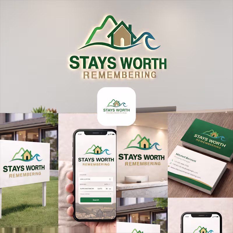
Md Zahid Hasan Khan
Stays Worth Remembering Travel Company Logo Design 2026. The idea behind this logo was to create a visual identity that instantly communicates comfort, memorable experiences, and destination-based stays in a clean and meaningful way. The mountain element represents travel, adventure, peaceful escapes, and beautiful destinations. It gives the brand a sense of exploration and unforgettable journeys. The house placed in the center symbolizes comfort, hospitality, safety, and the feeling of being “at home” no matter where someone travels. The wave element was added to represent relaxation, premium vacation experiences, and destinations connected to nature, lakes, beaches, or peaceful environments. Together, the mountain, home, and wave create a complete story of travel and memorable stays. For the typography, I used a bold and clean font to make the brand look professional, trustworthy, and easy to recognize across both digital and physical platforms. The word “REMEMBERING” uses a softer gold tone to create a warm emotional feeling and reinforce the idea that these stays are not just accommodations, but experiences people will remember for a long time. The green color palette represents nature, growth, relaxation, and trust, while the blue wave adds freshness, calmness, and a travel-inspired feeling. Overall, the logo was designed to feel welcoming, modern, memorable, and versatile for signage, branding materials, business cards, websites, and mobile applications.
1
43
Message
2
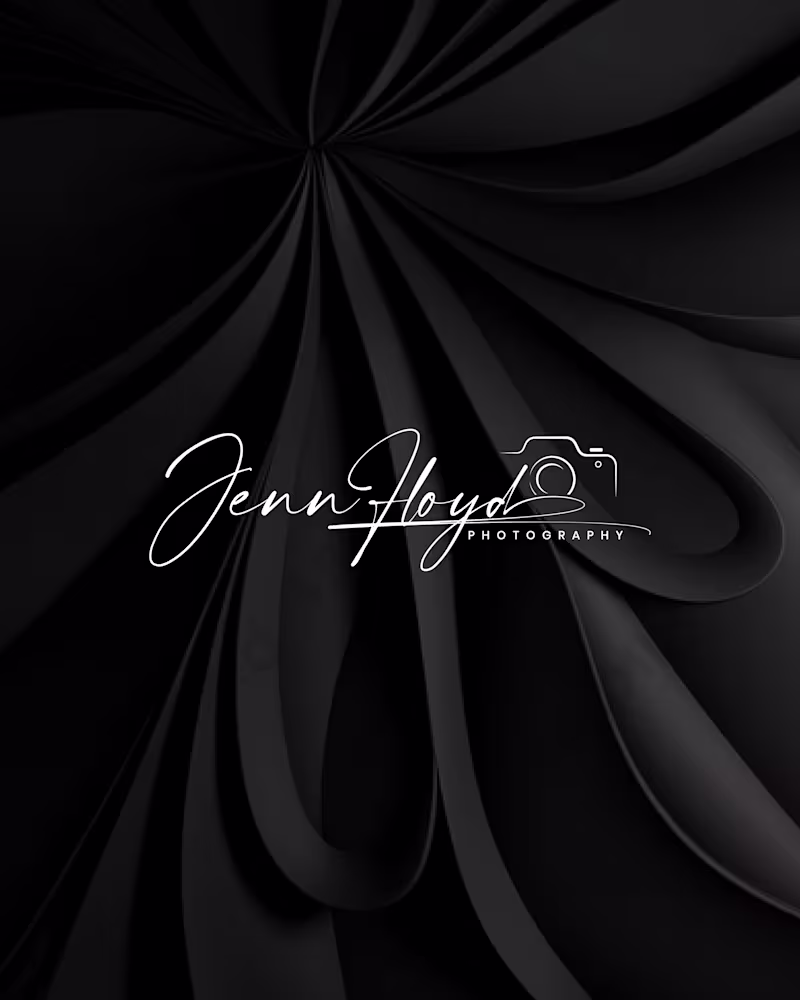
Md. Abdur Rahman
Project Title: Jenn Floyd Photography — Premium Visual Identity System Role: Brand Designer & Strategist Services: Brand Identity, Custom Lettering, Visual Strategy The Overview Many independent creatives compete on price because their visual identity relies on standard, off-the-shelf fonts. For the Jenn Floyd identity system, the objective was clear: skip the generic templates and build a bespoke, signature-driven brand that instantly positions the photography studio in the premium market. The Strategic Process True brand strategy lives in scalability. A premium identity must transition seamlessly across vastly different mediums without losing its core DNA or visual impact. Phase 1: Raw Sketching: Developed using graphite to map out organic weight, authentic line thickness, and typographic rhythm. Phase 2: Digital Optimization: Refined into a high-contrast digital vector optimized as an editorial watermark for low-light photography and high-res mobile interfaces. Phase 3: Physical Touchpoints: Engineered with precise line weights to translate flawlessly from luxury blind-embossed packaging to backlit storefront signage. By focusing on custom craftsmanship rather than fleeting design trends, we created a cohesive visual system that intentionally drives up perceived market value and consumer trust. Project Deliverables Custom Signature Wordmark & Secondary Sub-marks Comprehensive Brand Identity & Typography System Multi-Medium Asset Optimization (Digital Watermarking, Print, & Signage) Production-Ready Packaging Assets (Blind Embossing Specifications) Tools Used Adobe Illustrator, Adobe Photoshop, Procreate Tags & Skills brand identity, logo design, visual identity, custom lettering, typography, packaging design, creative direction, brand strategy, vector illustration, art direction, luxury branding
2
30
Message
0
Golam Rabbi
Are you planning for event next couple of days? #events
0
96
Message
1
Mehreen Hasan
I've designed 2,450+ social media posts. Built visual identities for 13+ brands. Created 45+ client presentations and 24+ brochures. And I'm just getting started on Contra. I'm Mehreen - Creative Director & Brand Strategist. I help brands look like they mean it. Want graphics that stop the scroll? Hire me!
1
43
Message
1
Md Rasedul Jamal
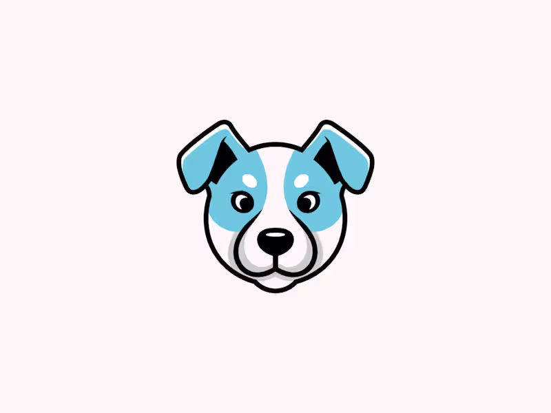
This is an exclusive pre made dog logo design created as a personal concept. It is 100% unique and currently AVAILABLE FOR SALE.
1
27
Message
0
Md.Shamim Ahamed
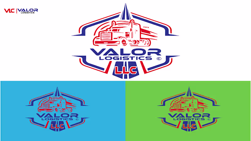
Bold Logo Design for Trucking & Transport Services
0
3
Message
0
S. M. Abu Seyam
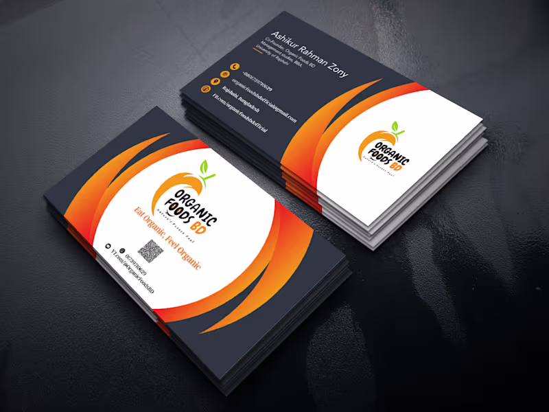
Business Card Design
0
3
Message
0
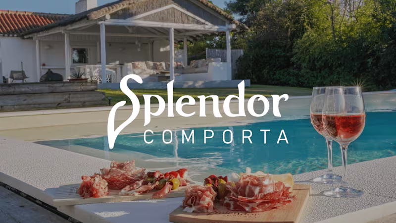
Md Ashraful Islam
Splendor Comporta - Logo Project
0
6
Message
0
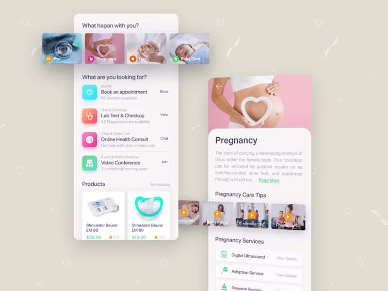
Khandaker Rasel
Mobile App UIUX Design
0
2
Message
0
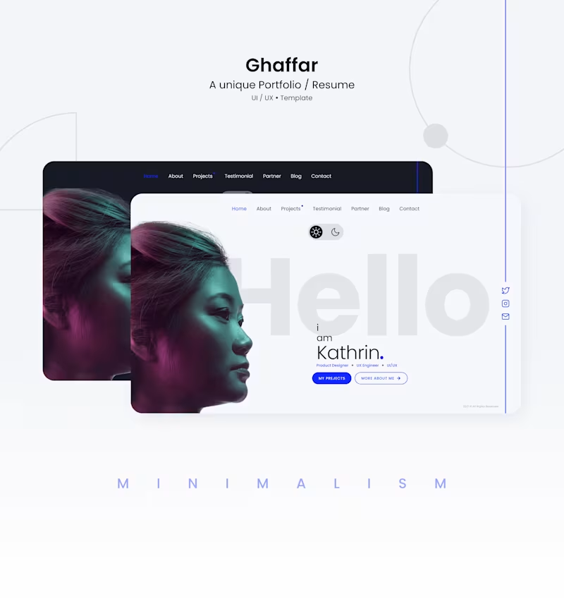
Shakhawat Hossen
Portfolio website design
0
25
Message
1
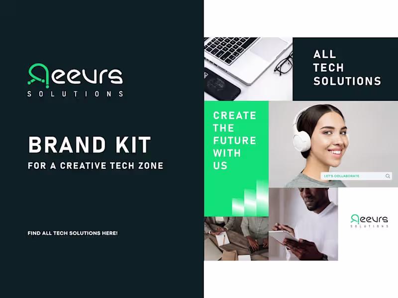
Md Hasem Ali
Reevrs logo & Branding Guidelines
1
2
Message
0
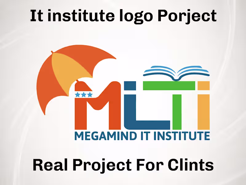
Mohammad Ali
MLIT Logo Design For IT Institute
0
1
Message
0
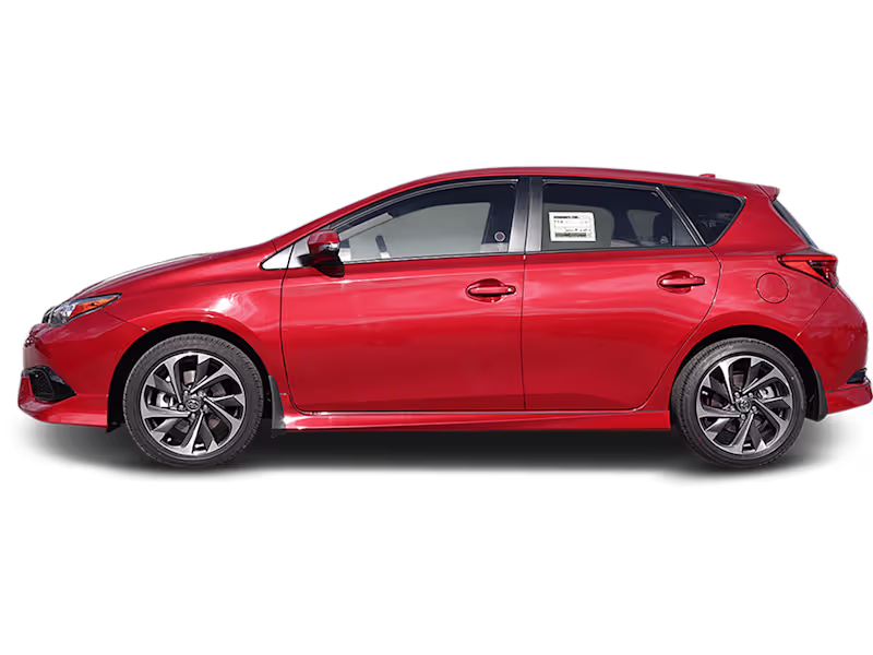
Md Selim Hossain
Car photo editing service
0
11
Message
0
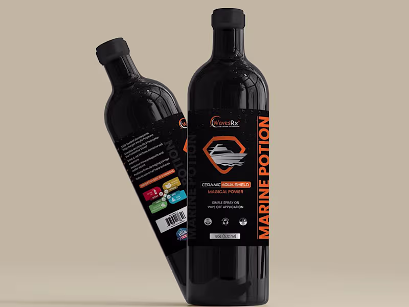
Iqbal Hssain
Packaging Design
0
0
Message
0
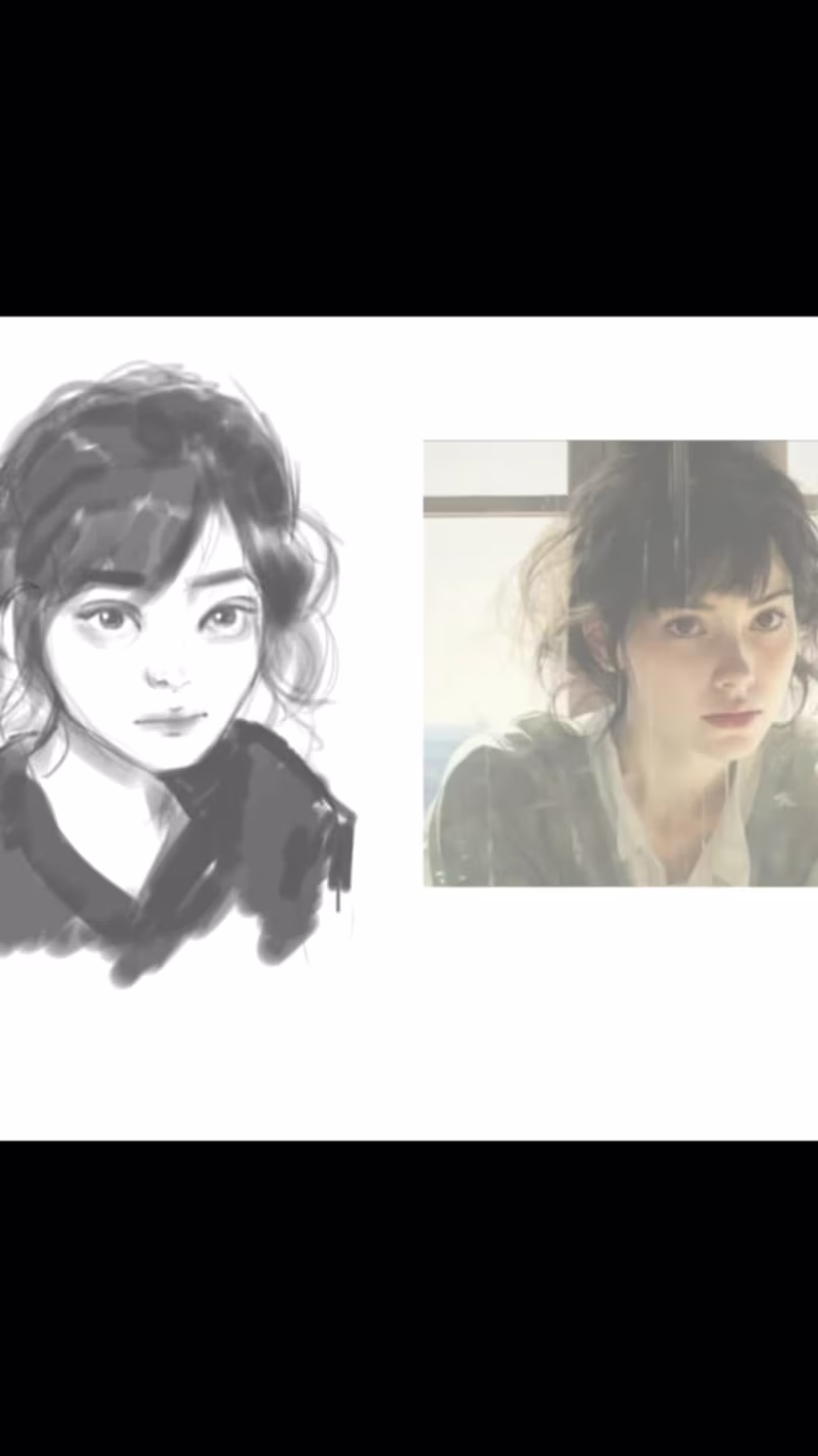
Jannatul Ferdous
I will create a portrait from a reference
0
8
Explore projects