Brand Design Projects in Rajshahi DivisionBrand Design Projects in Rajshahi DivisionSignature Brand Identity System for a Photography Business
PROJECT DESCRIPTION:
Jim Gower is a professional photographer who needed more than a logo. He needed a complete brand identity that could represent his work at every level — from a business card handed to a client after a shoot to a lightbox sign above a studio entrance.
The brief was clear: build something that feels personal, premium, and immediately recognizable as belonging to one person and one vision.
The Approach
Every decision in this project started with strategy before it touched aesthetics. Who is Jim Gower to his ideal client? What feeling should someone walk away with after their first encounter with his brand? What does premium mean in the photography space right now — and how do you stand apart from it without alienating it?
The answers shaped everything that followed.
The Work
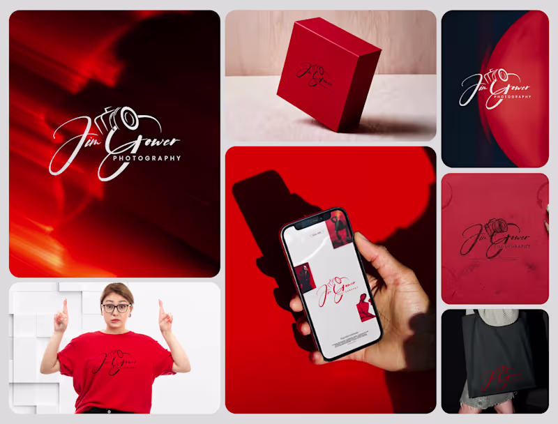
The primary logo is a signature script with the camera body structurally integrated into the letterforms — the "G" in Gower becomes the lens housing, making the mark read as both a name and a profession without requiring a separate icon. The script carries energy and movement, referencing the intuitive, fast-moving nature of working photographers.
The crimson brand palette was selected for emotional weight — confident, warm, and saturated enough to hold presence across both physical and digital surfaces without compromise.
The full system was then applied and stress-tested across every client touchpoint:
— Primary and secondary logo variations
— Brand color palette and typography system
— Business card design
— Premium gift box packaging
— Tote bag and apparel
— Digital UI mockup for web and mobile
— Environmental signage and lightbox application
The Result
A brand identity system that positions Jim Gower not as a photographer with a logo, but as a brand with a presence — one that commands attention, communicates quality instantly, and scales from a phone screen to a storefront without losing a single point of its power.
SERVICES INCLUDED IN THIS PROJECT:
Brand Strategy, Logo Design, Visual Identity System, Brand Collateral Design, Packaging Design, Apparel Mockup, Digital UI Application, Environmental Signage Mockup
Photography Logo Design, Signature Logo Design, Brand Identity System, Photographer Branding, Script Logo Design, Visual Identity Design, Custom Logo Design, Brand Identity Designer, Logo Design Process, Creative Brand Design, Handcrafted Logo Design, Photography Brand Kit, Premium Brand Identity, Calligraphy Logo Design, Brand Mockup Design, Logo Design Concept, Red Brand Identity, Photographer Visual Identity, Brand Strategy Design, Full Brand System