Freelancers using Google Gemini in Rabat
Sign Up
Post a job
Sign Up
Log In
Filters
2
Projects
People
Imad Dhin
max
Rabat, Morocco
AI & Engineer | Product Designer
$50k+
Earned
31x
Hired
5.0
Rating
185
Followers
expert
Partner
+2
Follow
Message
AI & Engineer | Product Designer
2
MenuRX: AI Diets & Clinical Solution
2
13
0
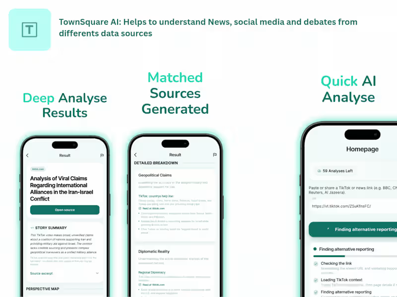
Townsquare AI Perspective-Exploration App
0
25
1
The Vault Los Angeles: Premium Fashion Rental
1
27
1
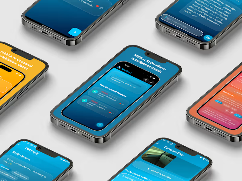
RIZZLA AI: EMOTIONAL INTELLIGENCE COACH
1
27
Google Gemini
(6)
Follow
Message
Jalal Eddine Maoukil
Rabat, Morocco
Framer Developer · Templates & Custom Sites
16
Followers
Follow
Message
Framer Developer · Templates & Custom Sites
5
Most template creators focus entirely on flashy animations. They forget that an agency website has one true job: to turn traffic into paid clients. When I started building Zevia, I wanted to strip away the noise. I spent days analyzing why high ticket clients leave a website without booking a call. The answer is always friction or a lack of trust. So I crafted Zevia with a clean, dark editorial aesthetic that instantly feels premium and authoritative. Instead of adding useless decorations, I focused on building functional pieces that actually matter to business owners: A seamless calendar booking section right in the footer so visitors never have to leave the page to schedule a call Parallel pricing lanes designed perfectly for agencies selling fixed timeline sprints A beautifully structured custom portfolio system to showcase your case studies If you are a design studio, AI agency, or consultant looking to launch a website that justifies your premium rates, Zevia is officially live today. You can go live in hours, not weeks. Just drop in your work, update your main brand color variable, and hit publish. See the live interactive demo here: https://zevia.framer.website You can also explore my fully updated store for more premium templates: https://jalaleddine.me
4
5
264
1
The biggest shift in my work happened when I stopped asking, "How can I make this look better?" and started asking, "Would I trust the company behind this website?" Everything changed after that.
1
19
0
Stills is a premium Framer template for investment firms, family offices, venture capital firms, private equity funds, and emerging managers who value clarity, restraint, and a timeless online presence. Inspired by the structure of editorial publications and annual reports, Stills helps you present your portfolio, leadership, and investment philosophy through a design that feels established today and remains relevant for years to come.
0
16
2
I spent three weeks trying to make a website look boring on purpose Here's a thing nobody tells you about designing for finance: almost every VC and private equity site looks like it was made by the same person. Dark hero section. Gradient mesh in the background. A stat counter that ticks up when you scroll. A stock photo of four people in a glass conference room, all laughing at something off-camera that clearly wasn't funny. I know this because I looked at probably 40 of them before I started Stills. And at some point I stopped taking notes on what to do and started taking notes on what to avoid. That list got long fast. No gradients. No drop shadows. No "trust badges" made of client logos in grayscale. No carousel testimonials with five-star icons, because nobody buying a $50M fund stake needs a Yelp rating to feel confident. What I kept coming back to was: none of this actually looks like money. It looks like a SaaS company borrowed a suit. So I asked myself a dumb-sounding question — what does an actual institution's printed material look like? Not their website. Their annual report. Their LP deck. Their internal memo. And the answer was obvious the second I framed it that way: serif headlines, generous whitespace, almost no color, typography doing all the emotional work instead of visual effects. Nobody at a family office is impressed by a hover animation. They're impressed by restraint. That became the whole design brief. One serif for headings — Source Serif 4, because it reads institutional without reading old. One sans for body — Geist, clean and quiet. Two colors, full stop. Canvas and Ink. Every single hierarchy decision made with opacity instead of a new color, a new shadow, a new border. If I found myself reaching for a gradient to fix a section that felt flat, that was a sign the layout was wrong, not the palette. The hardest part wasn't building it. It was resisting the urge to add things. Every "just one more effect" instinct I had, I killed. A slideshow here. A cursor trail there. All cut. The version that shipped is the version with the least in it, and that took longer to get to than the version with the most. I called it Stills — because a still frame doesn't need motion to hold your attention. That was the whole bet. It's live now. 14 pages, full CMS for portfolio companies, leadership, and research notes, built for VC funds, private equity, family offices, wealth managers — anyone whose website needs to say "we've been doing this since before you were interested in it" without saying it out loud. If you design in this space, or you're building something in fintech/wealth/institutional finance and every template you've found looks like it's trying too hard — take a look: https://www.framer.com/community/marketplace/templates/stills/ Curious what other designers in here are doing to make finance and institutional sites feel less like generic SaaS. Feels like an underbuilt niche.
2
66
Google Gemini
(1)
Follow
Message
Explore people