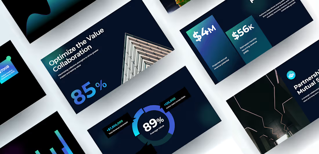
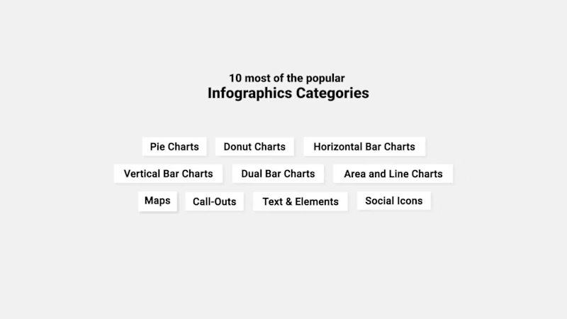
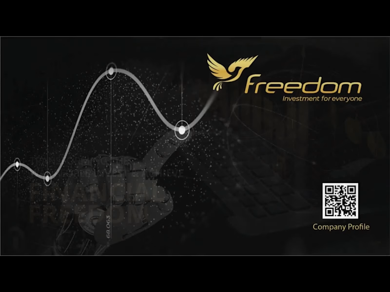
Infographic Design Projects in PunjabInfographic Design Projects in PunjabI create clean and professional infographic animations for data, reports, SaaS dashboards, and presentations. I animate a wide range of visuals including line charts, bar graphs, pie charts, donut charts, percentage indicators, KPI metrics, and data callouts — all designed with smooth motion, modern typography, and brand-aligned visuals.
If you need any type of chart or graph animation — line chart, bar graph, pie chart, donut chart, or custom infographic visuals — feel free to hire me. FoodOlics – Brand Promotion & Marketing Design
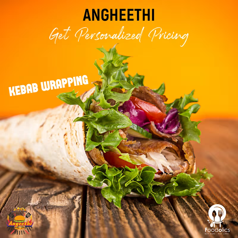
FoodOlics is a restaurant discovery platform that helps users enjoy better deals at their favorite restaurants by encouraging them to visit during less busy hours. By creating a win-win experience for both customers and restaurant partners, the platform offers exclusive discounts while helping restaurants optimize foot traffic and increase customer engagement.
For this project, I was responsible for the complete promotional design strategy across both print and digital media. My role involved creating visually engaging marketing materials that effectively communicated the brand’s value proposition and strengthened its market presence.
The scope of work included designing a wide range of assets such as social media creatives, digital advertisements, banners, flyers, brochures, and other promotional collateral. Each design was carefully crafted to maintain brand consistency, enhance user engagement, and deliver clear messaging across multiple channels.
The visual direction focused on creating an appetizing and modern brand experience through bold typography, vibrant colors, and compelling imagery that resonated with food lovers. By aligning the promotional materials with the brand’s identity and marketing goals, the designs helped increase awareness, attract users, and reinforce FoodOlics’ position in the competitive food-tech industry.
This project allowed me to work on a comprehensive brand promotion system, combining creativity with strategic design thinking to deliver impactful experiences across both online and offline touchpoints.