

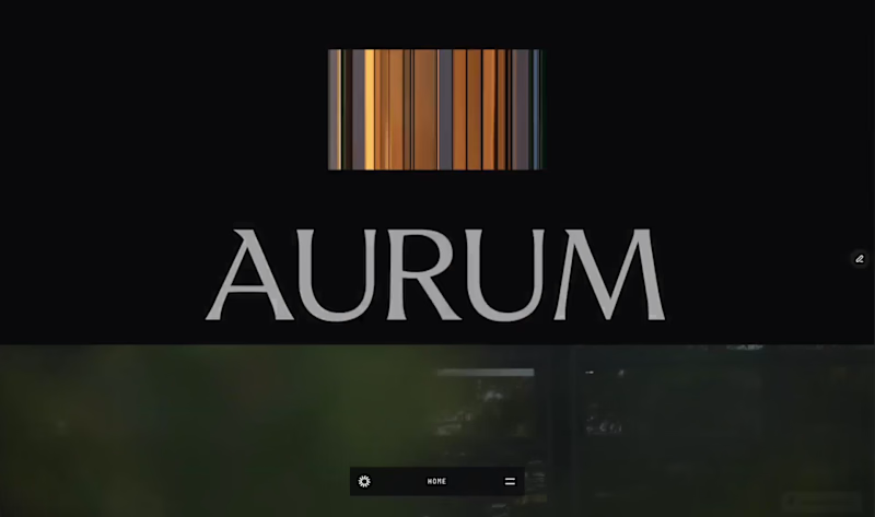
New template drop. And it's completely free for now.
Aurum is live on the @Framer marketplace. Built for luxury real estate brokers who want a site that does the selling for them.
12 pages • Full CMS • Copy included • $0 right now.
Preview: https://diplomatic-play-827625.framer.app
(https://diplomatic-play-827625.framer.app)Comment "AURUM"
Repost
Follow me (I’ll DM you the link)
2
2
157
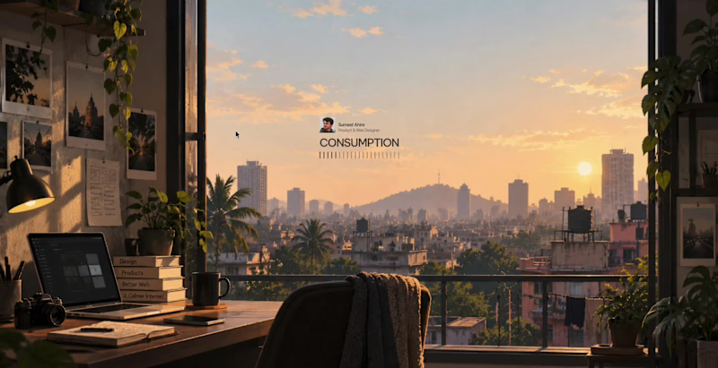


Built a full course platform website for Bill Hanna of Controller Academy:
- 285K YouTube subscribers
- 8 courses and 3 bundles
- CPE/NASBA compliance
- A custom 4-question quiz component with 11 outcomes built natively in Framer.
The site covers the entire funnel: social proof, problem framing, course catalogue, bundle pricing, instructor credibility, testimonials, FAQ, and CTA.
The full design process was led with strategy, and everything is built around the audience and buyer behaviour. The goal was not just to showcase the courses and their outcomes, but to leave a lasting impression on visitors.
Everything, from the course thumbnails to the website hero image to the CTA button, was carefully chosen and iterated.
Currently, the site is in a post-launch revision cycle based on live conversion data, and they're experimenting between new and old designs.
This is what it looks like to build a website that takes a creator's catalogue seriously.
1
87


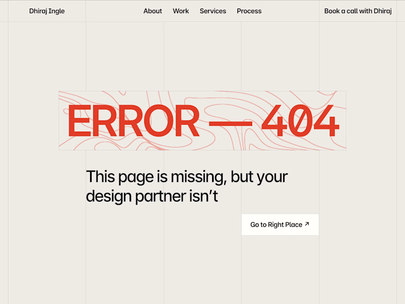
Portfolio 404 Page: Friendly Error Page in Framer 🧡✨
A small but important page on my portfolio, built in Framer, that turns a dead end into a way back
The design keeps the warm off-white base and thin grid lines from the rest of the site, with a bold orange “ERROR 404” headline sitting on a moving topographic line pattern
Special attention was given to:
Oversized orange headline with animated contour lines behind it
Copy with a little personality: “This page is missing, but your design partner isn’t”
Text that fades in softly, then the button appears
Clear “Go to Right Place” button with a smooth hover state
Same navigation and “Book a call” link as every other page
Subtle grid lines that match the full site system
Calm UI motion that guides the eye in order
The result is a 404 page that feels like part of the brand, keeps visitors on the site, and still points them toward booking a call 🤝
3
264


