AI Ad and creative Designer
AI Ad and creative Designer
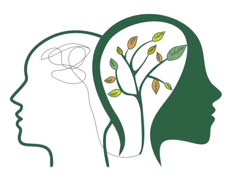
This logo was designed for my friend's Instagram page, SoulSpring Insta page:https://www.instagram.com/soulspringcounseling?utm_source=ig_web_button_share_sheet&igsh=ZDNlZDc0MzIxNw== , a platform focused on mental well-being, self-growth, and emotional healing. The objective was to create a visual identity that communicates transformation, inner peace, and personal development through a clean and meaningful design.
The concept features two human profiles representing the journey from mental chaos to emotional clarity. The abstract scribbles inside the first silhouette symbolize stress, overthinking, and internal struggles, while the flourishing tree within the second profile represents healing, growth, resilience, and a renewed mindset. The tree's branches and colorful leaves reflect continuous personal development, balance, and the different stages of emotional well-being. A calming green color palette was chosen to evoke nature, renewal, hope, and tranquility, reinforcing the brand's focus on mindfulness and positive transformation.
This project highlights my ability to create thoughtful, concept-driven logos that tell a compelling visual story while aligning with a brand's purpose, values, and audience.
0
59
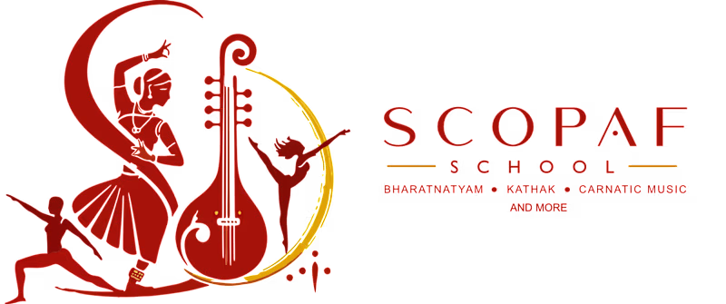
This logo was designed for Scopaf School, a multidisciplinary performing arts academy offering Bharatanatyam, Kathak, Carnatic Music, and other classical art forms. Created during my time at Lemici IQ, the objective was to develop a visual identity that reflects the richness of Indian culture while maintaining a modern and memorable brand presence.
The concept combines symbolic elements from multiple performing arts disciplines into a single cohesive mark. The Bharatanatyam dancer represents grace and tradition, the veena symbolizes the heritage of Indian classical music, and the contemporary dancer signifies versatility and artistic expression. A flowing circular form ties these elements together, conveying rhythm, movement, creativity, and the continuous journey of learning. The warm red and gold color palette was chosen to evoke passion, excellence, elegance, and the cultural significance associated with Indian classical arts.
This project showcases my ability to translate a brand's vision into a meaningful visual identity by blending storytelling, symbolism, and clean design principles to create a timeless and recognizable logo.
0
54

This logo was designed for KartavyaPath Charitable Trust (KCT), a non-profit organization dedicated to education, community welfare, and social empowerment. The goal was to create a meaningful visual identity that reflects the organization's commitment to nurturing lives, creating opportunities, and building a brighter future for those in need. The logo prominently features the organization's name and initials, reinforcing its identity.
The concept combines symbolic elements that represent the trust's mission and values. The open book at the base signifies education, knowledge, and lifelong learning, while the three human figures illustrate unity, collaboration, and community support. The central figure represents individuals empowered through the organization's initiatives, while the upward-reaching figures holding green leaves symbolize growth, hope, sustainability, and positive transformation. The circular emblem conveys inclusivity, protection, and the continuous cycle of giving back to society. A palette of blue, red, and green was chosen to represent trust, compassion, vitality, and progress.
This project demonstrates my ability to create purpose-driven visual identities that communicate an organization's mission through thoughtful symbolism, balanced composition, and impactful branding, resulting in a logo that is both memorable and meaningful.
0
57

This self-initiated AI commercial was created to explore emotional storytelling through a 3D Pixar-inspired visual style. The concept blends cinematic animation, character-driven storytelling, and premium product placement to create an advertisement that feels both heartwarming and memorable. By combining stylized 3D environments, expressive animation, and seamless AI-generated visuals, the project demonstrates how brands can move beyond traditional product ads and build deeper emotional connections with their audience through narrative-driven marketing.:
0
71

Fashion Illustrator & Logo Designer
Fashion Illustrator & Logo Designer


Brand designer solving problems over just aesthetics
Brand designer solving problems over just aesthetics



AI Video Ads & Motion Design for Brand Campaigns
- $•••••
- Earned
- 8x
- Hired
- 4.5
- Rating
- 27
- Followers
AI Video Ads & Motion Design for Brand Campaigns



Experienced Product Designer and Framer Expert

Experienced Product Designer and Framer Expert

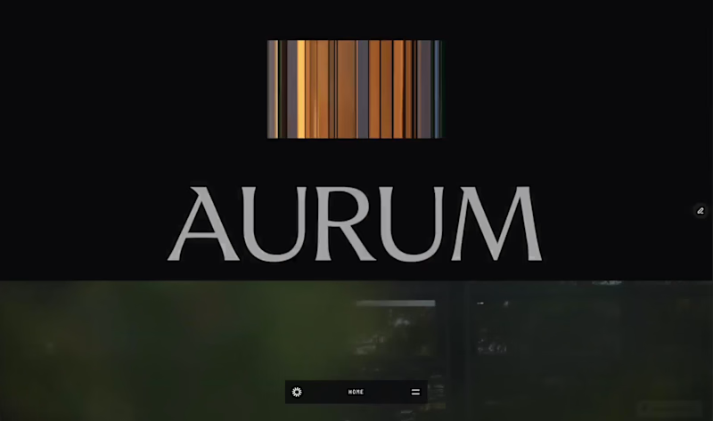
New template drop. And it's completely free for now.
Aurum is live on the @Framer marketplace. Built for luxury real estate brokers who want a site that does the selling for them.
12 pages • Full CMS • Copy included • $0 right now.
Preview: https://diplomatic-play-827625.framer.app
(https://diplomatic-play-827625.framer.app)Comment "AURUM"
Repost
Follow me (I’ll DM you the link)
2
2
157
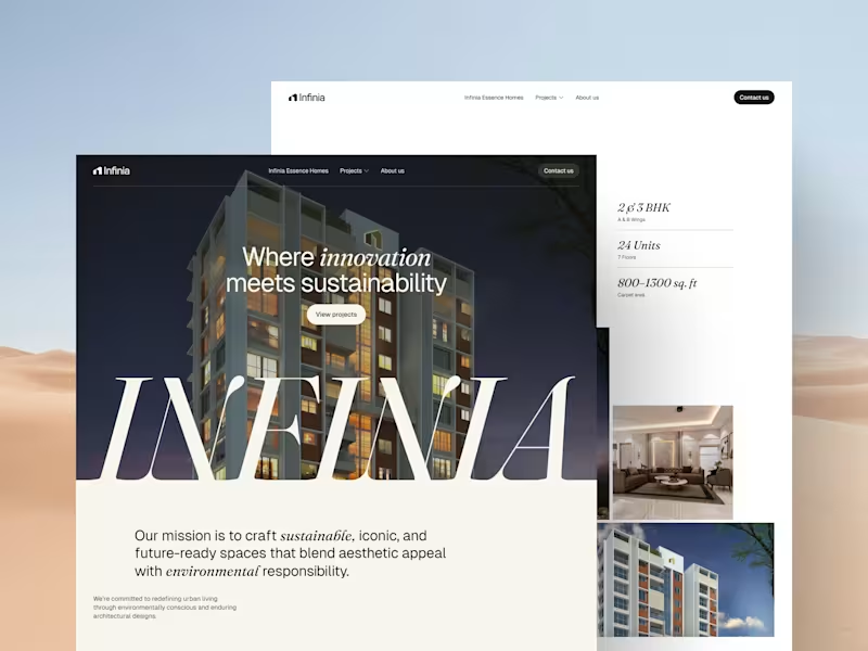

Freelance Designer | Bachelor’s in UI/UX & Graphic Design
Freelance Designer | Bachelor’s in UI/UX & Graphic Design
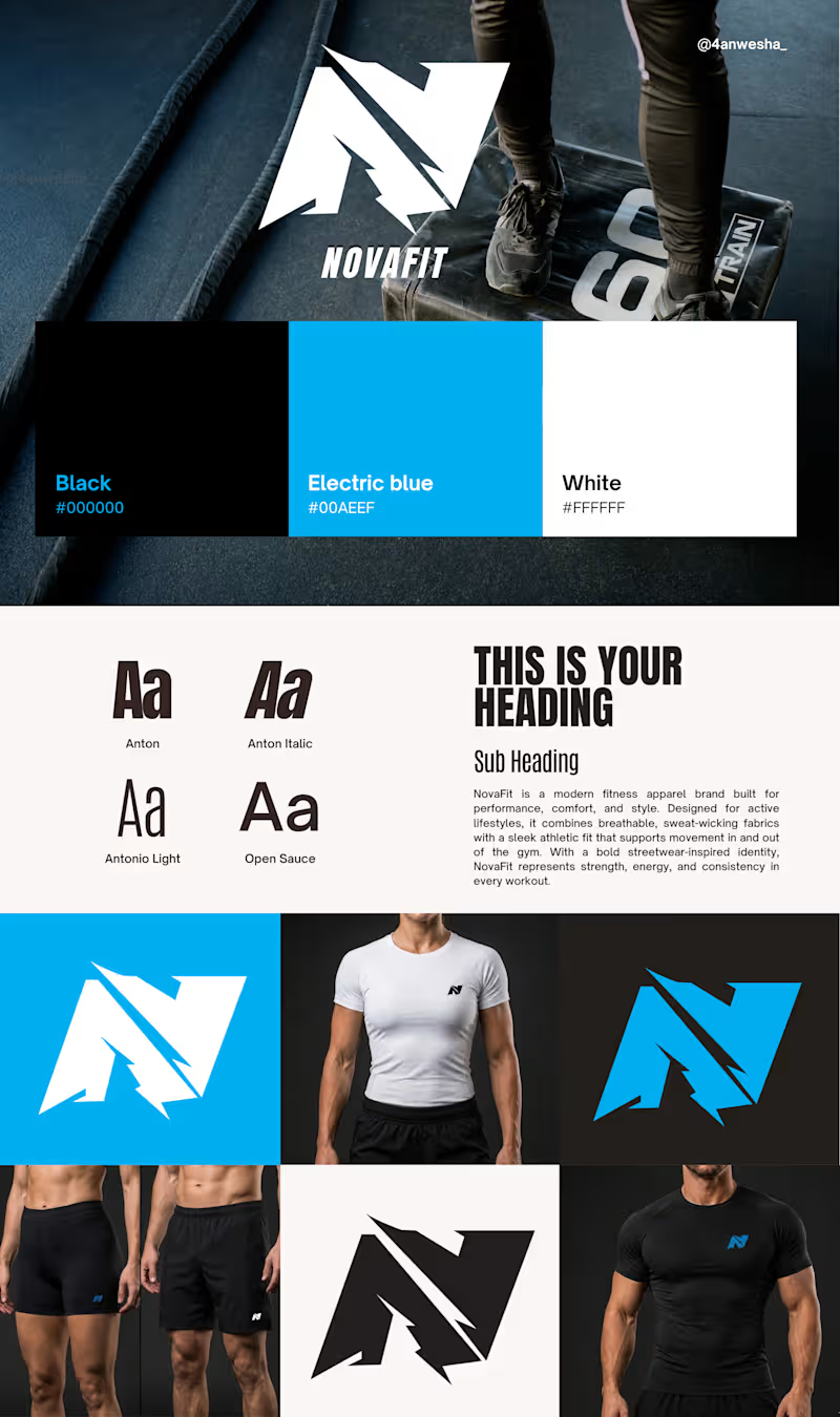
NovaFit – Fitness Apparel Brand Identity Concept
NovaFit is a modern fitness apparel brand designed for individuals who value performance, strength, and style. This branding project features a bold, athletic identity built around a custom lightning-inspired "N" logo that symbolizes energy, movement, and determination.
The visual identity combines a high-contrast color palette of black, electric blue, and white to create a strong and dynamic brand presence. Typography was carefully selected to reflect confidence, power, and a contemporary sportswear aesthetic. The project also includes logo variations, brand guidelines, color systems, typography exploration, and apparel mockups demonstrating real-world application across activewear products.
Skills Demonstrated:
Brand Identity Design
Logo Design & Development
Typography Selection
Color Palette Creation
Apparel Branding
Mockup Presentation
Adobe Illustrator & Photoshop
This concept showcases my ability to create cohesive, market-ready branding solutions that balance aesthetics, functionality, and brand storytelling.
0
57
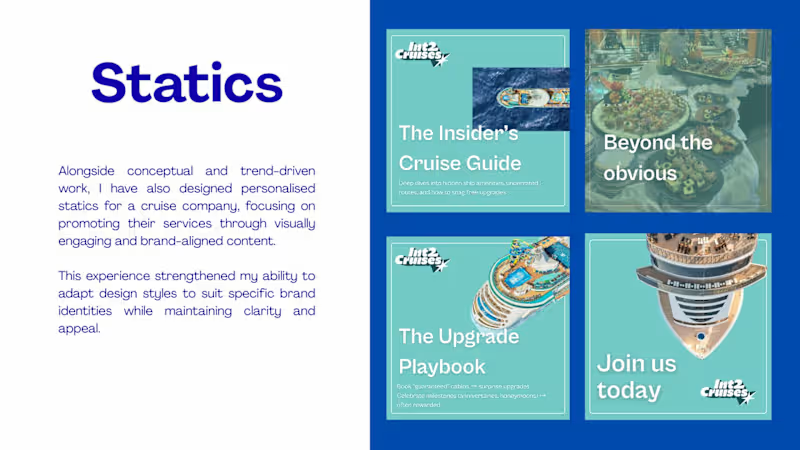

Bringing Ideas to Life Through Illustrations
Bringing Ideas to Life Through Illustrations



View more →

Illustrative brand designer, making standout your brand

The personal illustration series explored how mythology, and everyday emotion can be translated into expressive poster artworks. I wanted each piece to carry a distinct story and mood from the power of Kali to the calm after rain, while remaining visually connected through color, texture, and typography.
0
35
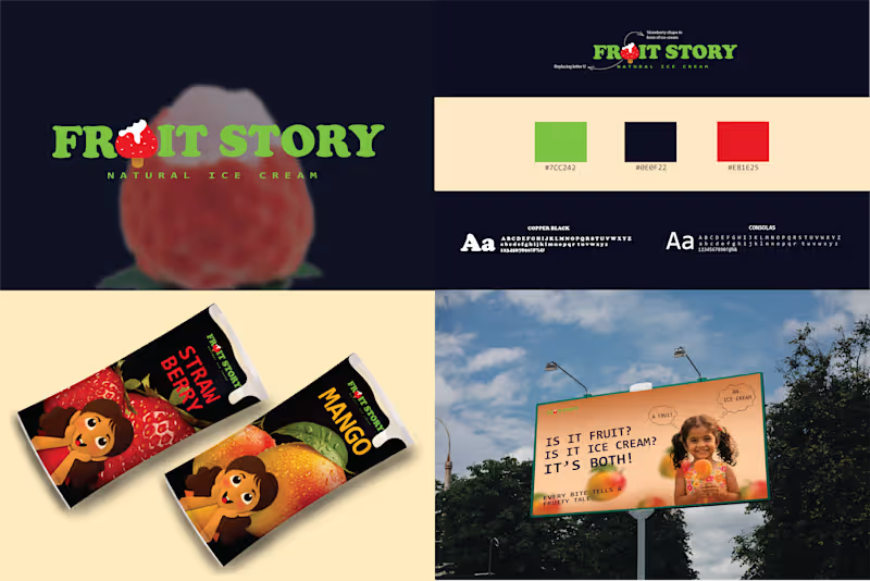
Fruit story ice cream is molded into realistic, 3D fruit shapes representing the actual ingredients inside, using fruit puree instead of water or corn syrup. It uses a soft-frozen technique to ensure it is safe and easy for kids to bite into.
0
55