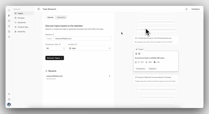
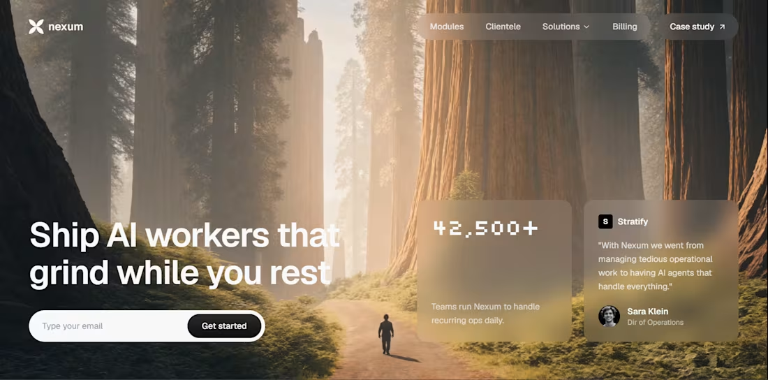
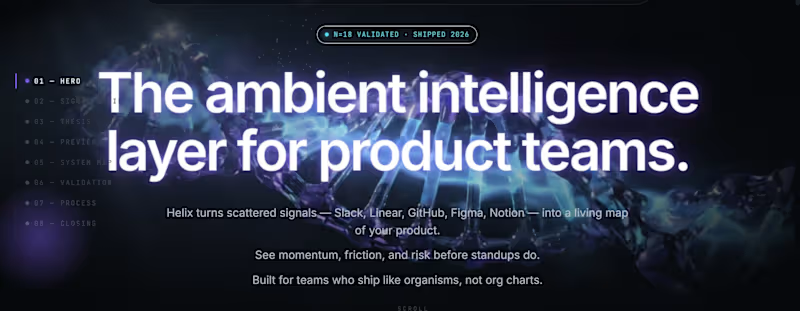
Product Design Projects in PrayagrajProduct Design Projects in PrayagrajNexum is a high-fidelity, visually striking landing page designed for a modern enterprise or SaaS platform. The goal was to break away from sterile, traditional B2B designs and introduce a premium, immersive user interface that builds immediate trust while clearly communicating complex software modules.
Project Highlights:
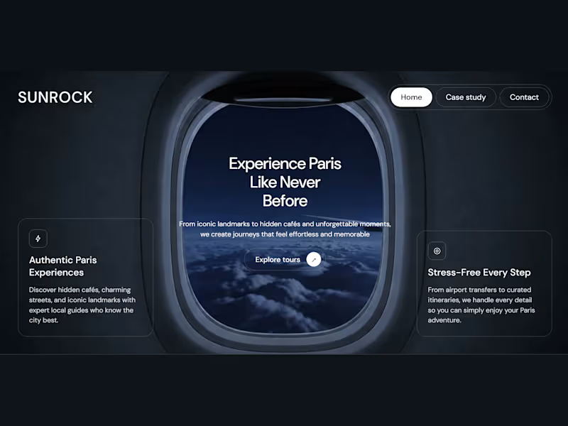
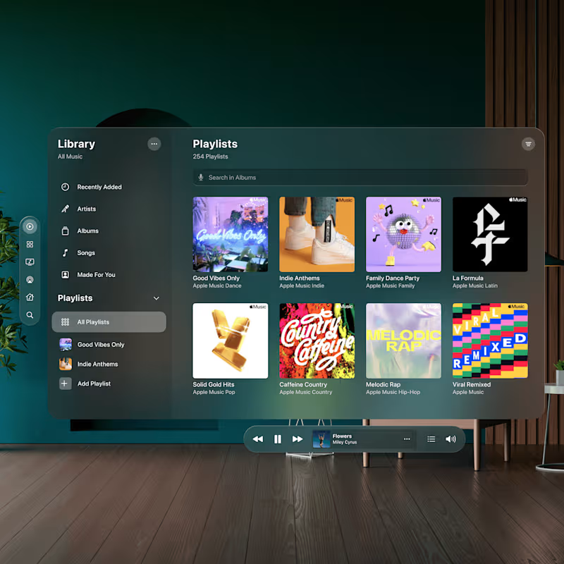
Premium UI/UX: Features a sleek, custom glassmorphism (frosted glass) navigation bar that seamlessly blends with rich, full-screen background imagery, establishing a strong visual identity.
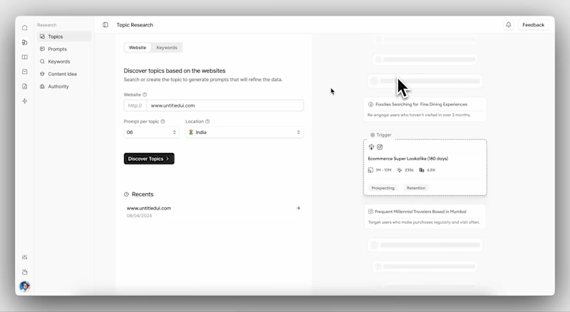
Intuitive Information Architecture: Designed a clean, scalable navigation system accommodating structured dropdowns for "Modules," "Solutions," and "Clientele" without overwhelming the user.
Scalable Front-End Execution: Built with a utility-first approach (leveraging Tailwind CSS principles) to ensure pixel-perfect translation from Figma to the browser.
Performance Optimized: Deployed on Vercel, ensuring fast load times, smooth rendering of UI elements, and a highly responsive layout across all device sizes.
This project showcases a deep understanding of combining aesthetic product design with robust, deployment-ready front-end development. When the product was expected to grow quickly, new modules are already in plan. Without a structured system, the interface would quickly become inconsistent and impossible to scale.
The biggest challenge was that we were essentially designing the product from scratch. There was no existing design language, no component system, and no defined interface patterns.
We studied several modern design approaches including ShadCN components, Tailwind-based systems, and other scalable UI libraries. The goal was not to copy a library, but to understand how scalable systems are structured and why they work.
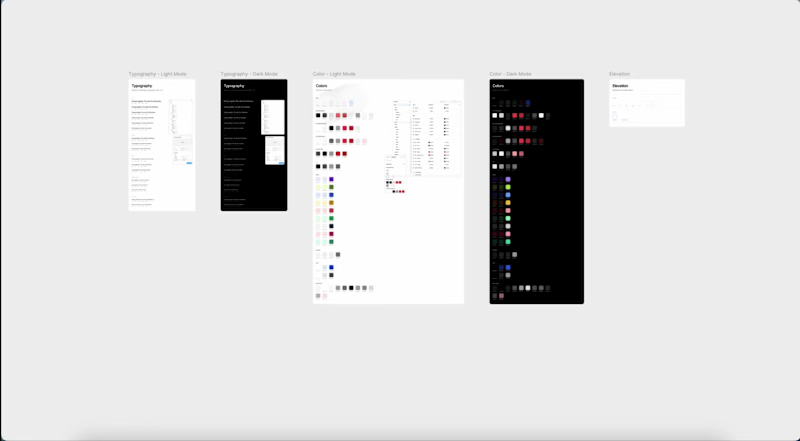
From there, we began defining tokens, primitives, and components that would power the interface at every level.
The design system was structured in four distinct layers, each building on the one below it. This hierarchy meant new features could be added without touching the foundation.
- Design Tokens & Variables
- Base UI Elements
- Composed UI Patterns
- Feature Modules
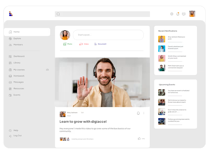
The design system quickly became the foundation of the product. Instead of designing screens individually, new features could be built using existing primitives and components improving design speed and reducing UI inconsistency.