
Brand identity | Framer | Ai video | Product design
- 80
- Followers
Brand identity | Framer | Ai video | Product design

I designed the packaging for Supertor Leaf, a health care brand that blends the power of nature with modern wellness science.
My goal was to create a visual identity that feels clean, trustworthy, and refreshing, something that reflects the brand’s natural roots while standing strong on the shelf.
Every color, texture, and element was chosen to communicate purity, vitality, and balance, aligning with Supertor Leaf’s mission to make wellness simple and natural.
Packaging Design | Health & Wellness Branding | Modern Natural Aesthetic
1
291

Brand campaign studio, a complete brand launch workflow built on Morphic
Every brand launch has the same problem: too many moving parts, no unified system, content that looks like it came from five different people.
I built a workflow that solves that.
https://www.morphic.com/en/workflows/019da63b-164c-72fb-b9b8-c5417f0282a3/brand-campaign-studio
Brand campaign studio takes a logo, three photos, and a product description and produces a complete, multi-platform brand campaign. Brand identity locked from the logo first. Then a LinkedIn carousel, a two-person podcast video with lip sync and branded overlays, and a viral clip engineered around proven scroll-stopping mechanics all consistent, all on-brand.
Every step has an approval gate. Nothing moves forward without sign-off, which makes it work as a client-facing production process, not just a personal tool.
The model stack is deliberate. Seedance 2.0 for native 9:16 video with strong face consistency. Gemini Image Pro for all image work. Sync V3 for lip sync. Text overlays added in post via video-operations — no AI-generated text inside video prompts, which eliminates the most common quality failure in AI video production.
On the first run it builds a brand kit that uploads on future runs to skip all setup and maintain consistency across campaigns.
This is the process I'd use for a real client. Now it's a system anyone can run.
7
8
459

Flow box multi-mode switch is using the two-mode switch which is the light and dark plus two more mode from the brand palette, making them represent season too, this is made for client to have more control over there screen.
2
216

What if one sneaker could adapt to your entire lifestyle?
Whether you’re running errands, heading to a meeting, or stepping out with friends, Loopo fits the moment without compromise.
Using Kittl, I developed the full visual identity from scratch,Then I pushed it further with AI-powered content creation:
Generated high-quality product visuals
Produced brand-style video content optimized for social media
The result? A cohesive, modern sneaker brand that feels ready for market powered by creativity + AI.
This project shows how I help startups and brands:
Turn ideas into visual experiences that convert.
If you're building something and need branding, visuals, or high-converting content, let’s talk.
#SneakerBranding #AIContentCreation #BrandIdentityDesign #KittlDesign #ProductDesign #StartupBranding
0
161


BOOK FORMATTING ||BOOK LAYOUT DESIGN|| KDP COMPLIANCES
- 10
- Followers
BOOK FORMATTING ||BOOK LAYOUT DESIGN|| KDP COMPLIANCES
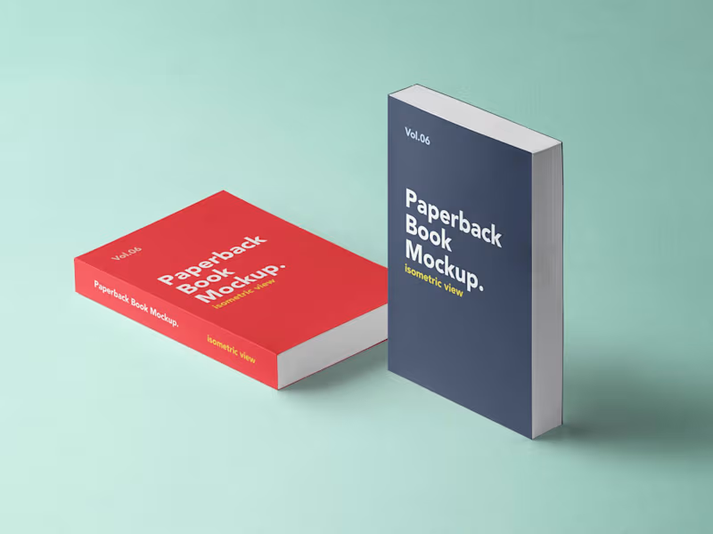
Bring Your Book Cover to Life with a Professional 3D Mockup.
Showcase your book with a realistic, eye-catching 3D mockup designed to make your cover stand out. Perfect for authors, publishers, marketers, and self-published writers.
Design Features:
Realistic 3D book presentation
Professional lighting and shadows
High-quality front cover display
Paperback and hardcover mockups
Attractive perspective and depth
Make Your Book Look Ready for the Bestseller Shelf!.
0
30
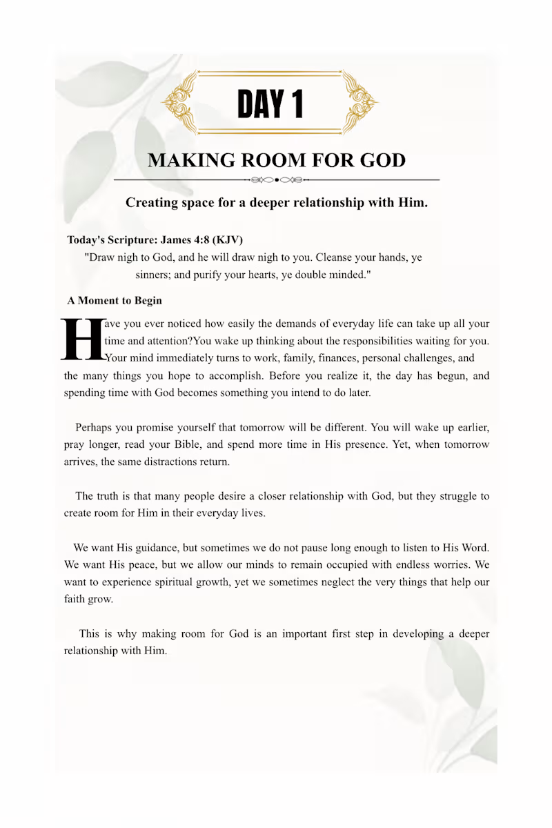
Project Overview
Growing Closer to God: A 7-Day Journey Toward Deeper Faith, Intimacy with God, and Spiritual Consistency is a Christian devotional eBook design project created to combine meaningful spiritual content with an elegant, reader-friendly publishing layout.
The project showcases professional eBook formatting, typography, page composition, and Canva-based interior design, with a clean and minimalist aesthetic that reflects the peaceful message of the devotional.
Services and Skills Demonstrated
Christian eBook Formatting and Layout Design
Canva Book Design and Typesetting
Professional Typography and Font Pairing
Elegant Cover Design
Copyright and Dedication Page Layout
Introduction and Chapter Page Formatting
Scripture and Devotional Content Presentation
Consistent Margins, Spacing, and Alignment
Reader-Friendly Interior Page Design
PDF Export and Digital Publishing Preparation
Amazon KDP Formatting Considerations
Design Approach
The design features a sophisticated combination of warm ivory, elegant black typography, and subtle gold accents, creating a clean and timeless Christian publishing aesthetic.
Special attention is given to readability, visual hierarchy, consistency, and balanced page composition to ensure a polished reading experience.
Project Goal
To transform a Christian devotional manuscript into a beautifully presented digital book that is visually appealing, easy to navigate, and prepared for professional publishing.
I bring the same attention to detail, creativity, and commitment to quality to every manuscript I format and design.
0
13
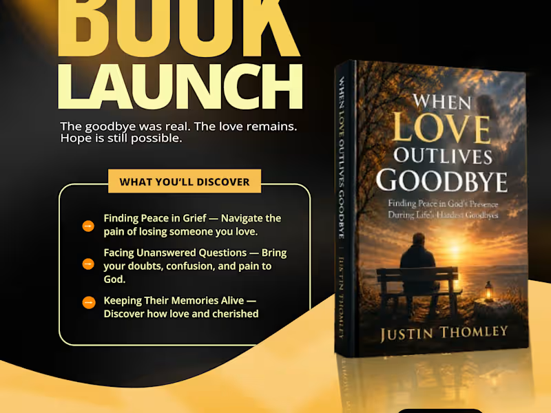
When Love Outlives Goodbye | Book Launch Flyer Design
A warm, high-contrast launch flyer that turns a grief-support book into a scroll-stopping social media promo.
I designed the official book launch flyer for When Love Outlives Goodbye: Finding Peace in God’s Presence During Life’s Hardest Goodbyes by Justin Thomley.
The book deals with grief, faith, and healing. The flyer had to feel hopeful and comforting, not heavy, while still standing out in a crowded social media feed and driving readers to buy.
1_ Color palette: Deep black with glowing gold and cream tones. This mirrors the sunset on the book cover, symbolizes hope after loss, and makes the headline pop.
2_ Typography: A bold, oversized “BOOK LAUNCH” headline paired with an elegant handwritten “Official” script, balancing impact with a personal touch.
3_ Hierarchy: The tagline “The goodbye was real. The love remains. Hope is still possible.” sits right under the headline for an instant emotional hook.
4_ Content block: A framed “What You’ll Discover” section highlights the book’s three key themes so readers understand its value at a glance.
5_ Book mockup: A 3D mockup of the cover, placed on the right to balance the text and give the book a premium feel.
Clear call to action: An “Now Available on Amazon” badge, a Kindle and Paperback note, and a scannable QR code lead straight to the purchase page.
A cohesive, emotionally resonant promo design ready for Instagram, Facebook, WhatsApp Status, and LinkedIn, giving the author a professional launch presence.
Deliverables
Book launch flyer (portrait, social media format)
Skills / Tags
Graphic Design, Flyer Design, Book Launch Design, Social Media Design, Book Marketing, Branding, Print & Digital Design, Typography
Tools Used (edit to match yours)
Adobe Photoshop, Adobe Illustrator, Canva
Your Role
Graphic Designer
Client
Justin Thomley (Author)
Project Type
Marketing / Promotional Design
1
169
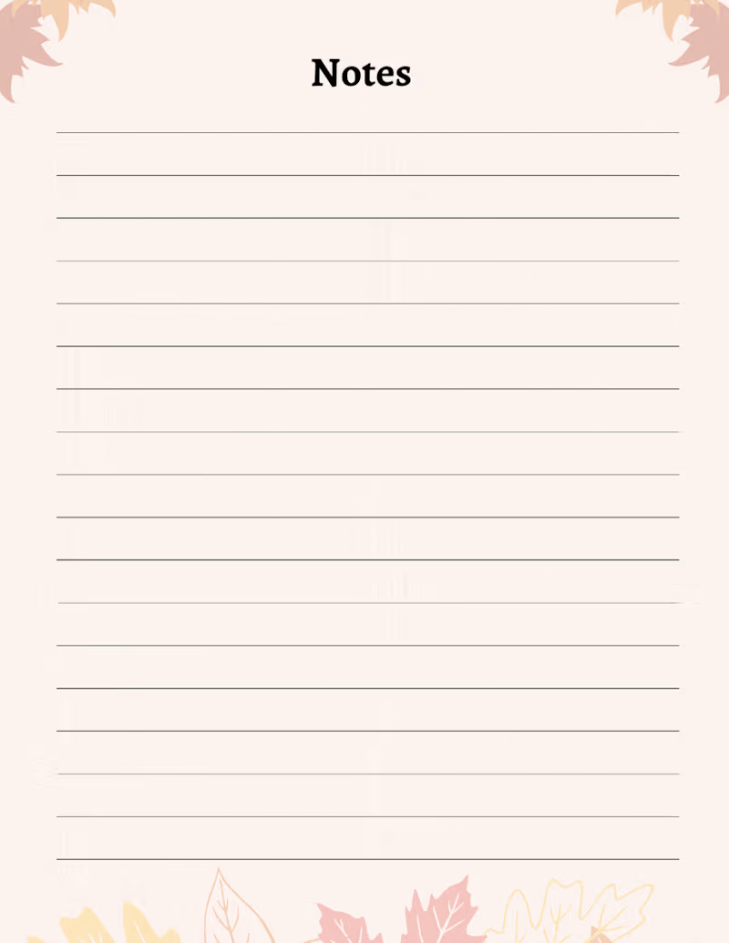
🍂 Gratitude Journal | Book Cover & Interior Design
A simple journal designed to turn everyday moments into meaningful reflections.
For this Gratitude Journal, I focused on creating a warm, calming, and inviting visual experience. The autumn-inspired palette, clean composition, botanical elements, and handwritten typography work together to create a peaceful atmosphere that encourages reflection and intentional journaling.
What I focused on:
📖 Journal cover design
🎨 Color palette & visual direction
✍️ Typography selection
🍁 Botanical/seasonal elements
📐 Clean and balanced composition
📝 Print-ready journal presentation
The goal was to create something that feels personal, peaceful, and easy to engage with a journal readers would actually want to pick up and use.
Looking for a professional book, journal, or planner design?
I help authors and creators transform their ideas into polished, publication-ready books.
Services: Book Cover Design • Journal Design • KDP Formatting • Interior Layout • Book Publishing
#BookDesign #JournalDesign #BookCoverDesign #KDP #SelfPublishing #GraphicDesign #PublishingDesign #ContraPortfolio #Journal #GratitudeJournal
0
114