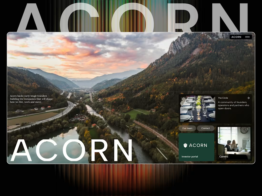
Acorn — a new VC website concept 🌱
Been working on Acorn, a Framer site for a modern venture capital firm.
I wanted this one to feel less like a traditional finance website and more like a serious technology brand — editorial, confident and very focused on the people and companies behind the numbers.
The site is built around three core areas:
Invest. Build. Scale.
With sections covering the investment thesis, criteria, portfolio, locations, team, fund metrics and dedicated journeys for founders and investors.
A big part of the challenge was making a lot of information feel simple without making it feel empty.
Built in Framer.
Acorn — backing founders early, and staying for the long run. 🌱
#Framer #FramerDesigner #WebDesign #VentureCapital #VC #StartupDesign #Investment #WebDesignInspiration
0
105


Really proud of this one.
I’ve put a lot of time into Helm, obsessing over the small details, interactions, spacing and overall feel until it felt right.
View here: https://helm.framer.media
It’s a complete SaaS website built in Framer, with product pages, pricing, customers, docs, changelog, status and everything in between.
Probably one of my favourite templates I’ve built so far.
Would genuinely love your feedback on this one, what works, what doesn’t, and what you’d change.
Built in Framer. 🤍
2
242

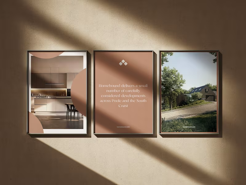
Really enjoyed working on Homebound, a property brand built around making the experience of discovering a home feel a little more considered.
The brief was to create something that felt premium, calm and editorial, while still making the important stuff easy to find.
Photography does a lot of the heavy lifting here, so the design is intentionally restrained — giving the homes room to breathe rather than throwing information at you.
From the property experience through to mobile, everything was designed to feel simple, intuitive and genuinely enjoyable to use.
A really nice one to work on.
#WebDesign #Branding #Property #WebDesignInspiration #Framer #FramerDesigner
4
14
442

Roberts & Co. A new identity built around certainty.
A complete brand identity for Roberts & Co, an independent firm of Chartered Surveyors and Registered Valuers.
The brief was to move the brand away from the conventional, corporate language of surveying and create something that felt established, considered and quietly premium.
We developed a refined visual identity built around restrained typography, a deep neutral palette and a more editorial approach to communication, giving Roberts & Co a distinctive presence across both digital and physical touch points.
From business cards and stationery to advertising and the new website, every element was designed to feel consistent, confident and unmistakably Roberts & Co.
Brand identity. Art direction. Digital.💯
Designed by Fabricatr.
#BrandIdentity #Branding #Rebrand #CreativeStudio #ArtDirection #WebDesign #Contra #PropertyBranding #Surveyors #RobertsAndCo
2
4
227

Would love some honest feedback on this direction 👀
I’ve been working on a sharper brand and website direction for Pantha — built around bold contrast, clearer messaging and a digital experience that feels more like a platform than a standard agency site.
The aim was to make it feel confident, strategic and slightly unexpected without becoming too “design for design’s sake”.
What lands for you?
And more importantly: what would you change?
Brutal honesty welcome.
#BrandDesign #WebDesign #CreativeDirection #Framer
3
229

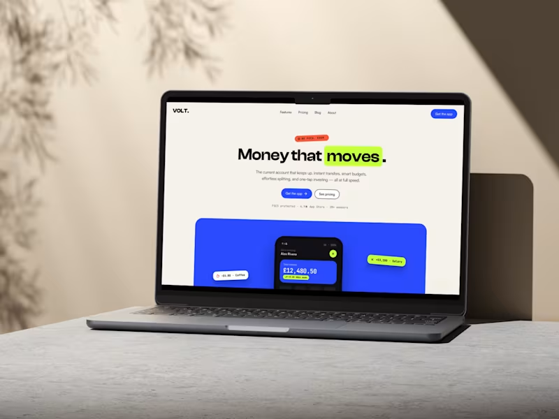
VOLT — a high-energy fintech landing page concept ⚡
A bold, conversion-led website concept built for a next-generation banking product.
The direction was simple: make finance feel fast, intuitive and worth paying attention to.
Clean editorial layouts, oversized type, high-contrast colour, playful product moments and a visual system that makes the platform feel more like a brand people want to be part of — not just another banking app.
Designed and built in Framer.
Looking for a website that feels as considered as the business behind it?
Let’s work together.
#WebDesign #Framer #FintechDesign #LandingPageDesign #UXDesign #BrandDesign
3
4
230


KILO — Strength Club Framer Website Template
KILO is a bold, fully editable Framer website template for strength clubs, boutique gyms and performance-led fitness brands.
Designed for businesses built around serious training, real coaching and strong community, KILO gives you a complete website system that goes far beyond a standard gym landing page. It includes everything needed to communicate your classes, coaches, training philosophy, membership options and location — while making it easy for visitors to take the next step and join.
The template combines raw editorial typography, high-impact fitness imagery, smooth interactions and conversion-led layouts to create a digital presence with real character. It is built for gyms that want to look credible, modern and different from the usual generic fitness website.
What you receive
Full editable Framer website template
Responsive layouts for desktop, tablet and mobile
Hero, class, timetable, coach, membership and FAQ sections
Membership pricing and sign-up calls-to-action
Gym philosophy, community and statistics blocks
Interactive one-rep-max strength calculator
Reusable Framer components and global styles
Clean, organised structure for fast customisation
Best suited for
Strength and conditioning gyms
CrossFit and functional fitness studios
Personal training businesses
Olympic lifting clubs
Boutique fitness concepts
Performance and recovery centres
Independent gyms and coaching brands
How it works
After purchase, open the included Framer remix link while logged into your Framer account. Duplicate the template into your own workspace, replace the imagery, branding, copy and links, then publish on your own domain.
This purchase includes the complete editable Framer website template — not just a landing page.
The existing KILO concept includes dedicated navigation for classes, timetable, membership and club content, alongside coaching profiles, pricing and a strength-calculator experience.
1
178