Freelance Photo Editors in Palampur
Freelance Photo Editors in Palampur
Sign Up
Post a job
Sign Up
Log In
Filters
2
Projects
People
Abhishek Sharma
Palampur, India
Designing scroll-stopping creatives for product brands.
New to Contra
Follow
Message
Designing scroll-stopping creatives for product brands.
0
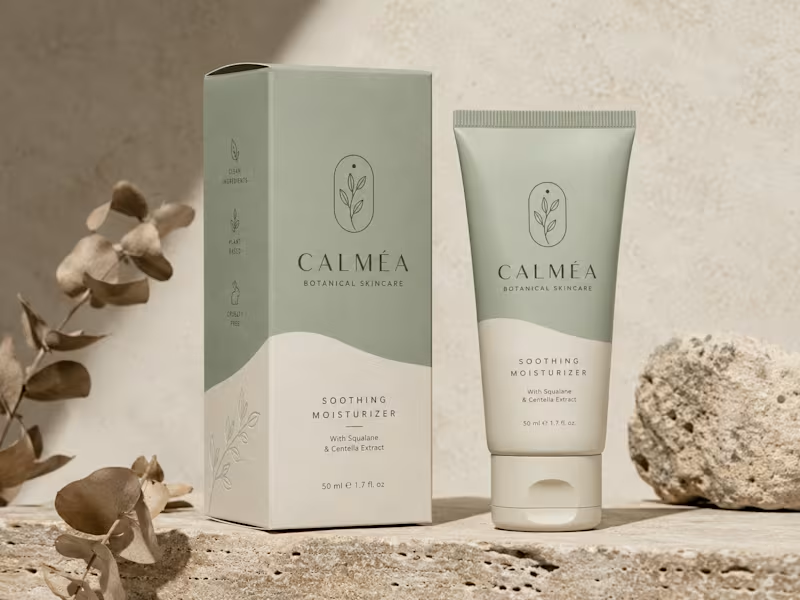
This project showcases the visual identity and packaging design for CALMÉA Botanical Skincare. The goal was to translate the brand’s core philosophy- gentle, plant-based, and science-backed skin nutrition—into a physical product experience that feels deeply calming and luxurious. Design Strategy & Key Elements Color Palette: A soothing, nature-inspired palette featuring a muted sage green and a warm, textured cream tone. The split-tone layout uses organic, fluid curves that mimic natural landscapes or gentle waves. Typography & Visual Assets: The brand name "CALMÉA" is set in an elegant, high-contrast serif typeface, paired with clean, architectural sans-serif typography for product details. The primary logo icon features a minimalist botanical branch enclosed in a delicate arch. Packaging Layout: As seen in the image, the outer box features structured side-panel iconography ("Clean Ingredients," "Plant Based," and "Cruelty Free") and a subtle line-art botanical illustration on the lower section. The theme carries over seamlessly to a matte-finish squeeze tube. Art Direction: The staging emphasizes raw, tactile textures - rough travertine stone, natural direct sunlight, and dried eucalyptus branches- to highlight the organic origin of the product.
0
53
0
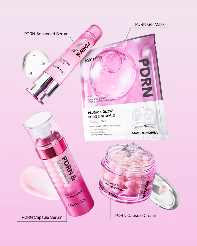
For this Farmstay PDRN creative, I laid out four products from the range (advanced serum, gel mask, capsule serum, and capsule cream) in a scattered grid so each item stayed clearly visible and labeled, making it easy for viewers to see the full collection at a glance. I added small product swatches near a couple of the items to hint at texture and application. The entire composition sits on a soft pink gradient background to match the brand's signature pink tone, keeping the set feeling cohesive and on-brand while each product still gets its own moment with a clean label callout.
0
61
1
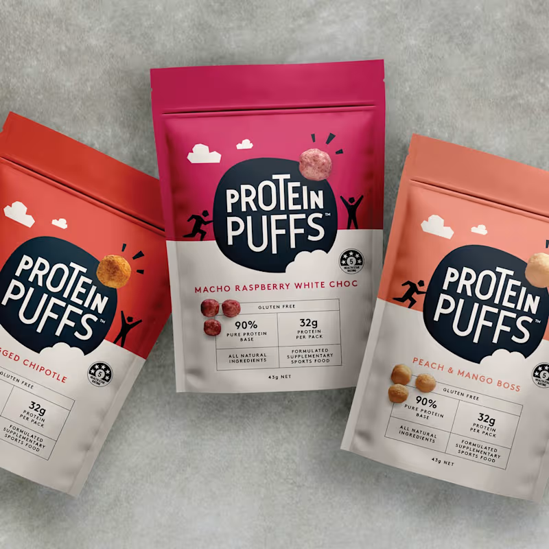
For this Protein Puffs creative, I arranged the three flavor packs in a fanned-out, slightly overlapping layout with the center pack raised higher to draw the eye to it first, then naturally guide attention to the two side packs. I placed them on a textured stone/concrete-style background to give the shot a grounded, lifestyle feel rather than a flat studio look. The angled, scattered arrangement keeps the composition dynamic and makes the range feel more like a real product lineup than a static catalog shot, while the bright pack colors stay the clear focal point against the neutral background.
1
1
100
0
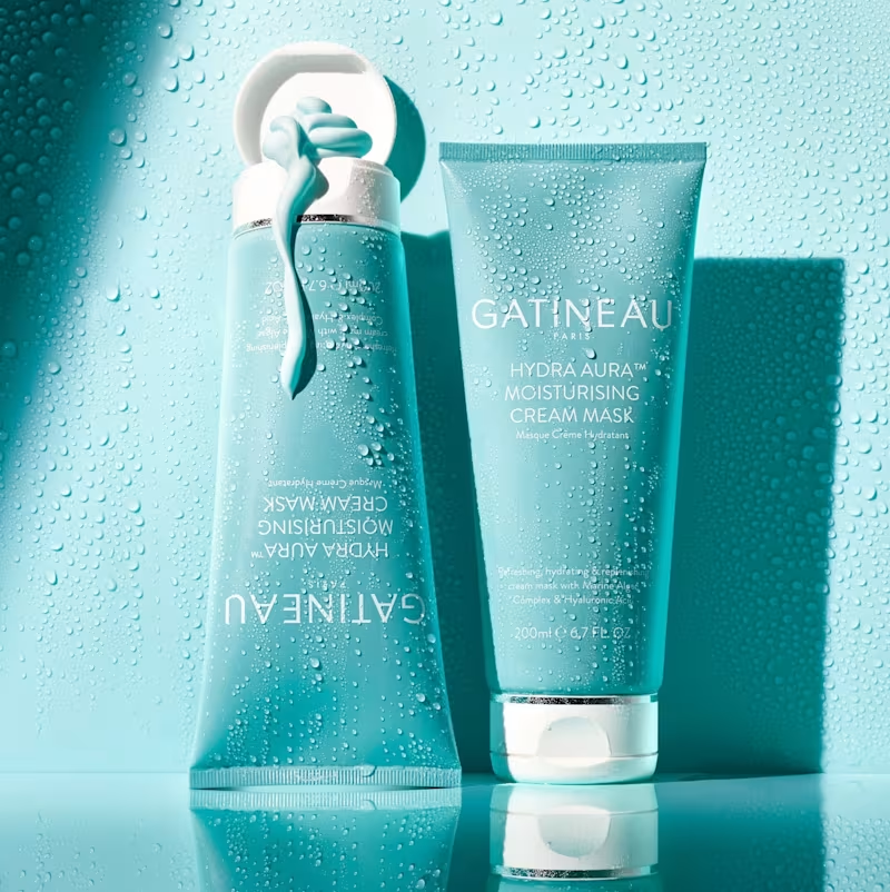
For this Gatineau creative, I placed the product on a reflective surface to create a mirrored duplicate beneath it, adding depth and a premium, editorial feel. I kept the entire scene in a cool teal tone to match the brand's packaging and added water droplets across the background to reinforce the "hydrating" and "moisturising" positioning of the product. The reflection and water texture work together to make the shot feel fresh, clean, and spa-like, while the lighting keeps the focus on the product without losing the mood of the scene.
0
62
Photo Editor
(8)
Follow
Message
Explore people