Freelance Presentation Designers in Odesa
Freelance Presentation Designers in Odesa
Sign Up
Post a job
Sign Up
Log In
Filters
2
Projects
People
Dmytro Messer
Odesa, 65000
Founder MDevise Agency & Senior Graphic Designer
Follow
Message
Founder MDevise Agency & Senior Graphic Designer
1
Using less text doesn’t mean leaving out important information. For me, the key is deciding what actually deserves space. Whether it’s a sentence, an image or a chart, every part should have a clear purpose and support the overall message. I pay close attention to visual hierarchy. I want the audience to move through the presentation naturally, starting with the most important point and then noticing the supporting details. Font size, formatting and placement all help create this structure. I also try to be careful with the amount of text. If there is too much, people are less likely to read it. When content doesn’t fit, reducing the font size only makes the slide harder to scan.
1
105
0
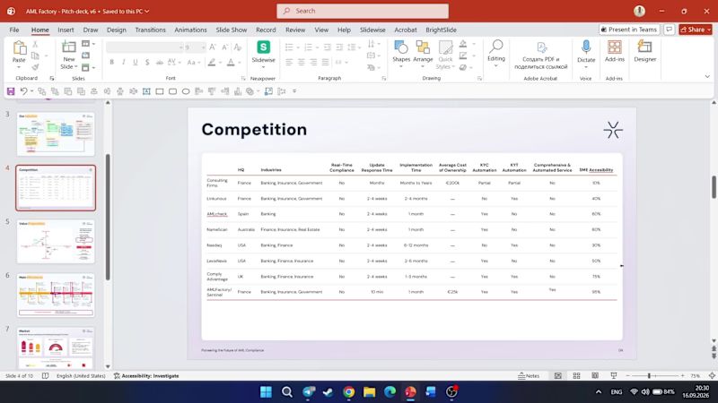
PowerPoint just made working with tables a little easier One of the small updates I really like is the ability to work with tables more easily directly from the interface, without having to jump into additional settings every time you want to make a simple adjustment. It may seem like a small thing, but when you work with presentations every day, these little improvements can save quite a lot of time. Have you already tried this update in practice?
0
93
0
Most people think presentation design is about opening PowerPoint, choosing a nice font, some colors and images, and making the slides look “wow.” But I actually start somewhere else. Before I design anything, I want to understand the presentation first. Who is it for? What is it meant to achieve? What is the main message? What should people remember after seeing it? Then I organize the content. I decide what belongs on each slide, what order makes the most sense, where the important points should stand out, and what can be removed. For me, good presentation design is about finding the right balance between the message and the visuals. The design should make the content more interesting without taking attention away from the main idea.
0
75
3
Even strong content can be difficult to understand when it’s presented without a clear flow. The audience may lose track of what really matters or simply stop paying attention. Before creating the slides, I would first define the key message. Then I would decide which ideas are essential and which ones can be left out. I would organize the content so each part naturally leads to the next. This makes the presentation easier to follow and keeps the story clear. Another thing I would focus on is the amount of information on each slide. Too much text, too many charts, or too many visuals can make the content overwhelming and distract from the message. A strong ending is just as important. I would leave the audience with a clear takeaway and a simple understanding of what they were meant to remember. For me, good structure is about making ideas clear, keeping people engaged, and making the message easy to remember.
1
3
224
Presentation Designer
(14)
Follow
Message
Explore people