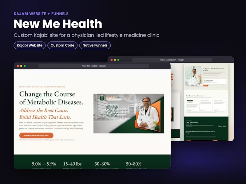
AI Enhanced Online Course Creator, Kajabi, Thinkific, Podia
- 5.0
- Rating
- 13
- Followers
AI Enhanced Online Course Creator, Kajabi, Thinkific, Podia
PROJECT TYPE
Online course landing page setup and launch preparation using Systeme.io (http://Systeme.io).
CLIENT PROBLEM / BUSINESS CHALLENGE
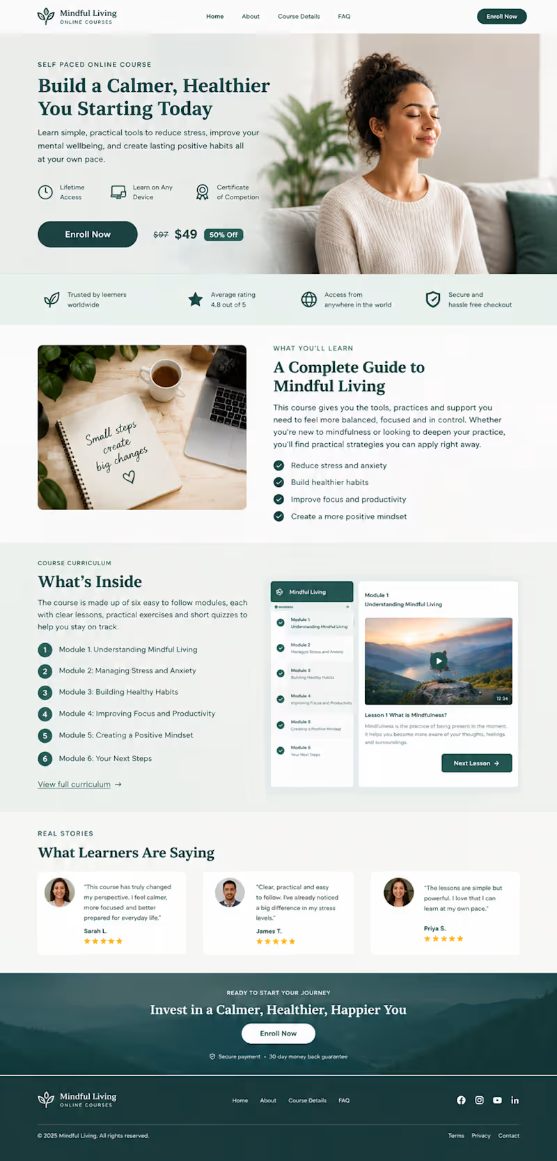
The course content and marketing messaging were already prepared, but they needed to be turned into a professional landing page that clearly presented the course and guided potential students toward enrollment.
The main challenge was organizing the available information into a page that was easy to understand, visually engaging, and structured around the course offer rather than simply placing the supplied content onto a webpage.
WHAT I DID
I structured the course information into a complete landing page experience inside Systeme.io (http://Systeme.io), focusing on clear presentation, visual hierarchy, and a straightforward enrollment journey.
The page included:
• A focused hero section introducing the course and its main value
• Clear course benefits and learning outcomes
• Course curriculum and module previews
• Visual previews of the online learning experience
• Strong and strategically placed enrollment calls to action
• Pricing and offer presentation
• Learner testimonial sections
• Supporting trust and value indicators
• A final enrollment section encouraging visitors to take action
• Consistent typography, spacing, imagery, and branding throughout the page
• A responsive structure designed for a professional online course launch
I organized the page so visitors could quickly understand what the course offers, what they would learn, what is included, and how to move forward with enrollment.
RESULT / OUTCOME
The completed landing page concept presents the course as a professional online learning product rather than simply displaying course information.
The structure gives visitors a clear journey from the initial course introduction through benefits, curriculum, learning experience, social proof, and the final enrollment call to action.
0
19
Career & Life Coaching Website | Systeme.io (http://Systeme.io)
The Client's Problem
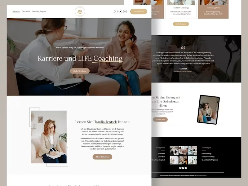
The client needed a professional coaching website that could clearly communicate her Life & Business Coaching services, introduce her personally, build credibility, and guide potential clients toward booking a consultation.
What I Did
I designed and structured the Systeme.io (http://Systeme.io) website around the client's coaching journey.
The homepage leads with a clear “Karriere und LIFE Coaching” message, followed by the coach's introduction, coaching services, specialization areas, client testimonial, consultation CTA, and supporting visual content.
I also focused on creating a calm, premium visual direction that matches the personal and professional nature of the coaching brand while keeping the navigation simple and the key actions easy to find.
The Result
A polished coaching website that gives visitors a clear understanding of the coach, her services, and the next step toward working with her.
3
214
The Client's Problem
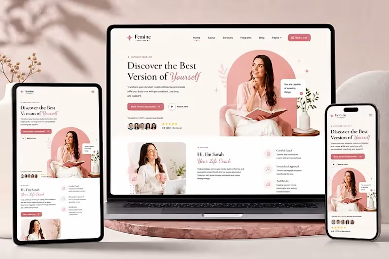
The coaching brand needed a professional website that could present its personal coaching offer clearly, build trust with potential clients, and make it easy for visitors to take the next step.
What I Did
I designed and structured this Systeme.io (http://Systeme.io) coaching website around a clear client journey. The homepage uses a strong hero section, prominent booking CTA, coach introduction, service information, trust elements, and responsive layouts across desktop, tablet, and mobile.
The goal was to make the brand feel professional and approachable while keeping the path from discovering the coach to booking a consultation simple.
The Result
A polished, responsive coaching website that presents the offer clearly and gives visitors a straightforward path toward working with the coach.
3
205
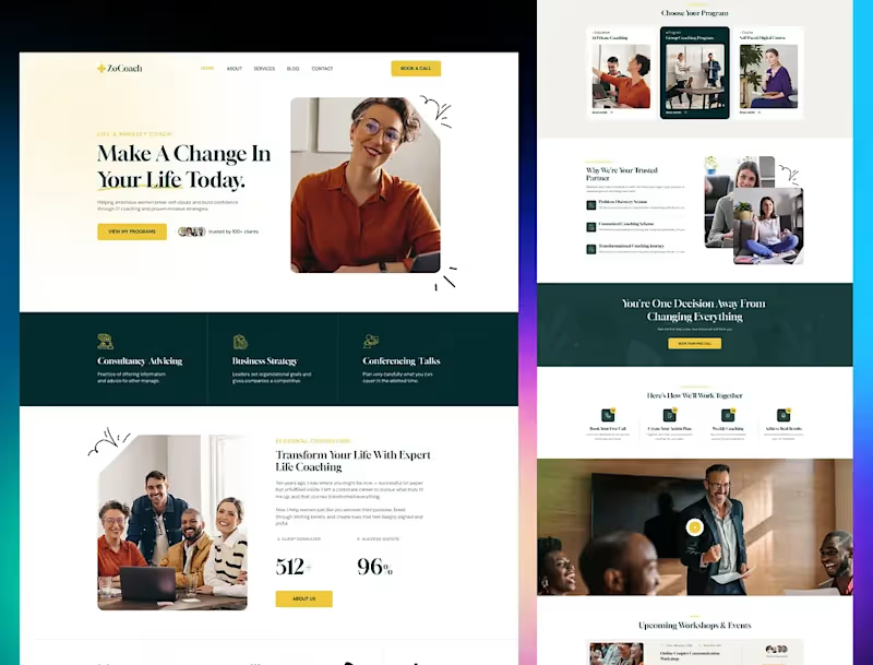
A coaching website should do more than explain what you offer. It should make the next step obvious.
This Systeme.io (http://Systeme.io) website was designed for a coaching brand with one clear goal: turn visitors into coaching clients.
From the strong hero section and clear “Book a Call” CTA to the program cards, trust section, client results, workshops, and step by step process, the page takes visitors through the journey from “What do you offer?” to “I’m ready to work with you.”
The structure matters just as much as the visuals.
A beautiful coaching website that doesn't guide visitors toward an action is just a pretty website. This one is built around the customer journey.
3
171


Shopify & GHL Expert | Stores That Sell on Autopilot
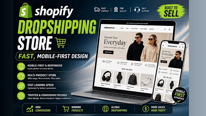
Shopify Dropshipping Store — Fast, Mobile-First Design
Shopify Dropshipping Store — Fast, Mobile-First Design
Built a clean, modern Shopify dropshipping store for a general/fashion brand designed to handle multiple products without feeling cluttered. The focus was speed, simplicity, and a shopping experience that keeps customers browsing.
Every page was built with mobile-first in mind—because most dropshipping traffic comes from social ads on phones.
What was built:
Multi-product Shopify store setup and branding
Clean homepage with featured collections and promotional banners
Product pages optimized for impulse buying
Fast-loading, mobile-first design
Navigation and filtering for easy product discovery
Basic SEO setup and store settings configuration
Result: A ready-to-launch dropshipping store built for paid traffic — clean enough to build trust, fast enough to hold attention.
Available for similar projects—general stores, fashion brands, lifestyle products, and dropshipping businesses ready to scale.
1
169
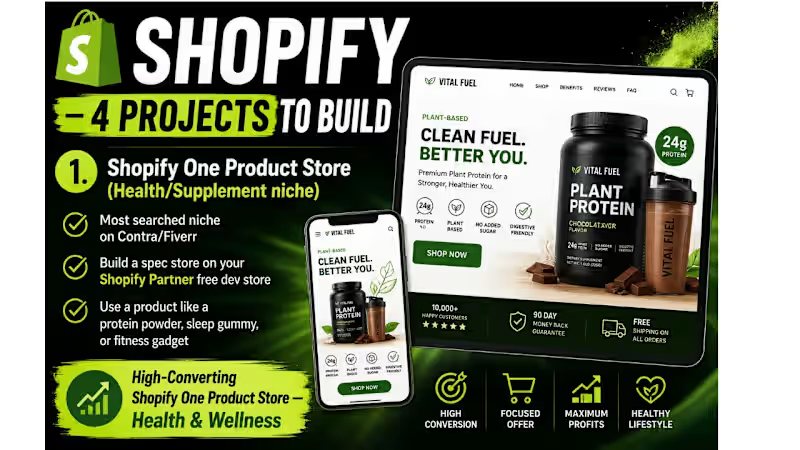
High-Converting Shopify One Product Store — Health & Wellness
High-Converting Shopify One-Product Store — Health & Wellness
Built a focused, conversion-optimized Shopify store for a health and wellness brand selling a single hero product. The goal was simple: turn visitors into buyers — fast.
The store was designed with a clean, trust-first layout featuring a bold above-the-fold section, benefit-driven copy, social proof blocks, a sticky add-to-cart button, and a mobile-first experience that loads in under 3 seconds.
What was built:
Custom Shopify theme setup and branding
High-converting product page with urgency triggers
Upsell and cross-sell sections
Mobile-optimized layout
Basic SEO and speed optimization
2
163

Why Your Shopify Store Isn't Converting (And How to Fix It)
Most Shopify stores lose sales not because of bad products — but because of bad design decisions.
Here are 3 things I fix on every store I build:
1. No clear above-the-fold hook
Visitors decide in 3 seconds. If your hero section doesn't say what you sell + why it matters, they're gone.
2. Product pages with no trust signals
Reviews, badges, guarantees — these aren't optional. They're what turn browsers into buyers.
3. Checkout friction
Too many steps, no express checkout, no mobile optimization. You're basically asking people to leave.
Fix these three things and your store will outperform 80% of competitors.
Building a Shopify store soon? Drop a comment or send me a message — happy to help.
1
3
182


Web Developer | Business Websites | Landing Pages & Funnels
Web Developer | Business Websites | Landing Pages & Funnels
Project Title: Webinar Funnel with Automated Live-Broadcast Experience
The Problem:
Most webinar funnels are just a video embedded on a page — visitors can skip ahead, get distracted, or leave before the offer is made. There's no structure guiding attention, and no mechanism to reveal the offer at the right psychological moment. The client needed a funnel that felt like a real live event, kept viewers engaged for the full session, and only presented the buy button when it was actually relevant — not before.
How I Solved It:
I built a full funnel flow — opt-in page → post-signup popup → confirmation page → automated webinar room → payment page — with custom JavaScript controlling the experience at each stage:
On the confirmation page, I used JavaScript to automatically redirect visitors into the webinar room at the scheduled start time, removing manual steps and keeping the "live" illusion intact
Inside the webinar room, I stripped out all video player controls (no pause, skip, or scrub) so the video behaves like a live broadcast rather than an on-demand replay
I added a timed reveal system — the purchase button stays hidden until a specific point in the video (e.g. minute 34 of a 40-minute webinar), then appears automatically right as the offer is pitched, keeping attention on the content until that exact moment
Connected the flow into a secure payment page for checkout immediately after the reveal
Result / Other Details:
The finished funnel runs end-to-end with zero manual intervention — a visitor can land on the opt-in page, get carried through confirmation, watch a fully "live-feeling" webinar, and reach checkout at the exact right moment, all timed automatically. Fully responsive across desktop, tablet, and mobile.
Tech used: HTML, CSS, JavaScript, Systeme.io
1
221
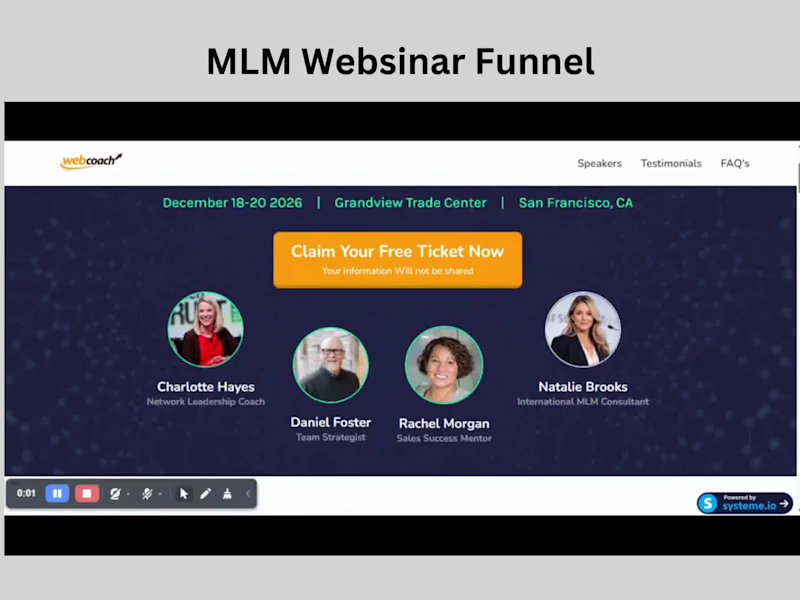
Problem
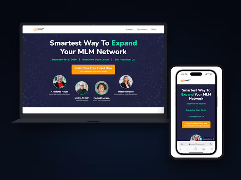
Webinar funnels need to do more than present information. They need to capture interest quickly, create enough anticipation to keep people moving, and make the transition from registration to the actual webinar feel seamless.
What I built
I designed and built a webinar lead-generation funnel for an MLM/network marketing summit.
The funnel starts with an opt-in landing page designed to communicate the value of the event, introduce the speakers, and encourage visitors to reserve their spot.
From there, I built the supporting journey:
Popup opt-in form for collecting attendee details
Confirmation/transition page after registration
A 5-minute countdown experience to build anticipation before the event
A dedicated webinar room where attendees continue to the actual presentation
The design was built around the event's speakers, schedule, social proof, and educational value while keeping the path to registration straightforward.
Technologies
HTML · Tailwind CSS · JavaScript · Systeme.io
I handled the frontend UI with HTML and Tailwind CSS, using JavaScript for the countdown and smaller interactions. Systeme.io was used for the funnel infrastructure, lead capture, CRM, and automation.
Result / Goal
The goal was to create a complete webinar funnel rather than a standalone opt-in page — giving visitors a clear path from discovering the summit to registering and entering the webinar experience.
Opt-in → Registration → 5-minute countdown → Webinar room.
A good example of how I approach funnel projects: the page is only one part of the experience; the journey between each step matters too.
1
169
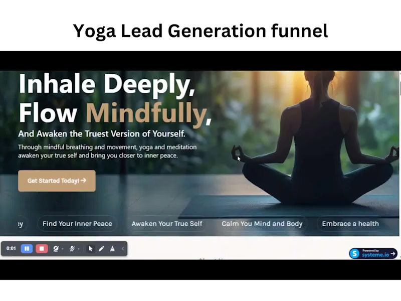
Problem
Wellness websites often look beautiful but leave the actual lead journey as an afterthought. I wanted to build a yoga and meditation experience that felt calm and premium while giving visitors a clear, low-friction path from discovering the service to making an enquiry.
What I built
I designed and developed a yoga & meditation lead-generation funnel with the complete user journey in mind.
The experience includes:
A premium, responsive landing page
Service and benefits sections
Instructor profiles and social proof
Interactive FAQ section
Popup lead capture form for collecting visitor contact details
A dedicated thank-you page after form submission
CRM and automation connected through Systeme.io
The visual direction focuses on warmth, space, strong imagery, and a calm editorial feel — keeping the interface aligned with the wellness space while still maintaining a clear conversion path.
Technologies
HTML · Tailwind CSS · JavaScript · Systeme.io
I used HTML and Tailwind CSS to build the responsive UI, with JavaScript handling smaller interactions across the page. Systeme.io handles the CRM side, lead capture, automation, and the post-submission journey.
Result / Goal
The goal was to create more than a static landing page — a complete lead-gen funnel where the design, form experience, CRM, and thank-you flow work together.
The result is a reusable yoga/wellness template that takes a visitor from first impression → exploration → lead capture → confirmation, without making the experience feel overly commercial.
Built to feel like a wellness experience first, and a funnel second.
1
138
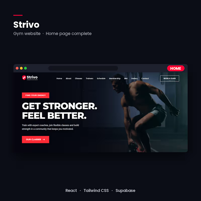
Strivo, a gym website built with React + Supabase (in progress)
A full gym website with class booking, trainer profiles, a weekly schedule, membership plans, and an admin dashboard where the owner approves customer reviews before they go live.
STACK: React, Tailwind CSS, Supabase (database, auth, Row Level Security), Vercel.
STATUS: home page complete. Next are the booking system, reviews flow and admin dashboard.
Available for gym and fitness website projects.
2
87

Funnel & Lead Magnet Expert Driving More Leads & Sales

🚀 Want to Turn More Visitors Into Customers and Grow Your Business Online?
Having an online presence is great, but having the right systems to attract leads, follow up with prospects, and convert them into customers can make a real difference.
I help businesses, entrepreneurs, coaches, and online creators build professional digital solutions that support their growth.
Here are some of the services I offer:
🌐 Framer Landing Page Design
🌐 Website & Landing Page Design
📈 Sales Funnel Creation & Optimization
⚙️ GoHighLevel Setup & Automation
💻 Systeme.io (http://Systeme.io) Funnel & Website Setup
📩 Email Marketing & Follow-Up Automation
📅 Appointment Booking & Calendar Setup
🤝 CRM Setup & Lead Management
🛒 Online Course & Membership Setup
🔗 Business Workflow & Integration Setup
Whether you're launching a new business, generating leads, selling products, or looking to automate your daily processes, I can help you put the right digital system in place.
Let's make your business work smarter, not harder!
💬 Have a project in mind? Send me a message here on Contra. Let's discuss your goals and find the right solution for your business.
#GoHighLevel #SystemeIO #SalesFunnels #MarketingAutomation #LandingPageDesign #CRMSetup #EmailMarketing #BusinessGrowth
0
32
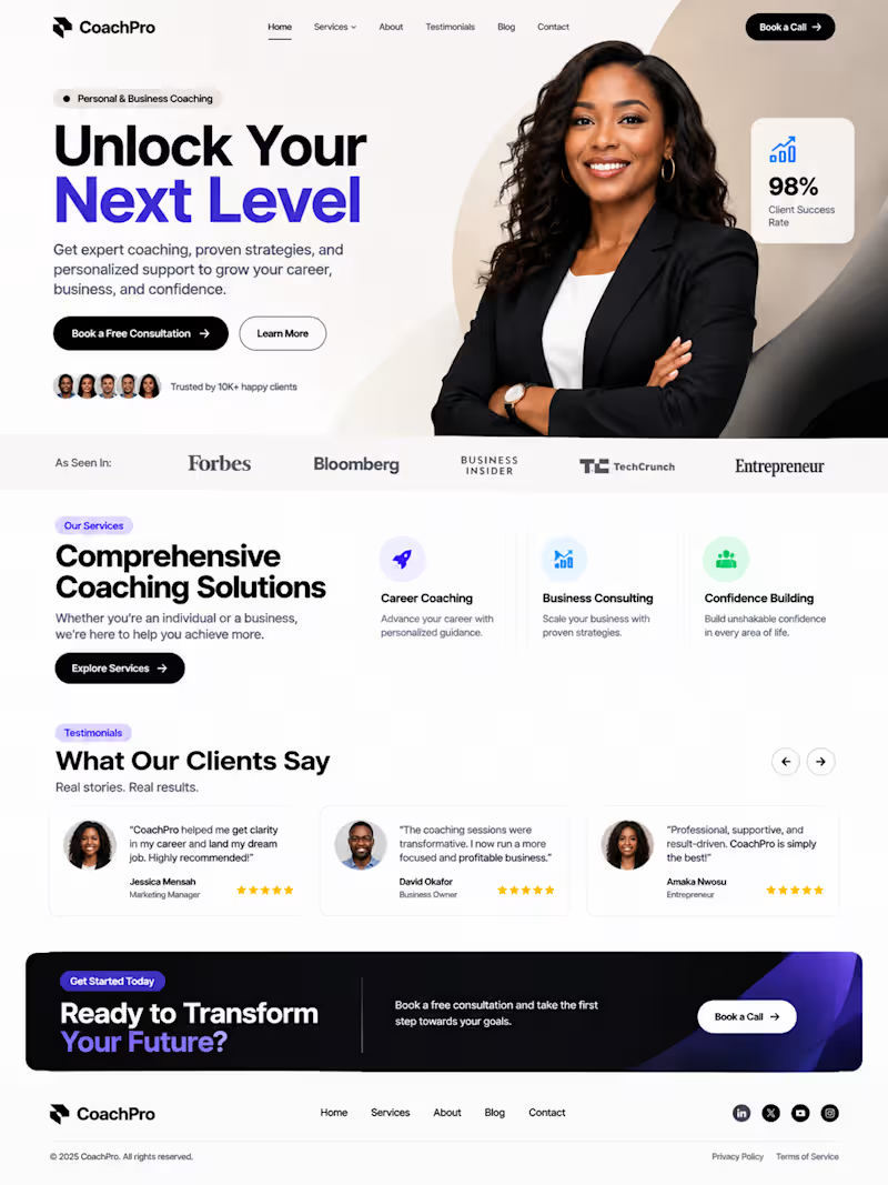
A professional landing page concept for a coaching and consulting business, designed to introduce services, build trust, and encourage potential clients to submit inquiries.
The page includes a compelling hero section, service presentation, benefits, testimonials, lead capture form, and strategic call-to-action buttons.
0
30
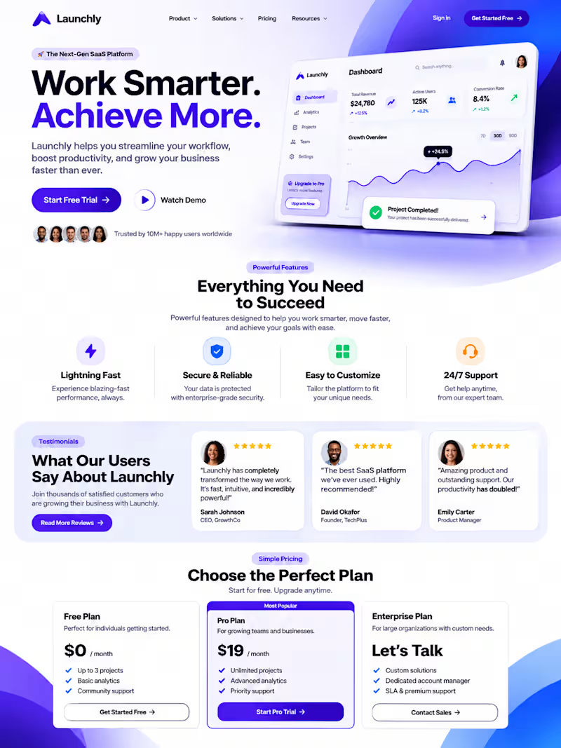
A modern, responsive SaaS landing page concept designed to help technology startups present their products, communicate their value, and encourage visitors to take action.
The design features a bold hero section, product benefits, features, testimonials, clear calls to action, and a professional layout.
1
47
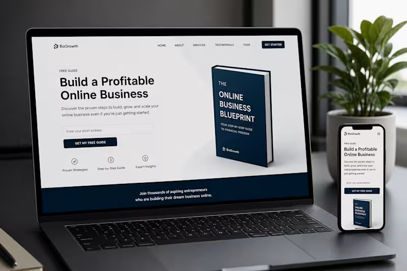
Many businesses are spending money to drive traffic, but the real question is:
What happens after visitors land on your website?
Right now, I'm helping businesses improve their customer journey through strategic sales funnels, lead magnets, and conversion-focused landing pages.
A well-designed funnel doesn't just collect leads—it guides prospects, builds trust, and turns interest into action.
If you're getting traffic but not seeing enough inquiries, leads, or sales, the issue may not be your marketing. It may be what happens after the click.
I'm currently available to help businesses optimize their funnels, improve conversions, and create lead generation systems that support sustainable growth.
#Contra #SalesFunnels #LeadGeneration #LandingPages #ConversionOptimization #MarketingStrategy #BusinessGrowth #Freelancer #WebDesign #DigitalMarketing
2
251

Full-Stack Funnel & Conversion Copy Strategist
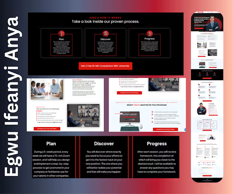
Executive Coaching Program - Conversion Funnel
I designed and structured a high-converting funnel for a leadership and performance coach with 12+ years of experience.
The project included strategic page flow, program positioning, membership tier breakdown, testimonial integration, FAQ handling, and multiple consultation booking CTAs to drive 15-minute strategy calls. The messaging was crafted to emphasize credibility, transformation, and practical results, not hype.
Result: A trust-driven coaching acquisition system built to attract serious professionals and convert them into booked consultations and long-term program members.
0
68
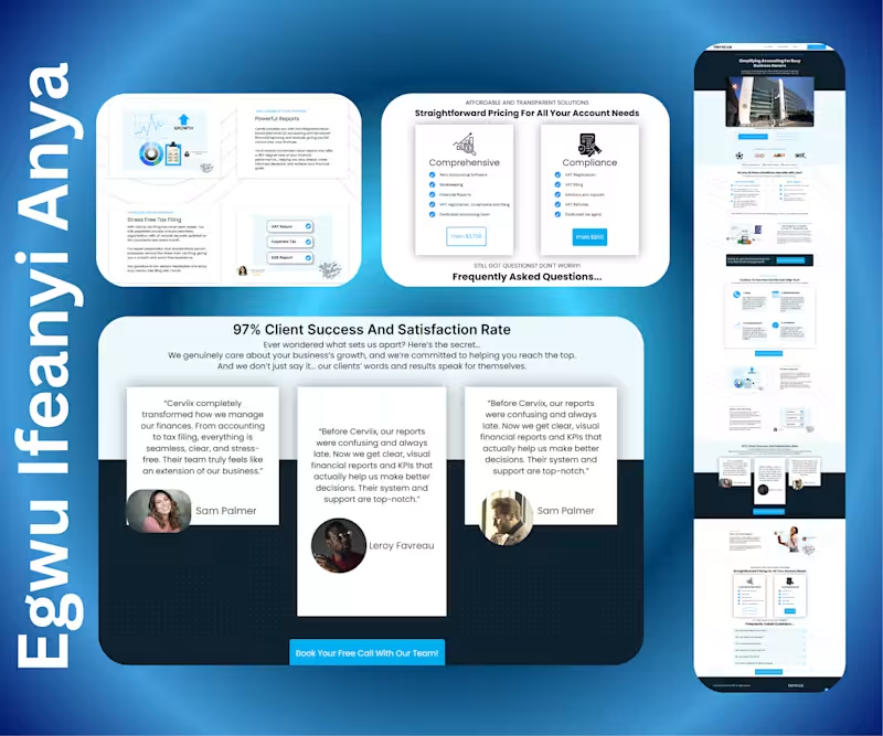
Accounting & Tax Management Agency Funnel
Designed and built a client acquisition system for an accounting agency handling company accounts, bookkeeping, and tax compliance.
The strategy focused on building trust first, clear service positioning, credibility elements, reassurance of compliance, and simplified messaging that speaks directly to overwhelmed business owners. The funnel included a structured services page, a strategic call-booking integration, and a follow-up thank-you page to improve consultation show-up rates.
Outcome: A professional, authority-driven system that consistently attracts qualified business owners and positions the agency for long-term client relationships.
0
59
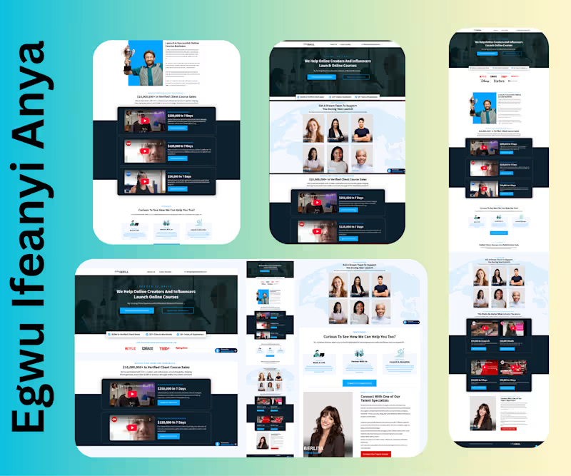
Course Launch Agency – Authority Funnel
I built this high-converting authority website and funnel for an agency helping creators and influencers launch profitable online courses.
Structured the messaging around proof ($10M+ verified sales), case studies, media logos, team credibility, and strategic call booking flow. Integrated video case studies, industry-specific results, and multiple CTA points to drive qualified strategy calls.
Result: A trust-driven acquisition system designed to position the agency as premium and convert visitors into booked consultations.
0
64
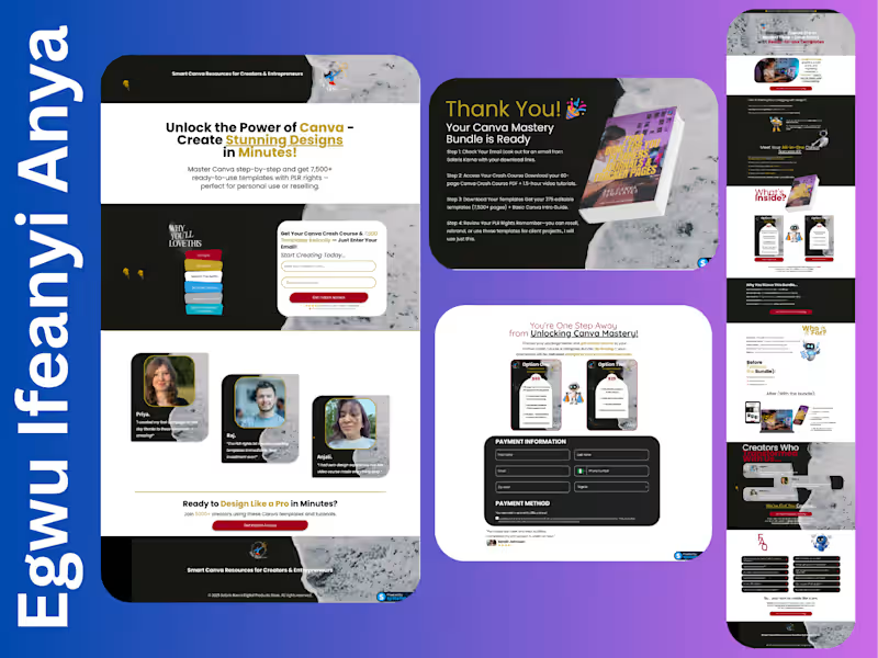
Canva Crash Course Sales Funnel
I built this high-converting sales page for a Canva template bundle and crash course targeting creators and entrepreneurs.
I structured the offer positioning, value stacking (multiple pricing options), testimonials, FAQs, and CTA flow to increase urgency and perceived value.
Result: A conversion-focused digital sales asset designed to turn aspiring creators into confident buyers quickly.
0
63

I build high-converting funnels, websites & automations.
New to Contra
I build high-converting funnels, websites & automations.

Project Title: Amazon Consulting Lead Funnel & Email Automation — Systeme.io (http://Systeme.io)
Description:
Built a complete lead management and email automation system in Systeme.io (http://Systeme.io) for a consulting brand serving Amazon sellers across India and the USA.
The system starts at opt-in. When a prospect subscribes via the KAM PPC main page, a conditional workflow fires after one hour and checks whether they've already booked a call. If they have, they exit cleanly — no duplicate messaging. If they haven't, they're tagged as a non-booked lead and automatically enrolled into a recovery sequence designed to bring them back and get the booking.
For leads who do book, a separate 4-email nurture sequence kicks in immediately — delivering an Amazon growth toolkit on confirmation, a second resource 3 hours later, then a real-world listing optimization example on day 1, and a marketplace scaling case study on day 2. Every email is timed to reduce no-shows and pre-frame the sales call so prospects arrive already warmed up.
The result is a fully automated lead lifecycle — from opt-in to segmentation, booked nurture to non-booked recovery — running without manual intervention across two markets.
Platform: Systeme.io
(http://Systeme.io)Category: Lead Segmentation / Email Campaign / Conditional Workflow / Pre-Call Nurture
0
76

Project Title: Course Access & Upsell Enrollment Automation — Systeme.io (http://Systeme.io) Workflow
Description:
I Built a post-purchase enrollment automation in Systeme.io (http://Systeme.io) for a coaching brand running a challenge-based course model. When a new upsell sale comes in, the workflow immediately tags the buyer (Upsell Buyer + 1 Year Access), then grants full access to two courses simultaneously — "The Rebirth Challenge" and the "30 Day Quantum Alignment Challenge."
The smart part: access doesn't stay open indefinitely. A date-based wait step holds until December 31, 2026, then automatically revokes access to both courses — no manual offboarding, no forgotten memberships, no expired buyers still inside paid content.
The whole flow runs hands-free from purchase to expiry, protecting the client's course content while delivering a seamless buyer experience.
Platform: Systeme.io
(http://Systeme.io)Category: Course Automation / Membership Access Management / Post-Purchase Workflow
0
84

Designed and built a full sales funnel page for a home services subscription business targeting homeowners tired of chasing multiple contractors for repairs and maintenance.
The page was structured around a core pain point — what I framed as the "Vendor Vortex" — and positioned the client's one-call system as the obvious solution.
What went into it:
Trust-heavy design using a clean blue and gold palette suited to the home services industry
Problem-framing section to identify the homeowner's frustration with managing multiple vendors
Social proof section with real homeowner testimonials placed early to build credibility fast
Three-tier subscription pricing layout ($99 / $199 / $299) with a clear "most popular" option to guide decisions
Feature breakdown of exactly what subscribers get — reducing doubt before purchase
Scarcity element: limited monthly service spots to create urgency
100% money-back guarantee section to eliminate risk
Strong CTAs throughout pushing toward a single conversion action
Built on Systeme.io (http://Systeme.io) with full mobile optimization
The objective was to turn skeptical homeowners into paying subscribers through a clear, trust-first structure that handled every objection before the pricing section.
0
119
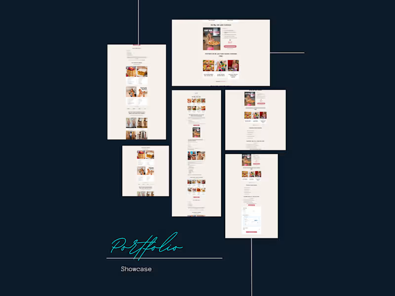
Designed and built a long-form product sales page for a high-protein cookbook targeting women focused on body recomposition — eating more while getting leaner.
The page was built to convert cold traffic into buyers through a story-driven structure — opening with a relatable problem, moving into a personal journey, then stacking proof before the offer.
What went into it:
Light, clean aesthetic with a warm beige palette suited to the health and wellness niche
Story-based copy layout — problem, personal struggle, transformation, solution
Before/after client results section to build trust and social proof
Recipe preview gallery to give buyers a taste of the product
Objection-handling section ("You do NOT need to:") to reduce buyer hesitation
Bonus stack presentation to increase perceived value
Integrated checkout section with multiple payment options
FAQ section to close remaining objections before purchase
Built with mobile responsiveness in mind throughout on the samcart platform
The goal was a single page that takes a visitor from curious to convinced — without needing a separate checkout or product page.
0
135

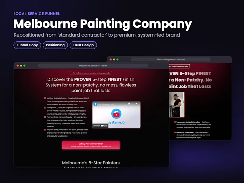
Hi I' m Oluwole Website and Funnel Building Specialist.
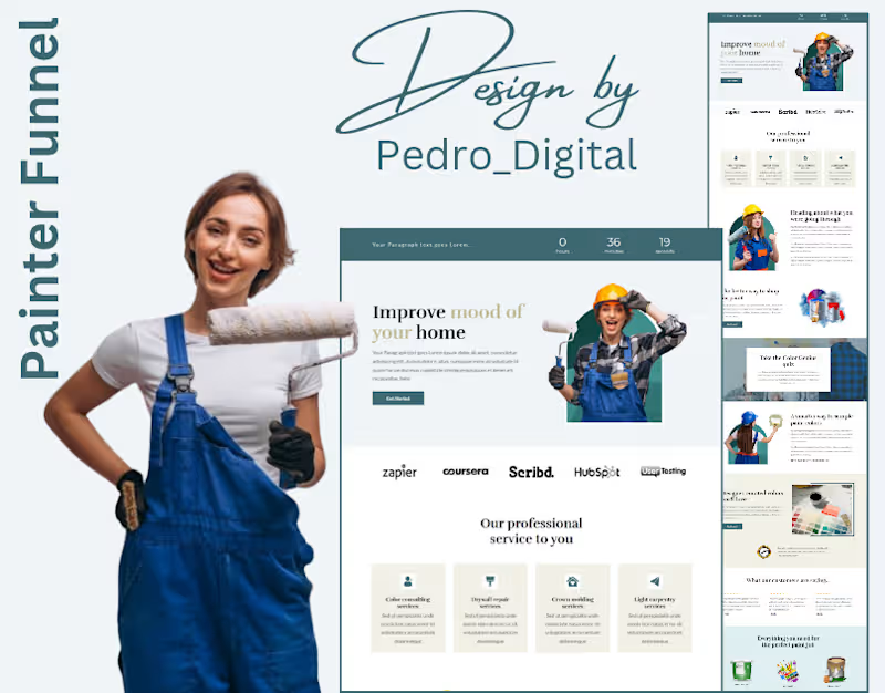
A great painting business deserves more than word-of-mouth alone.
This Painter Funnel was designed to help turn interest into actual project inquiries, with a clear and structured client journey from start to finish.
Instead of relying on scattered communication or inconsistent follow-ups, this system is built to:
• Capture potential client inquiries efficiently
• Present services in a professional way
• Build trust through a clean user experience
• Guide prospects toward requesting a quote or booking a consultation
Because in service-based businesses, speed, clarity, and presentation matter.
Most potential clients decide within minutes whether to move forward or move on.
That’s why a strategic funnel isn’t just about design,
it’s about creating a process that supports consistent growth.
Simple structure.
Better experience.
Smarter conversions.
If your current system isn’t helping you turn visitors into paying clients,
it may be time to build something more intentional.
Send a message if you’re ready to build a funnel that works as professionally as your service.
#SalesFunnel #LeadGeneration #PainterBusiness #HomeServiceBusiness #BusinessGrowth #MarketingSystems #ConversionDesign #DigitalMarketingStrategy #ServiceBusiness #systemeio #FunnelBuilder #GoHighLevel #CRMAutomation #consultantbusiness #MarketingSystems #onlinecoaches #enterpreneur #businessgrowth #realestateagent #clickfunnels #websitedevelopment #website
0
25
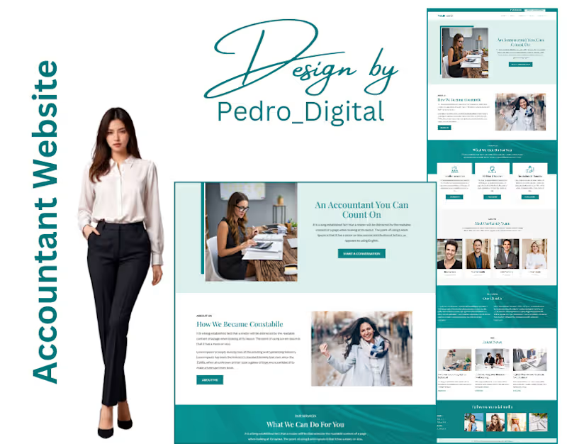
An accountant’s website should do more than just exist online.
It should build trust before the first conversation even happens.
This accountant website was designed with a clear objective,
create a professional digital presence that communicates credibility, clarity, and confidence.
From the structure to the user experience, every section was positioned to:
• Present services clearly
• Build immediate trust with visitors
• Create a smooth client journey
• Encourage inquiries without confusion
Because in professional services, perception matters.
People want to feel confident before they reach out,
and a well-structured website helps make that decision easier.
A clean design is good.
A strategic design that supports business growth is better.
This is what happens when design meets purpose.
If your current website no longer reflects the level of business you want to attract,
it may be time for an upgrade.
#WebsiteDesign #BusinessWebsite #AccountingFirm #ProfessionalServices #LeadGeneration #SmallBusinessGrowth #DigitalPresence #ConversionDesign #ServiceBusiness #WebStrategy #systemeio #FunnelBuilder #GoHighLevel #clickfunnels #consultantbusiness #Automation #MarketingSystems #digitalmarketingstrategy #BusinessAutomation #onlinecoaches #website
1
138
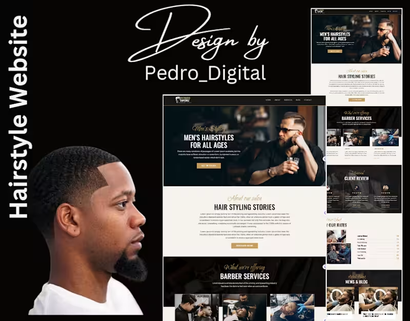
Most hairstyle websites look good.
Very few are built to generate bookings.
This project was approached differently.
Every section was structured with a clear objective:
not just to showcase styles, but to guide visitors toward action.
• Clear service positioning
• Strategic layout for decision-making
• Seamless booking experience
• Mobile-optimized for fast conversions
Because when a potential client lands on your website,
you don’t have time to “impress”, you have to convert.
In service-based businesses,
the difference between a visitor and a paying client
is the system behind the page.
A well-structured website doesn’t just represent your brand,
it works for your business.
If your current website isn’t translating visits into appointments,
it’s time to rethink the structure.
Send a message if you’re ready to build a website that performs as well as it looks.
#WebsiteStrategy #ConversionDesign #LeadGeneration #BeautyBusiness #HairstylistBrand #ServiceBusiness #SmallBusinessGrowth #DigitalMarketingStrategy #OnlineBookingSystem #MarketingSystems #funnelbuilder #GoHighLevel #consultantbusiness #PaidAds #onlinemarketing #appointmentbooking #clickfunnels #MarketingSystems #CRMAutomation #ConversionStrategy
1
155
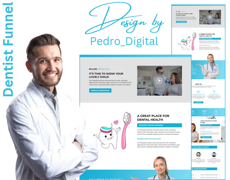
Most dental clinics don’t have a marketing problem…
They have a conversion problem.
This is a Dentist Funnel designed to fix that.
Instead of relying only on referrals or random posts, this system:
• Captures patient inquiries automatically
• Pre-qualifies them before booking
• Sends instant follow-ups (so no lead goes cold)
• Books appointments without back-and-forth.
No missed opportunities.
No delayed responses.
No guessing.
Just a clear system that turns interest into booked appointments.
Because in today’s market, speed + structure = more patients.
This is how modern clinics grow consistently.
If you run a service-based business and you’re still handling everything manually, you’re leaving money on the table.
Comment “FUNNEL” if you want something like this for your business.
#SalesFunnel #LeadGeneration #HealthcareMarketing #DentalMarketing #BusinessGrowth #MarketingAutomation #CRMsystems #ServiceBusiness #OnlineMarketing #AppointmentBooking #funnelbuilder #GoHighLevel #clickfunnels #CRMAutomation #consultantbusiness #MarketingSystems #entrepreneurmindset #entrepreneurlife #digitalmarketingstrategy #MarketingAutomation
1
66

Kajabi, GHL & Squarespace Expert | Funnels That Book Clients

Kajabi, GHL & Squarespace Expert | Funnels That Book Clients

Just finished building this low-ticket funnel 🔥
Low-ticket offers aren’t about being cheap , they’re about strategy.
A good funnel should:
• Turn visitors into buyers
• Reduce resistance
• Stack value with bonuses
• Include strong risk reversal
• Lead naturally to higher-ticket offers
Clean design. Clear messaging. Conversion-focused structure.
If your funnel isn’t converting, it’s not the traffic , it’s the strategy.
#SalesFunnel #FunnelDesign #LowTicket
1
1
651
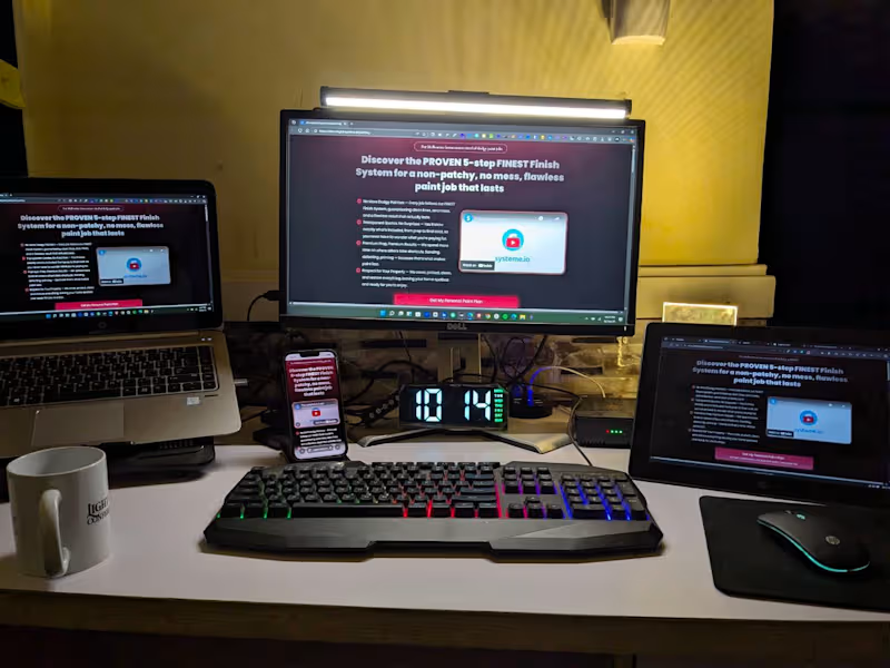
Late nights and multiple screens , that’s the reality behind clean UX and high-converting funnels.
Every device tells a different story:
Mobile sells impulse
Desktop sells depth
Tablet sells hybrid experiences
Your funnel needs to perform across all three.
Building, testing, tweaking, optimizing ,that’s how you turn clicks into clients.
If you want a landing page or funnel that actually converts, happy to chat.
1
3
399