AI VIsual Designer Projects in Navi MumbaiAI VIsual Designer Projects in Navi MumbaiI asked myself a simple question:
"When is human, human enough?"
And believe it or not, this challenge completely changed the way I think about creative thinking and AI assisted workflows.
Over the past few days, I have been sharing my journey here on @Contra and on X, asking people to contribute their thoughts on ideation, visual direction, and refinement. From classic pen and paper brainstorming to a fully realized product, every step happened within the limited timeline of the @Envato Challenge.
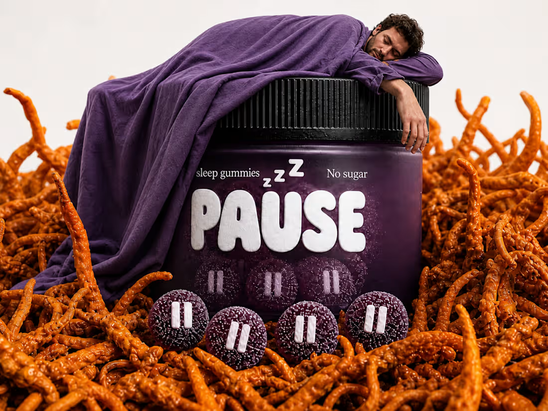
'Pause (https://on.contra.com/cLGnfB)' is the brand I created for this challenge, it is the result of human creativity steering AI capabilities and the outcome goes far beyond simply generating visuals, it demonstrates what happens when intentional thinking guides powerful tools.
Using Envato's AI Suite, I built an entire brand from the logo and visual assets to the product campaign and even a motion design video. The experience exceeded every expectation I had.
The tagline, "PAUSE THE NOISE," was written by me. It does not just define the brand. It also reflects what I believe is the real message behind this challenge: pausing the noise around the idea that AI is here to replace creatives.
The human contribution was never just writing prompts. It was constantly questioning assumptions, pivoting from one idea to another, exploring different visual languages, selecting the strongest assets, directing the product campaign, shaping the motion design, and refining every output until it aligned with the vision. AI generated the assets. Human creativity gave them purpose.
I am so proud of the final result that I am now turning Pause into a detailed Contra case study.
My two cents:
AI is a tool. Like a sword, it is only as powerful as the person wielding it. In the hands of someone without vision, it loses its edge. In the hands of a creative thinker, it becomes a force multiplier. The future does not belong to AI alone. It belongs to people who know how to think, direct, and create with it.
Sound on 🔊
Scroll through the comments to explore all the visuals and the complete motion design videos.
Tools Used -
Envato
My own Vibe coded text behind video & Video editing apps SOOT — Mascot of LAST DRAFT
Every creative person has a SOOT inside them.
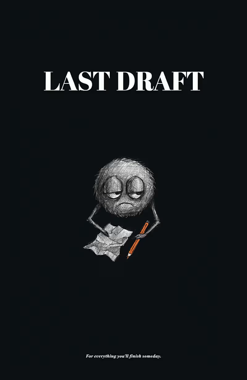
SOOT is the official mascot of LAST DRAFT — a fictional stationery brand built for people who start things beautifully and abandon them gloriously. SOOT is a small, round creature made entirely of graphite smudge and dust. He has no legs — he just floats, unbothered. He has oversized expressive eyes that carry the weight of seventeen unfinished projects. And he always, always carries one unfinished thing. It's never the same thing twice.
He's not sad about it. He's weirdly proud.
THE BRAND IDEA
LAST DRAFT exists for the beautifully unfinished. Not for people who quit — for people who start with full intention, get distracted by a better idea, and begin again. The brand lives on stationery, notebooks, and merch — products for people who buy notebooks but never finish them. Sound familiar?
Tagline: "For everything you'll finish someday."
CHARACTER BRIEF
Name: SOOT
Role: Brand mascot of LAST DRAFT
Form: Small round graphite smudge creature — no legs, tiny stubby arms, oversized expressive eyes
Personality: Unbothered, chaotic, soft, perpetually mid-thought, oddly proud of unfinished work
SOOT is the patron saint of good intentions and better beginnings. Warm and chaotic, he shows up on every LAST DRAFT product as a reminder that starting is the whole point. He has been working on something for three years. He doesn't mind. Neither should you.
THE SYSTEM
Every element of LAST DRAFT was designed to feel like it belongs together — and like nothing else out there.
Color palette: Three colors only. Deep charcoal #1C1C1E, warm paper off-white #F5F0E8, and a single burnt amber accent #D4622A — used sparingly, like a pencil tip.
Typography: Bold serif for LAST, italic serif for DRAFT — because one thing is certain, and the other is still being figured out.
SOOT across five applications:
Sticker Pack — Six emotional states: happy, tired, shrugging, focused, done, pretending to work. Because SOOT contains multitudes.
Dark Poster — Pure charcoal background, SOOT centered with breathing room, one orange pencil. Tagline at the bottom in the smallest possible font. Less is the whole point.
Notebook Cover — SOOT peeking from the bottom edge of a kraft paper cover, just his eyes and the top of his head visible. Because the best notebooks are the ones you almost finish.
Social Post Template — "another unfinished thought." SOOT holding a crumpled paper, looking directly at you. @lastdraft. This is the post format that would make anyone who has ever abandoned a project stop scrolling.
T-Shirt Merch — SOOT on a clean white tee, small and centered. "still working on it." in tiny lowercase. The most relatable shirt ever made.
WHY SOOT WORKS
Most mascots are aspirational. SOOT is the opposite — he's deeply, specifically relatable. Every creative person, every student, every person who has ever bought a notebook and not finished it will see SOOT and think: that's me.
That's the point. A mascot people laugh at themselves through is a mascot they remember.
SOOT is distinctive enough to own a silhouette. Simple enough to stay consistent. And human enough to make you feel seen.
He's been working on something for three years.
You already know what it feels like.
That's LAST DRAFT.
🔗 Full Recraft Project:
https://www.recraft.ai/project/adad844a-479d-4b83-86ff-665bf04fca89 Warm Modernism: Erbusco Bilocale Interior Visualization 🛋️✨
Project Overview: Erbusco Bilocale
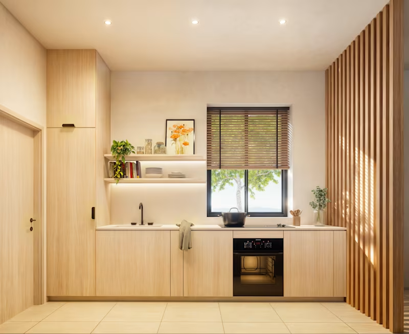
Visualizing a "bilocale" (a compact, two-room apartment) requires a delicate balance of light, texture, and spatial flow. For this interior project, the objective was to craft a cohesive, warm minimalist atmosphere that maximizes the feeling of space without sacrificing coziness.
I focused heavily on the nuanced interplay of natural sunlight across the textured plaster walls, pairing light oak joinery with rich terracotta and rust-toned accents to bring warmth into the room. Architectural details, like the wooden slat dividers, were carefully rendered to show how they elegantly zone the open-plan kitchen and living areas while maintaining an airy, light-filled environment.
The Collaboration:
This project was beautifully executed during my ongoing collaboration as a contract 3D Visualizer for OverTheRender. Working alongside their talented team on international projects continually sharpens my eye for the refined, high-end aesthetics that global clients demand.
What I Brought to This Project:
Spatial Optimization: Strategically framing shots to make compact, open-plan living areas look expansive, functional, and inviting.
Material & Color Accuracy: Balancing warm, earthy palettes (terracotta, oak, textured plaster) to evoke a specific, moody-yet-bright emotional response.
Lighting Mastery: Simulating soft, diffused daylight and realistic interior shadow play to ground the furniture and cabinetry in reality.
Need a dedicated 3D artist for your next interior project? With over 6 years of professional experience in architectural visualization, I help interior designers, architects, and developers worldwide turn their concepts into photorealistic marketing assets. I am available for remote freelance contracts and love collaborating with international teams.
Let’s chat about bringing your next design to life! 📩 If there’s one thing I love about AI adverts and video production, it has to be experimentation.
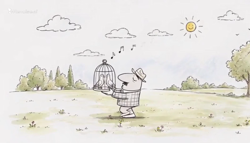
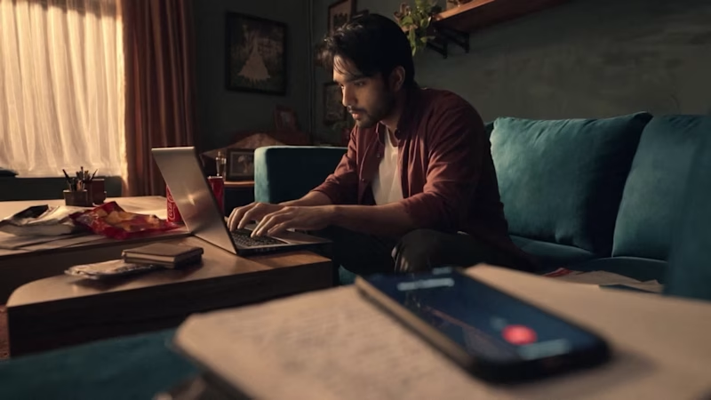
I’ve been working on an advertisement for PickPeas, and this right here is the first draft.
There’s still a LOT I want to fix and enhance. The pacing, a few transitions, some character details, and a couple of visual moments can definitely be pushed further.
But honestly?
This already feels about 80% complete.
And that’s what I find so interesting about working with AI for video. You can start with a rough idea, experiment with different visual directions, test a sequence, break it, rebuild it, and suddenly you’re looking at something that actually feels like an advert.
The goal isn’t to get everything perfect in the first generation.
It’s to experiment enough to discover what works.
This is just Draft 01. 👀
I’ll share the final version once I’ve pushed it further.
What do you think of the direction so far? ![Cover image for ☣️ PROJECT: HAZARD_CORE // [BUILDATHON]
DESIGN](https://media.contra.com/video/upload/w_800,so_auto/uunorrk41cjk9gwkuru6.avif)