Graphic Design Projects in Natore District
Graphic Design Projects in Natore District
Sign Up
Post a job
Sign Up
Log In
Filters
2
Projects
People
Message
0
Md Toufic Ahmed Khan Badhon
pro
Figma to shopify converting using Replo
0
9
Message
1
Md Zahid Hasan Khan
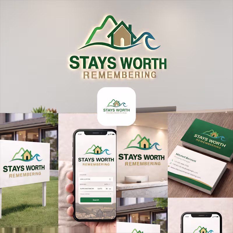
Stays Worth Remembering Travel Company Logo Design 2026. The idea behind this logo was to create a visual identity that instantly communicates comfort, memorable experiences, and destination-based stays in a clean and meaningful way. The mountain element represents travel, adventure, peaceful escapes, and beautiful destinations. It gives the brand a sense of exploration and unforgettable journeys. The house placed in the center symbolizes comfort, hospitality, safety, and the feeling of being “at home” no matter where someone travels. The wave element was added to represent relaxation, premium vacation experiences, and destinations connected to nature, lakes, beaches, or peaceful environments. Together, the mountain, home, and wave create a complete story of travel and memorable stays. For the typography, I used a bold and clean font to make the brand look professional, trustworthy, and easy to recognize across both digital and physical platforms. The word “REMEMBERING” uses a softer gold tone to create a warm emotional feeling and reinforce the idea that these stays are not just accommodations, but experiences people will remember for a long time. The green color palette represents nature, growth, relaxation, and trust, while the blue wave adds freshness, calmness, and a travel-inspired feeling. Overall, the logo was designed to feel welcoming, modern, memorable, and versatile for signage, branding materials, business cards, websites, and mobile applications.
1
44
Message
1
Md Rasedul Jamal
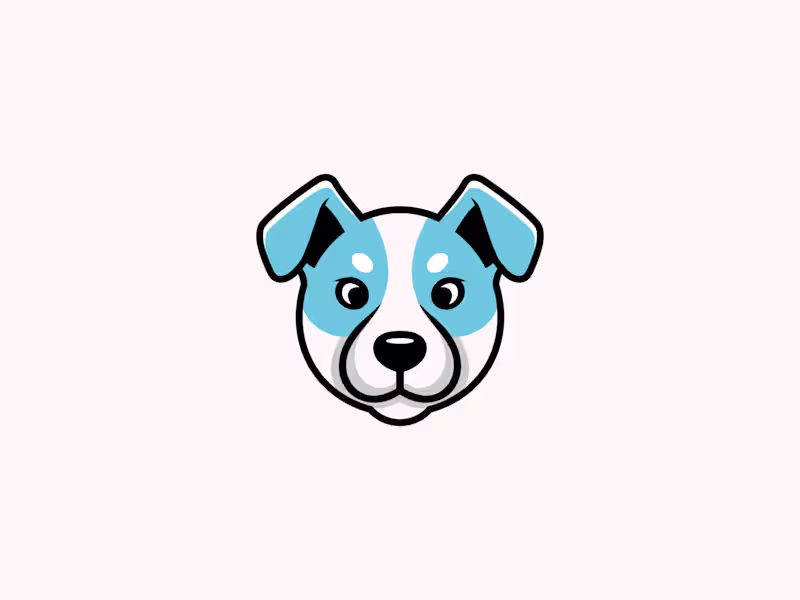
This is an exclusive pre made dog logo design created as a personal concept. It is 100% unique and currently AVAILABLE FOR SALE.
1
27
Message
0
MD FARHAD ALI
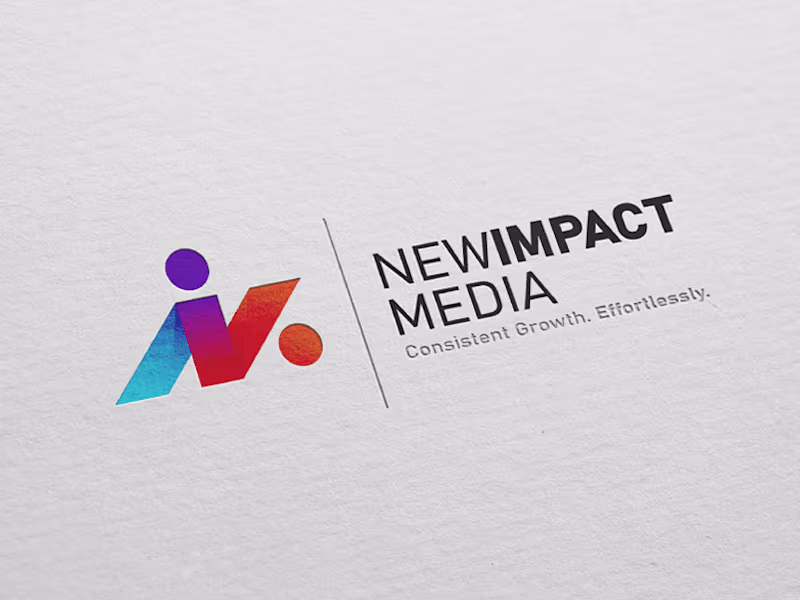
New Impact Media Logo Design
0
13
Message
0
S. M. Abu Seyam
Business Card Design
0
3
Message
0
Shakhawat Hossen
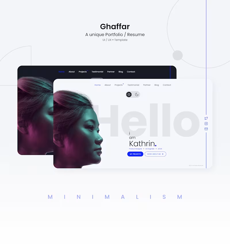
Portfolio website design
0
25
Message
0
Iqbal Hssain
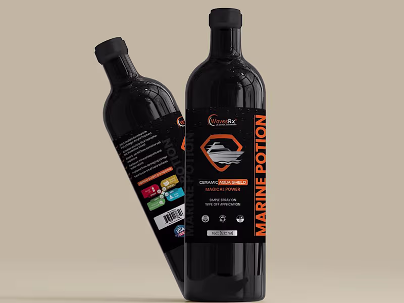
Packaging Design
0
0
Message
0
Rabbi bijoy
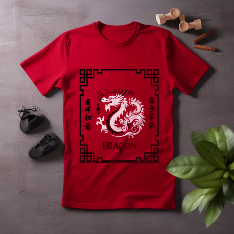
new dragon typogrphy t-shirt design :: Behance
0
0
Message
0
Alex sabbir Bibard
Company logo design
0
0
Message
0
Md Toufic Ahmed Khan Badhon
pro
Shopify One-Product Store Homepage Design Using Replo
0
6
Message
2
Md Zahid Hasan Khan
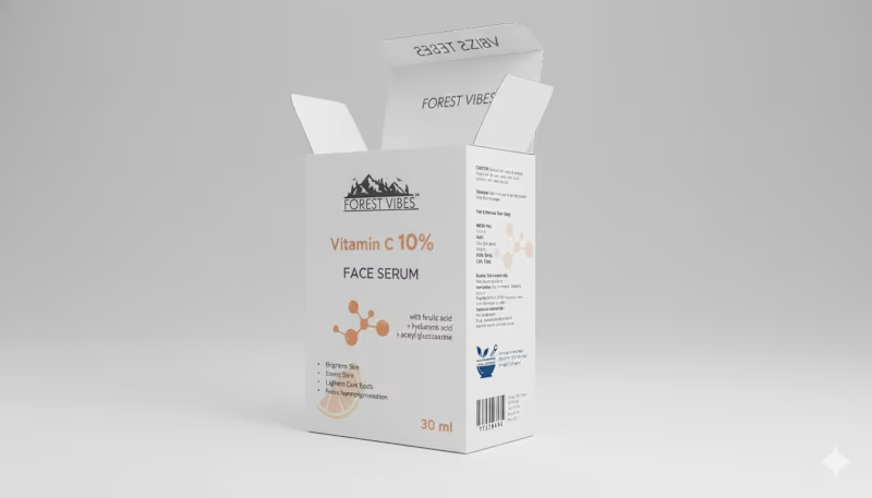
Indian Client Work Vitamin C 10% Face Serum Package Design. Here I have designed several packages of Vitamin C 10% Face Serum for my Indian client. From here, the client has finalized a design and is selling their product by printing that package. From here you can get your design ideas if you want and those who want to package such products can contact me. I am here for you. You (http://you.you/) can design labels for your products, and if you want, you can get your company's full branding done by me. If you want to get ideas about my designs, you can check out my entire portfolio, so if you need this service, be sure to contact me.
2
69
Message
1
Md Rasedul Jamal
Mr panda mascot logo
1
2
Message
0
MD FARHAD ALI
Pixellab App Icon Design
0
15
Message
0
S. M. Abu Seyam
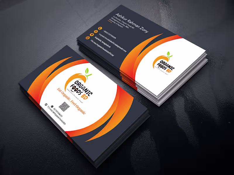
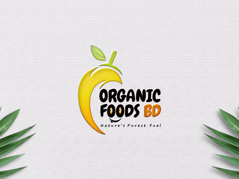
Logo design of Organic Foods BD
0
2
Message
0
Iqbal Hssain
Social Media Post Design
0
0
Message
0
Rabbi bijoy
YOUTUBE THUMBNAILS :: Behance
0
0
Explore projects