Visual Arts Projects in NarsingdiVisual Arts Projects in NarsingdiThe best café brands don't introduce themselves. They just feel familiar from day one.
Most neighborhood café brands hide behind generic coffee cup icons, overused script fonts, and a color palette that could belong to a yoga studio or a juice bar or literally anything else. The logo promises character. The brand delivers nothing you'd remember by the time you reach the door.
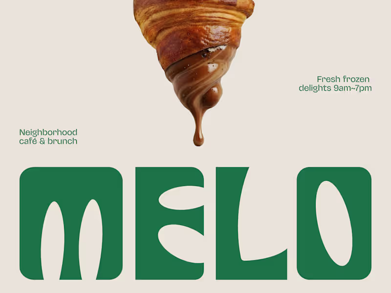
Melo made familiarity the whole brief.
A custom palm tree emblem encircled in a clean oval, organic, architectural, impossible to mistake for anything else. Deep forest green across three environments: cream, burnt green, and dark olive, each one feeling as considered as the last. A rounded wordmark so confident it can fill an entire poster at display scale and still feel warm rather than loud. And right there on the campaign visual, a caramel-dripping croissant melted into the letterforms, like the food and the brand were always the same thing.
That's not just a logo system. That's a place people recognize before they even read the name.
Because a neighborhood spot that earns a place in someone's morning deserves a brand that feels just as inevitable.
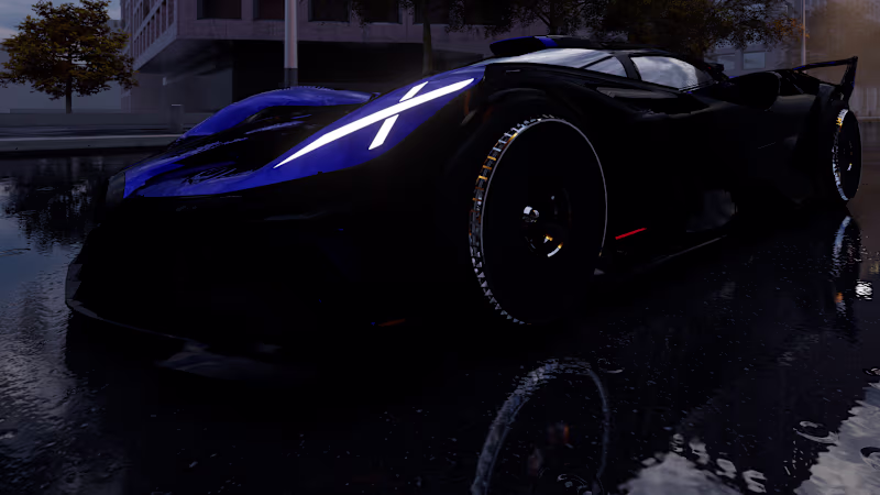
What makes a café logo feel like it actually belongs to a place? 👇 A cinematic 3D visualization of the Bugatti Bolide, created to explore dynamic lighting, atmospheric conditions, and high-contrast automotive presentation. The scenes were rendered using Lumion, with a strong emphasis on night environments, wet surfaces, reflections, and dramatic light behavior to enhance visual impact.
The 3D model was sourced from an online library and used exclusively for visualization and rendering purposes, not for original vehicle design. This work reflects a growing interest in real-time rendering, environmental storytelling, and high-performance automotive CGI. Predun Edge
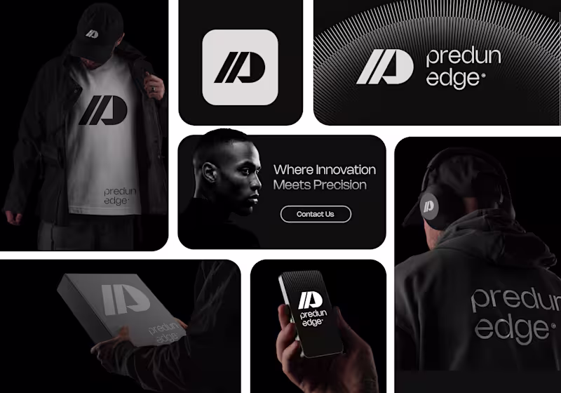
Predun Edge is a forward-thinking software company built to engineer the future.
We design intelligent, scalable, and high-performance digital solutions that help businesses stay ahead in a rapidly evolving world.
At Predun Edge, innovation isn’t optional — it’s our foundation.
Mission
To build powerful, secure, and future-ready software solutions that solve real-world problems with precision and efficiency.
We are committed to combining advanced technology with smart strategy to help businesses operate faster, smarter, and stronger.
Vision
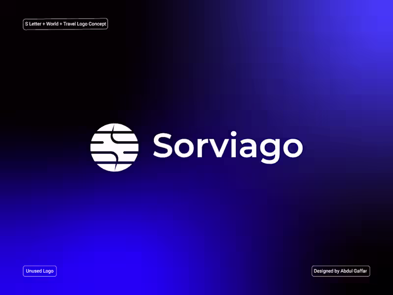
To become a global leader in next-generation software innovation, setting new standards in performance, security, and digital transformation. Sorviago Logo, S Letter Logo, World Logo, Travel Logo.
Sorviago is a modern travel brand identity inspired by the letter "S." (https://"S.")
A globe and the spirit of exploration. The circular symbol represents
the world, while the flowing S-shaped path reflects seamless journeys,
global connectivity, and continuous movement.
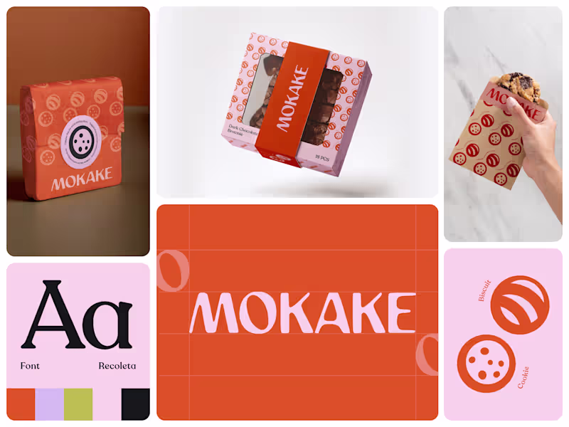
Designed with a clean geometric style, the logo communicates trust, navigation, and worldwide accessibility. Its versatile and memorable form makes it ideal for travel agencies, tourism companies, airlines, booking platforms, logistics services, and global mobility brands. Sweet brands are easy to make look playful. Making them feel memorable is harder.
MOKAKE was built to feel like a modern bakery brand with personality baked into every surface, from the packaging wrap to the takeaway experience in someone’s hand.
Most dessert brands lean on predictable pastel aesthetics or overloaded illustrations. The result usually feels generic, temporary, and forgettable after the first purchase. MOKAKE takes a cleaner direction. Bold orange tones paired with soft lavender create a visual system that feels energetic without becoming noisy. Warm enough for cookies and brownies, sharp enough to stand out on a crowded shelf.
The identity revolves around a simple circular symbol language inspired by biscuits, chocolate chips, and baked textures. Repeated across wraps, boxes, sleeves, and print materials, the pattern creates instant recognition without needing excessive decoration.
Typography plays a huge role in the personality too. The custom wordmark feels soft, rounded, and slightly imperfect in a way that mirrors handmade bakery products while still keeping the brand contemporary and scalable across packaging systems.
From a floating brownie box mockup to a simple cookie sleeve held in one hand, every touchpoint was designed to make the product feel gift-worthy before the first bite even happens.
Because in food branding, packaging isn’t just protection. It’s appetite, memory, and marketing all happening at the same time.
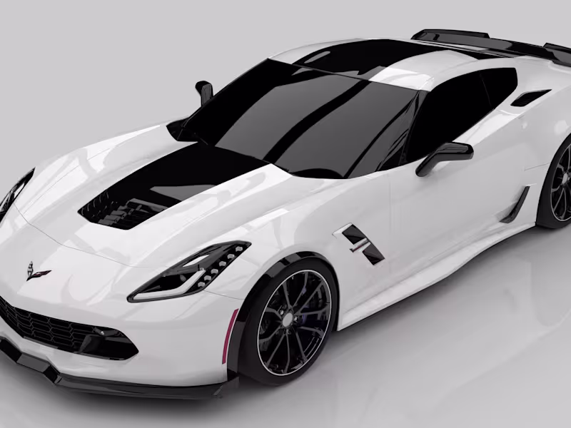
What’s the first thing that makes you trust a bakery brand: packaging, color, typography, or the overall experience? 👇 This project explores high-end automotive 3D visualization through a detailed render of the Chevrolet Corvette, focusing on precision lighting, material accuracy, and clean studio presentation. The rendering was completed using KeyShot, with careful attention to carbon-fiber elements, paint behavior, reflections, and sharp body contours.
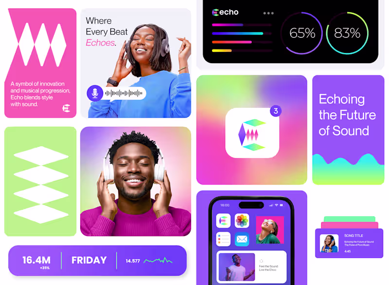
The 3D model was sourced from an online library and used exclusively for rendering and visualization practice, not for original vehicle design. This work reflects my growing focus on automotive CGI, presentation realism, and professional rendering workflows. Echo
Echo is a music brand built on emotion, expression, and connection.
We believe music is more than sound — it’s a voice that travels, resonates, and leaves an imprint long after it’s heard.
Echo exists to amplify creativity, support artists, and create experiences that stay with people.
Mission
To create and promote music that inspires, connects, and moves people across cultures and generations.
Echo’s mission is to empower artists, elevate authentic sound, and build a platform where creativity is heard without limits.
Vision
To become a globally recognized music brand that shapes culture through powerful sound and meaningful storytelling.
We envision Echo as a movement — where every beat, lyric, and rhythm creates a lasting echo in the world.