Freelance Healthcare IT Support Specialists in Narsingdi
Sign Up
Post a job
Sign Up
Log In
Filters
2
Projects
People
Orbix Studio
max
Dhaka, Bangladesh
UX-led product design & dev agency for b2b saas and AI
$25k+
Earned
183
Followers
expert
Follow
Message
UX-led product design & dev agency for b2b saas and AI
0
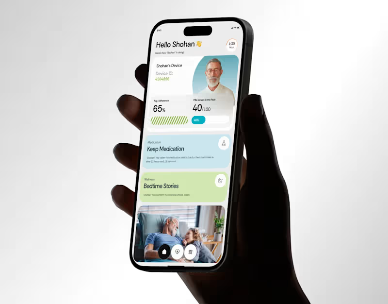
Wellnest Healthcare UI UX | Mobile App | Orbix Studio
0
15
6
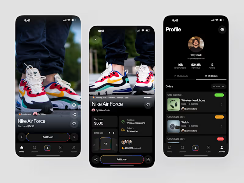
Most sneaker apps make you work to find what you want. This one puts the shoe on screen and gets out of the way. Nike Air Force from $500. 4.95 stars, 657 reviews. Size selector, delivery tomorrow, trending now product detail that answers every question before the "Add to cart" tap. And a seller profile that tracks 1.9k orders and $24.5k revenue without a single wasted pixel. Check it out (https://dribbble.com/shots/27747815-Sneaker-E-commerce-Mobile-App-Design)
1
6
78
7
Banking apps scatter your controls everywhere. This one doesn't. Payno was designed to close that gap. Not just with numbers - but with clarity. Dashboard overview: balance, recent activity, spending breakdown. Card management: virtual and physical unified. Spending controls: front and center, not buried. The dashboard handles the daily view - your balance, recent transactions, card status, and quick actions. The spending screen goes deeper - category breakdown, monthly limits showing spent vs available, and transaction insights. The card management screen pulls it all together - unified card control, payment options, and activity history in one clean panel. Three screens. Every financial question answered before it's asked. This is what banking UI looks like when it treats users like adults who want control, not just data. Does this feel like a fintech app that would actually change how someone manages their money? ๐ Designed by Orbix Studio (https://www.orbix.studio/) ยท See full view ๐ https://www.behance.net/gallery/255260777/Payno-Finance-Solution-Orbix-Studio-Mobile-App Tools: Figma
3
7
148
18
Most people know how much they earn. Very few know how well they're actually managing it. This personal finance app was designed to close that gap. Not just with numbers - but with a score. Cash Flow Health: 86/100. Income: Excellent. Expenses: Good. Savings: Excellent. A single gauge that tells Noah more about his financial health in one glance than a spreadsheet could in an hour. The home screen handles the daily view - income, expenses,saved, quick payments to contacts, available cards, and budget saving categories. The transactions screen goes deeper - weekly spending , a monthly limit tracker showing spent out of , and a transaction activity score. The cash flow screen pulls it all together - inflow,2 outflow, net cash flow, and top inflow sources in one clean panel. Three screens. Every financial question answered before it's asked. This is what personal finance UI looks like when it treats users like adults who want clarity, not just data. Does this feel like a finance app that would actually change how someone manages their money? ๐ Designed by Orbix Studio (https://www.orbix.studio/) ยท Tools: Figma , Jitter
8
18
1.1K
Healthcare IT Support Specialist
(2)
Follow
Message
Subash Chandra
pro
Dhaka, Bangladesh
UI/UX Designer โ Web Designer & Developer in Figma/Webflow
112
Followers
Certified Partner
Follow
Message
UI/UX Designer โ Web Designer & Developer in Figma/Webflow
7
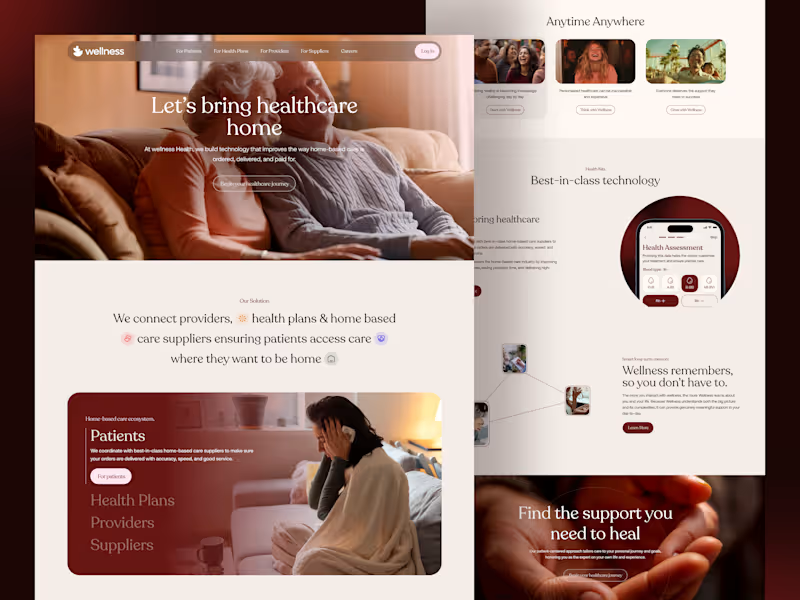
Healthcare - Wellness Website | Medicare Landing Page We designed a clean, modern, and accessible healthcare website tailored for homecare medical services, medicare services, wellness clinic, and health care providers. This landing page concept was built with a patient-first approach and supports seamless experiences for doctors, hospitals, clinics, and health plans. Key Features: ~ Doctor and Clinic to manage profiles, services, and appointments. ~ Health care suppliers and medicine distributors. ~ Medicare and health plans targeting patient engagement. ~ Patients booking, doctor appointments and accessing care fast. ~ Doctor and health care providers.
4
7
325
3
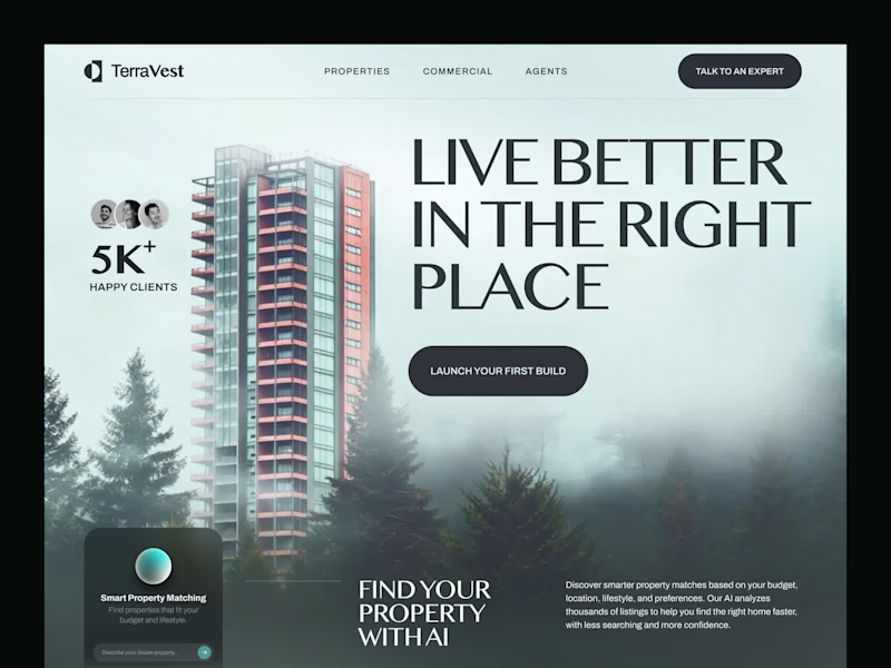
TerraVest - Real Estate Property Website A real estate website designed to make property discovery clearer and more engaging for buyers, renters, and investors. The experience brings property listings, key information, and discovery flows together in a focused digital experience, helping users explore properties and investment opportunities with less friction.
1
3
105
4
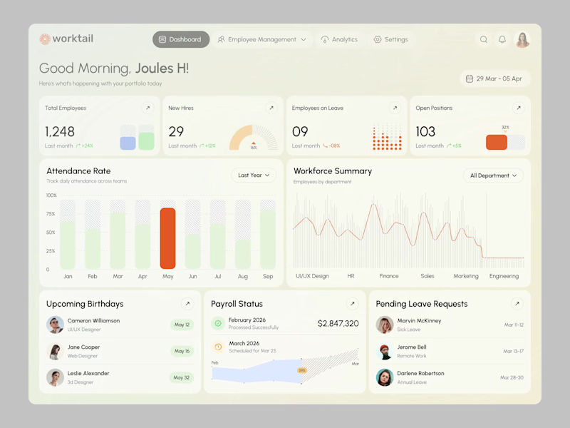
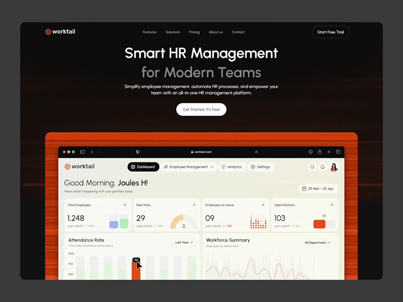
Worktail โ HR Management Dashboard | SaaS UI Worktail is a smart HR Management Dashboard concept designed to simplify employee management, payroll, attendance tracking, leave management, and workforce operations through an intuitive SaaS interface. The dashboard features clean layouts, data-driven insights, and scalable UI components that help HR teams manage daily operations more efficiently while delivering a seamless enterprise experience.
3
4
202
3
Worktail โ HR Management SaaS Platform | Website Design Worktail is a smart HR Management SaaS Platform website concept focused on simplifying employee management, payroll, attendance, leave management, and workforce operations through an intuitive and scalable user experience. The design emphasizes clarity, usability, and enterprise-ready interfaces, creating an effortless digital experience for modern organizations.
3
180
Healthcare IT Support Specialist
(1)
Follow
Message
Taqwah - SaaS Product Design
pro
Dhaka, Bangladesh
Only 3 Slots Left - Get 30% Off Your First SaaS Project.

62
Followers
Follow
Message
Only 3 Slots Left - Get 30% Off Your First SaaS Project.
7
Healthcare products often focus on functionality first. But trust is built through experience. Nureinโs branding motion was designed to make healthcare communication feel calmer, clearer, and more human through structured motion storytelling. The system combines: โข Bento-inspired identity motion โข Logo animation โข Real-time doctor suggestion visuals โข Minimal healthcare aesthetics โข Precision-focused transitions Every movement was designed to reinforce clarity, accessibility, and emotional reassurance - not just visual polish. Because strong healthcare branding should help users feel confident before they even interact with the product. Building a healthcare, SaaS, or AI product? We help brands create motion systems, visual identities, and scalable digital experiences that convert trust into engagement. ๐ taqwah.agency (http://taqwah.agency) | ๐ฉ hello@taqwah.agency (mailto:hello@taqwah.agency)
4
7
225
4
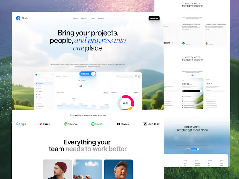
Qloxia - Modern Project Management & Team Collaboration SaaS Design Complex workflows deserve clearer interfaces. Qloxia is a project management and team collaboration SaaS concept designed around a simple product promise: Bring projects, people, and progress into one place. The experience combines: โข Project management โข Task management โข Team collaboration โข Planning and analytics โข Progress visualization โข Social proof โข SaaS pricing โข Conversion-focused UX The design direction uses soft visual environments, editorial typography, rounded components, product-led storytelling, and structured content hierarchy to make the platform feel both professional and approachable. The goal wasn't to make another dashboard-heavy SaaS website. It was to create an experience where users can quickly understand the product, explore its capabilities, build confidence, and take action. Building a SaaS product, dashboard, or web application? Taqwah can help you transform your product idea into a clear, scalable, conversion-focused UI/UX experience - from strategy and UX to polished interface design. ๐ Send us your product idea and let's discuss how we can design the experience around your business goals. ๐ taqwah.agency (http://taqwah.agency) | ๐ฉ hello@taqwah.agency (mailto:hello@taqwah.agency)
4
50
3
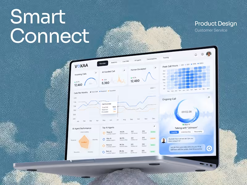
VOXAA - Sales CRM AI Call Center Dashboard AI voice products aren't only about making conversations happen. They're also about helping teams understand what happens before, during, and after every conversation. VOXAA explores that experience through a unified AI call-center dashboard. The product combines: โข Incoming call analytics โข AI-handled conversations โข Human escalation โข Peak-hour monitoring โข AI agent performance โข Resolution metrics โข Real-time customer conversations The design challenge was to create a system that feels intelligent without being complicated. Clean hierarchy, soft visual surfaces, focused data visualization, and a real-time conversation panel keep the experience operational but approachable. This is the kind of product where UX becomes the bridge between complex AI capabilities and everyday business operations. Building an AI SaaS, voice agent, dashboard, or customer-support platform? Taqwah can design the product experience from UX architecture to polished UI and scalable design systems. Start your project with us. ๐ taqwah.agency (http://taqwah.agency) | ๐ฉ hello@taqwah.agency (mailto:hello@taqwah.agency)
2
3
122
5
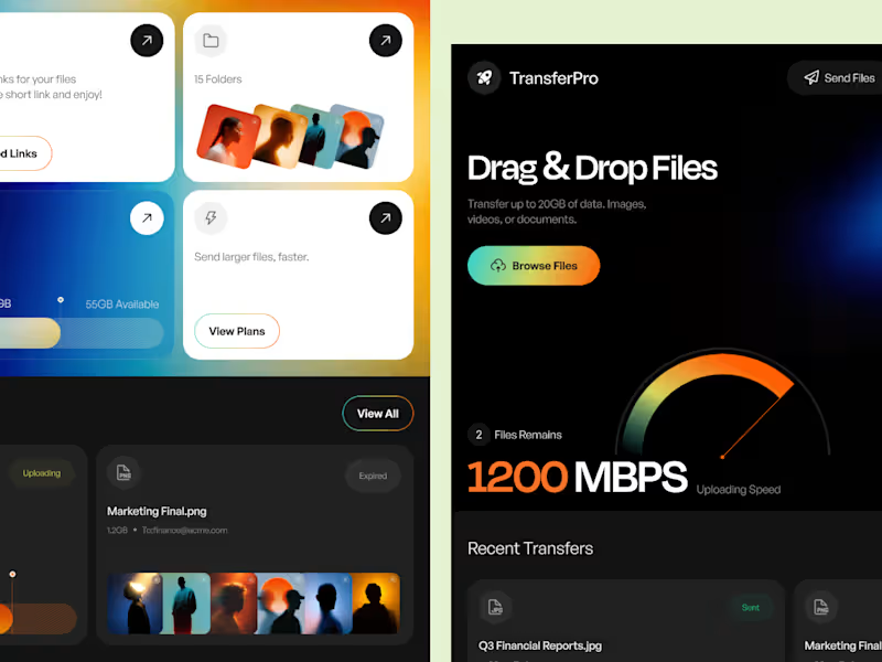
TransferPro - A High-Speed File Transfer SaaS Experience TransferPro explores how a complex file-management product can feel fast, focused, and visually refined. The concept combines large-file transfers, cloud storage, shared links, folder organization, and recent activity inside one centralized SaaS workspace. From the 1200 Mbps performance visualization to the bento-style feature cards, every section was designed to reinforce the product's core promise: speed without unnecessary complexity. The visual language uses a dark foundation with energetic gradients to create a futuristic cloud-tech aesthetic while maintaining a clear information hierarchy. For SaaS products, good UI isn't just about making the interface look modern. It's about making complex workflows easier to understand, faster to navigate, and easier to scale. Building a SaaS product that needs a stronger UX or a complete UI redesign? Let's collaborate. Taqwah specializes in SaaS UI/UX, dashboard design, design systems, and product interfaces built around real user and business needs. ๐ taqwah.agency (http://taqwah.agency) | ๐ฉ hello@taqwah.agency (mailto:hello@taqwah.agency)
2
5
208
Healthcare IT Support Specialist
(1)
Follow
Message
Abdul Gaffar
Narsingdi, Bangladesh
Logo & Brand Identity Designer
84
Followers
Follow
Message
Logo & Brand Identity Designer
3
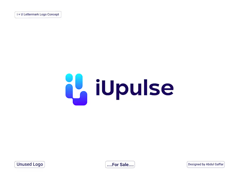
iUpulse Logo - Modern HealthTech Logo Design. iUpulse is a premium, minimalist, and smart logo concept designed for futuristic HealthTech and Fitness platforms. The visual monogram creatively blends the letters 'i' and 'u' with geometric, pill-shaped data components. The left element symbolizes a human/user silhouette, while the adjacent bar signifies digital tracking and data flow. Combined with the word "Pulse," the brand perfectly embodies real-time health monitoring, connectivity, and modern medical technology. The vibrant cyan-to-purple gradient gives it a cutting-edge, tech-forward vibe, making it ideal for mobile apps, smart wearables, and SaaS platforms.
3
232
1
Grixtone - Real Estate & Construction Brand Identity
1
1
7
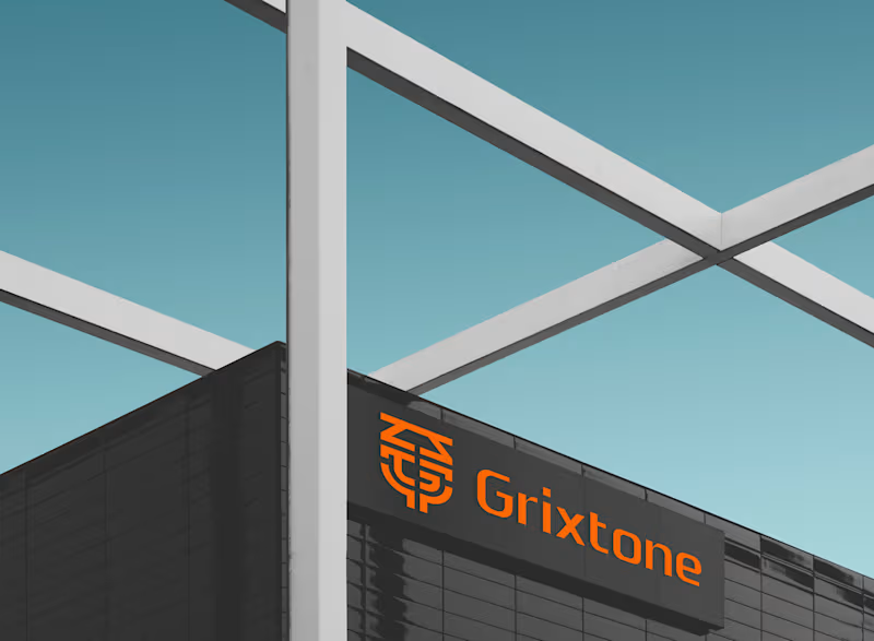
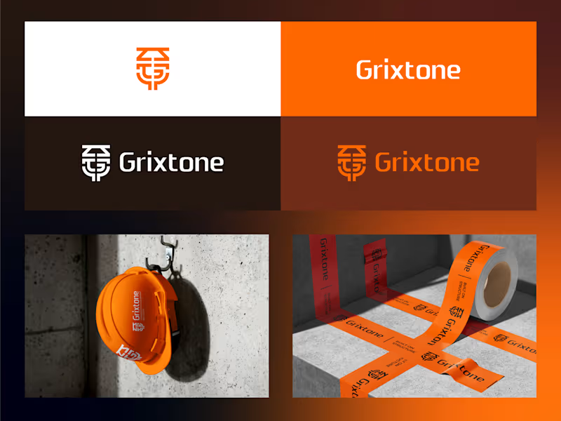
Grixtone is a modern real estate and construction brand built around the idea of strong foundations, thoughtful design, and long-term growth. The logo combines three essential elements into one distinctive symbol. The roof represents shelter, homes, and residential spaces, while the G letter creates a bold connection to the name. The foundation element represents strength, stability, construction, and lasting growth. The visual system uses a bold architectural aesthetic, combining deep charcoal, warm orange, and soft neutral tones to create a confident and contemporary presence across different applications. From construction environments and architectural spaces to stationery, digital interfaces, safety equipment, and outdoor applications, the identity is designed to remain recognizable, functional, and consistent. Built on Structure. Designed for Growth. Logo Concept Built on Structure. Designed for Growth. The Grixtone logo combines three essential elements into one distinctive symbol. The roof represents shelter, homes, and residential spaces, while the G letter creates a bold connection to the name. The foundation element symbolizes strength, stability, and long-term growth. Together, these forms create a modern identity that reflects trust, construction, and the foundations of better living.
4
7
182
28
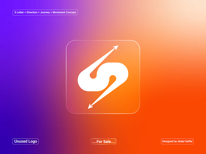
A dynamic S lettermark logo created for the travel and transportation industry, combining a smooth flowing form with directional arrows to represent direction, journey, movement, and forward progress. The arrow elements symbolize travel routes and movement between destinations, while the flowing S-shaped structure creates a sense of speed and continuous motion. The clean and modern symbol is suitable for travel agencies, transportation companies, tour operators, travel apps, mobility services, car rentals, and logistics businesses.
24
28
1.6K
Healthcare IT Support Specialist
(1)
Follow
Message
Ahmed Shams Wali
Dhaka, Bangladesh
Fullstack Dev: Detailed & Design-Focused Expert
Follow
Message
Fullstack Dev: Detailed & Design-Focused Expert
0
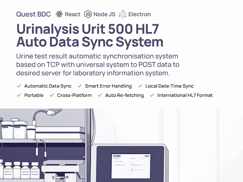
Urinalysis Urit 500 HL7 Auto Data Sync System
0
4
0
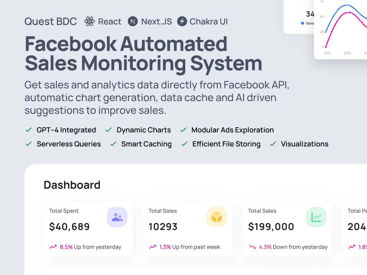
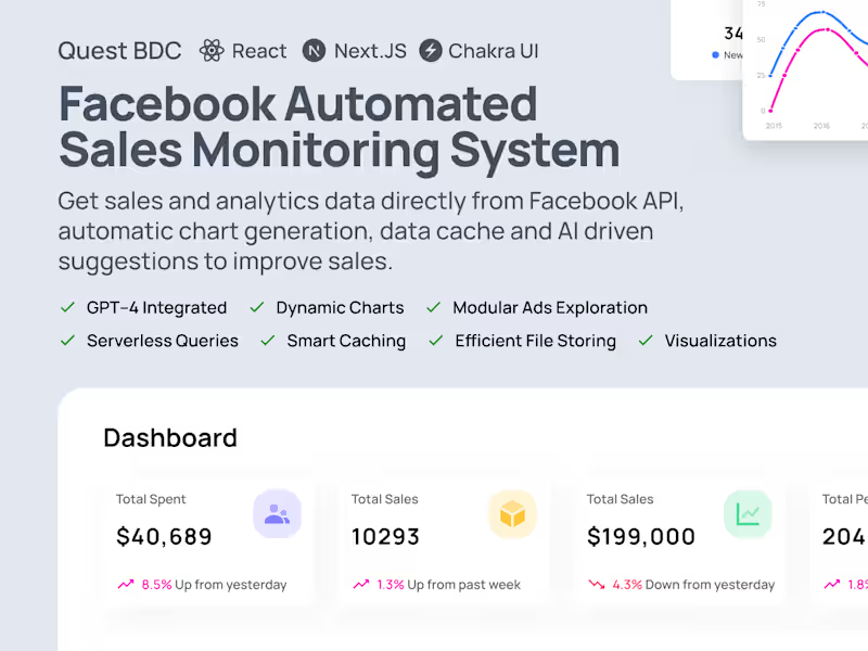
Facebook Automated Sales Monitoring System
0
9
0
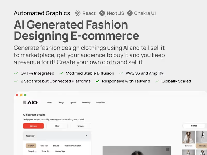
AI Generated Fashion Designing E-commerce
0
6
View more โ
Healthcare IT Support Specialist
(1)
Follow
Message
Muntasir Mahmud
Dhaka, Bangladesh
UX Researcher, UI Designer - Solving User Problems
8
Followers
Follow
Message
UX Researcher, UI Designer - Solving User Problems
0
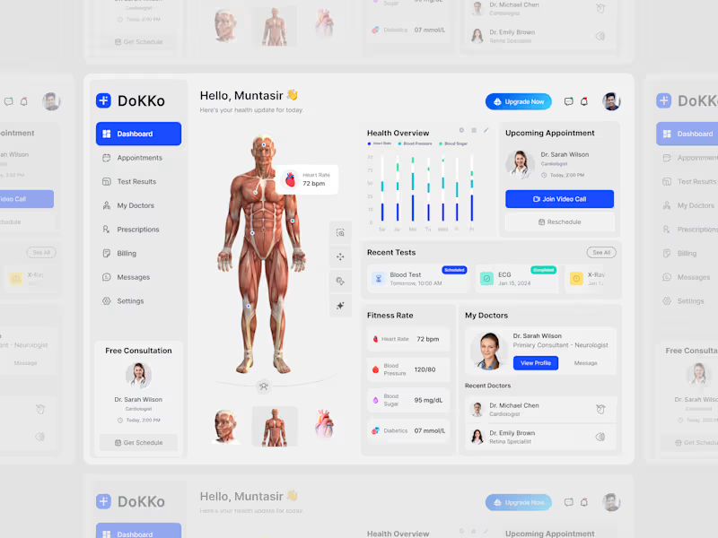
Health Care Patient dashboard. let me know, how is it to you???
0
84
0
Problemย Managing personal finances can feel overwhelming when balances, spending, bills, and transactions are scattered across different places. Users need a clearer way to understand where their money is going and make confident financial decisions. Challengeย The challenge was to design a modern fintech experience that makes everyday money management simple while presenting complex financial informationโsuch as transactions, spending patterns, income, and activityโwithout overwhelming the user. Solutionย I designed a clean, visual-first mobile banking experience focused onย clarity, control, and quick actions. The dashboard brings the most important informationโbalance, transactions, upcoming actions, and financial shortcutsโinto one place, while the analytics screen transforms spending data into easy-to-understand visual insights. The onboarding experience uses a bold visual direction to establish the product's personality while keeping the core actions straightforward.
0
33
1
Buying groceries online can quickly become overwhelming when users have to browse through large catalogs, compare products, and navigate multiple steps before completing a purchase. The challenge was to create aย simple, fresh, and visually engaging grocery shopping experienceย that helps users discover products quickly while keeping essential information and purchasing actions easy to access. I focused on creating aย clean, product-first mobile experienceย using fresh colors, large product imagery, clear categories, and a straightforward navigation structure. The experience was designed around three key moments:ย discover, explore, and purchase.
1
54
1
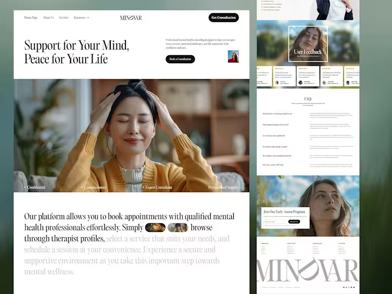
A calming and human-centered mental health platform designed to make professional support more accessible, trustworthy, and approachable. The experience combines soft visuals, elegant typography, and thoughtful layouts to create a safe digital space for healing, growth, and emotional well-being. Design Highlights: โข Modern mental health & therapy platform UI โข Warm, calming visual language with a premium feel โข Seamless appointment booking experience โข Trust-focused design with therapist credibility elements โข Service discovery for anxiety, trauma, depression & relationship support โข Clean editorial typography and spacious layouts โข Optimized for accessibility, comfort, and emotional connection Tools:ย Figma Designed to help people find support, build resilience, and take meaningful steps toward better mental wellness.
1
101
Healthcare IT Support Specialist
(1)
Follow
Message
Ornob Sikder
Dhaka, Bangladesh
Creative Director & Marketing Strategist
$1k+
Earned
1x
Hired
5.0
Rating
4
Followers
Follow
Message
Creative Director & Marketing Strategist
0
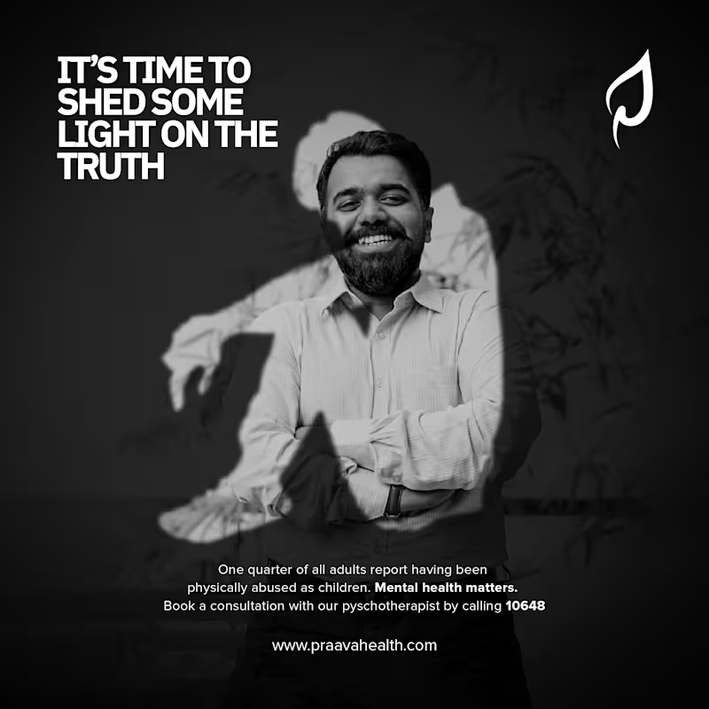
Praava Mental Health Awareness
0
3
0
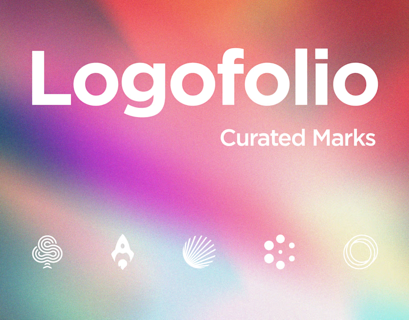
Logofolio | Curated Marks 2024-2025
0
1
0
Ontik Visual Identity Design
0
3
0
Pocket Rocket Identity Design
0
1
Healthcare IT Support Specialist
(1)
Follow
Message
Sadia Afrin Ratri
Dhaka, Bangladesh
UI/UX Designer for SaaS, Mobile Apps & Web Experiences
New to Contra
Follow
Message
UI/UX Designer for SaaS, Mobile Apps & Web Experiences
1
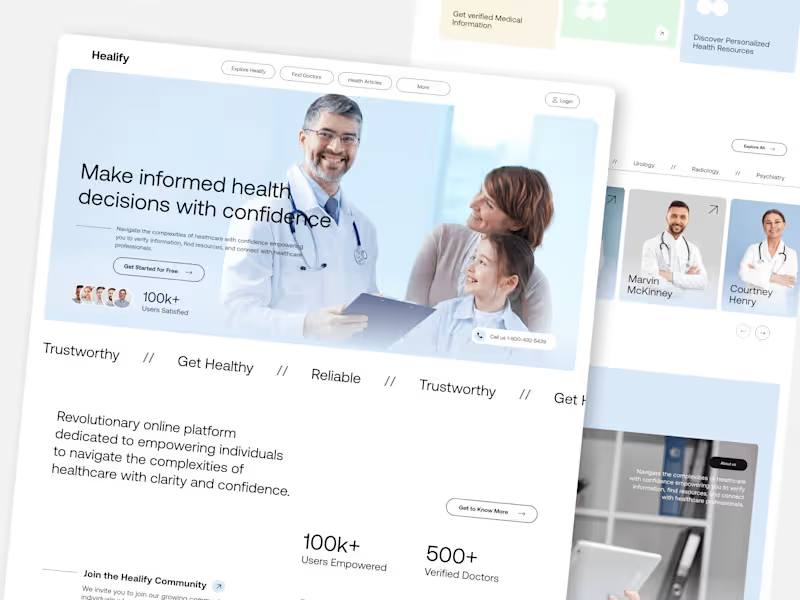
Healify- Healthcare Landing Page
1
8
0
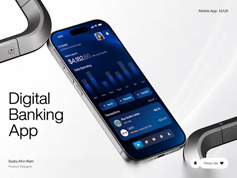
Digital Banking App Mobile UI/UX Design ๐ฅ A modern fintech concept designed to make everyday banking feel simple, clear, and intuitive. For this project, I focused on creating a smooth mobile experience around key financial tasks such as checking available balance, reviewing daily spending, viewing recent transactions, and sending or transferring money. The visual direction combines a deep blue interface, clear typography, structured data, and focused call-to-action elements to create a product that feels both trustworthy and contemporary. Key areas explored: mobile banking UI, dashboard design, financial data visualization, transaction management, and money transfer flows. Designed in Figma. Available for UI/UX Design, Mobile App Design, Fintech Products, and Product Design projects.
4
0
61
0
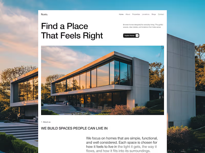
Landing Page Design for Nuvio Rental Platform
0
8
0
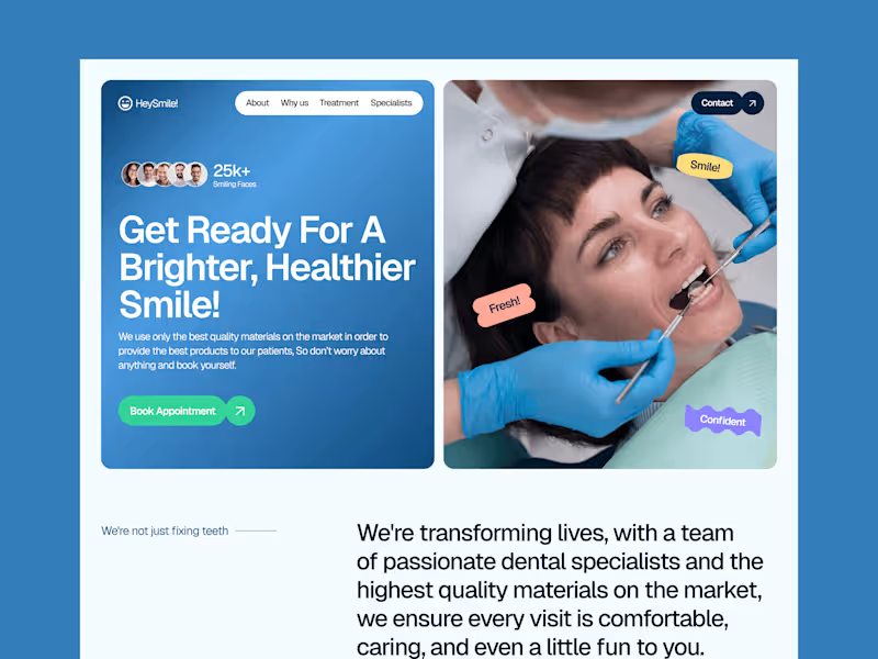
HeySmile! Dental Care Landing Page
0
7
Healthcare IT Support Specialist
(1)
Follow
Message
Explore people