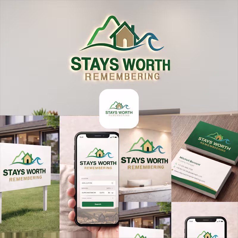
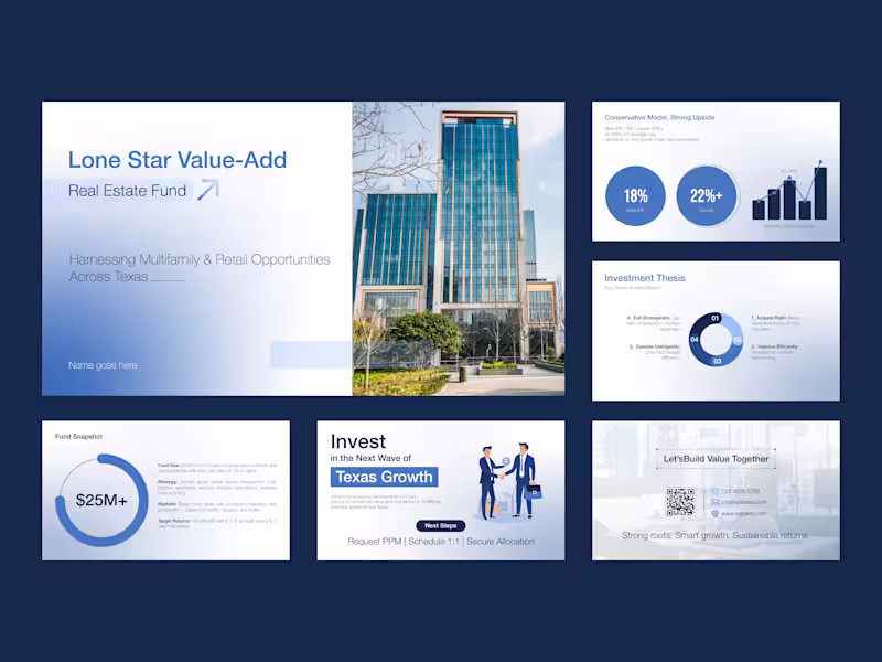
Projects in Naogaon DistrictProjects in Naogaon DistrictStays Worth Remembering Travel Company Logo Design 2026.
The idea behind this logo was to create a visual identity that instantly communicates comfort, memorable experiences, and destination-based stays in a clean and meaningful way.
The mountain element represents travel, adventure, peaceful escapes, and beautiful destinations. It gives the brand a sense of exploration and unforgettable journeys. The house placed in the center symbolizes comfort, hospitality, safety, and the feeling of being “at home” no matter where someone travels.
The wave element was added to represent relaxation, premium vacation experiences, and destinations connected to nature, lakes, beaches, or peaceful environments. Together, the mountain, home, and wave create a complete story of travel and memorable stays.
For the typography, I used a bold and clean font to make the brand look professional, trustworthy, and easy to recognize across both digital and physical platforms. The word “REMEMBERING” uses a softer gold tone to create a warm emotional feeling and reinforce the idea that these stays are not just accommodations, but experiences people will remember for a long time.
The green color palette represents nature, growth, relaxation, and trust, while the blue wave adds freshness, calmness, and a travel-inspired feeling. Overall, the logo was designed to feel welcoming, modern, memorable, and versatile for signage, branding materials, business cards, websites, and mobile applications. Automotive Inventory Platform – B2B SaaS for Tire & Auto Service Businesses
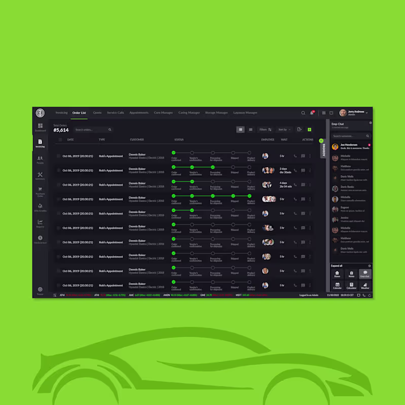
Designed for an automotive service enterprise. This platform lets teams manage inventory, billing, purchases, and reports — all in one clean, enterprise-grade web app. I created a sidebar-driven UX with intuitive navigation, role-based modules (Dashboard, Invoicing, Inventory, PO, Bills, Check-in), and filterable tables to streamline complex workflows and reduce cognitive load. A modern dark interface, clear visual hierarchy, and strong spacing support users who aren’t tech specialists while boosting operational efficiency and decision-making.
Available for freelance opportunities. Schedule a call at rifatuxd@gmail.com (mailto:rifatuxd@gmail.com)