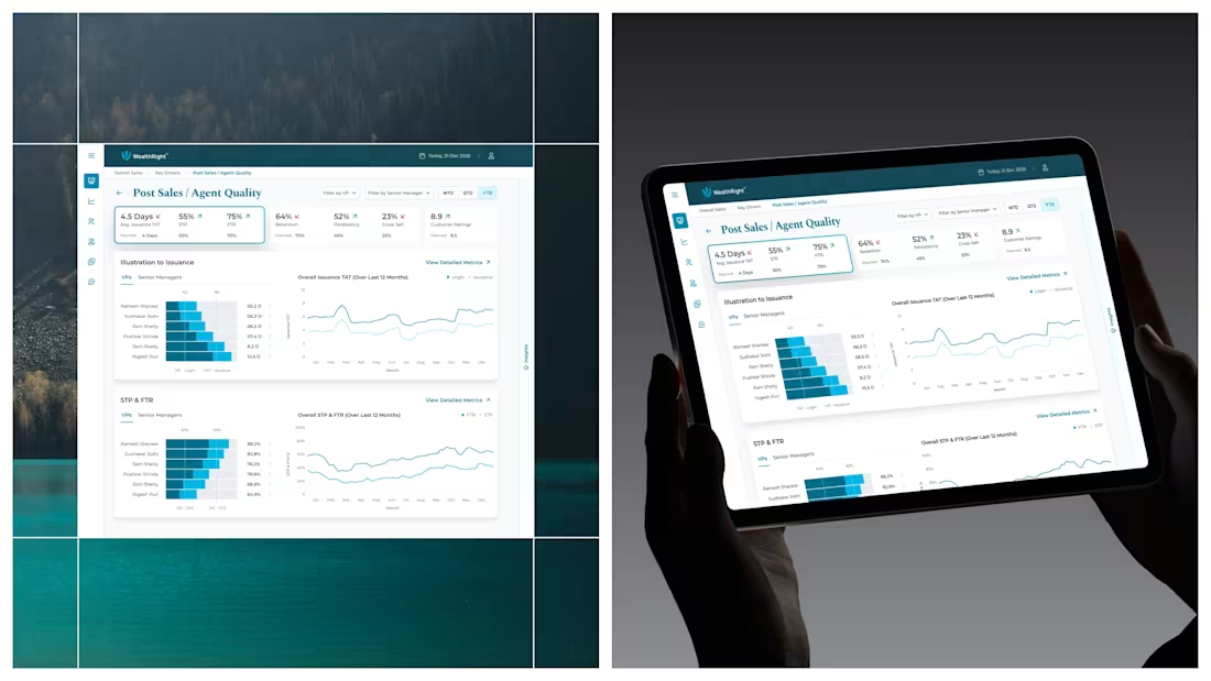
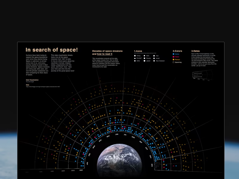
Data Visualization Projects in MumbaiData Visualization Projects in MumbaiChapter 2.2 of my English textbook, A True Story of Sea Turtles, was how I was introduced to Olive Ridley turtles. The story of Velas village (Maharashtra, India) going from stealing turtle eggs to protecting them stayed with me and became the starting point for this project. Kasav Mitra brings the data published by Sahyadri Nisarga Mitra to life while highlighting the shift from conservation awareness to community-led action and livelihood through tourism.
I translated research, geographic information, species data, and conservation statistics into a visual narrative that makes the story easier to explore and understand.
The infographic combines data visualization, mapping, illustration, typography, and editorial layout to show the evolution of turtle conservation from nesting trends and participating villages to the threats faced by turtles and the 2006 shift toward community-led conservation. Live GitHub Pulse — Broadcast Ticker for the Rive Broadcast & Livestream UI Challenge
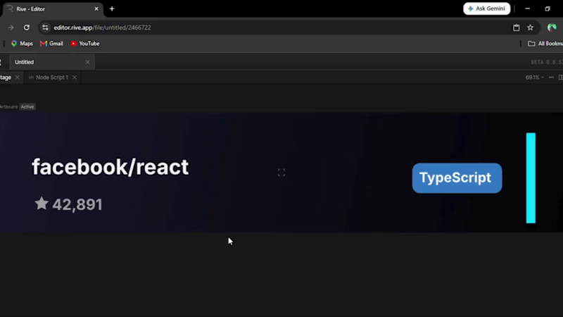
I work as a data analyst and dashboard specialist, so when I saw this challenge, I didn't want to just animate something pretty — I wanted to see if I could bring actual live-data thinking into Rive, the same way I'd build a real-time analytics panel in my day job.
The concept: A broadcast-style lower-third ticker, similar to what you'd see on a live sports or esports stream — except instead of scores, it surfaces trending GitHub repositories in real time. Repo name, star count, and primary language, updating continuously like a stat panel during a live broadcast.
How it's built:
Data Binding — I set up a View Model (VMTicker) with three properties (repoName, starCount, language) and bound them directly to text layers on the canvas. Star count uses a Number-to-String converter so it renders cleanly as text.
Rive Scripting (Luau) — This is the part I'm most proud of. I wrote a custom script that runs inside the artboard and cycles through a set of trending repos every few seconds, pushing fresh values into the View Model through context:rootViewModel(). It's a small simulation of what a live API feed would do, built entirely with Rive's native scripting layer — no external app or backend needed.
State Machine animation — A looped timeline animates the accent bar's opacity in a subtle pulse, so the UI feels "alive" even during the seconds between data updates — like a live broadcast indicator light.
Why this approach: Most broadcast UI concepts lean heavily on motion and character work. I leaned into what I actually know — data pipelines and dashboards — and used Rive's newer Scripting and Data Binding features to bring that thinking into a motion-design tool for the first time. It was also my first time using Rive Scripting, so a good chunk of the build was debugging Luau type errors and figuring out the runtime API through trial and error.
https://editor.rive.app/file/live-github-pulse/2466722
https://www.linkedin.com/posts/abuaasif_rive-uidesign-datavisualization-ugcPost-7490354984044154881-mIL_/?utm_source=share&utm_medium=member_desktop&rcm=ACoAACRm5rcB0nVG0_HUX6-IXfuWqNGquZ-jMQU
📊 Sales Tracking Dashboard | Excel + Power BI Project
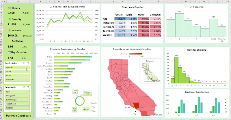
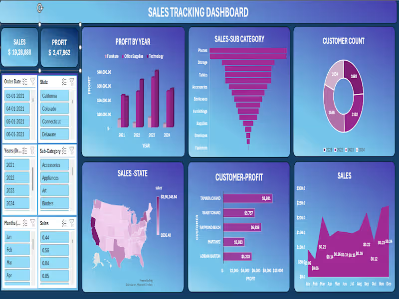
Built an end-to-end interactive Sales Tracking Dashboard covering 2021–2024 across the entire US market.
Top-Line Numbers:
💰 Total Sales: $19,28,888
📈 Total Profit: $2,47,962
👥 Total Customers: 8,314 across all years
What the dashboard reveals:
🏆 Best-selling sub-categories: Phones ($2,79,464) and Chairs ($2,77,058) lead the pack — together accounting for nearly 29% of all sales
📅 Profit growth year-on-year:
→ 2021: $49,556 → 2022: $61,618 → 2023: $81,786 — consistent upward trajectory across Furniture, Office Supplies & Technology
🗺️ Geographic concentration: California dominates at $3,90,145 in sales. New York ($2,46,517) and Texas ($1,51,436) follow. West Virginia sits at the bottom with just $536 — a clear signal for regional strategy review.
📦 Technology drives profit — highest-margin category across all 4 years, despite Furniture holding significant volume
🧾 Seasonal trends: Q4 is king — November ($2,34,013) and December ($2,41,464) are the strongest months. February dips to just $59,640 — opportunity for targeted campaigns.
👤 Top customer by profit: Tamara Chand at $8,981, followed by Raymond Buch ($6,939) and Sanjit Chand ($5,757)
Tools used: Microsoft Excel · Pivot Tables · Power Query · Charts & Slicers · Dashboard Design
This project sharpened my ability to turn raw transactional data into a clean, decision-ready visual — with filters for state, date, year, sub-category, and month.
Open to feedback! 👇
#Excel #DataAnalytics #SalesDashboard #DataVisualization #BusinessIntelligence #MicrosoftExcel #DashboardDesign Integrating modern automation into daily business operations serves as a catalyst for eliminating repetitive manual overhead, drastically reducing human error, and accelerating critical decision-making cycles. By leveraging structured workflows through tools like SQL, Excel VBA macros, Power BI dashboards, and custom Python automation scripts, organizations can transform complex, fragmented datasets into dynamic, real-time reporting systems. Rather than spending valuable hours manually aggregating reports, cleansing raw data, or cross-referencing records across disparate databases, automated pipelines seamlessly process and visualize key metrics in real time. This operational shift not only enhances operational speed and analytical precision across functions like MIS and performance tracking, but it also frees up core team members to focus on high-impact strategic initiatives and proactive business growth.
Name - Mahesh Narendra Khedekar
Contact No -(+91) 7021027927 [fast responce Conntact with whatapp]
Email ID - maheshkhedekar329@gmail.com