Projects using Stitch in MultanProjects using Stitch in Multan Project Description: CONTRA Phone – The Blossom Sanctuary
Status ( incomplete and unpolished)
Project Overview
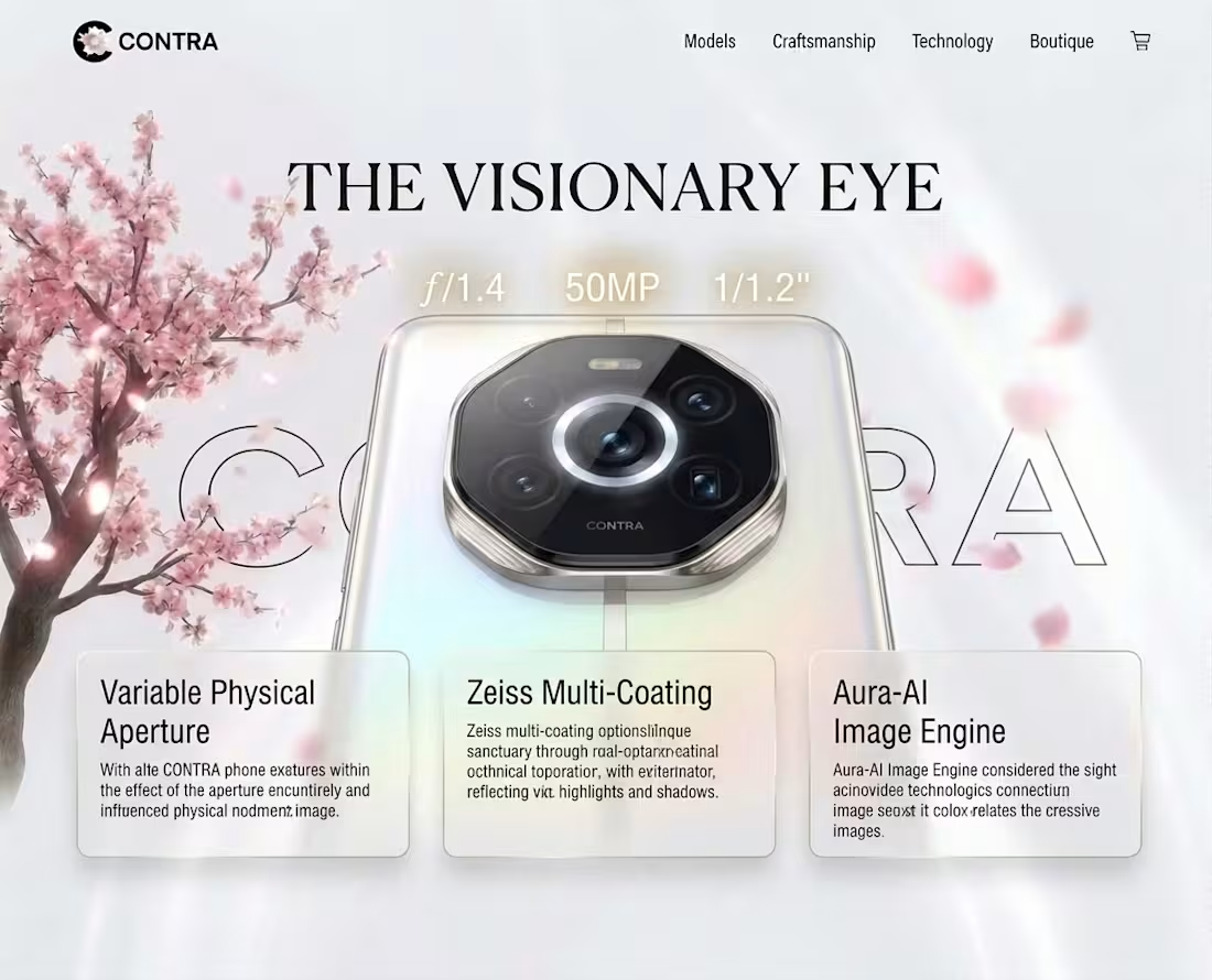
CONTRA: The Blossom Sanctuary is an immersive, world-class 3D cinematic web experience built for the Google Stitch flagship portal competition. Moving far beyond traditional, flat e-commerce layouts, this project establishes a "Digital Sanctuary" that merges high-fashion luxury product presentation with interactive, atmospheric storytelling. The experience is engineered using an HTML-native canvas that links fluid 3D animations directly to the user’s real-time scroll.
The Creative Vision
The aesthetic concept creates an intentional contrast between raw, precision hardware and organic tranquility.
The Hero Asset: The CONTRA flagship smartphone floats weightlessly as a central monument, showcasing its premium titanium frame and its signature pulsing hardware feature: the Aura Ring.
The Environment: A vast, minimalist White Fantasy Void featuring a soft, glowing white marble floor. Arching over the device is a massive, hyper-detailed ancient Japanese Cherry Blossom tree in full bloom.
The "Alive" Factor: To make the portal feel active and responsive, a custom 3D particle system drifts pink petals through the workspace. The phone's Aura Ring dynamically casts an emissive white-and-pink glow that bleeds into the atmosphere and reflects off the passing petals.
Technical Architecture & Core Mechanics
Built on a high-performance WebGL stack utilizing React-Three-Fiber and Three.js, the project is optimized for a locked 60 FPS delivery directly in the browser:
Scroll-Bound Interpolation: Using canvas scroll controls, the smartphone executes a flawless, continuous $360^\circ$ rotation along its Y-axis mapped perfectly to the user's scroll depth.
GPU-Accelerated Particle Engine: To prevent performance lag, the falling cherry blossom petals are managed via an instanced mesh (THREE.InstancedMesh). This compiles over 100 unique, tumbling petals into a single draw call, calculating wind drift and reset boundaries on the GPU.
Cinematic Lighting & Shaders: The camera uses a post-processing Bloom Shader combined with a highly emissive MeshDistortMaterial. This causes the phone's light ring to bleed naturally into the high-contrast white environment, giving it a premium, ethereal glow.
Dynamic Material Swapping: A responsive front-end state manager hooks into the 3D scene, allowing users to select from a 6-color finish palette (including Obsidian, Pearl, Alpine, and Rose) which instantly repaints the phone's digital shaders.
The User Experience (UX) Journey
1. Section 1: The Reveal (Hero Phase)
The user lands on a pristine white canvas. The CONTRA phone floats dead-center under the blossom canopy. The word "CONTRA" sits anchored in the background layer in a massive, bold 200px Syne typography outline, establishing an immediate high-fashion editorial vibe.
2. Section 2: Aura Intelligence (Detail Phase)
As the user scrolls, the phone smoothly spins $360^\circ$ and tracks across the screen to clear space for the UI. A semi-transparent, ultra-blurred glassmorphic layout card flies in from the side with a crisp motion blur effect, revealing the hardware specs (Aura-Flow OLED, X-IMAGE Variable System, Grade 5 Titanium) alongside the interactive finish-swapper.
3. Section 3: Material Honesty (The Sanctuary)
The camera shifts depth-of-field, drifting past the hardware as a final brand philosophy statement fades onto the screen. The interaction leaves the user with a lasting impression of the phone not just as a tool, but as a design environment.
While standard competition entries rely on flat grids and basic scrolling text, The Blossom Sanctuary wins on both Creativity and Technical Execution. By syncing advanced WebGL rendering, GPU particle physics, and high-fidelity post-processing with simple scroll behavior, this project redefines the boundaries of modern, flagship interactive web design.
Preview1 :https://stitch.withgoogle.com/preview/420511950395424838?node-id=d0e8c33cd85a47428ddf3d0c4f36681f
Preview 2:https://stitch.withgoogle.com/preview/420511950395424838?node-id=08e254f0306b4cce94b63657831bb2ef (Studio Flat-Lay Concept) Web Design
Visual Direction: Bridging Direct-to-Consumer Reality and Digital Agency
Concept Overview:
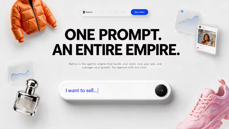
This concept is built on a direct, high-contrast flat-lay studio aesthetic. The design philosophy was to instantly merge the result (physical products) with the catalyst (the digital agentic engine). By displaying iconic e-commerce goods—like a vibrant orange puffer jacket and a bold pink sneaker—side-by-side with minimal UI, the composition tells a story: your words create physical reality.
Key Design Elements:
High-Tactility Flat-Lay: Curated photography of physical retail goods (luxury fragrance, high-fashion apparel, modern sneakers) positioned on a crisp white textured canvas.
Minimalist UI: The prompt bar is stripped down to its essential form with a clean black control button, highlighting the ease of "one click" approval.
Augmented Widgets: Floating frosted panels displaying performance graphs and a natural user story/social post concept are placed around the products, reinforcing the "engine" that handles your ads and growth, grounding the platform's power in tangible outputs.
Description for Image 3 (Soft Ivory Editorial Concept)
Visual Direction: Editorial Autonomy & Strategic Sophistication
Concept Overview:
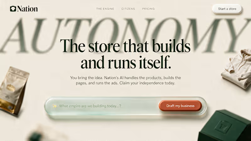
This description addresses the mature, refined core of the Nation brand identity. Designed with a warm, textured ivory canvas and subtle, organic shadows, this layout functions like a prestigious editorial cover for a modern creative engine. It rejects typical cold, technical UI patterns in favor of luxury brand sophisticated typography (a dominant serif title) and extensive whitespace to convey trust and quality. It positions Nation not just as a tool, but as a strategic partner.
Key Design Elements:
Editorial Serif Typography: I used a large, elegant serif font to headline "AUTONOMY," making the concept feel mature and premium.
Organic Shadow-Work: The design relies on soft, floating product samples (like a premium bag and a folded hoodie) cast in subtle shadows, creating deep layers without clutter.
Themed CTAs: Features a custom, soft-green-tinted prompt bar and a warm terracotta primary CTA ("Draft my business"), using natural earth tones instead of generic digital blue to emphasize the organic, human aspect of business creation.