Cloud Infrastructure Projects in MultanCloud Infrastructure Projects in MultanSolace Collective - Therapy Practice Landing Page
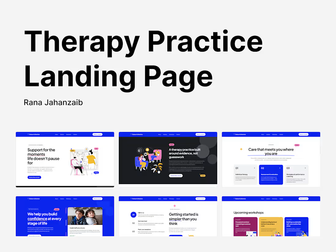
A landing page for a therapy and mental wellbeing practice, built to feel calm and human instead of clinical, with workshops and a clear "how it works" path front and center.
Solace Collective is a concept landing page for a therapy practice, built around evidence-based care that still feels warm and human. The hero avoids the usual therapy-site vagueness ("you're not alone") and leads instead with something concrete: a free monthly newsletter, a free first consult, and a clear call to action.
The page structure does a lot of the trust-building work. A three-step "getting started" section (talk to us, get matched, start your sessions) removes the biggest friction point in seeking therapy, not knowing what actually happens after you reach out. A services section breaks down individual therapy, assessment and evaluation, and workplace coaching as genuinely distinct offerings rather than one blurred pitch. And an upcoming workshops section, with real dates and specific topics like burnout and supporting an anxious teen, gives the practice a reason for someone to come back to the site even before they're ready to book.
The tone throughout avoids clinical distance without swinging into empty affirmation... lines like "no generic intake forms, no starting over with someone new every few months" speak directly to real frustrations people have with mental healthcare, not just template reassurance.
It's built on the same reusable Cloudflare deployment system as the rest of this series... a single Worker with static assets, a working consult-request form backed by D1 with spam protection and rate limiting, and a schema that brings itself up to date automatically on first submission. Ember Studio: Brand & Design Agency Landing Page
A landing page for a creative brand agency, built to showcase work and services without the portfolio-site clichés... case studies, team, and process all pulling their weight.
Ember Studio is a concept landing page for a brand and design agency, built around the pitch "ideas that ignite brands." Rather than one long scroll of service descriptions, the page is structured the way an actual agency pitch deck would be... a confident hero with real client logos, a clear breakdown of services (brand identity, experiential design, strategy and positioning), a recent work grid with real project types and years, and a team section that puts faces to the studio instead of hiding behind a logo.
The copy throughout leans into specificity over the usual agency vagueness. Stats like 320+ brands launched and 96% client retention sit right in the page instead of being buried in an about page, and the "strategy and craft turn attention into loyalty" section explains what the studio actually does rather than just how it feels to work with them.
This project also is the base template itself, since the underlying reusable Cloudflare landing page system was built and proven out using this project as the reference implementation. The optimization pass reflects that:
- SEO went from 69 to 100 on both mobile and desktop
- Performance and Best Practices were already perfect and held at 100 throughout
- Accessibility went from 96 to 100 on both form factors
It runs as a single Cloudflare Worker with static assets, with a working contact form backed by D1, spam protection, and IP rate limiting, built so a client could connect the repo and deploy without wiring anything by hand. Dental Clinic Landing Page
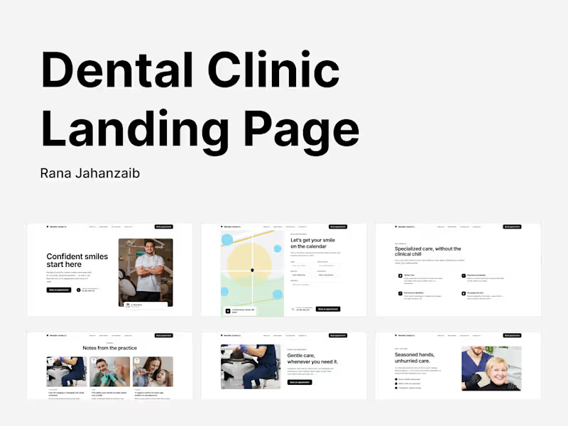
A landing page for a dental practice, built to feel calm and personal instead of clinical, with a booking flow front and center.
Live Preview (https://meridian-dental-landing-page.preview.withrana.com/)
Meridian Dental Co. is a concept landing page for a dental practice built around a simple idea... most people don't dread the dentist because of the work itself, they dread the waiting rooms, the paperwork, and the cold, clinical tone. Every section here works against that. The hero leads with a real, warm photo instead of a stock smile. The booking section puts the form front and center with a clean location map, not buried three clicks deep. And the "why us" section speaks directly to the actual hesitations people have... nervous patients, first-timers, insurance questions... rather than listing generic services.
The content structure also does something a lot of local business templates skip: it includes a journal/blog section for practice updates, which matters for a real dental practice's local SEO and gives the site somewhere to grow after launch instead of staying static.
This one had the steepest starting gap of the series and the clearest before/after:
- Mobile Performance went from 75 to 98, Desktop from 81 to 100
- SEO went from 69 to 100 on both mobile and desktop
- Accessibility went from 96 to 100 on both
- Best Practices held steady at 100 throughout
It's deployed as a single Cloudflare Worker with static assets, with a working appointment-request form backed by D1, spam protection, and rate limiting, all designed so a client could connect the repo and deploy without wiring anything by hand. Roam — Footwear Brand Landing Page
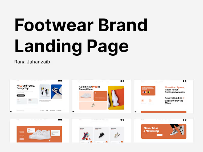
A marketing site for a lightweight-footwear brand, with a heavy focus on image performance, cutting product photography from 7.6MB to 1.3MB without losing visual quality.
Live Preview (https://roam-landing-page.preview.withrana.com/)
Roam is a marketing site concept for a lightweight footwear brand, built around movement and everyday wear. The homepage runs through a full storytelling arc... a hero built to sell the brand's positioning, a collection teaser for an upcoming drop, growth and trust stats, a product spotlight breaking down materials and construction, a product grid, and a newsletter capture.
This build leaned heavily into image performance, since a footwear brand's site lives and dies by product photography. Every image in public/images/ was hand re-encoded to WebP at its actual rendered dimensions rather than left at source size, which was the single biggest lever in the results:
- Mobile Performance went from 74 to 99
- Desktop Performance went from 80 to 100
- Mobile Accessibility went from 89 to 100, fixing low-contrast text on brand-colored panels and invalid list markup
- SEO and Best Practices landed at 100 across both form factors
It's deployed as a single Cloudflare Worker with static assets, on infrastructure designed to hand off cleanly... a D1-backed lead capture form with spam protection and rate limiting, and a schema that brings itself up to date automatically on first submission. Fernway — Design Agency Membership Landing Page
A landing page for a flat-rate design studio membership, built on a zero-config Cloudflare deployment template with a measured performance pass across every category.
Live Preview (https://fernway-landing-page.preview.withrana.com/)
Fernway is a landing page for a creative studio membership concept... one flat monthly rate for unlimited brand, product, and web design requests, positioned as an alternative to the traditional agency retainer. The page is built around the core pitch: no scoping calls, no per-project quotes, drop requests into a queue and get them turned around by a senior team.
Structurally it walks through the value proposition in clear, skimmable sections... the flat-rate pitch with real metrics up front, a "why teams switch" comparison block, a selected work showcase, a breakdown of what's included, and an FAQ section addressing the objections a prospective client would actually have (how many requests, what happens after delivery, how fast is turnaround).
Like the rest of this template series, this wasn't just a visual build. A full round of optimization work took the site from a mixed baseline to consistent scores across the board:
- SEO went from 69 to 100 on both mobile and desktop
- Performance hit 100 on both form factors
- Accessibility reached 100 on mobile, with one remaining desktop contrast finding tracked and documented rather than hidden
- Best Practices reached 100 on both
The site is deployed on a template built for real handoff, not just a demo. It ships as a single Cloudflare Worker with static assets, includes a working contact form backed by D1 with spam protection and rate limiting, and the database schema brings itself up to date automatically on first submission, so a client can connect the repo and deploy without needing to run a manual migration step. PixelMint — Concept Device Landing Page
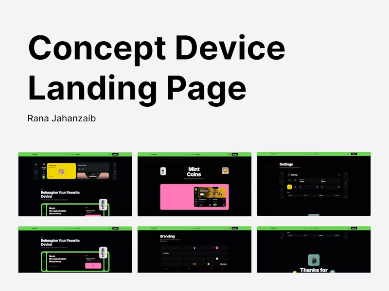
A scroll-based concept case study for a reimagined handheld device, built on a reusable React template that deploys to Cloudflare with zero config.
Live Preview (http://pixelmint-landing-page.preview.withrana.com/)
PixelMint is a concept case study exploring what a favorite handheld device could look like if it were rebuilt around habit, not novelty. The page walks through the idea in layers... the lock screen, the branding system, the coin economy, the settings panel... each treated as its own small design problem rather than a single hero shot.
Beyond the visual design, this project was also an exercise in shipping infrastructure. It's built on a template designed to deploy to Cloudflare Workers with close to zero configuration, so a client could connect the repo and go live without touching a build pipeline by hand. That included:
- A single flat repo, one Cloudflare Worker with static assets, no unnecessary monorepo overhead
- A working contact form backed by D1, with spam protection, IP rate limiting, and email notifications via Resend, all optional and none of it requiring manual setup
- A self-healing database schema that brings itself up to date on first submission, so a first deploy never depends on remembering a migration step
- A real performance pass, not just eyeballed... measured before and after, landing at 99 to 100 on Performance and a clean 100 across Accessibility, Best Practices, and SEO on both mobile and desktop
The contrast fixes alone were a good reminder that fixing accessibility by eye isn't the same as fixing it by measurement. The first pass looked better and didn't move the score. The real fix came from actually rendering computed colors to a canvas and reading the pixels back, since Tailwind v4's oklch color format quietly breaks naive contrast checkers. Autoloom — AI Workflow Automation Landing Page
A SaaS landing page for an AI workflow automation tool, connecting the apps a team already uses so busywork runs in the background.
Autoloom is a concept landing page for an AI-powered workflow automation product, the kind of tool that connects Gmail, Slack, spreadsheets, and CRMs so repetitive tasks stop eating up a team's day. The page is built to sell that pitch fast... a hero that leads with the outcome, not the tech, a "build custom workflows in minutes" section showing off drag-and-drop simplicity, a trigger/action visual explaining how the automation actually works, and a wall of specific, believable customer quotes instead of generic praise.
The copy throughout avoids the usual SaaS habit of describing a feature and calling it a day. Each section ties back to a real before/after: four spreadsheets and a Slack bot nobody trusted, replaced with three working automations. A support queue that used to sit for a day, now triaged and routed automatically. That's the kind of specificity that makes a landing page feel like it was written by someone who's used the product, not just described it.
On the technical side, this went through a full performance and accessibility pass:
- Accessibility jumped from 93 to 100 on both mobile and desktop
- SEO went from 69 to 100 on both form factors
- Performance and Best Practices were already strong and held at 99 to 100 across the board
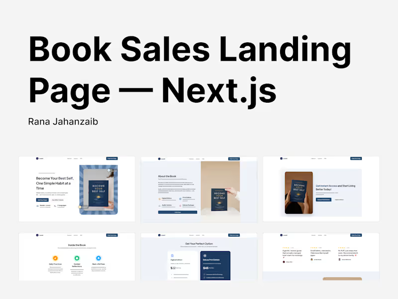
It ships as a single Cloudflare Worker with static assets, with a working lead-capture form backed by D1, spam protection, and rate limiting baked in, so a client could connect the repo and deploy without touching a build pipeline. Book Sales Landing Page | Next.js, Cloudflare-native 100% PageSpeed Score
A self-help book landing page built with Next.js and deployed on Cloudflare for near-instant load times worldwide. Static export, edge delivery, 100 speed score on both desktop and mobile.
Speed was the priority on this build.
Live Preview (https://lucent-landing-page.preview.withrana.com/)
Landing pages like this one live or die in the first two seconds. If a visitor is clicking in from an ad, an email, or a social post, any delay costs conversions before they even see the pricing section. So the entire stack was chosen around that constraint.
Why Cloudflare?
The page is built as a static export and deployed on Cloudflare, served from Cloudflare's edge network instead of a single origin server. That means whether someone opens the page from the US, Europe, or Asia, the assets are coming from a server close to them, not routing back to one region. No cold starts, no server rendering delay on each request... just static files served fast, everywhere.
This matters more for a sales page than almost any other type of site. A blog post can afford to load in three seconds. A page asking someone to buy something can't.
The results:
- 100 Lighthouse score on both desktop and mobile
- Fully responsive, fully static, edge-delivered, no server round trip
- Fast enough that the pricing and FAQ sections are interactive before most competing pages have finished their hero image.
Performance Reports
Initial Score
- Mobile: 74/100 (https://pagespeed.web.dev/analysis/https-lucent-landing-page-preview-withrana-com/3pl0nunaxh?form_factor=mobile) | Desktop: 93/100 (https://pagespeed.web.dev/analysis/https-lucent-landing-page-preview-withrana-com/3pl0nunaxh?form_factor=desktop)
After Image Fix
- Mobile: 100/100 (https://pagespeed.web.dev/analysis/https-lucent-landing-page-preview-withrana-com/atptqm9qlh?form_factor=mobile) | Desktop: 100/100 (https://pagespeed.web.dev/analysis/https-lucent-landing-page-preview-withrana-com/atptqm9qlh?form_factor=desktop)
After SEO Fix
- Mobile: 99/100 (https://pagespeed.web.dev/analysis/https-lucent-landing-page-preview-withrana-com/hqnxdo423d?form_factor=mobile) | Desktop: 100/100
(https://pagespeed.web.dev/analysis/https-lucent-landing-page-preview-withrana-com/hqnxdo423d?form_factor=desktop)* Mobile Performance reading 99 instead of 100 in the final round is normal run-to-run variance (Lighthouse re-measures live on every request), not a regression... every metric behind it (FCP 0.9s, LCP 2.0s, TBT 30ms, CLS 0) is essentially identical to the prior round.
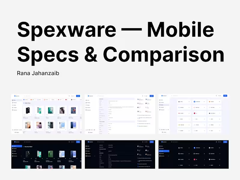
If you're launching a book, course, or digital product and speed and conversion both matter to you, this is the kind of build I do. Spexware - Mobile Phone Specs & Comparison Platform
Spexware is a phone specifications platform covering every major brand, from Samsung and Xiaomi down to Nothing and Nokia, with spec sheets detailed enough to matter to someone actually deciding between two phones: chipset architecture down to individual core clocks, GPU shading units, FLOPS, memory type and channel count, storage generation. Not marketing bullet points... the numbers a buyer or reviewer actually wants.
The comparison feature is the core of the product. Rather than reading two spec pages in separate tabs, a visitor picks two phones and gets them side by side, which is the actual job a specs platform exists to do. Editor Picks, per-device community engagement (likes, comments), and a live search surface the catalog without forcing a category browse for every lookup.
Built as a Next.js static export served from Cloudflare, structured as a monorepo with separate web and admin apps, so the catalog can scale... new devices, new brands, new comparisons... without the admin surface and the public site stepping on each other. Ad-supported and built for global reach. 100% FREE Serverless AI Chat on Cloudflare
Open-source AI chat app running entirely on Cloudflare Workers, R2, and Workers AI. No traditional backend - inference lives at the edge.
Code: https://github.com/ranajahanzaib/waichat
Click to Deploy on Cloudflare: https://deploy.workers.cloudflare.com/?url=https://github.com/ranajahanzaib/WaiChat/tree/v0.1.5-alpha.2
Most AI chat apps assume a conventional backend: a server somewhere, a managed database, an API layer in between. WaiChat doesn't have one. It runs entirely on Cloudflare's edge primitives - Workers for compute, D1 for storage, and Workers AI for inference - so there's no origin server to provision, patch, or scale.
That's a different set of constraints than a typical Node backend. Workers have execution limits and a stateless-by-default model, D1 is SQLite at the edge rather than a full Postgres, and inference has to run through Workers AI's model catalog rather than an arbitrary hosted API. Building a real chat experience inside those constraints means the request path, the data model, and the inference calls all have to be designed for the edge from the start, not adapted to it afterward.
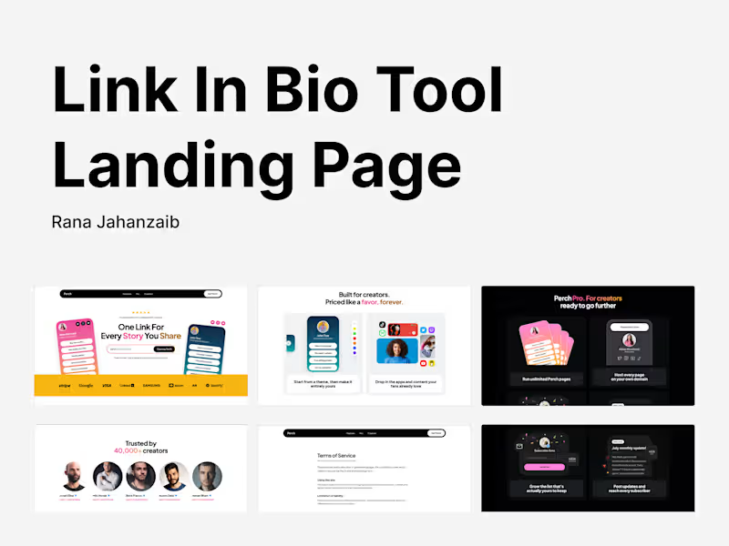
I built WaiChat solo, open source, as exactly that kind of project - no client, no spec, just deciding what a chat app should look like when it's edge-native end to end. It's on GitHub for anyone who wants to see how the pieces fit together. Perch - Link-in-Bio Tool Landing Page
A marketing site for a link-in-bio product built for creators, with pricing, platform integrations, and a Pro upsell all pulling their weight.
Live Preview (https://perch-landing-page.preview.withrana.com/)
100/100 PageSpeed Insight Score: Mobile (https://pagespeed.web.dev/analysis/https-perch-landing-page-preview-withrana-com/ayniuhn2oq?form_factor=mobile) | Desktop (https://pagespeed.web.dev/analysis/https-perch-landing-page-preview-withrana-com/ayniuhn2oq?form_factor=desktop)
Perch is a concept marketing site for a link-in-bio tool, the kind of product creators use to turn one link into a hub for everything they make. The hero sells the core promise fast... "one link for every story you share"... backed by real customer-logo social proof.
From there the page builds out the actual reasons a creator would pick this over the dozen other link-in-bio tools out there: a "start from a theme, then make it entirely yours" customization pitch, direct integrations with the platforms creators already live on (Spotify, YouTube, TikTok, Twitch), and a dedicated Pro section covering unlimited pages, custom domains, and real subscriber growth tools. A trusted-by section with named creators closes the credibility loop before the pricing pitch even lands.
This build also went through a deliberate image weight fix worth calling out specifically... the testimonial and mockup imagery dropped from 9.6 MB to 264 KB, alongside fixes for seven contrast failures and a full set of security headers (CSP, HSTS, COOP, XFO). SEO and image-weight fixes are complete and shipped; a fresh PageSpeed scan against the redeployed site is the one remaining step before final numbers are locked in.
It runs as a single Cloudflare Worker with static assets, with a working signup form backed by D1, spam protection, and rate limiting, so a client could connect the repo and deploy without wiring anything by hand.