

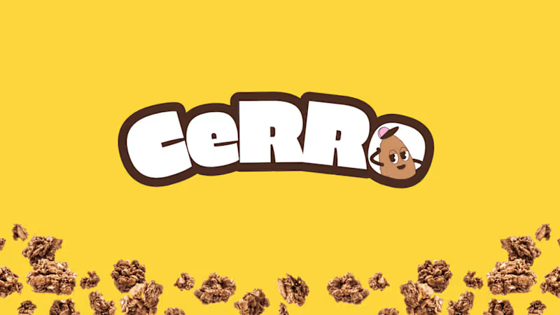
Fuel your day with goodness. 🥣
Introducing CERRO, a granola cereal brand we designed to make everyday breakfast more delicious, nutritious, and fun.
CERRO pairs wholesome oats, nuts, and seeds with high-protein nutrition and no added sugar. We built the identity around that same energy: a chunky rounded "CeRRo" wordmark, a playful retro-cartoon mascot that replaces the "o", and a bold yellow hero color.
Each flavor gets its own color code, with pink for Strawberry, brown for Chocolate, and yellow for Banana. That keeps the range easy to read on the shelf while staying consistent as a system. The work covers the logo, packaging, posters, merchandise, and a billboard campaign.
See the full project on Behance:
www.behance.net/gallery/Cerro-Granola-Branding-Packaging-Design (https://www.behance.net/gallery/Cerro-Granola-Branding-Packaging-Design)
What's your go-to breakfast? 👇
#BrandIdentity #PackagingDesign #Branding #FoodPackaging #VisualIdentity #GraphicDesign #Illustration
0
10

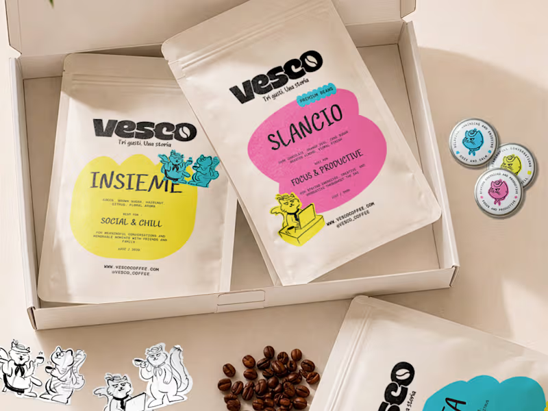


Veylow - Branding & Logo
A fresh identity direction for Veylow, built around a circular geometric mark, bold black and neon yellow contrast, and a flexible line system that carries across digital and physical touchpoints. We wanted it to feel sharp, modern, and easy to recognize at any scale. Would you keep this identity this bold or push it even further?
0
16


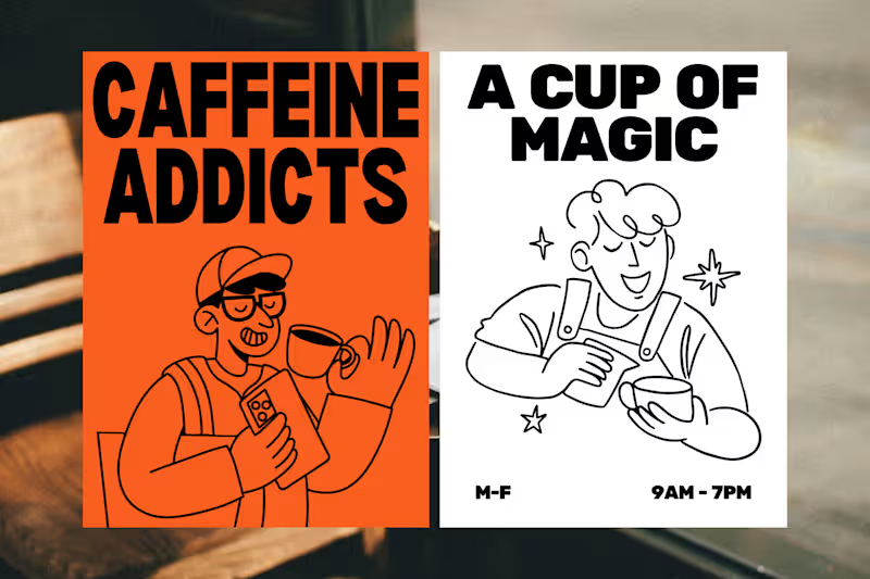
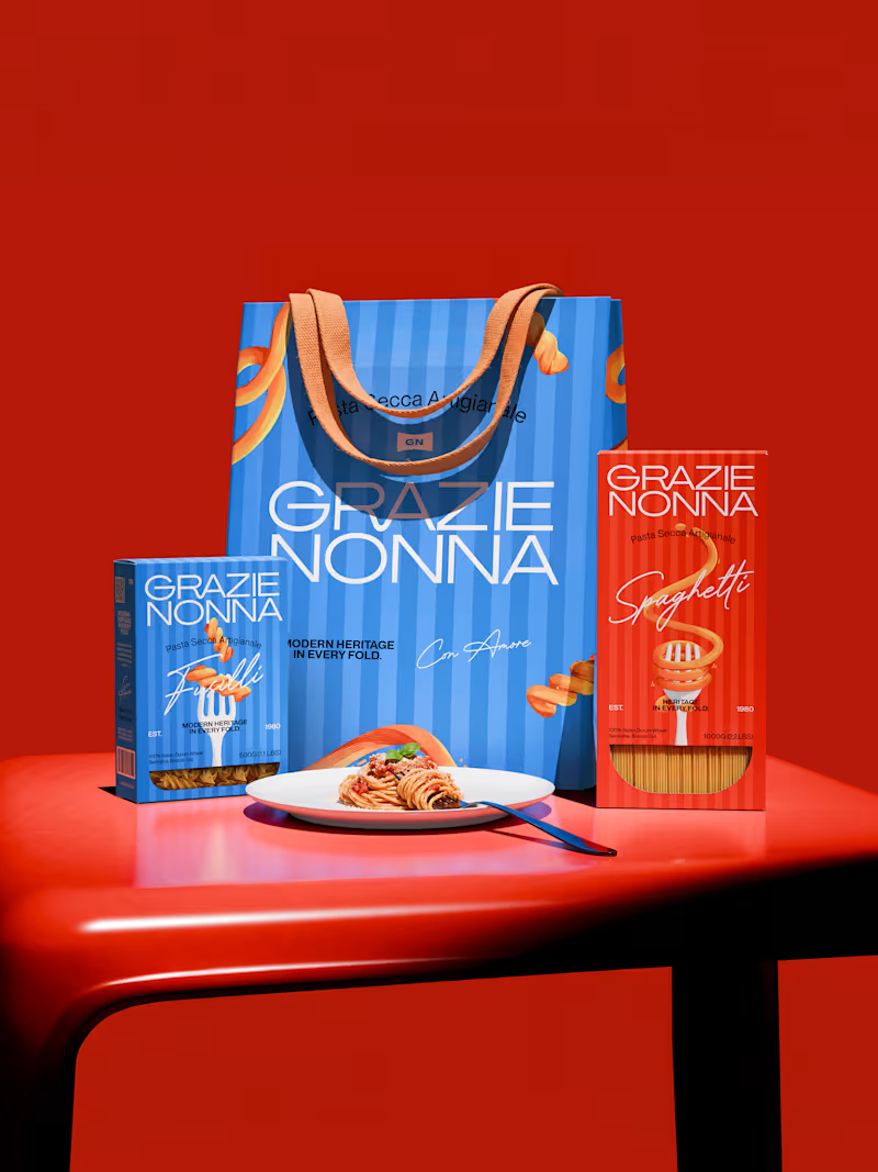
Grazie Nonna is a modern pasta brand inspired by the warmth, craft, and authenticity of handmade family recipes.
The challenge was to create a brand identity and packaging system that could celebrate Italian heritage without falling into the familiar visual language of traditional pasta brands.
Instead of looking backward, the identity brings nonna's heritage into a contemporary world: bold, expressive, colorful, and unmistakably Italian. The result is a visual identity built around one central idea: Tradition, reframed for a new generation.
4
3
148