3D artist / Illustrator


Social Media & Content Strategist | UGC Content Strategist
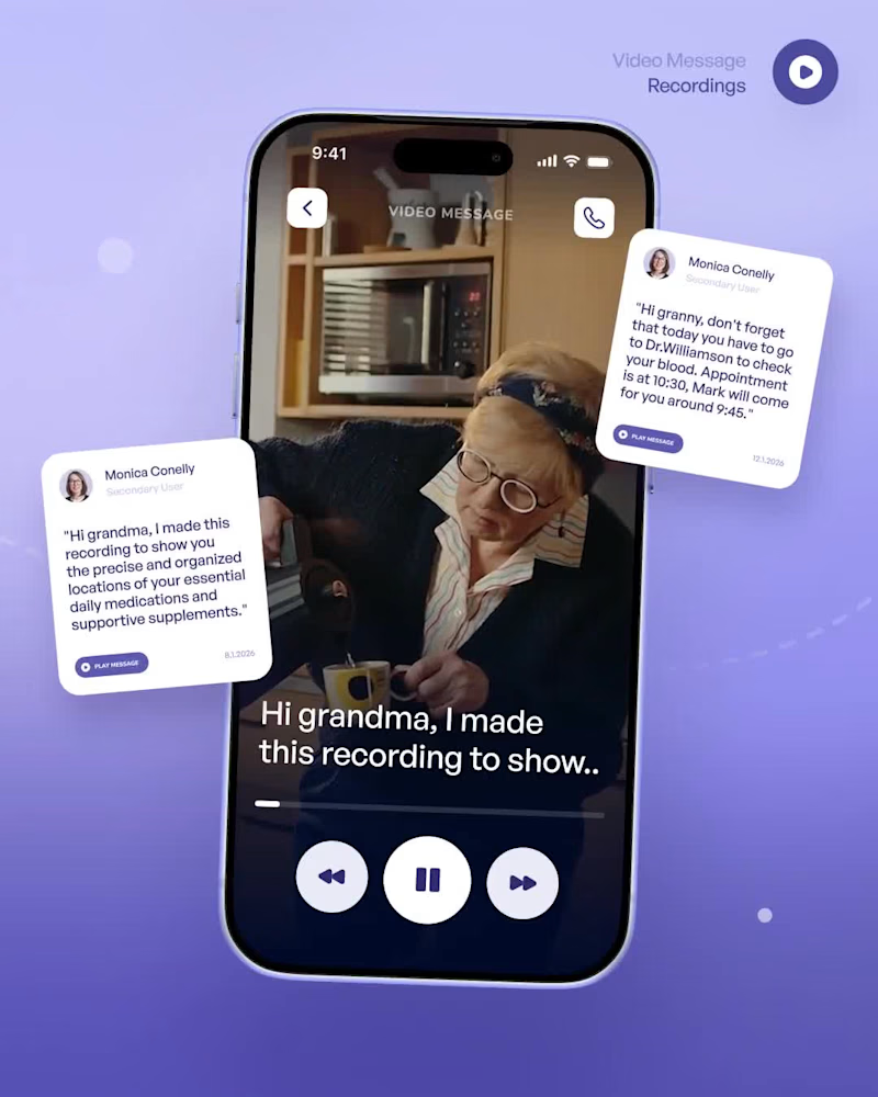
Business Services – Promotional Motion Graphics Video
Created a modern, animated promotional video designed to showcase a business's creative services in a visually engaging and professional way.
What I did:
Developed the creative concept and visual direction.
Designed a clean, modern layout using bold colors, typography, and geometric elements.
Created animated service showcases for web design, motion graphics, and video editing.
Incorporated visual imagery to make each service more engaging and recognizable.
Designed smooth transitions and animated elements to maintain visual flow.
Created a clear contact section to encourage potential clients to get in touch.
Tools Used: Figma, Canva, and Adobe Illustrator.
Skills: Motion Graphics, Promotional Video Design, Graphic Design, Visual Storytelling, Typography, Animation, and Creative Direction.
0
76
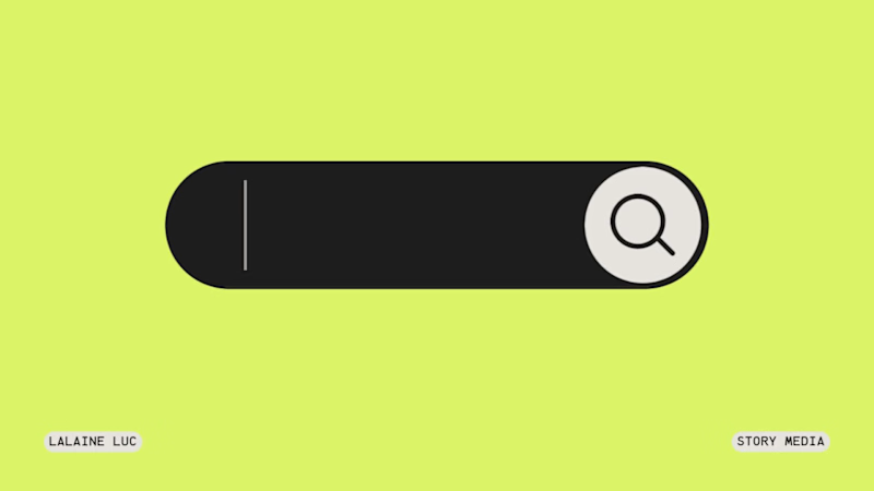
Dream & Create – Inspirational Typography Animation
Created a short, eye-catching typographic animation centered around dreams, creativity, and inspiration. The project combines playful typography, bold colors, and simple animated graphic elements to communicate a positive and creative message.
What I did:
Developed the creative concept and visual direction.
Designed bold typography and playful text compositions.
Created custom graphic elements, including an animated search bar and dream-inspired illustrations.
Experimented with typography styles, layouts, and contrasting colors.
Arranged and animated visual elements to create a dynamic storytelling experience.
Focused on creating an engaging, modern, and memorable visual style.
Tools Used: Figma, Canva, and Adobe Illustrator.
Skills: Motion Graphics, Typography, Graphic Design, Visual Storytelling, Creative Direction, and Animated Content Creation.
0
78
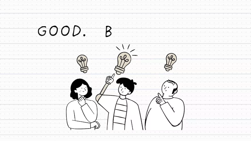
Good. Better. Best. – Creative Motion Design & Illustration
Created a short, engaging animated visual exploring the progression from good to better to best through simple storytelling and hand-drawn illustrations.
What I did:
Developed the creative concept and visual direction.
Designed custom illustrations and graphic elements.
Created a clean, minimal visual style using hand-drawn characters and lightbulb illustrations.
Arranged visual elements and typography to communicate the message clearly.
Produced an engaging animation with smooth visual transitions.
Tools used: Figma, Canva, and Adobe Illustrator.
Focus: Graphic Design, Visual Storytelling, Illustration, Motion Content, and Creative Direction.
0
70
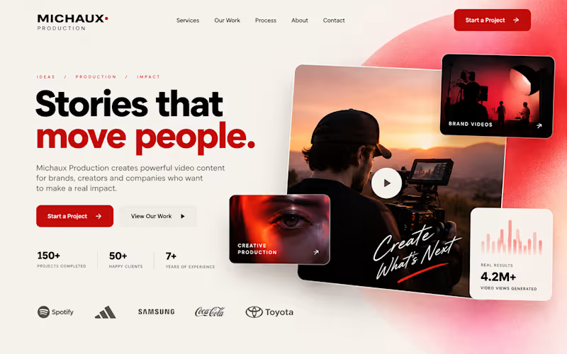
Michaux Production — Creative Landing Page Design
I designed a bold, modern landing page concept for Michaux Production, a creative video production brand focused on producing impactful visual content for businesses and brands.
The goal was to create a strong first impression through a clean layout, striking typography, and cinematic imagery that communicates creativity, professionalism, and storytelling.
I combined a warm, minimal background with bold red accents, layered visual elements, and a clear call to action to create an engaging digital experience that showcases the brand’s creative identity.
The final concept brings together modern web design, visual storytelling, and a conversion-focused layout to help Michaux Production present its services and portfolio in a compelling way.
0
98

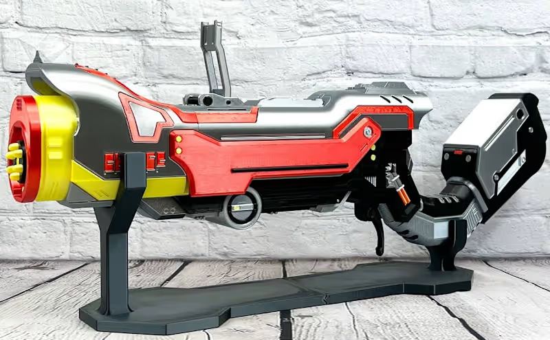
Mechanical Designer & Electronics Enthusiast 💡
Mechanical Designer & Electronics Enthusiast 💡


View more →

High-quality Interior Designs: from idea to 3D visualisation
High-quality Interior Designs: from idea to 3D visualisation


Multidisciplinary designer turning ideas into visual stories
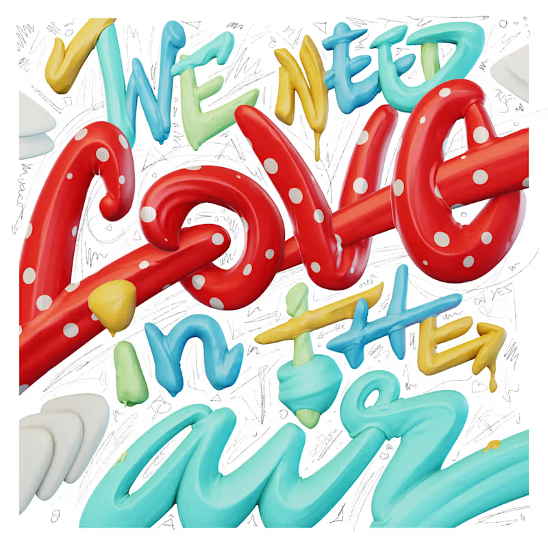
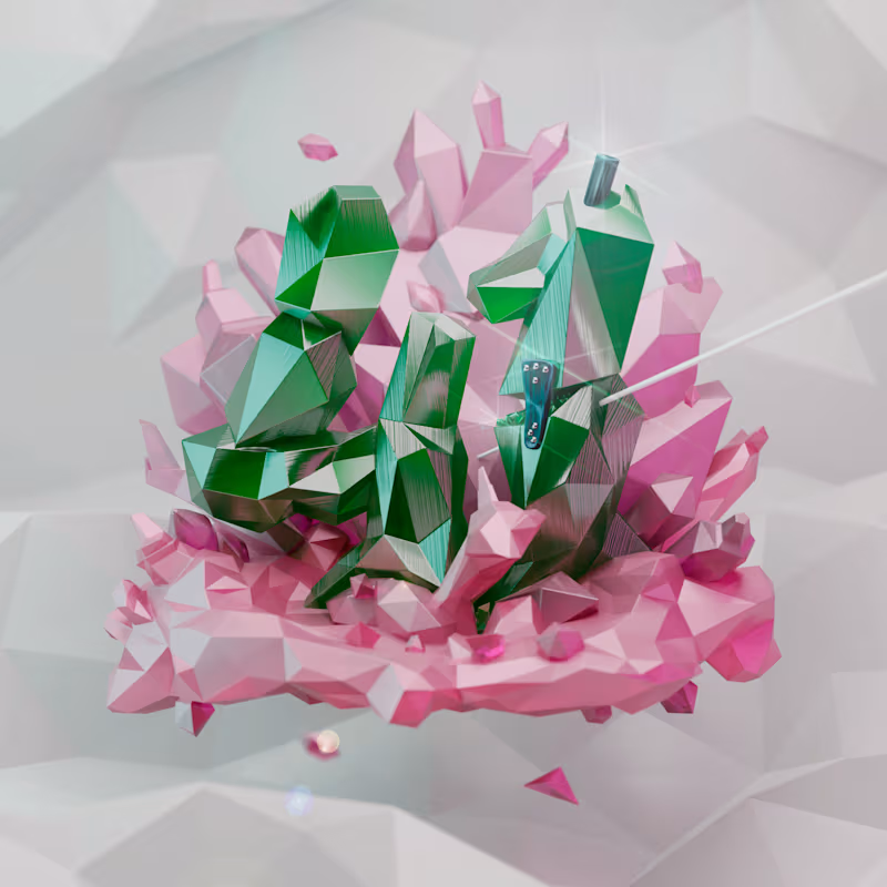
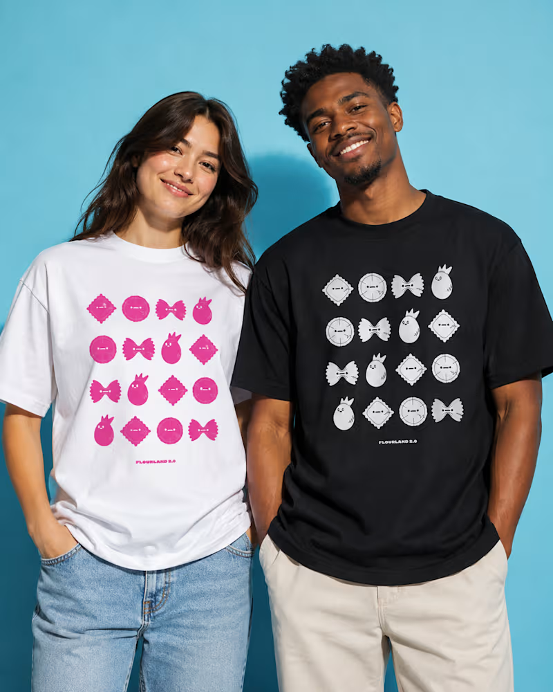
From screen to object: what should Flourland become next?
I’ve been developing Flourland since 2020, exploring this world through illustration, animation, paintings, murals, and stickers.
Now I’m working on bringing the same family of characters into physical products.
The sculptural pieces shown here are still prototypes. I’m currently sanding, filling, correcting imperfections, and gradually preparing them for their final finish. At the same time, I’m visualizing how the characters could work together on a first T-shirt—the image shown is an early product mockup.
I’m now deciding which direction to prioritize:
A small, limited edition of sculptural objects or the first Flourland T-shirt?
Which would you most want to own first, and why?
I’d especially value feedback on which format feels more distinctive, collectible, and capable of introducing Flourland to new people.
3
100

Product Designer
Product Designer


Artist of the digital craft, sharing experiences
Artist of the digital craft, sharing experiences


Strategy, Branding & Product UX designed for Impact.
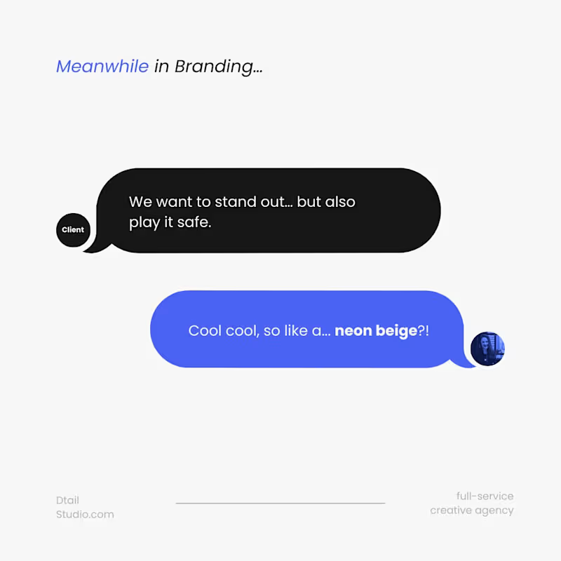
Client:
We want to stand out… but also play it safe.
Us:
Cool cool, so like… a neon beige?
Helvetica Medium Gray won’t get you remembered.
Bold moves > blended moodboards.
Because when you play it too safe, you end up with:
Airbnb, but with a more hotel website vibe
Tesla, but make it more Corolla-ish
“We’re different,” in a layout we’ve all seen 14 times this week
You’re building something big.
So act like it.
Pick weird.
Pick clear.
Pick brave.
Your brand should start conversations — not fade into the feed.
Let’s make it unforgettable.
1
47