
Designing thoughtful brand identities, logos, and packaging.
- 1x
- Hired
- 4.8
- Rating
- 5
- Followers
Designing thoughtful brand identities, logos, and packaging.
View more →

Transforming ideas with creativity
Transforming ideas with creativity


View more →

Brand Designer · Visual Identity · Packaging Design
Brand Designer · Visual Identity · Packaging Design
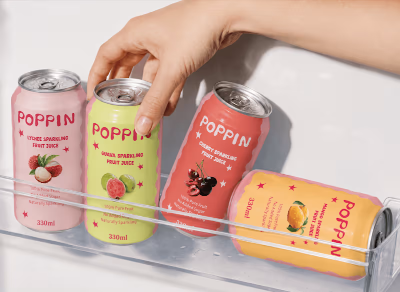
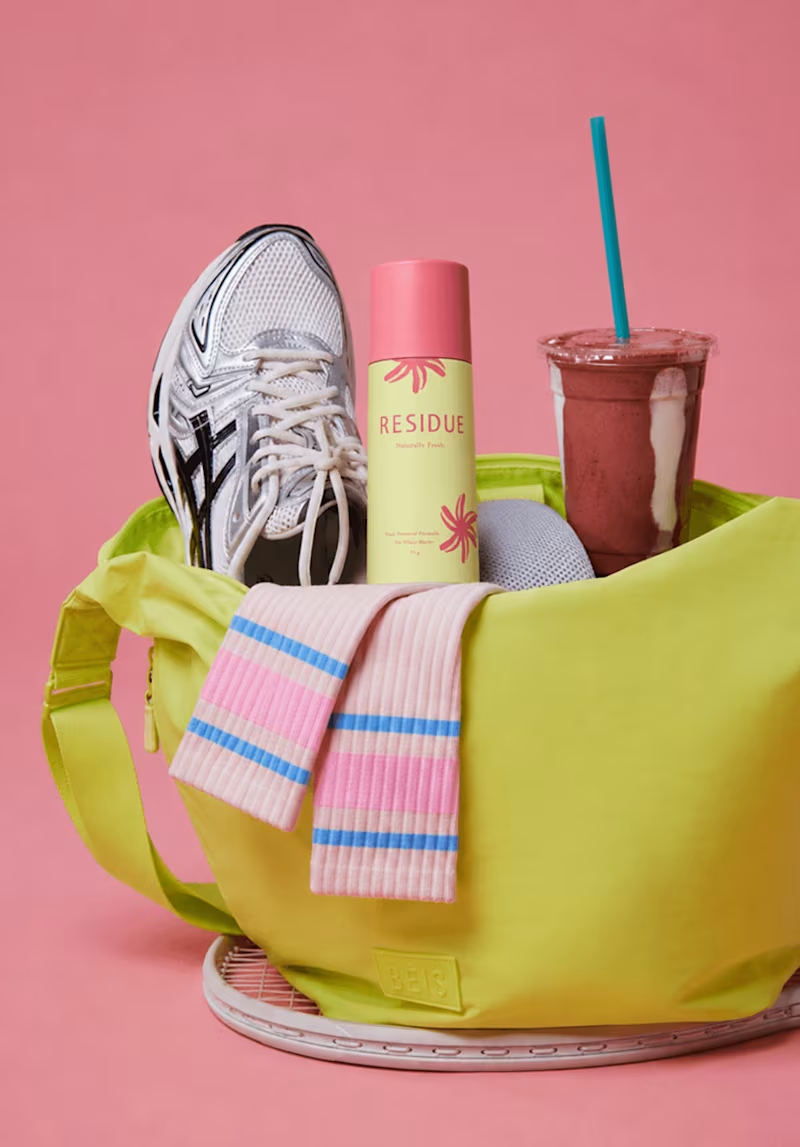
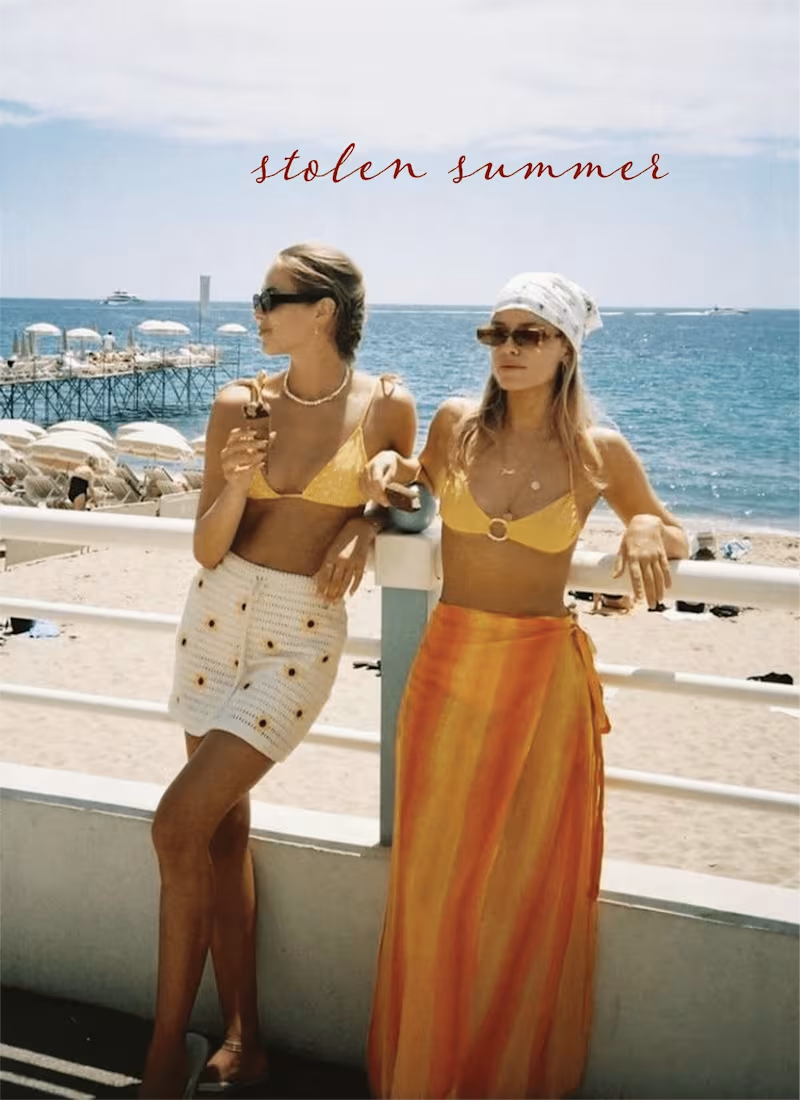
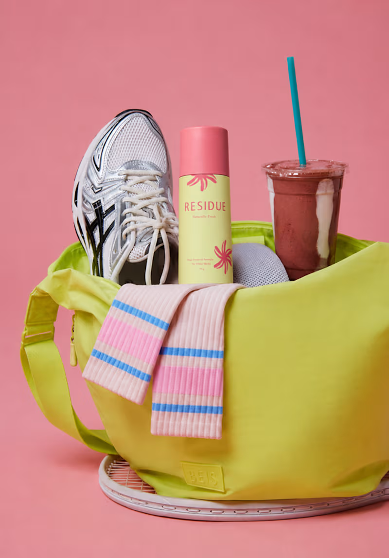
Residue needed an identity that felt as intimate as the product itself a fragrance brand built around memory and lingering feeling, not just scent. The challenge was translating that emotional, sensory concept into a visual system: packaging, color, and typography that felt confident and premium, while staying warm and personal rather than clinical.
0
73

Motion Design | Brand Design | Packaging


Designing brands that live on shelves and thrive on screens.
Designing brands that live on shelves and thrive on screens.

A fun, feel-good packaging design for Navi Nature, bringing color, character, and charm to healthy millet products.
0
28


Graphic Designer
Graphic Designer


View more →