





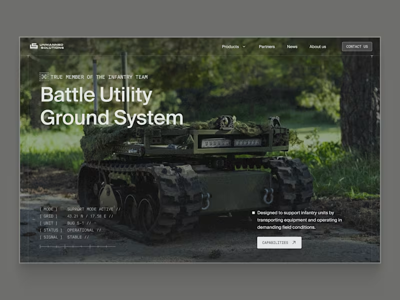
Hero section redesign for Unmanned Solutions.
Defence products are often impressive, but their websites struggle with a few familiar problems: dated visuals, lack of credibility, and no obvious next step for partners or buyers.
I redesigned the hero to address those issues by:
– creating a more modern environment that holds up alongside other defence companies
– delivering an overall visual uplift without over-styling
– putting the product front and centre
– introducing clear paths forward, with capabilities highlighted in the hero and contact access made obvious in the navigation
Same product. Clearer focus. Stronger first impression.
1
120
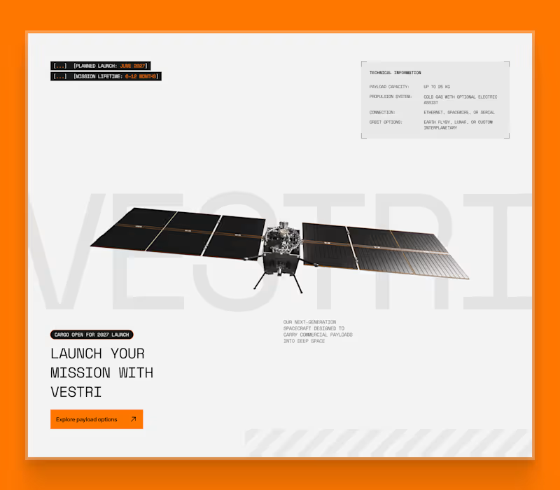
Space systems website visual exploration
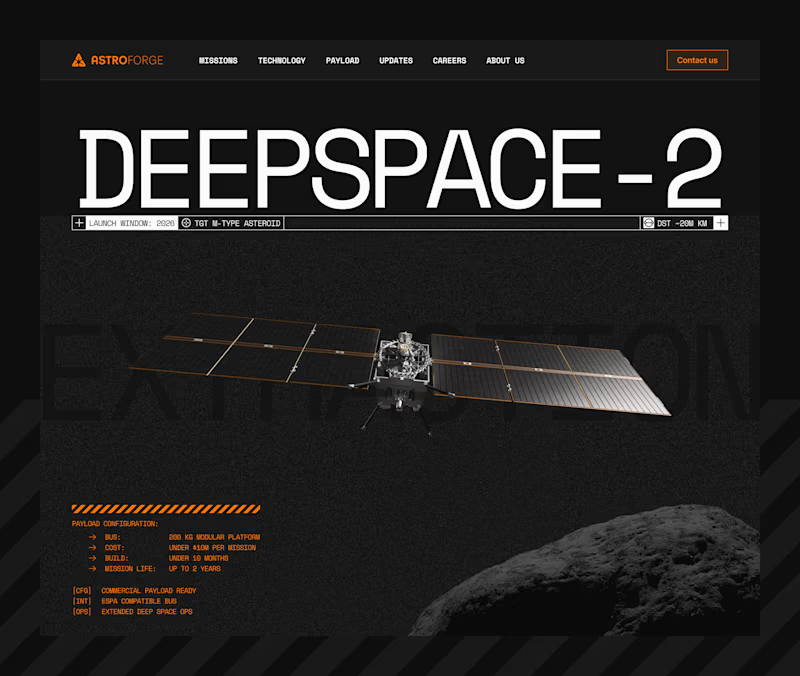
This is a visual exploration for a space systems website, focused on how complex offerings are introduced and framed.
A common issue with sites like this is that everything is technically impressive, but it takes too long to understand what’s actually available, who it’s for, and what to do next. In real buying situations, people want to understand relevance quickly before committing time.
This block explores a simpler approach. Set the context, show readiness, surface key constraints, and guide the right visitors toward a clear next step, without overwhelming them with specs upfront.
The goal here was clarity first, with technical depth revealed progressively.
2
3
94
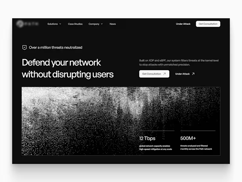
Cybersecurity website hero concept
This concept was designed to address clarity issues in the existing site. The product and its proprietary technology weren’t coming through clearly, which made it hard for visitors to understand what the platform actually does or why it’s different.
Another key challenge was visibility and conversion. Important information was missing, and there was no clear path for interested users to get in touch or take the next step.
The goal of this hero was to clearly explain the product, introduce technical depth gradually, surface credibility early, and guide the right users toward action.
6
70