Icon Designer Projects in LodhikaIcon Designer Projects in LodhikaAISporty
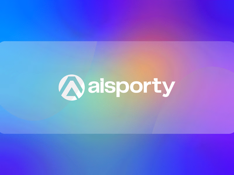
I got a brief for a sports technology platform.
The brief?
Create a brand that feels intelligent, energetic, and future-ready while helping athletes and users track performance, improve results, and stay connected through technology.
Here's how I brought AISporty to life:
• I explored how modern athletes rely on data, insights, and smart technology to reach their goals more efficiently.
• We crafted a mission: Empower people to achieve peak performance through intelligent digital tools and actionable insights.
• Shaped a vision: To become a trusted platform where sports, technology, and personal growth seamlessly come together.
• Designed a bold geometric symbol inspired by achievement, progress, and upward momentum, reflecting the journey toward better performance.
• Developed a vibrant gradient color system that blends innovation, energy, and accessibility, creating a modern experience that feels both powerful and approachable.
The result?
A brand that doesn't just represent a sports app. It represents ambition, progress, and the confidence that comes from having the right tools to perform at your best.
The client's reaction?
"This isn't just a logo. It perfectly captures the energy, intelligence, and forward-thinking vision behind our platform." PRYN
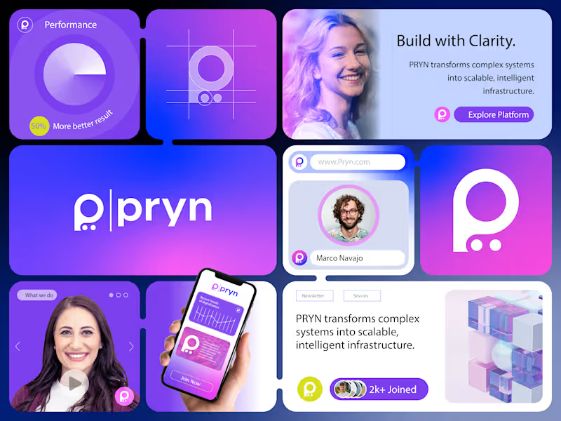
I got a brief for a technology and infrastructure platform.
The brief?
Create a brand that makes complex systems feel simple, intelligent, and accessible while positioning the company as a trusted partner for scalable digital growth.
Here's how I brought PRYN to life:
• I explored how modern businesses struggle with complexity when managing data, systems, and digital infrastructure.
• We crafted a mission: Transform complex systems into scalable, intelligent solutions that empower growth.
• Shaped a vision: To become a trusted platform that helps organizations build with clarity, confidence, and efficiency.
• Designed a visual identity around a minimalist "P" symbol, representing precision, connectivity, and streamlined problem-solving.
• Developed a vibrant purple-to-blue gradient system that communicates innovation, reliability, intelligence, and forward-thinking technology.
The result?
A brand that doesn't just represent technology. It represents clarity in complexity. It gives businesses confidence that powerful solutions can also be intuitive and approachable.
The client's reaction?
"This isn't just a logo. It perfectly captures our goal of making complex infrastructure feel simple and accessible." SwiftNetSet
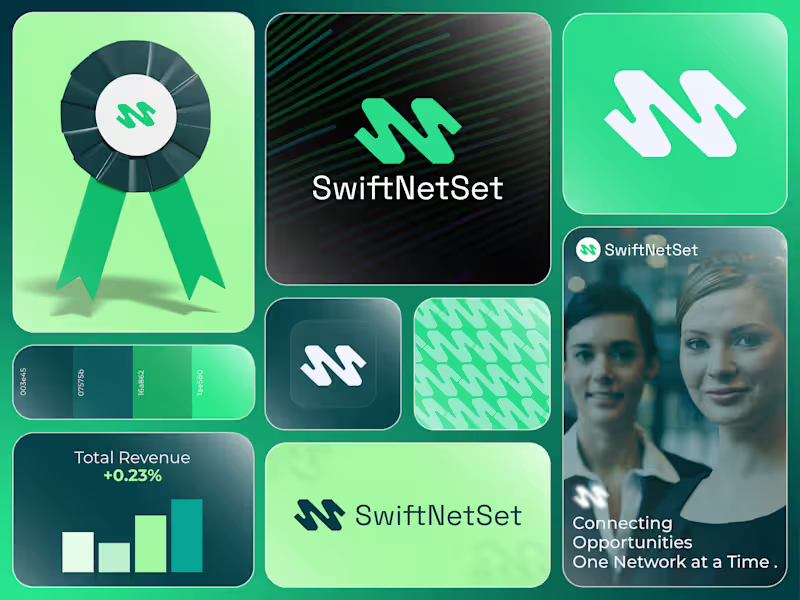
I got a brief for a networking and business growth platform.
The brief?
Create a brand that feels fast, reliable, and professional while helping businesses build meaningful connections and unlock new opportunities.
Here's how I brought SwiftNetSet to life:
• Researched the challenges professionals face when building strong networks in an increasingly digital world.
• Defined a brand mission focused on simplifying connections and helping businesses grow through smarter networking.
• Created a dynamic visual identity inspired by speed, connectivity, and seamless communication.
• Designed a modern symbol that combines movement and structure, representing the flow of ideas, opportunities, and professional relationships.
• Built a fresh green and teal color system that communicates growth, trust, innovation, and forward momentum.
The result?
A brand that feels modern, efficient, and dependable. One that helps professionals connect with confidence and positions networking as a catalyst for growth.
The client's reaction?
"This feels exactly like the future of professional networking. Clean, memorable, and built around connection." Distorted Duality
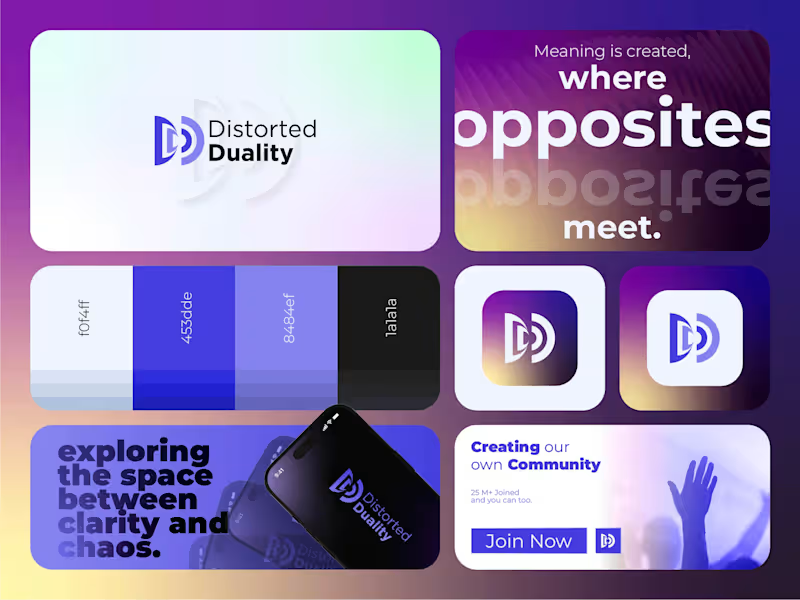
I got a brief for a music and audio production brand.
The brief?
Create a brand that captures the relationship between sound and reflection, originality and influence, while feeling modern, immersive, and unforgettable.
Here's how I brought Distorted Duality to life:
• I explored the idea that every sound creates a response, an echo, a reflection of itself.
• We crafted a mission: Create immersive audio experiences that transform sound into emotion.
• Shaped a vision: To build a recognizable creative identity where music, production, and storytelling intersect.
• Designed a visual identity centered around two interconnected "D" forms, representing sound and echo, creation and reflection.
• Developed a vibrant purple-to-gold color palette that evokes energy, creativity, depth, and movement.
The result?
A brand that doesn't just represent music production. It represents the relationship between sound and perception. It turns a simple concept into a memorable visual experience.
The client's reaction?
"This isn't just a logo. It's a visual expression of how our music moves and resonates." Kalyx
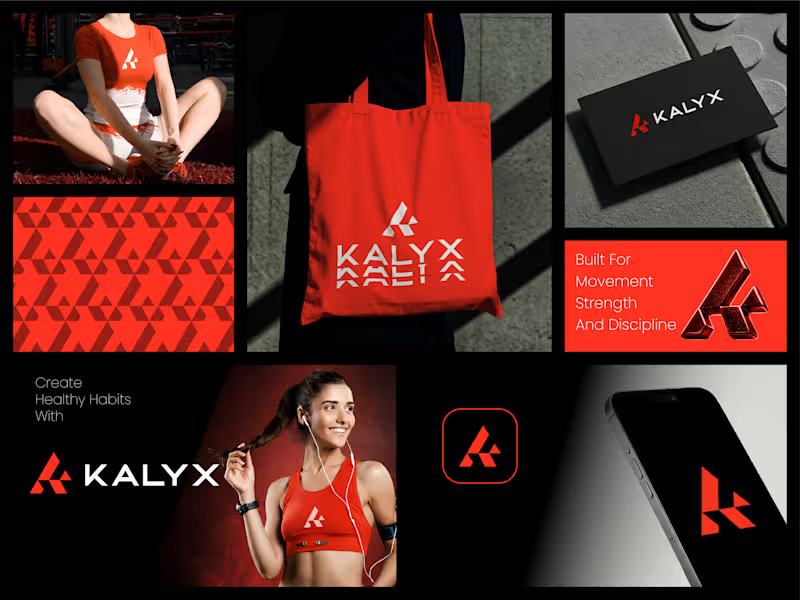
I got a brief for a fitness and performance brand.
The brief?
Create a bold identity that inspires discipline, strength, and progress while appealing to people committed to pushing their limits.
Here's how I brought Kalyx to life:
• Explored the mindset of athletes and fitness enthusiasts who see training as more than exercise. It's a commitment to growth, resilience, and self-improvement.
• Developed a brand strategy centered around movement, determination, and the pursuit of peak performance.
• Designed a dynamic geometric symbol that reflects strength, momentum, and forward progression while creating a memorable visual signature.
• Built a high-energy visual identity using bold red, black, and white tones to communicate power, confidence, and intensity.
• Created a versatile brand system designed to perform across activewear, digital platforms, mobile applications, packaging, and promotional campaigns.
The result?
A brand identity that feels strong, modern, and motivating. One that empowers individuals to stay focused on their goals and embrace the discipline required to achieve them.
The client's reaction?
"This captures exactly what our brand stands for. Powerful, energetic, and built for people who never stop improving." Roboline
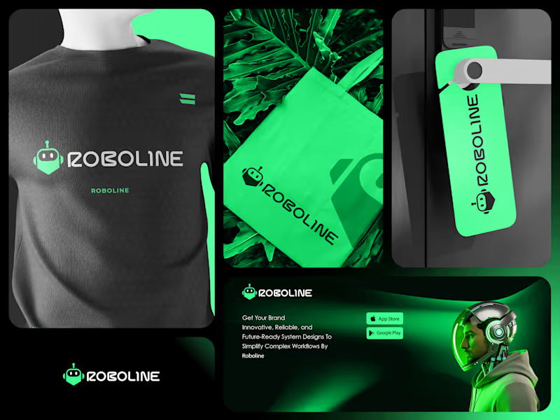
I got a brief for a technology and automation company.
The brief?
Create a futuristic brand identity that communicates innovation, intelligence, and reliability while remaining approachable to modern businesses adopting automation.
Here's how I brought Roboline to life:
• Explored how businesses perceive automation today. They want technology that is powerful and advanced, but also intuitive and dependable.
• Developed a brand strategy centered around simplifying complexity through intelligent systems and forward-thinking solutions.
• Designed a custom robot-inspired symbol that instantly communicates technology, automation, and digital transformation.
• Built a bold visual identity using vibrant neon green and deep black tones to create a modern, high-tech presence that stands out in a competitive market.
• Created a scalable branding system designed to perform across software platforms, mobile applications, digital products, merchandise, and marketing campaigns.
The result?
A brand identity that feels innovative, energetic, and future-ready. One that positions Roboline as a trusted technology partner helping businesses streamline operations and embrace the future with confidence.
The client's reaction?
"This perfectly reflects the direction of our company. It feels modern, intelligent, and instantly recognizable." Symbolic Eye
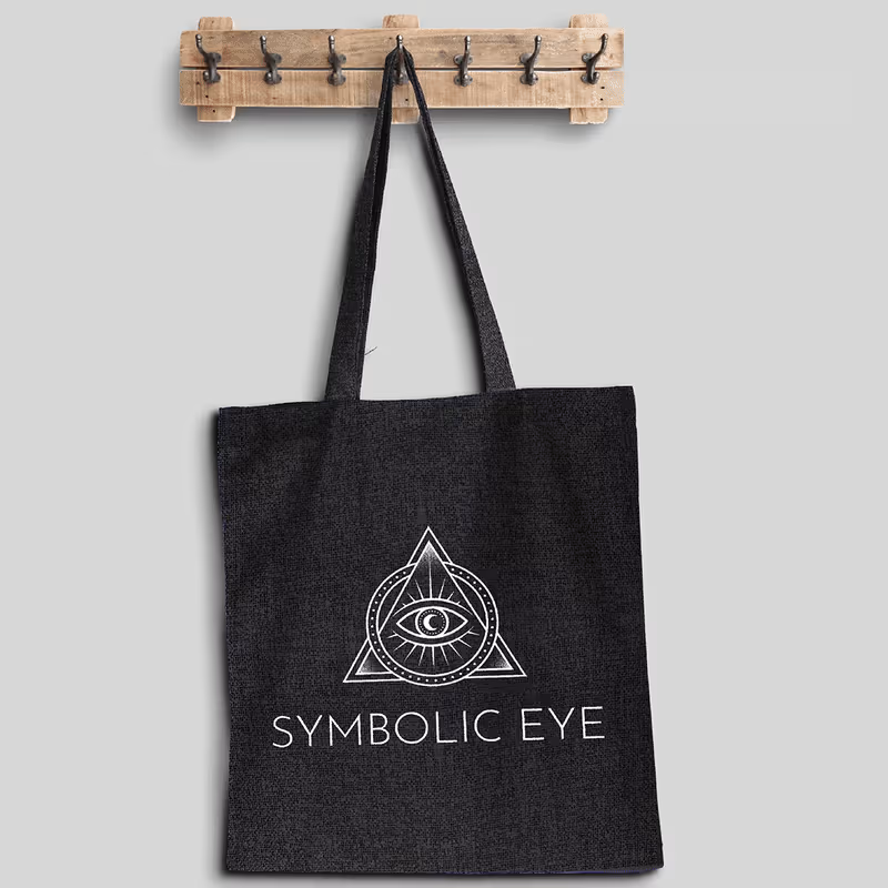
I got a brief for a tattoo studio and symbolic art brand.
The brief?
Create a bold identity that reflects the deeper meaning behind body art, blending sacred geometry, spiritual symbolism, and modern tattoo culture into a memorable visual experience.
Here's how I brought Symbolic Eye to life:
• I explored the connection between tattoos and personal transformation, creating a brand that represents stories, beliefs, and individuality rather than just ink on skin.
• We defined a mission: Transform meaningful ideas into timeless body art through symbolism, craftsmanship, and artistic expression.
• Established a vision: To become a destination for clients seeking tattoos that carry purpose, emotion, and lasting significance.
• Designed a custom emblem featuring an all-seeing eye enclosed within a geometric triangle, representing intuition, protection, balance, and inner awareness.
• Enhanced the identity with celestial details, radiant lines, and minimalist ornamental elements that evoke mystery while maintaining a refined and contemporary aesthetic.
• Developed a monochromatic visual system that pairs crisp white linework with deep black backgrounds, creating a striking identity that stands out across signage, merchandise, social media, and studio branding.
The result?
A brand identity that feels powerful, artistic, and deeply symbolic, inviting clients to wear meaningful stories with confidence and individuality.
The client's reaction?
"The logo feels like a modern talisman. It captures the spiritual energy and artistic precision of our studio while giving the brand a distinctive identity that people instantly remember."