Projects using Adobe Suite in LakevilleProjects using Adobe Suite in LakevilleOverview
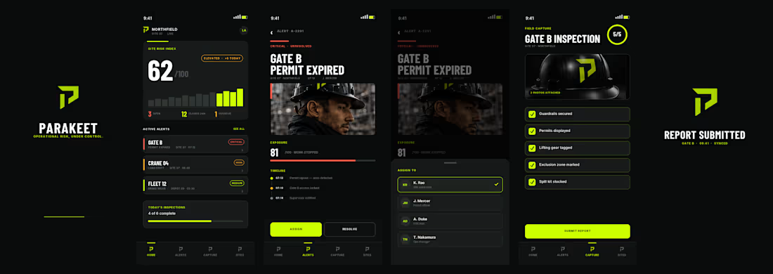
Parakeet is a speculative brand concept created to demonstrate how a complex B2B software platform could be transformed into a modern, enterprise-grade technology brand. The objective was to move beyond generic SaaS aesthetics and position Parakeet as a trusted operational risk intelligence platform serving industrial, energy, manufacturing, and infrastructure organizations.
Challenge
Most risk and compliance platforms rely on outdated corporate branding that feels technical but lacks clarity, authority, and differentiation. The goal was to create a brand that communicated trust, precision, operational excellence, intelligence, and enterprise credibility while remaining visually modern and scalable.
Solution
I developed a complete brand system including:
Brand positioning
Logo and visual identity
Color palette and typography system
Iconography suite
Website direction
Product UI concepts
Social media assets
Sales deck and collateral design
The visual language combines industrial strength with technology-forward sophistication through a high-contrast black, carbon, and safety-lime palette inspired by control rooms, infrastructure, and mission-critical operations.
Result
The final concept demonstrates how strategic branding can elevate a technical software product into a premium enterprise platform with a clear market position, strong visual differentiation, and a cohesive customer experience.
Services: Brand Strategy, Creative Direction, Visual Identity, UI/UX Direction, Product Marketing, Sales Enablement Assets MISUNDERSTOOD WHISKEY CO.
Greetings From Bourbon Collection
Brand Extension · Packaging · Art Direction · Illustration
Overview
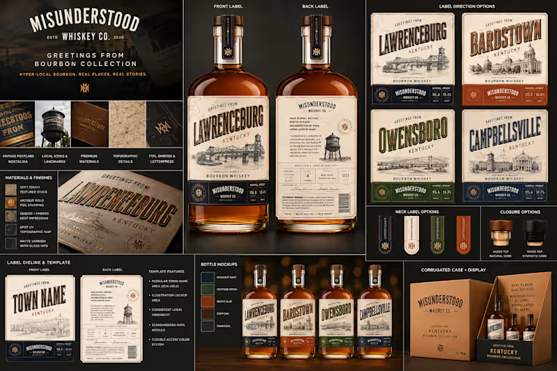
Misunderstood Whiskey’s Greetings From collection was developed as a hyper-local bourbon concept celebrating the Kentucky towns and communities behind bourbon culture. The goal was to create something rooted in heritage and nostalgia without falling into the visual conventions of traditional whiskey packaging.
The Idea
The creative direction takes inspiration from vintage American postcards—where typography, illustration and a sense of place become part of the story. Each expression celebrates a different Kentucky town, transforming the bottle into a small piece of local history.
The System
A modular packaging architecture allows Lawrenceburg, Bardstown, Owensboro and Campbellsville to have distinct personalities while remaining immediately recognizable as one collection. Custom architectural illustrations, topographic details and town-specific accent colors differentiate each release, while consistent typography and label construction unify the range.
Premium production details—including textured stocks, antique-gold foil, embossing, debossing and selective gloss finishes—add tactility and elevate the nostalgic visual language.
Beyond the Bottle
The identity was designed as a complete retail system rather than a standalone label. Neck tags, closures, secondary packaging, shipping cases and point-of-sale displays extend the same visual language across every consumer touchpoint.
The Result
A flexible, collectible packaging system that gives Misunderstood Whiskey room to continually introduce new destinations while maintaining a strong, recognizable identity.
REAL PLACES. REAL STORIES.
A bourbon collection inspired by where it comes from.